Reusable styles are only part of a design system. The way settings connect, combine, and update matters just as much once a site grows. In Divi 5, presets form a connected system: small groups of settings can feed into larger presets, while variations can be layered without duplicating the entire design.
That structure is the strongest reason to look beyond a simple feature comparison. Below, we’ll explain the layers, compare them with other builders’ approaches, and show where Divi’s combination of reusable settings and visual controls can make a difference.
What Are Presets In Divi 5?
Presets save supported builder settings so you can reuse and manage them from one place. Instead of adjusting the same border, button treatment, or Scroll Effects settings separately, you edit the shared preset. Elements using those settings can then receive the change.
Divi provides two main preset types, supported by a separate system of reusable values.
Design Variables
Design Variables are the value layer. Define a primary brand color, give it a name, and reference it in supported fields. Presets can use those references, connecting reusable settings to centrally managed values.
Divi 5 supports six variable types: Colors, Fonts, Numbers, Images, Text, and Links. Content such as your company logo, a CTA URL, or a phone number can all be stored as variables, so the system handles both content management and design.
Open the Variable Manager from the left toolbar, choose a type, name the variable, and set its value. To use it, open the Dynamic Content picker on a supported field and select the variable.
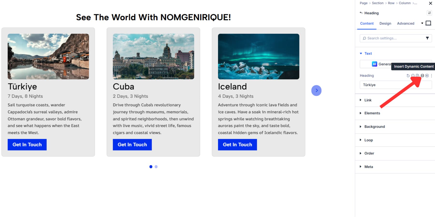
Update the variable in the Variable Manager, and the fields referencing it use the new value.
Option Group Presets
Option Group Presets save settings from an individual group, such as typography, spacing, borders, shadows, or backgrounds. Open the group’s preset menu and choose New Preset from Current Styles to save a treatment you’ve created. The preset can then be selected on compatible groups elsewhere.
These presets follow a compatible option group rather than a single module type. For example, a Border preset can be reused wherever the matching Border group is available. Open that group’s preset menu and select it. You can also choose a default for the applicable group.
Editing the shared preset updates its connected uses. Local overrides or higher-priority settings can take precedence, so changing a preset does not necessarily replace every value on an element.
Element Presets
Element Presets bring supported settings together for a complete element. A Button preset, for example, can combine its typography, spacing, background, and border treatment. Open the element’s preset menu and choose New Preset from Current Styles to create one from your current design.
Element Presets belong to a particular element type. A Text module preset applies to Text modules; a Button module preset applies to Button modules. Option Group Presets provide the smaller, reusable pieces that can be shared between compatible groups on different elements.
Element Presets are available for sections, rows, columns, and modules. Select one from the matching element’s preset menu, or make it the default starting point for that element type.
How Other Builders Approach Reusable Design
Elementor, Bricks, Breakdance, and Oxygen all provide tools for consistent design. Their strengths deserve an accurate comparison: visual class editing is still visual editing, and reusable styles are not exclusive to Divi.
The useful distinction is how each builder organizes shared settings and variations. Divi’s case rests on the connections between its preset layers, rather than on other builders lacking design systems.
Elementor: Global Classes And Variables
Elementor’s earlier system included global colors, fonts, Theme Style settings, and Global Widgets. V4 expands reusable styling with global classes.
With Elementor’s classes, you can define styles visually and apply them to multiple elements. Editing a shared class updates the elements using it.
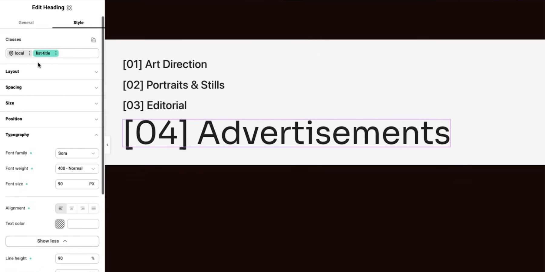
Image by Elementor on YouTube
Variables provide reusable values for those styles. For example, a color variable can supply several classes, so a brand color change does not require editing each class individually.
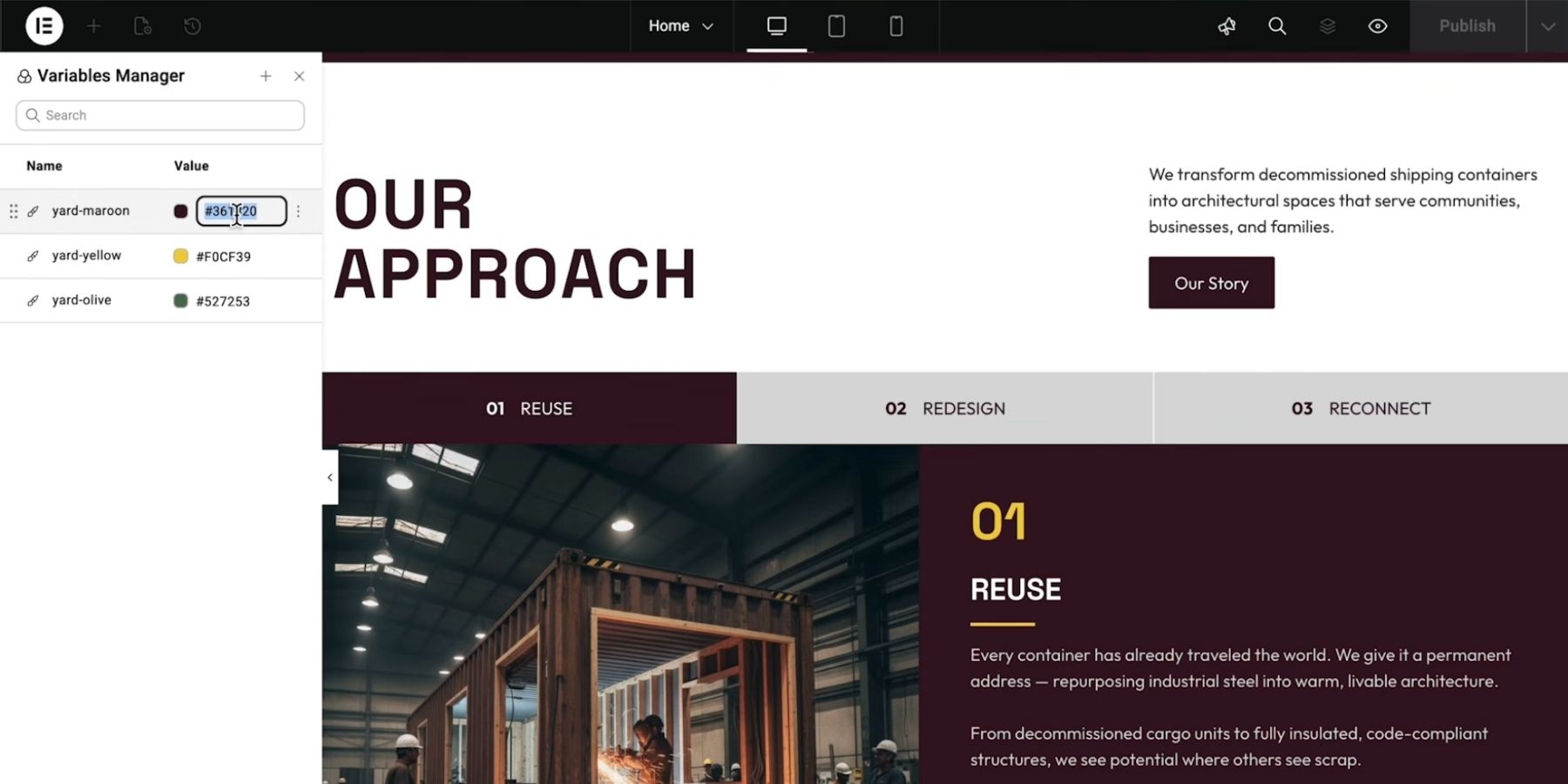
Image by Elementor on YouTube
This separates shared values from shared style rules, much as Divi separates variables from presets. The two systems pursue similar consistency goals through different editing models.
Elementor’s Class Manager helps organize the class library. It supports class management and ordering, while the editor lets you choose between a shared class and local styling.
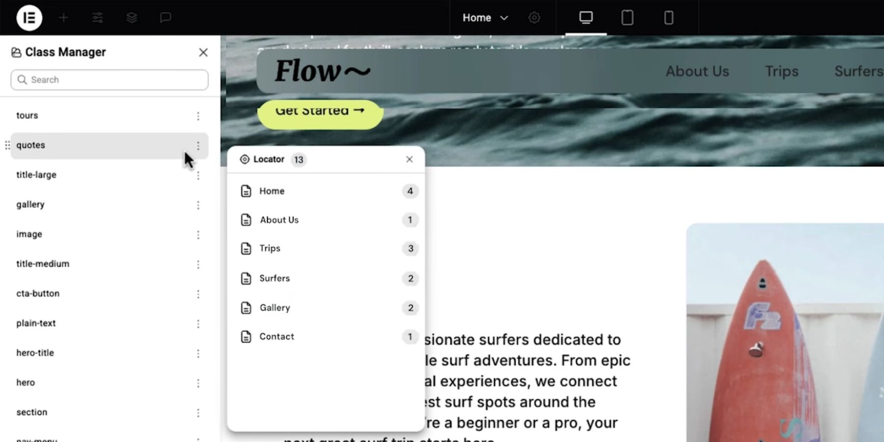
Image by Elementor on YouTube
Clear names help make the intended use of each class understandable, just as meaningful preset names do in Divi.
Elementor also lets you convert local styles into a global class. A locally created variation does not have to be rebuilt to become reusable.
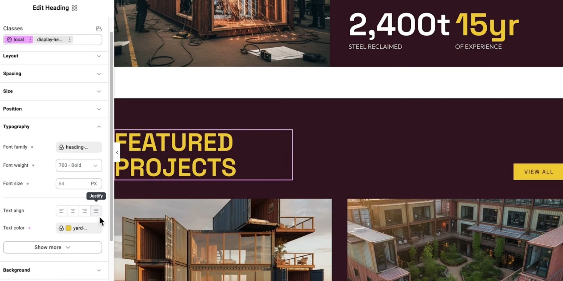
Image by Elementor on YouTube
Divi’s alternative is to organize reuse around option groups and element presets, then connect them through nesting and stacking. The difference is the structure of the workflow, not whether Elementor can reuse styles.
Bricks: A Visual Class-Based Workflow
Bricks’ Style Manager brings together classes, variables, theme styles, and tools for colors, typography, and spacing.
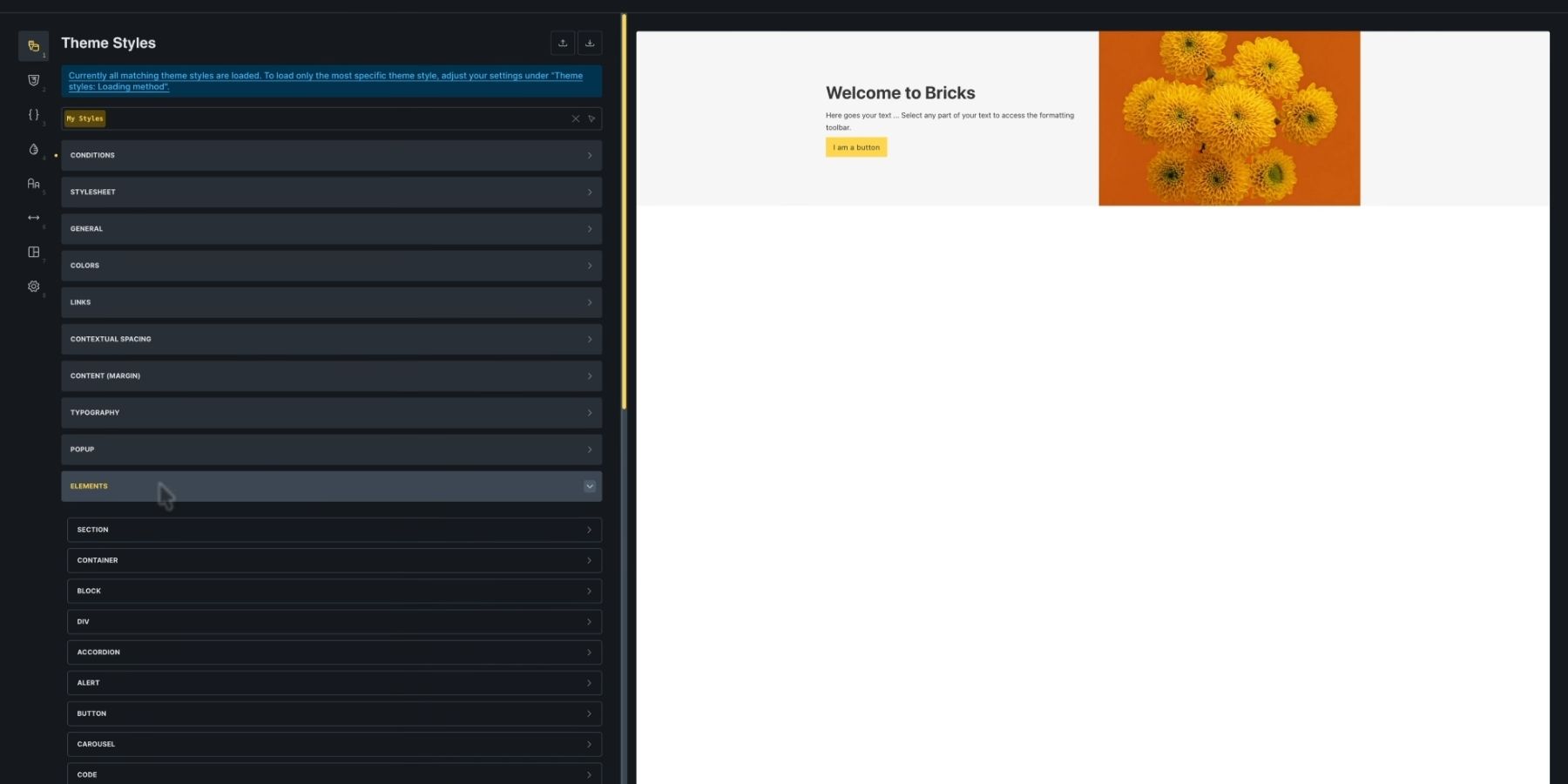
Image by Bricks – Visual Site Builder for WordPress on YouTube
This gives users a native place to organize their design system. Third-party frameworks may still offer their own conventions and features, so the manager should not be treated as a complete replacement for them.
Global classes can be styled visually and applied across elements. Shared class edits then carry through to their uses.
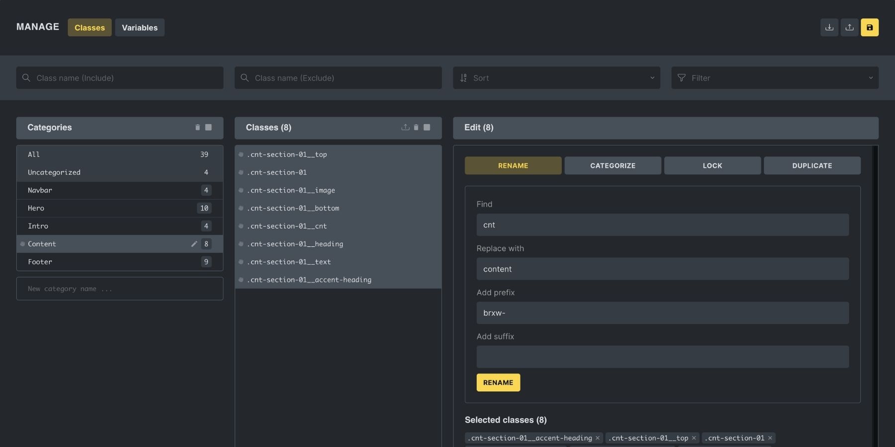
The active styling target matters. Selecting a class directs edits to that shared class; editing the element itself creates local styling. Checking the target helps avoid unintended overrides.
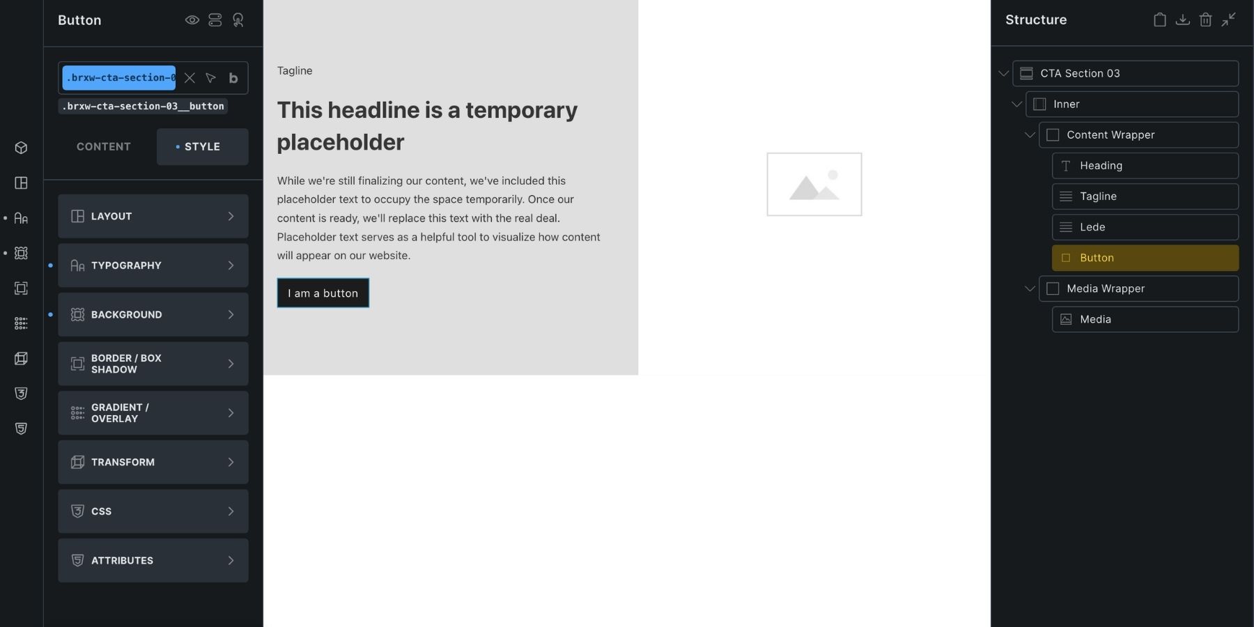
That distinction requires attention, but it is not a problem unique to Bricks. Divi users also need to distinguish editing a preset from changing an individual element.
For teams comfortable organizing styles as classes, Bricks offers a direct workflow. Divi’s option-group structure may be preferable when a team wants reusable settings organized around the builder’s controls.
Breakdance: Element And Typography Presets
Breakdance’s element presets save Design tab settings for reuse on elements of the same type. Changes to a preset update its linked elements, making them useful for maintaining consistent buttons, headings, and other elements.
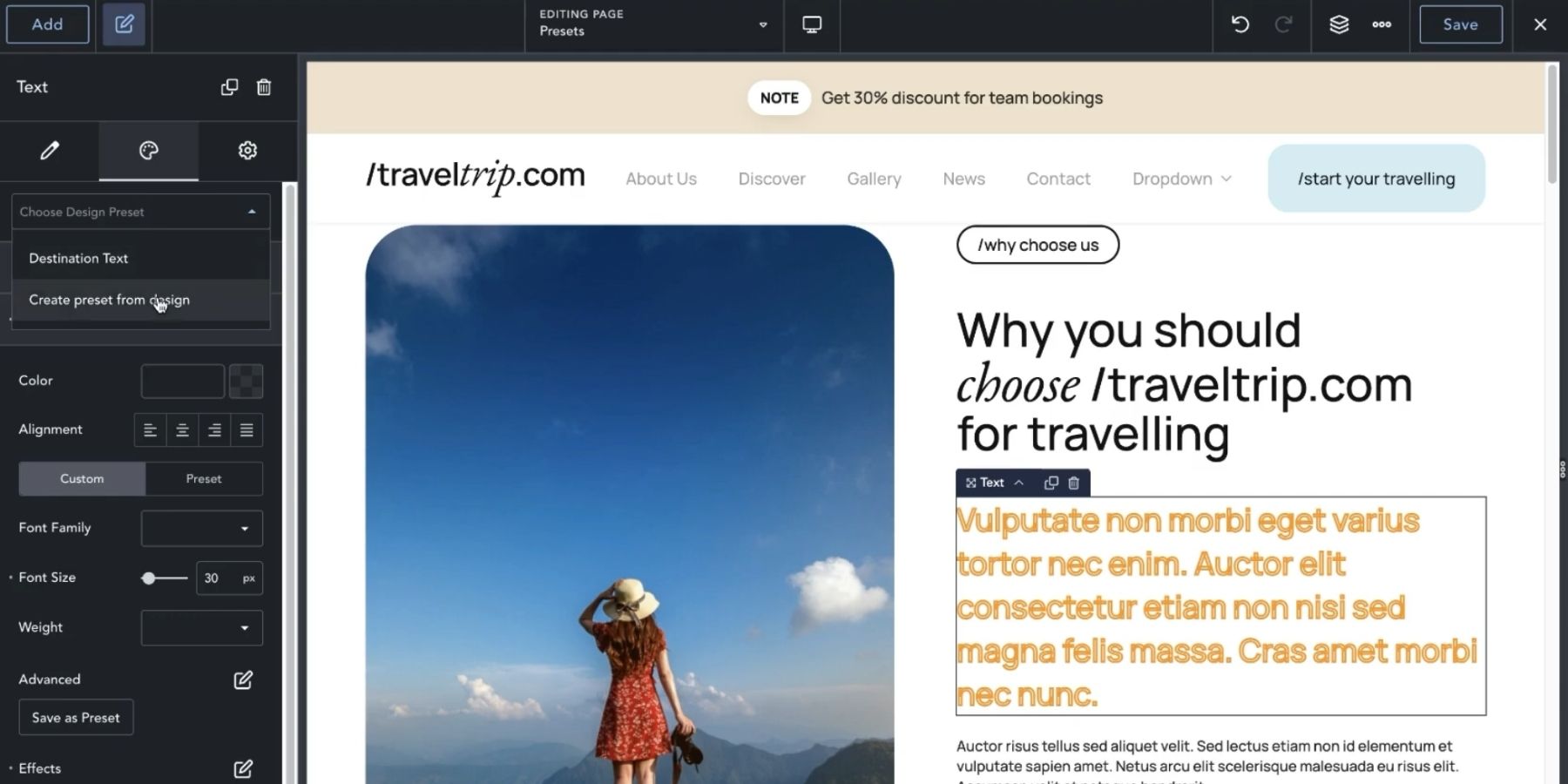
Image by Breakdance on YouTube
Breakdance also offers typography presets, alongside global settings and class-based styling tools. It would be inaccurate to describe its reusable design features as limited to element presets alone.
Divi’s additional distinction is its general Option Group Preset system: compatible groups can be reused across element types and referenced inside larger presets, including other option presets.
Oxygen: Classes And Variables
Oxygen provides visual class editing alongside variables. Named values can be referenced within styles, separating the values from the rules that use them.
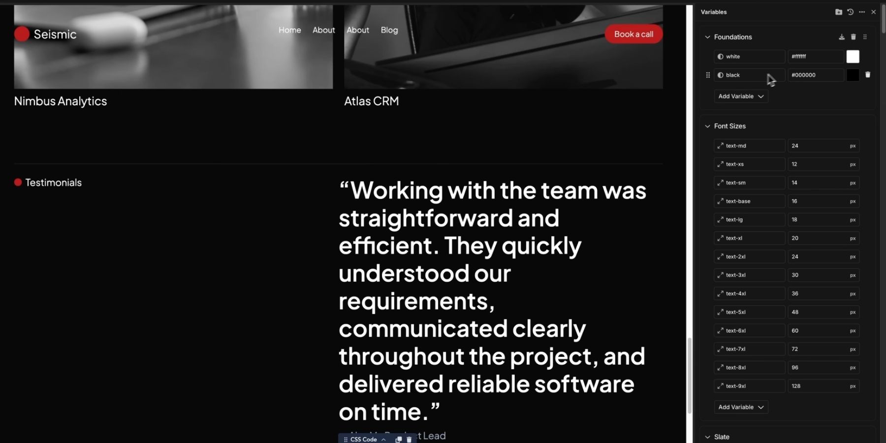
Image by Oxygen on YouTube
Apply a class to multiple elements, and shared edits affect those elements. Change a referenced variable, and the styles using that reference receive its updated value.
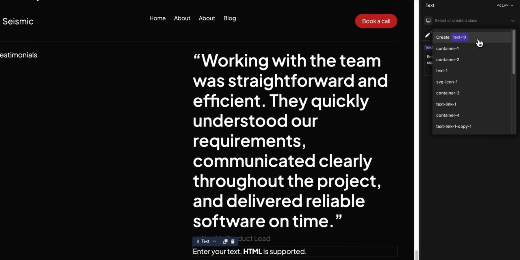
This is a natural fit for people who prefer a CSS-oriented design workflow, though writing CSS is not required for every change. Divi approaches reuse through preset-enabled builder settings, including settings that are not simply CSS declarations.
Where Divi 5’s Preset System Goes Further
Divi still uses CSS to render styles, and other builders also support reusable design. Its distinction is the combination of cross-element option groups, nested references, stacked variations, and composable controls in one preset workflow.
These features are most useful together. A small shared setting can become part of a button treatment, which becomes part of a complete module preset, while a separate preset supplies a variation.
Option Group Presets Work Across Compatible Elements
An Option Group Preset lets you reuse a specific treatment without importing an entire module design. A shared border or shadow can remain consistent even when the surrounding content, typography, and layout differ.
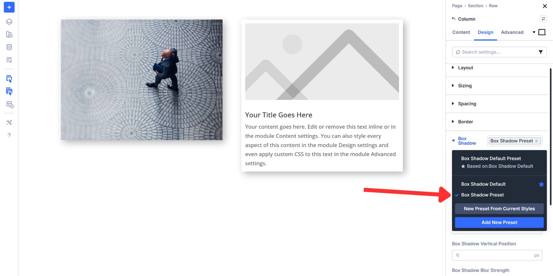
Create the treatment in its option group, then save it through the group’s preset menu.
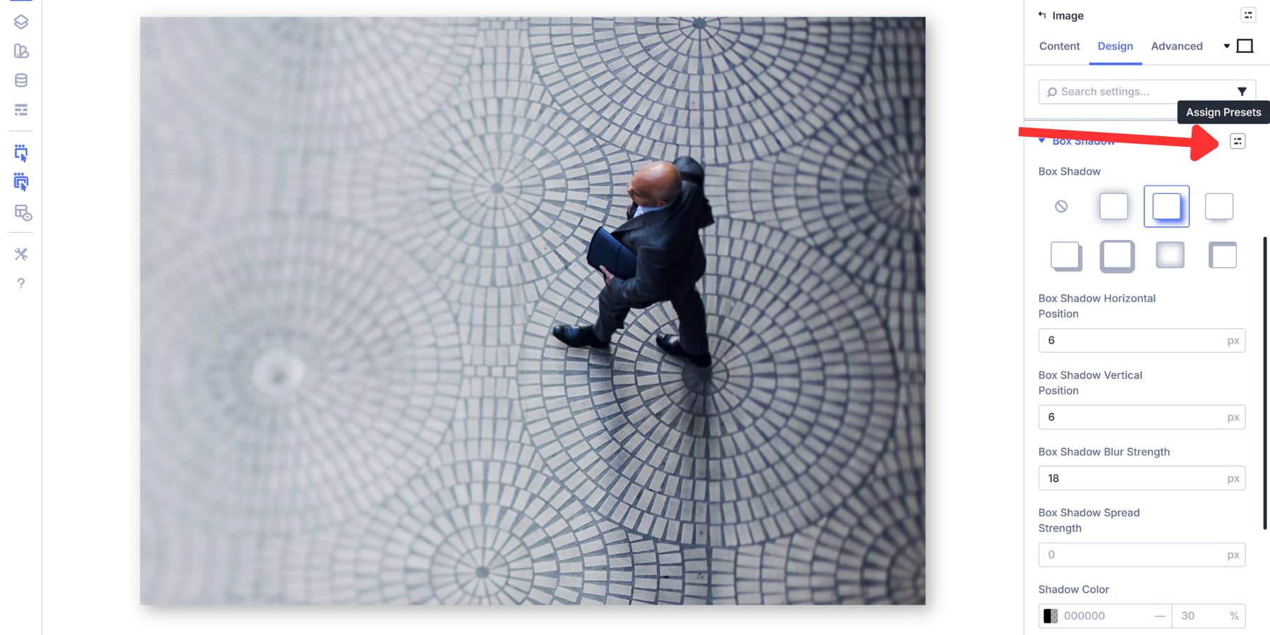
You can then select that preset on another element with the matching option group. The example below shows an Option Group Preset being reused from an Image module on a Column.
Presets Go Beyond CSS
Divi 5 presets can store behavior settings as well as visual styles. Scroll Effects are a practical example: the settings that control how an element moves or changes as visitors scroll can also be saved and reused through presets.
For example, configure a subtle vertical movement on an Image module and save the Scroll Effects settings as an Option Group Preset. Apply that preset to other elements with the matching group to reuse the same motion settings without configuring each one separately. Editing the shared preset updates its connected uses, unless those settings have been overridden.
This goes beyond saving CSS declarations. Divi’s Scroll Effects use script-driven behavior to respond to scrolling, and presets preserve the builder settings that configure that behavior. You can manage a reusable motion treatment through the same preset workflow you use for borders, spacing, and typography.
That Scroll Effects preset can also be referenced within an Element Preset, bringing shared appearance and behavior together in a larger design. The benefit is a connected system for both how elements look and how they behave.
Nested Presets Create A Connected Hierarchy
A shared value handles one decision, such as a radius. A shared preset can handle a coordinated set of decisions, such as a border’s width, style, color, and radius. Nesting lets that reusable treatment remain connected inside a larger design.
Stacked And Nested Presets introduced connections between Option Group Presets and Element Presets. Nested Option Presets extend this to option presets inside other option presets.
For example, a Pill Border preset can be selected inside a Solid Button option preset. That Button preset can then be used inside a CTA Element Preset. The CTA contains a reference to the button treatment, and the button treatment contains a reference to the border.
These are connected references, not separate copies of the border settings. Updating the shared Border preset can therefore update buttons within the CTA presets that use it. A local override or a higher-priority preset can still take precedence.
The same Border preset can also be used directly on another compatible Border group. You can share one treatment across several designs without making those designs identical.
Composable Settings Extend The Preset’s Controls
Modules contain smaller elements, such as a Blurb’s title and image or a CTA’s button. Composable Settings let you expose additional controls for these parts.
Open Toggle Options on a supported sub-element group and enable the controls you need, such as Border, Background, Sizing, Transform, or Animation. This lets you work on the inner element directly rather than treating the module as one indivisible design.
You can enable these groups while editing a preset, so elements using it expose the same controls. With nested option presets, the supported inner groups can also reference reusable treatments.
That connects the layers: Composable Settings make a control group available, an Option Group Preset supplies its settings, and an Element Preset brings the design together. The preset can define both the treatment and which additional controls are available to edit it.
Stacked Presets Add Focused Variations
A base design often needs a few variations. Rather than duplicating a complete button preset for every color or size, you can separate the shared foundation from the settings that differ.
Stacking lets you apply multiple presets to the same element or option group. A base button preset can supply typography and spacing, while a focused variation changes its colors. The variation does not need to repeat the entire base design.
When stacked presets define the same setting, their order determines priority: the last preset in the stack wins. Local overrides can still take precedence. Keep variation presets focused on the settings they are meant to change so combinations remain understandable.
Nesting and stacking solve different problems. Nesting connects reusable pieces inside a larger preset. Stacking combines presets at the same level to create a variation. Together, they can reduce duplication without flattening your design system into unrelated saved styles.
The Preset Manager Brings The Layers Together
The Preset Manager lets you create and edit presets without first placing a sample element on the page. Search or filter the library, manage defaults, and preview a preset while working on it.
This makes it practical to build the relationships deliberately. Create a shared Border treatment, reference it within a Button option preset, and use that within a compatible Element Preset. Enable any needed composable groups while editing the preset. You can also build on the canvas and save useful treatments as the design develops.

Defaults provide a starting point for the matching element type or option group. For example, a default Shadow preset supplies its shadow settings; it does not define an unrelated border radius. Choose defaults intentionally, then use named variations where a design needs something different.
We cover how to build that library in our post on reusable Border and Shadow presets, which can serve as a jumping-off point for building libraries for other elements as well.
You can also move reusable work between projects. Both managers support import and export, allowing you to bring a variable and preset library into another Divi 5 site instead of rebuilding it from scratch.
We cover importing and exporting Presets and Design Variables in their respective guides.
What Makes This Approach Worth Choosing?
Divi 5‘s advantage is the depth of the connections. Variables supply reusable values. Option Group Presets share compatible settings across elements. Nested presets preserve those relationships inside larger designs, and stacked presets add variations. Composable Settings extend the controls available within that structure.
A practical system might have one shared Border preset feeding several button treatments, those treatments feeding CTA presets, and a stacked variation adjusting a particular CTA’s colors. A shared Scroll Effects preset can supply motion behavior too, so the system governs more than a site’s static appearance.
For teams that prefer to manage these relationships through builder controls, that is a compelling reason to choose Divi 5. Class-based builders offer capable alternatives; Divi’s strength is giving reusable settings a connected, granular structure that you can manage visually.
The post What Makes Divi 5 Presets Unique (And Better Than The Competition) appeared first on Elegant Themes Blog.