A blog grid can look perfectly aligned while you’re designing it with placeholder content, then fall apart as soon as real posts start loading in. One author uploads a wide screenshot, another uses a portrait photo, and somebody else adds a square image from the brand library. The card design stays the same, but the image proportions do not.
Divi 5’s Aspect Ratio and Framing settings solve that directly inside the builder. You define the frame once on the card, decide how images should fill it, and every featured image pulled into the loop follows the same visual rules without changing the original files in your Media Library. We’ll build the blog loop with the Loop Builder first, then apply the image settings that keep the finished grid consistent.
Why Loop Images Break A Grid
Nobody uploading a featured image is necessarily thinking about the proportions of your archive grid. A writer grabs the screenshot that illustrates their point, a contributor sends a portrait straight from their phone, and a designer exports a square from the brand kit.
Product catalogs run into the same problem when photos arrive from different suppliers, each using a different setup. The loop pulls all of those files into the same card design, so without a shared image frame, the layout inherits whatever shape each upload happened to have.
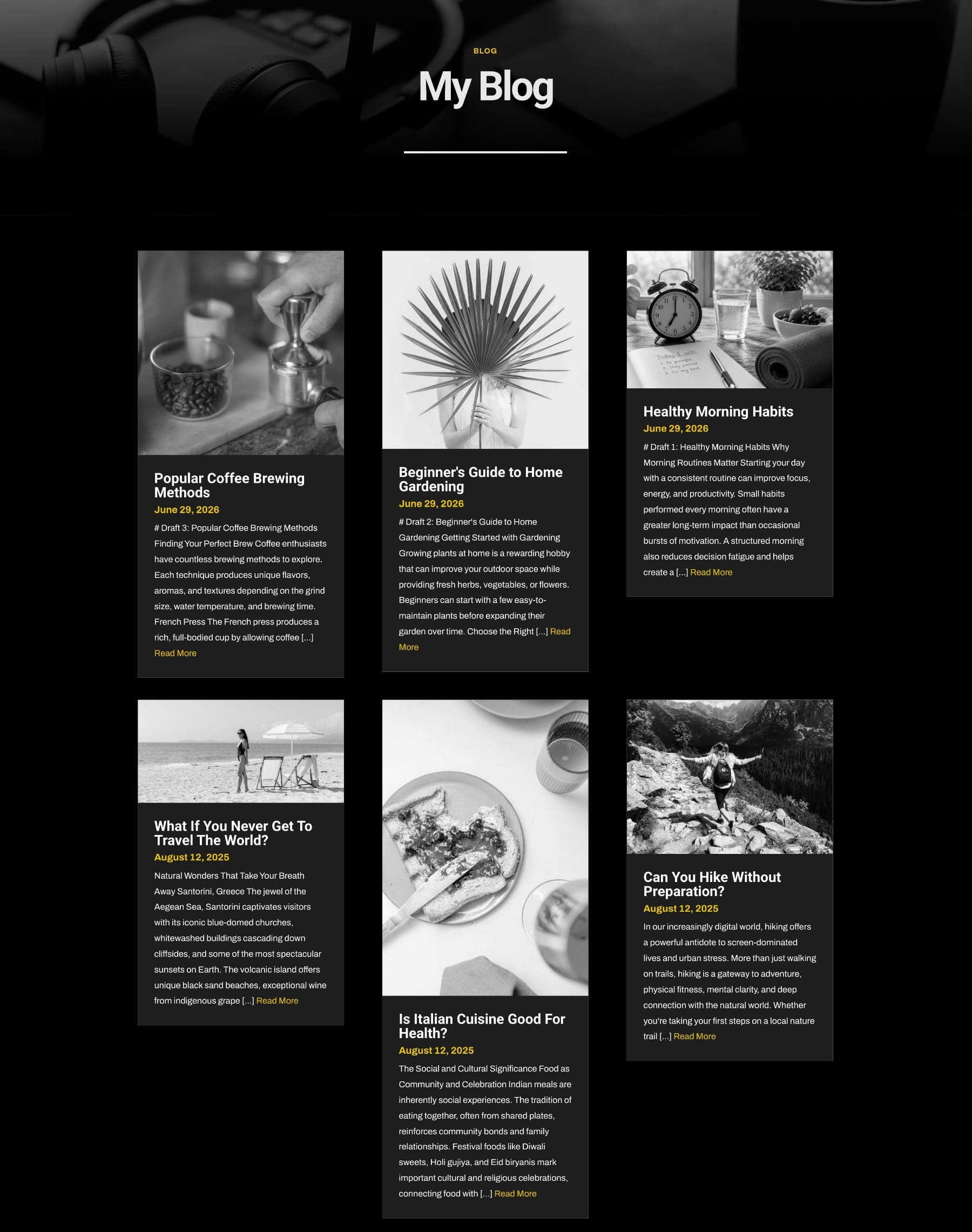
Manually preparing every image can work while the archive is small, but it becomes another maintenance task as the site grows. More importantly, if the layout changes later, a crop that was prepared specifically for the old design may need to be recreated.
The loop gives us somewhere better to manage that decision. We design one card, Divi repeats it for every item returned by the query, and the settings applied to that card repeat with it. Aspect Ratio and Framing let us define the image treatment at the template level instead of fixing each source image individually.
What Aspect Ratio And Framing Do
The two settings solve different parts of the same problem. Aspect Ratio lives in the Sizing option group and defines the proportions of the element. Framing controls how an image behaves inside the rendered frame. Once both are configured, the original upload dimensions no longer determine how much space each image occupies in the loop.
Aspect Ratio Sets The Frame
Aspect ratio describes the relationship between width and height. A 16:9 element is 16 units wide for every 9 units tall, giving it a widescreen shape. A 1:1 element is square, while 3:4 creates a portrait-oriented frame.
By default, an image follows the proportions of its source file. The Aspect Ratio setting gives the module a defined shape instead. Set every loop image to 4:3, for example, and a portrait photograph, square graphic, and wide screenshot all occupy the same proportional space in their respective cards.
Because Divi calculates the element’s height from its rendered width, the proportion continues to hold as the layout gets wider or narrower.
Object Fit Decides How The Image Fills The Frame
Once the frame has a defined shape, the image itself has to fit inside it. If the source image already matches the chosen ratio, there is very little to resolve. When the source and frame have different proportions, Object Fit determines how the two interact.
You’ll find Object Fit under Design > Framing. In modules where the image is a sub-element, such as Person or Blurb, the same controls appear inside the corresponding Image option group. Five values are available:
- Fill: The default. The image stretches to fill the frame exactly, which can distort it when the source and frame use different proportions.
- Cover: The image scales until the frame is completely filled while preserving its original proportions. Anything that extends past the frame is cropped. This is usually the most useful option for blog thumbnails and other photographic loop images.
- Contain: The complete image remains visible and keeps its proportions, but unused space may appear along two sides of the frame. This works well for logos, diagrams, and product imagery where cropping would remove important information.
- None: The image displays at its intrinsic size without being scaled to fit. Depending on the relationship between the image and frame, it may be cropped or leave empty space.
- Scale Down: Behaves like None when the image is already smaller than the frame and like Contain when the image needs to be reduced to fit.
Object Fit only produces a visible change when the image’s rendered dimensions differ from its intrinsic dimensions. Setting an Aspect Ratio is one common way to create that difference, as is defining both a Width and Height.
Object Position Chooses What Survives The Crop
Cover solves distortion by cropping, but the default crop starts from the center. That works well when the subject is centered and less well when important content sits toward an edge. Portraits are an obvious example: when a tall portrait enters a wide frame, the top and bottom are likely to be trimmed, and the person’s face may sit higher than the center.
Object Position lets you decide which part of the source image receives priority. The nine-point selector includes Top Left, Top Center, Top Right, Center Left, Center, Center Right, Bottom Left, Bottom Center, and Bottom Right. You can also enter custom horizontal and vertical values when one of those anchors is not precise enough.
For a loop, remember that the same Object Position repeats across every image using that template. Top Center might be ideal when most featured images contain people, while Center is often safer for a mixed editorial archive. Test the setting against several posts rather than judging it from only the first card.
All of this happens at display time. The source image in the Media Library remains untouched, so you can change the Aspect Ratio, Object Fit, or Object Position later and let the entire loop adopt the new treatment.
Build The Blog Loop
Now we’ll put those controls into a real dynamic layout. We’ll build the grid, design one post card, connect it to live post data, and let Divi repeat it. Our Loop Builder tutorial goes deeper into the query system, so we’ll keep this part focused on the structure needed for the image workflow.
1. Add A Grid Row
Open your blog template in the Divi Builder and add a new Section. The Row picker includes familiar structures alongside Grid layouts. Choose the structure closest to what you want, or select Build Custom Grid when you want to define the tracks yourself.
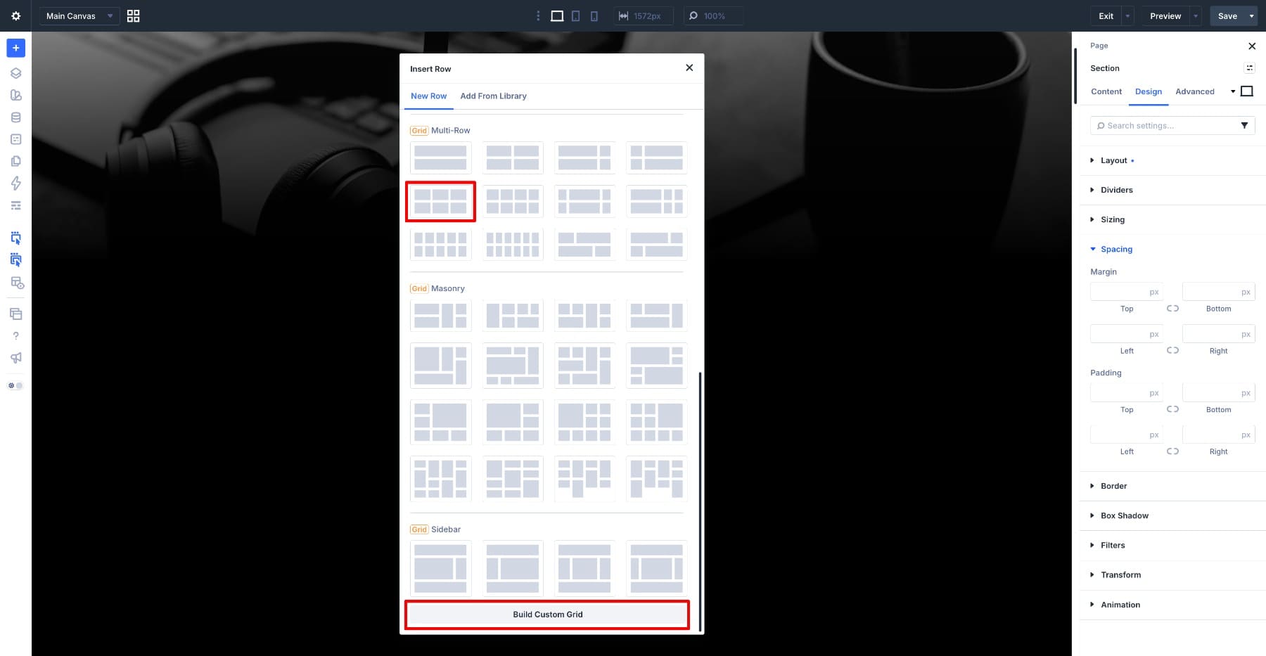
With the Row selected, click Open Grid Editor. The Grid Editor gives you a visual view of the container’s columns, rows, gaps, and item placement. You can add or remove tracks, resize them, adjust gaps, and create more advanced arrangements using Grid Offset Rules while the underlying layout remains stored on the parent container.
Delete every Column except the first. We only need one card structure because the Loop will repeat that Column for every post returned by the query.
2. Enable Loop
Select the remaining Column and open its Content tab. Find the Loop option and enable it. Divi now treats that Column as the repeating item and places each generated instance into the Grid according to the parent Row’s layout.
The query settings appear beneath the Loop option. For this blog listing, we’re using:
- Post Type: Posts
- Posts Per Page: 10
- Order By: Date
- Order: Descending
- Post Offset: 0
Those settings determine which posts Divi returns and in what order. The design we create inside the Column determines how each result looks.
3. Build The Post Card
Add a Group inside the Column to hold the complete card. Place an Image module inside it for the featured image, then add another Group below the image to contain the post information.
Inside the second Group, add three modules: a Heading for the post title, another Heading for the published date, and a Text module for the excerpt.
Style The Groups
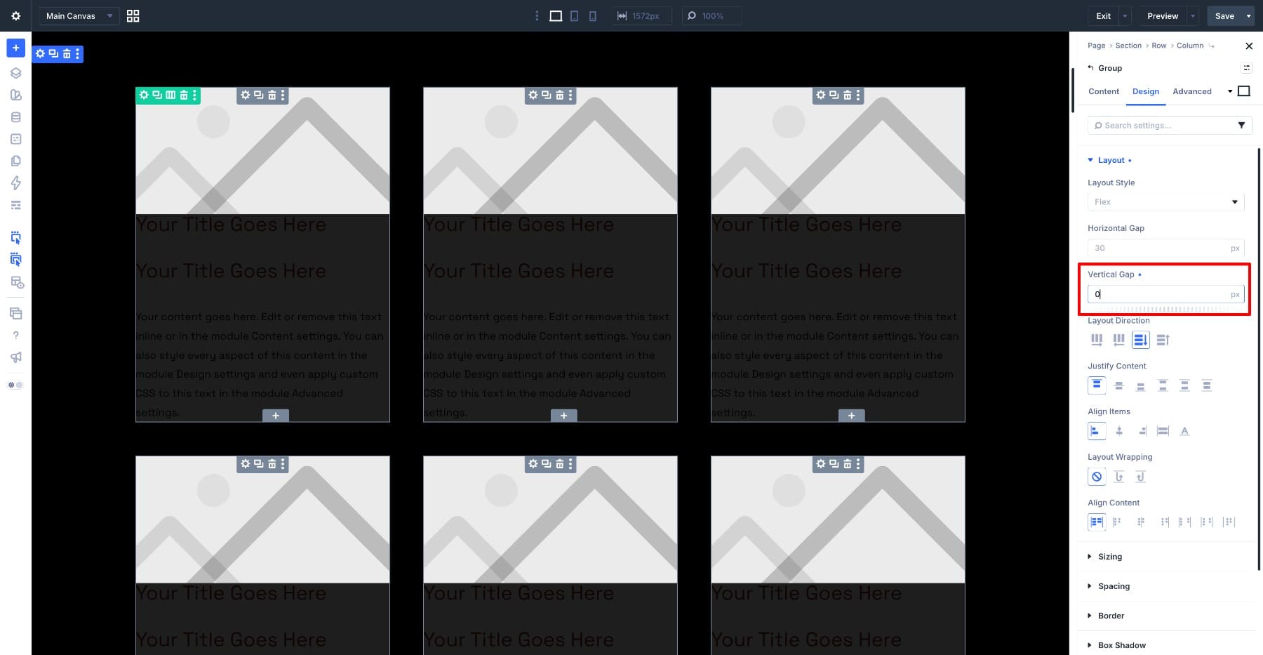
Open the outer Group and set Vertical Gap to 0. Removing the gap lets the image and text area read as one continuous card.
Open the inner Group and set its background to #1e1e1e. Set Vertical Gap to 10px, then add 25px of top and bottom Padding and 20px on the left and right.
Style The Text
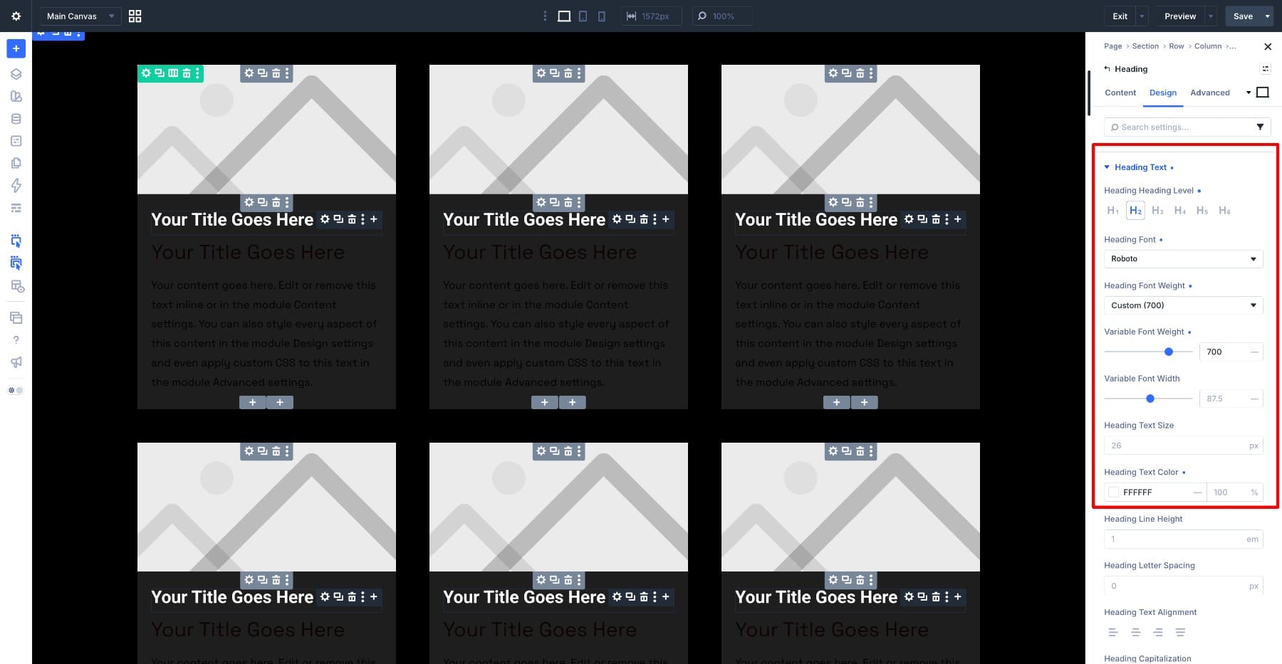
For the post title, set the Heading Level to H2 and use Roboto at a Weight of 700, Width of 87.5, and Size of 26px in white.
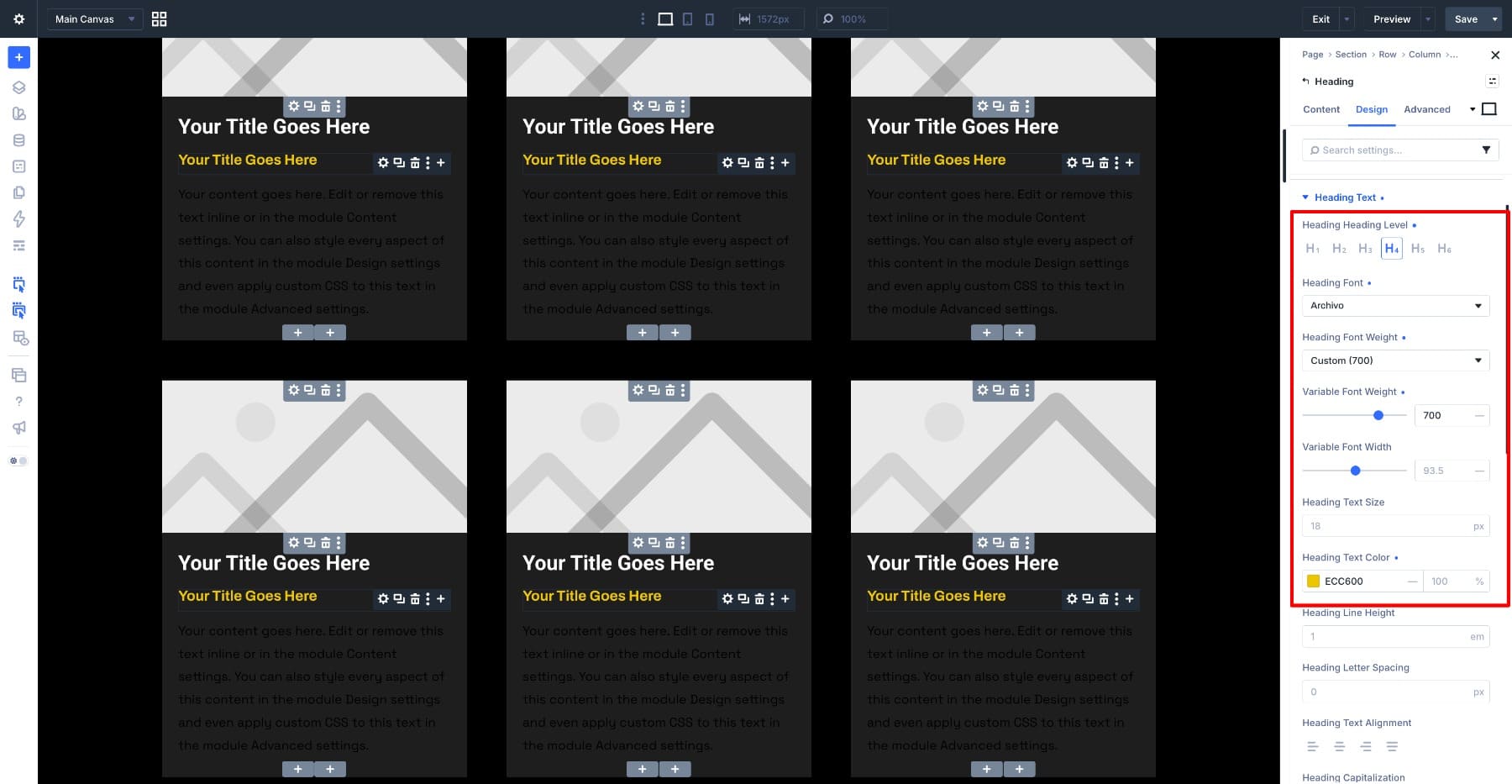
Set the date to Heading Level H4 using Archivo at Weight 700, Width 93.5, and Size 18px. Use #ECC600 for the color.
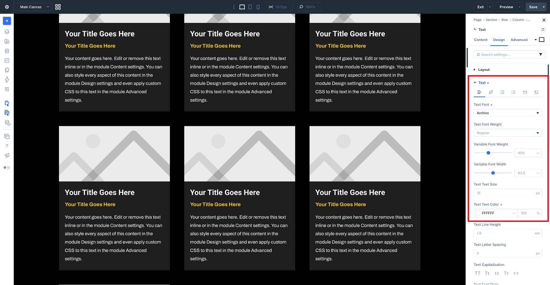
Give the excerpt the matching supporting typography used in the design so the date and summary sit cohesively beneath the title.
4. Connect The Dynamic Content
The card is designed, but its contents are still placeholders. Dynamic Content is what connects each module to the post represented by that Loop item. Hover over the field you want to populate, click the Dynamic Content icon, and select the corresponding Loop value:
- Image: Loop Featured Image
- First Heading: Loop Post Title
- Second Heading: Loop Published Date
- Text: Loop Post Excerpt
While configuring the excerpt, set its Word Count to 50 so unusually long summaries do not dominate individual cards. You can also add Read More text to make the destination clearer. If its link styling uses one of your Design Variables or Presets, the card remains connected to the wider design system rather than relying on another one-off value.
Finally, use Loop Post Link for the relevant link fields on the Image, title, and supporting content. Visitors can then reach the post from the main parts of the card instead of depending on one small link.
5. Set The Aspect Ratio And Framing
Now the real featured images are flowing into the Loop, which means their source dimensions are visible in the grid. Portraits create tall cards, wide screenshots create short ones, and the carefully structured rows begin to lose their rhythm.
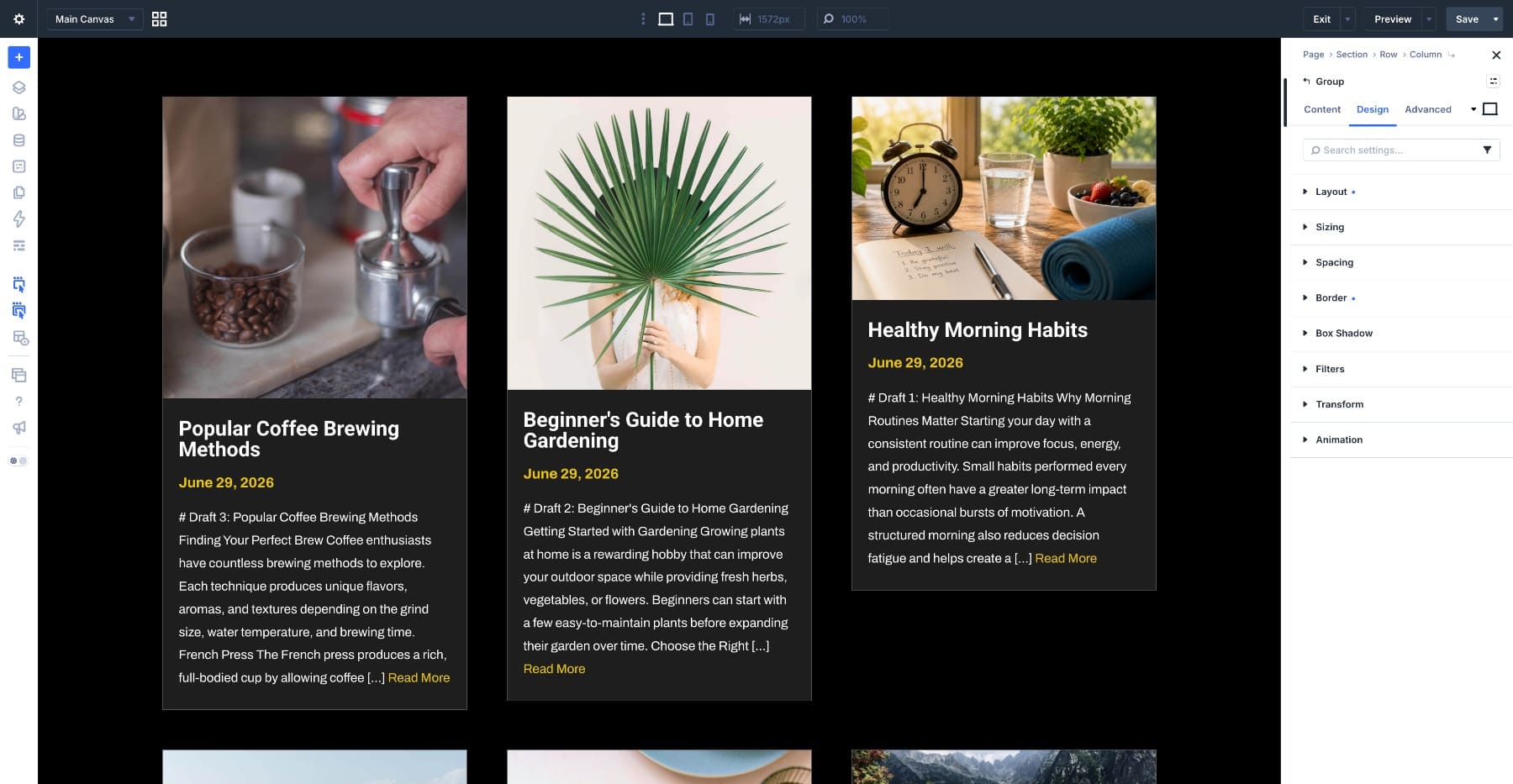
Open the Image module and go to Design > Sizing. Set Aspect Ratio to 1:1. The Image module now reserves a square frame for every repeated post, regardless of whether the source image is landscape, portrait, or square.
The grid may initially look worse because Fill is the default Object Fit value. The images are being stretched into those square dimensions. Open Framing in the same Design tab and set Object Fit to Cover. The images now preserve their proportions while filling the complete square, and Divi crops only the portions that extend outside the frame.
Cover begins from the current Object Position, which is centered unless you change it. Scroll through several real posts while testing the available positions. One setting applies across the repeated Image module, so the best choice is the one that works reliably across the collection rather than perfectly framing a single featured image.
If most of the site’s imagery follows a consistent composition, such as portraits with faces near the top, Top Center can be a stronger default. For mixed editorial photography, Center is often more forgiving.
Optional: Save The Crop As An Image Preset
If this same image treatment will appear in other loops, save it as an Image Preset instead of rebuilding the ratio and framing settings each time. Image option groups in Divi 5 support Presets, so a reusable Blog Card Image preset could contain the Aspect Ratio, Object Fit, Object Position, Border, Box Shadow, Filters, and other shared image styling.
That also gives the crop system a central place to change later. Update the Preset and the connected images follow.
6. Level The Cards
The featured images are consistent now, but the overall cards may still end at different heights because the amount of text varies from post to post. There are two ways to approach that depending on whether the card should follow a fixed proportion or adapt more naturally to its contents.
For a deliberately proportioned card, open the outer Group and go to Design > Sizing. Set an Aspect Ratio that fits the overall design, such as 3:4 or 4:5. Because Aspect Ratio is available in the Sizing controls beyond images, the container itself can maintain a proportional frame as its width changes.
You can apply a ratio to the inner text Group as well when the design calls for a tightly controlled image-to-content relationship.
A fixed card ratio means the available height is decided by the width of the card, so always test it with the longest realistic title and excerpt in the Loop. If the content needs more room than the proportion provides, a rigid ratio can become counterproductive.
For a more content-driven alternative, use Grow To Fill. When the loop items sit inside a layout that gives each grid row a shared available height, Grow To Fill lets the card’s Group expand into that space. Applying it thoughtfully to the outer card and the inner content Group can help the cards align while allowing their final height to respond to the content rather than a fixed ratio.
The two approaches solve slightly different problems. Use Aspect Ratio when a fixed card silhouette is part of the design. Use Grow To Fill when equal alignment matters more than forcing every card into one predetermined shape.
7. Adjust The Grid For Smaller Screens
Three columns work comfortably on a desktop but become cramped as the available width decreases. Select the Row, switch to the Tablet breakpoint, and open the Grid Editor. Reduce the layout to 2 columns, then move to Phone and set it to 1 column.
If you keep the same image Aspect Ratio at each breakpoint, the frame maintains that proportion as the cards change width. The image still scales with the layout, and Cover continues to crop the source consistently inside the frame.
That is a useful default, but it is not the only option. Aspect Ratio, Object Fit, and Object Position can also receive responsive values, which gives you room to change the crop when the card itself changes dramatically.
Picking A Ratio That Fits The Layout
We used 1:1 because square thumbnails work well in this compact three-column design and give every post similar visual weight. The best ratio depends on the layout, the subject matter, and the images your contributors actually publish.
- 16:9: Works well for wide feature rows, editorial previews, video-oriented content, and single-column lists where the image stretches across most of the card.
- 4:3: A versatile choice for multi-column blog and portfolio grids. It gives photographs more vertical room than 16:9 while cropping less aggressively than a square.
- 1:1: Useful for compact grids, related post sections, directories, and card layouts where consistent visual weight matters. Because the crop is stronger, check images with important details near the edges.
- 3:4 And 4:5: Work naturally for portraits, editorial photography, team members, products, and other vertically composed imagery.
- 9:16: A much taller treatment that makes sense when the image itself is a major part of the content experience rather than a compact thumbnail.
You can also mix ratios intentionally when the layout contains distinct content treatments. A separate featured-post Loop, for example, might use a wide 16:9 image while the standard archive grid beneath it uses 4:3 or 1:1.
Inside a single shared Loop template, however, the same Image module settings repeat across each item. If one particular position needs a different crop, treat it as a deliberate layout variation rather than manually changing one repeated card.
None of these choices lock you in. The ratio lives in the design settings, so you can change it later and preview the new crop across the actual posts before committing to it.
Set A Different Ratio Per Breakpoint
Keeping one ratio across every screen size is often the cleanest option, but some layouts benefit from a responsive change. A square image that feels balanced inside a three-column desktop card can become very tall once the card expands to nearly the full width of a phone.
Aspect Ratio is responsive in Divi 5. Switch to the Phone breakpoint in the Image module and try a wider frame such as 16:9 or 3:2. The mobile card becomes shorter, which lets visitors see more of the title, excerpt, and surrounding posts without scrolling past a large square image first.
Object Fit and Object Position can be adjusted responsively too. You do not need a different Object Position simply because the ratio changed, so keep the shared value when it still frames the collection well. If the mobile ratio introduces a genuinely different crop problem, however, a responsive Object Position override is available.
The important part is to test the setting against several representative posts. Just like the desktop crop, one responsive value is being repeated across the whole Loop.
Common Issues And Fixes
When a loop grid looks wrong, the cause is usually one of a handful of settings. Start with what you can see and work backward.
- The Images Look Stretched: You set an Aspect Ratio but Object Fit is still on Fill. Change it to Cover to preserve the image proportions while filling the frame.
- Faces Are Being Cropped: Cover is working, but the current Object Position does not match the composition of the images. Try Top Center for portrait-heavy content or another shared anchor that works across the collection.
- The Card Background Shows Beside The Image: Object Fit is probably set to Contain. Contain preserves the complete source image and may leave unused space when its ratio does not match the frame. Use Cover when filling the frame matters more than preserving every edge.
- One Image Looks Soft While The Others Look Sharp: The source image may be smaller than the rendered frame, and Cover is scaling it beyond its intrinsic dimensions. Establish a sensible minimum featured image size for contributors.
- Nothing Changes When You Switch Object Fit: Object Fit needs a difference between the image’s rendered dimensions and intrinsic dimensions. Confirm that the Aspect Ratio saved correctly, or that both a custom Width and Height are constraining the image.
- The Crop Works On One Post But Fails On Another: The Loop repeats one Object Position. Test Center, Top Center, or another shared position against a wider sample of images. If one outlier consistently fails, fixing that source image may be better than compromising every other card.
- The Cards Still Finish At Different Heights: The images may be consistent while the content is not. Review the excerpt length, fixed card Aspect Ratio, or Grow To Fill approach depending on how rigid you want the card silhouette to be.
Build A Cleaner Blog Grid In Divi 5
Aspect Ratio and Framing are small settings with a much larger effect once they sit inside a Loop. You define the image frame once, Divi 5 repeats that decision across every card, and a collection of unrelated source images starts behaving like one visual system.
The workflow also stays flexible. Change the ratio later and the repeated cards follow. Adjust Object Position and the crops update without touching the uploads. Save the treatment as an Image Preset and the same image system can move into other blog feeds, portfolio grids, product loops, or related-post sections.
The Loop Builder handles the repetition. Aspect Ratio defines the shape. Framing decides how the images live inside it. Together, they let the layout stay consistent even when the content feeding it is not.
The post Using Aspect Ratio To Design Cleaner Loops in Divi 5 appeared first on Elegant Themes Blog.