In Part 5, we built the homepage for our coworking space website. Then, in Part 6 and Part 7, we added a global header and footer using the Theme Builder. In Part 8, we created global templates for posts, archives, search results, and 404 pages.
Now, we’re ready to build the core inner pages of the site. For this coworking website, that means creating a Contact page and an Events page.
By this point, the design system is doing most of the work. The header and footer load globally from the Theme Builder. Headings, text, buttons, containers, forms, and layout elements all have presets. The Design Variables from Part 3 are used throughout the presets that control color, typography, spacing, and borders.
As a result, this part is mostly structural assembly. We’ll reuse the system we already built, add a few new module presets where needed, and use Divi 5 workflow features like Page Manager, Command Center, and Extend Attributes to move faster.
Building The Contact Page
Create a new page named Contact, open it in the Visual Builder, and choose Build From Scratch when prompted.
The first section uses three rows. Inside it, the first holds the page heading, the second is a two-column split with the form on the left and a stack of detail blocks on the right, and the third holds the map at full width below. A second section follows with a single row and a single column, holding a heading and an accordion for FAQs.
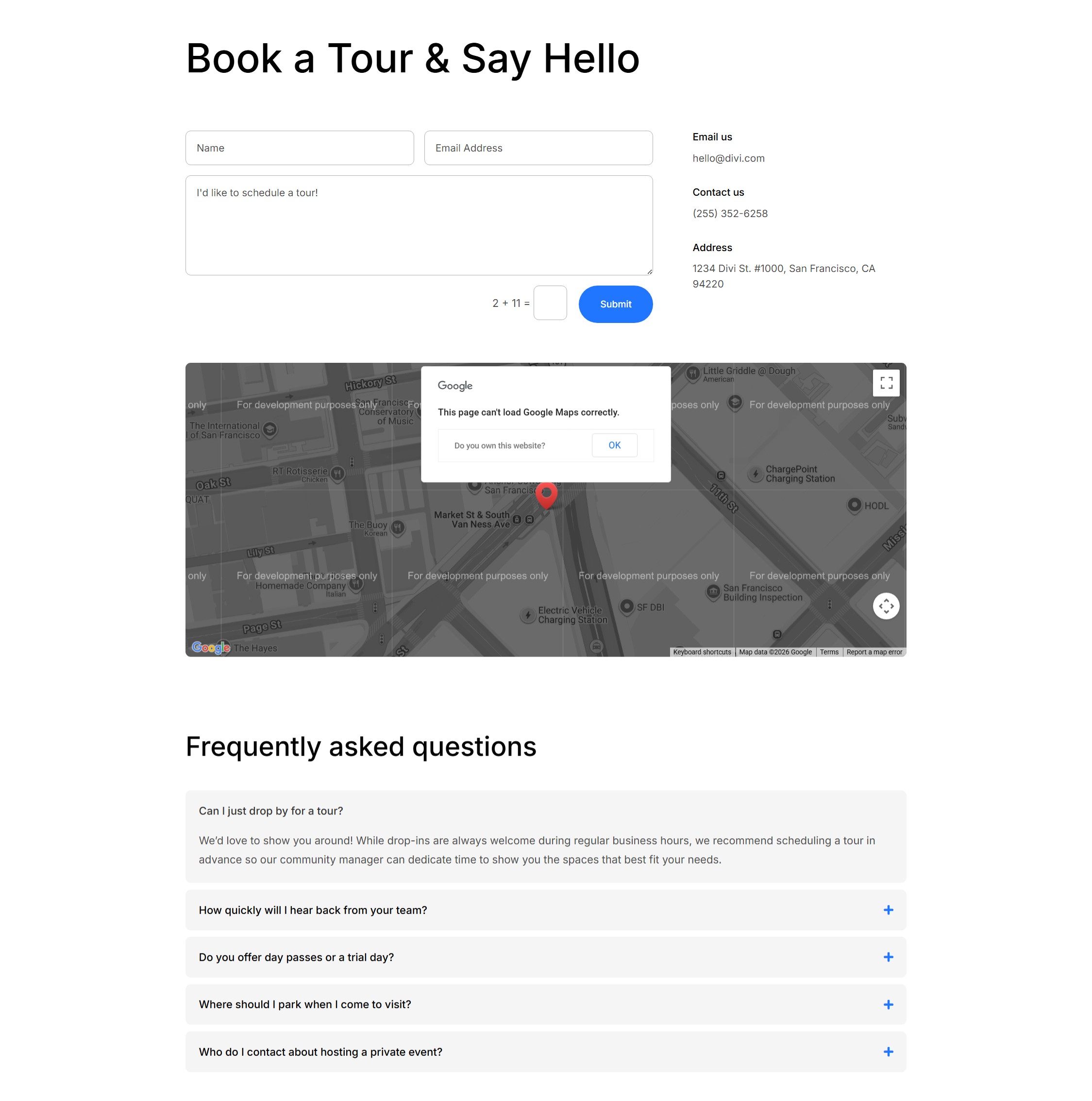
Contact Page Structure
Add a Section. The first Row uses the Equal Columns 1 Flex structure with a Heading module inside.
Next, add a second Row using an Offset Columns structure with two Columns. Set the left Column to 2/3 width and the right Column to 1/3 width.
Inside the left Column, add a Contact Form module. Inside the right Column, add a Group module with a Heading module and a Text module inside. Then, duplicate the Group twice so you have three contact detail blocks.
Add a third Row to the first Section using a single-column Flex structure. Place a Map module inside it.
Then, add another Section underneath the first, with a Single-Column Flex Row. Add a Heading and an Accordion module.
Contact Page Presets
Now, apply presets to the first Section. In the right Column, apply Subheading to each Group Heading and Small Text to each Group Text module.
Apply Heading 1 to the page heading in the first Row. Then, apply the Dark Element Preset to the Contact Form module.
The Map module gets the Black and White Element Preset. This preset sets the Filters option group’s Saturate value to 0%, turns Mouse Wheel Zoom off, and adds rounded corners.
Contact Page Content
Now, add the content. Use a page heading such as Get in touch. Each of the three right-column Groups holds one piece of contact information: Phone, Email, and Address.
The Heading is the label, and the Text is the value. Use a tel: link for the phone number, a mailto: link for the email address, and a maps link for the address if needed.
In the Map module, enter the coworking space address in the location field and let the map pin populate from that address.
Contact FAQ Section
For the FAQ section, apply Heading 2 to the heading. Apply Filled – Primary Color to the Button.
On the Accordion, stack two Element Presets: Dark Text first, then Contained. Dark Text controls the text color, divider style, and toggle icon. Contained adds the rounded corners and light gray background for each Accordion item.
For content, the heading can read Still have questions? Set the Button text to Email us and link it to the contact form anchor or a mailto: address.
Add five Accordion items with questions a prospective member is likely to ask. Good topics include hours, day-pass policy, guest access, parking, and meeting room booking. Set the first item to Open: On in its settings so the page loads with one question already expanded.
Building The Events Page
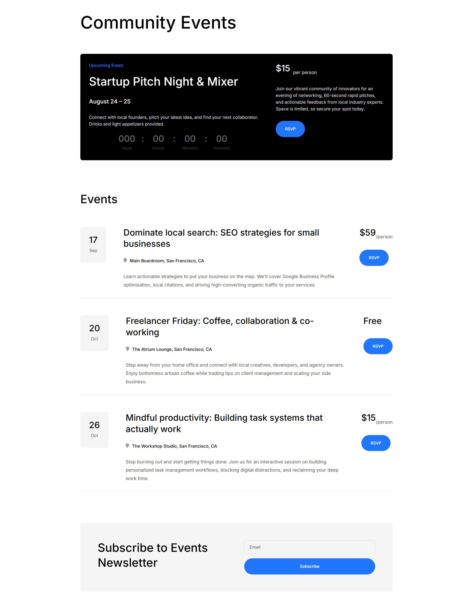
The Events page is more involved. It includes three sections: a featured event banner with a countdown, a list of upcoming events, and a subscribe section with an email signup.
Most of the work is structural. Once the modules and columns are in place, the styling comes from the presets and variables you already created.
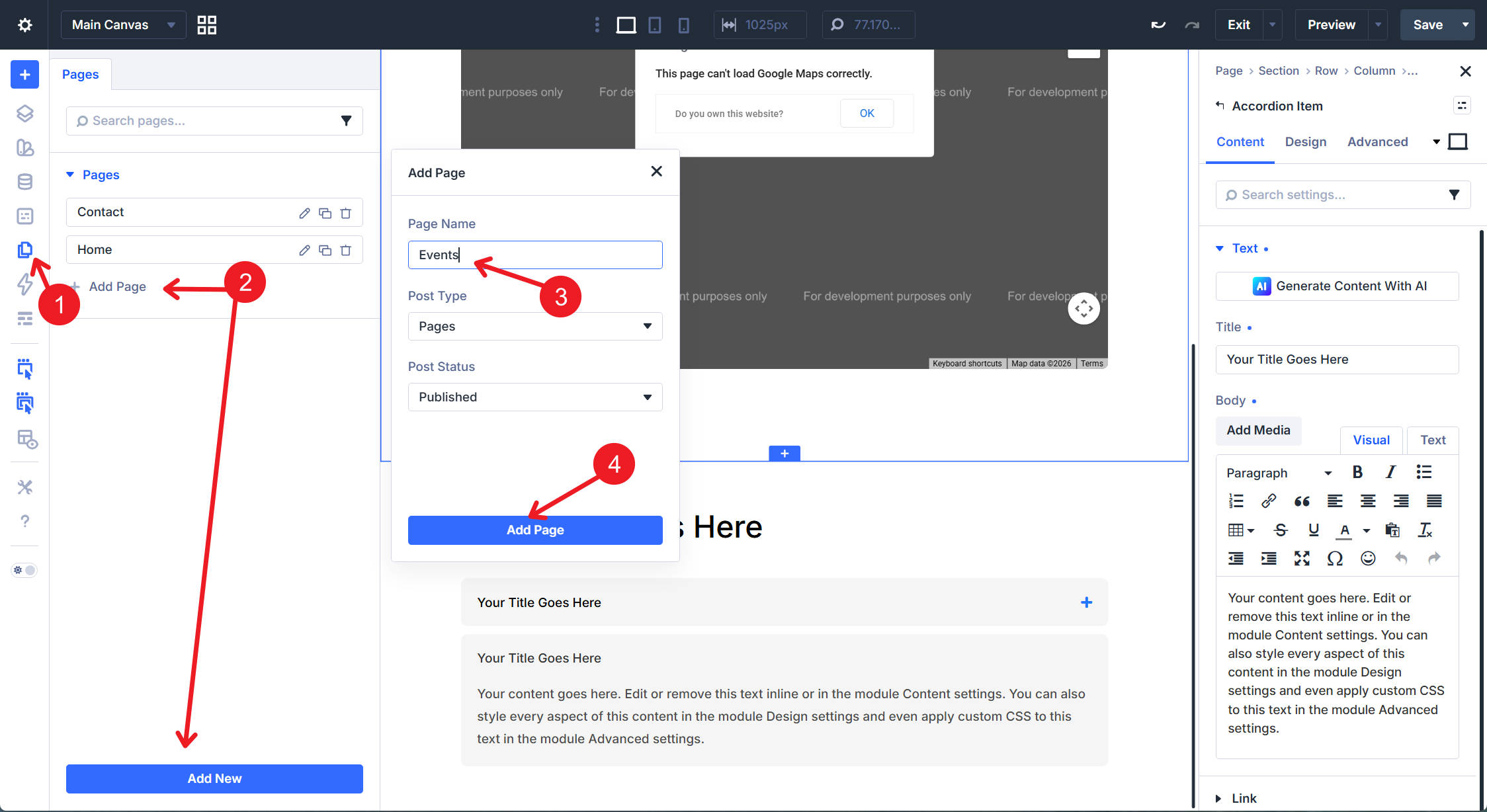
Create a new page named Events. You can create it from the WordPress dashboard or use Divi 5’s Page Manager from inside the Visual Builder. Open the page in Divi and choose Build From Scratch.
Featured Event Banner Structure
Add the first Section. The first Row uses Equal Columns 1 with a Heading module inside for the page title.
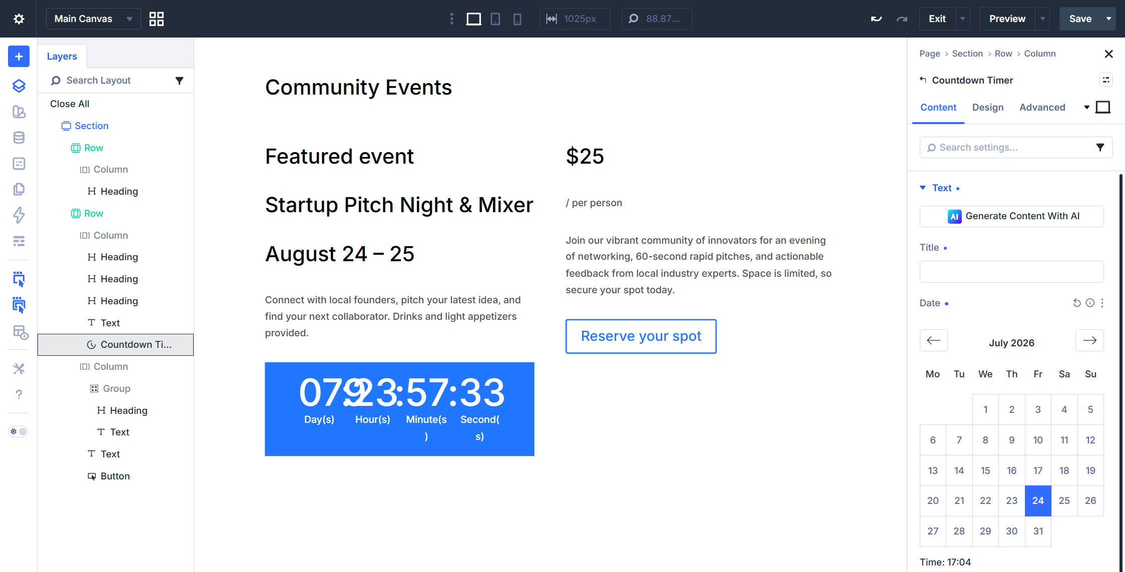
Below it, add a second Row with two equal Columns. In the left Column, add three Heading modules, one Text module, and one Countdown Timer module, in that order. You can add these modules manually or use the Command Center to add elements faster with the keyboard.
In the right Column, add a Group module with a Heading module and a Text module inside. Then, add another Text module and a Button module as siblings below the Group, not inside it.
Featured Event Content
Before fine-tuning the layout, add realistic content so the spacing decisions are easier to judge. For the page heading, use Community Events. The eyebrow subheading reads Featured event.
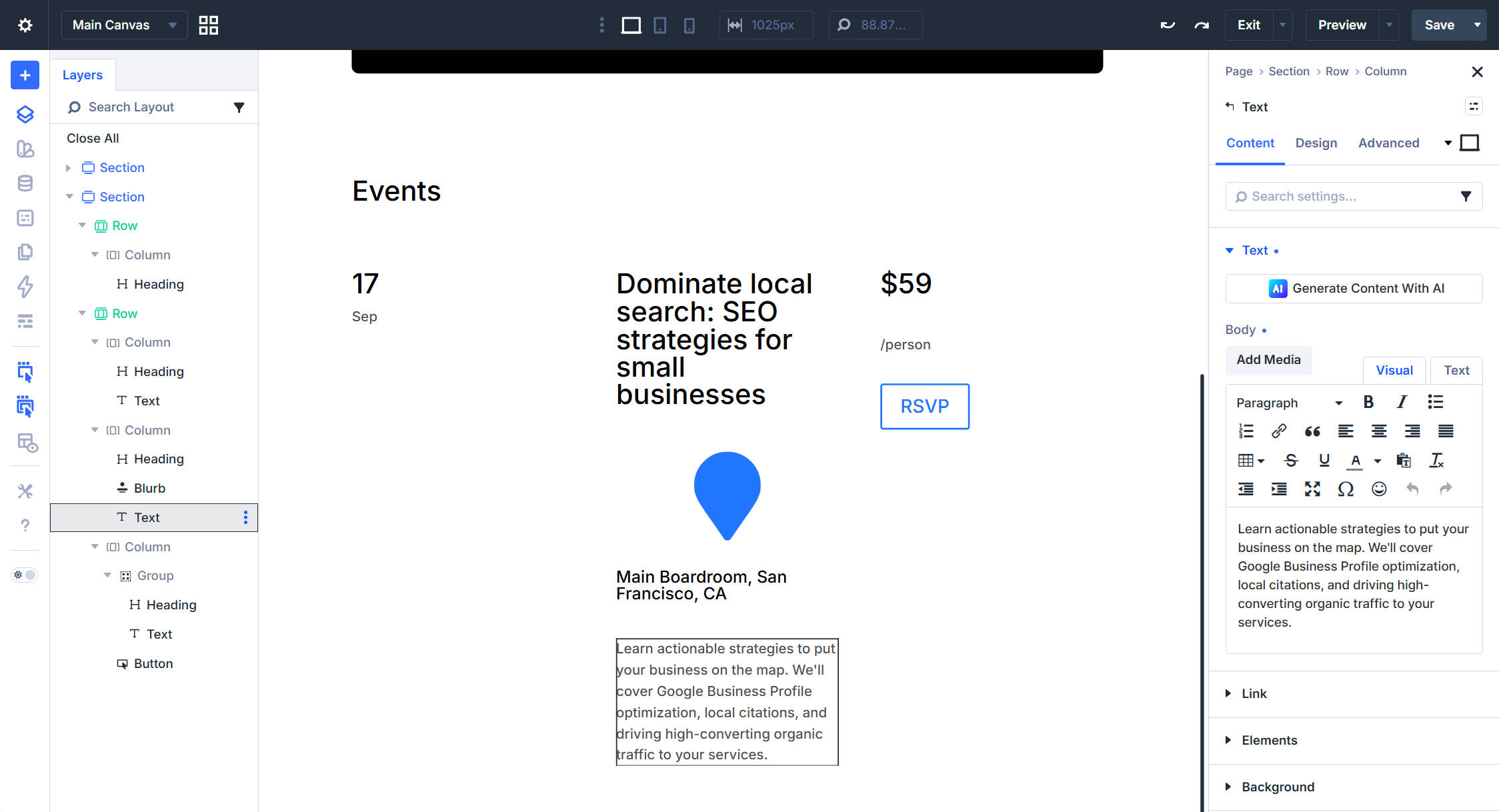
Below that, the H2 contains the event name, the H5 contains the date or location line, and the Text module describes the event in two or three sentences. Set the Countdown Timer target date to the event start date and remove the module’s heading text.
In the price Group, the Heading reads $25 and the Text module reads /person. Set the Button text to Reserve your spot.
Featured Event Presets
Apply Heading 1 to the page heading in the first Row. Apply the Contained – Dark Row Element Preset to the second Row. This gives the featured event banner its dark background, padding, and rounded corners.
In the left Column, apply Subheading to the eyebrow heading, Heading 2 to the event name, and Heading 5 to the date or location line. Stack Light Text and Small Text on the description Text module. Then, apply Light Text – Dense to the Countdown Timer.
In the right Column, apply Heading 3 to the price Heading, Light Text to the price qualifier Text, and the same Light Text plus Small Text stack to the disclaimer Text. Finally, apply Filled – Primary Color to the Button.
Featured Event Layout Tweaks
A few layout tweaks finish this section. In the second Row, set the left Column to 3/5 and the right Column to 2/5 on desktop. You can also use the Change Structure Layout setting to update both columns at the same time.
Set the left Column’s internal Vertical Gap to 20px to tighten the stacked event details. Inside the right Column’s first Group, set Flex Direction to Row and Align Items to Flex End. This keeps the price and qualifier, such as $25 and /person, on the same baseline.
Upcoming Events List Structure
Next, build the upcoming events list. This section is a stack of event rows. Each row uses the same structure: a date block on the left, the event name and description in the middle, and the price plus Button on the right.
Build the first event row carefully, then duplicate it. That is much faster than rebuilding each event card from scratch.
Add a new Section. The first Row uses an Equal Columns Flex layout with a Heading module inside. Below it, add a second Row using a Three Equal Columns Flex structure. We’ll adjust the column behavior manually in a moment.
The left Column holds a Heading module and a Text module for the date block. In the middle Column, add a Heading module, a Blurb module, and a Text module. The right Column holds a Group containing a Heading module and a Text module, followed by a Button module below the Group.
Upcoming Events List Layout
Add realistic content to the first event row before adjusting the layout. This helps you judge spacing, line length, and alignment using content that resembles the final design.
Set the Row’s bottom padding to 30px. While editing the Row, apply the Bottom Border Option Group Preset in Design > Border.
Set the middle Column’s Column Class to 3/5 in Sizing. Enable both Shrink to Fit and Grow to Fill. Set the left and right Columns to No Column Class.
For the left Column, set the Vertical Gap to 0px so the date heading and day-of-week text stack tightly. In the middle Column, set the Vertical Gap to 20px.
Inside the right Column’s Group, set Flex Direction to Row, Align Items to Flex End, Flex Wrap to Wrap, and Horizontal Gap to 0px. This keeps the price inline with the /person qualifier.
Upcoming Events List Presets
On the event row, apply Contained – Light to the left Column. Then, set the date block’s Background Color to the Background – Light Gray variable if that is not already included in your preset.
The date Column’s Heading uses H2-sized styling, while the actual heading level can be set to H3 if that better fits the page hierarchy. The Text below uses Dark Text and Small Text with center alignment.
For the middle Column, use Heading 3 for the title, Dense for the Blurb, and Dark Text for the description. In the right Column’s Group, apply Heading 3 to the price Heading and Dark Text to the qualifier Text. The Button gets Filled – Primary Color.
Once the first event Row looks right, right-click it and use Duplicate Row to copy the layout, presets, and styles to additional rows. Then, update the date, title, description, icon, and price on each duplicate.
Subscribe Section
Finally, create the subscribe section for event updates.
Add a new Section with a Row using the Two Equal Columns structure. The left Column gets a Heading module. The right Column gets an Email Optin module.
On the right Column, set Justify Content to Center so the form sits vertically centered against the heading on the left.
Apply the Contained – Dark Row Element Preset. Then, override the Row’s Background Color using the Background – Light Gray variable. Apply Heading 2 to the left heading. The Email Optin module gets the Signup – Dark Element Preset.
Connect the Email Optin module to your supported email service in the Email Account option group. Then, add the section content. The heading can read Never miss an event.
The Contact and Events pages are now complete.
Both pages were built mostly from presets and Design Variables created earlier in the series. The structural choices still matter, but the design decisions are already reusable. That is the point of the system you have been building: the more decisions you encode into presets and variables, the faster every new page becomes.
What’s Coming Next
In Part 10, we’ll focus on Flexbox in detail. We’ll cover the layout settings used throughout this part, including flex direction, wrap, justify content, align items, column structures, and how Divi 5’s flex containers shape responsive layouts.
The goal is to give you a stronger mental model for the Flexbox concepts used across the homepage, header, footer, templates, and inner pages. Once those concepts click, you can build more custom layouts from scratch without relying only on prebuilt column structures.
The post Part 9: Building The Core Inner Pages Of Your Divi 5 Website appeared first on Elegant Themes Blog.