In Part 6 of our Mastering Flexbox course, we shared key tips for building responsive layouts in Divi 5 with cleaner structure, smarter breakpoint decisions, and real-content testing.
Now, in Part 7, we’ll focus on smaller layout patterns that appear on almost every website: button groups, navigation menus, breadcrumbs, footer links, and tag rows. These elements look simple, but they can be tricky to make responsive because they often need to stay horizontal on Desktop, wrap cleanly on Tablet, and stack or expand on Phone without feeling cramped.
With Divi 5’s Flexbox Layout System, you can build flexible button groups, menu rows, and link sections directly in the Visual Builder. By combining Layout Direction, Gap, Layout Wrapping, Column Class, Module Groups, and responsive sizing, you can create interaction-heavy rows that adapt across screen sizes without duplicating structures or writing custom CSS for common layout patterns.
Let’s dive in.
Why Button, Menu, And Link Rows Need Special Attention
Buttons, menus, and link rows are some of the most important interactive elements on a website. They guide users to key pages, actions, categories, and conversion points, so they need to remain clear and easy to use across screen sizes.
The challenge is that these rows often have competing layout needs. On Desktop, they usually look best as compact horizontal groups. On Tablet, they may need to wrap into multiple lines. On Phone, they may need to stack vertically, become full width, or move into a separate mobile menu.
Common problems include cramped spacing, misaligned icons and labels, buttons that are too small to tap comfortably, menu rows that break awkwardly on Tablet, and link groups that lose their structure when they wrap.
Divi 5’s Flexbox tools help solve these issues at the container level. Instead of adding manual margins to every item or duplicating separate mobile versions, you can use parent-level controls like Horizontal Gap, Vertical Gap, Layout Direction, and Layout Wrapping to manage how the group behaves.
Core Flexbox Techniques For These Elements
Creating flexible button, menu, and link rows in Divi 5 becomes easier once you understand which Flexbox controls do the heavy lifting.
Layout Direction controls the main flow of the container. Use Row when items should sit side-by-side and Column when they should stack vertically. You can change this per breakpoint, which is useful for button groups that stay horizontal on Desktop but stack on Phone.
Justify Content and Align Items control distribution and alignment. Justify Content works along the main axis, while Align Items works along the cross axis. Together, they help you center icon-and-text pairs, distribute navigation groups, and keep buttons aligned inside their parent container.
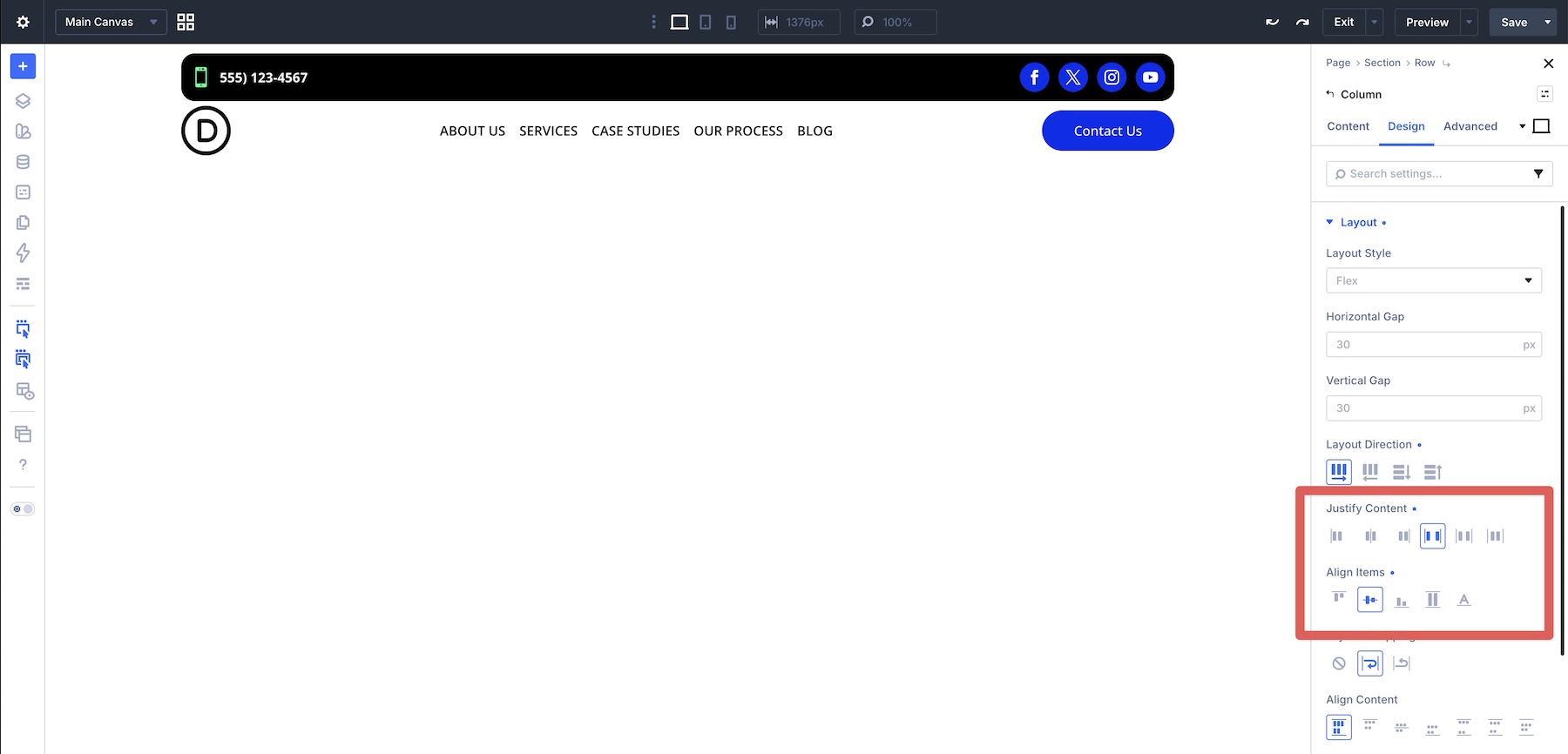
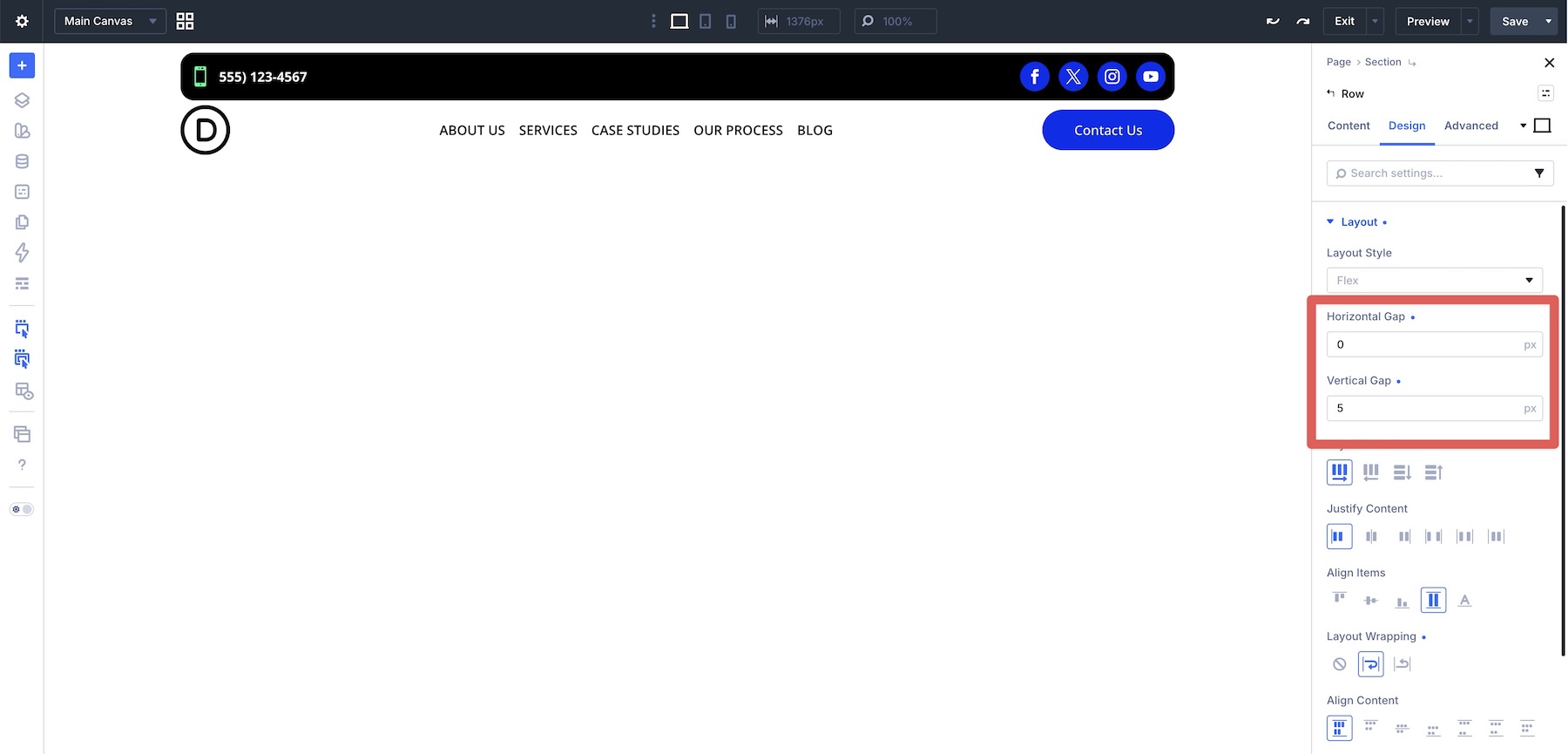
Horizontal Gap and Vertical Gap provide consistent spacing between direct child items without adding margins to every button, link, or module. This is especially useful when a row wraps because the spacing between items and lines stays centralized in one place.
Layout Wrapping lets items move onto additional lines when they no longer fit in one row. Combine it with Column Class or Structure Templates when you want more control over how many items appear per line at each breakpoint.
Finally, Module Groups let you create smaller layout contexts inside a larger row or column. Wrap related buttons, links, icons, or menu items in a Module Group so you can apply independent Flexbox settings without affecting the rest of the layout.
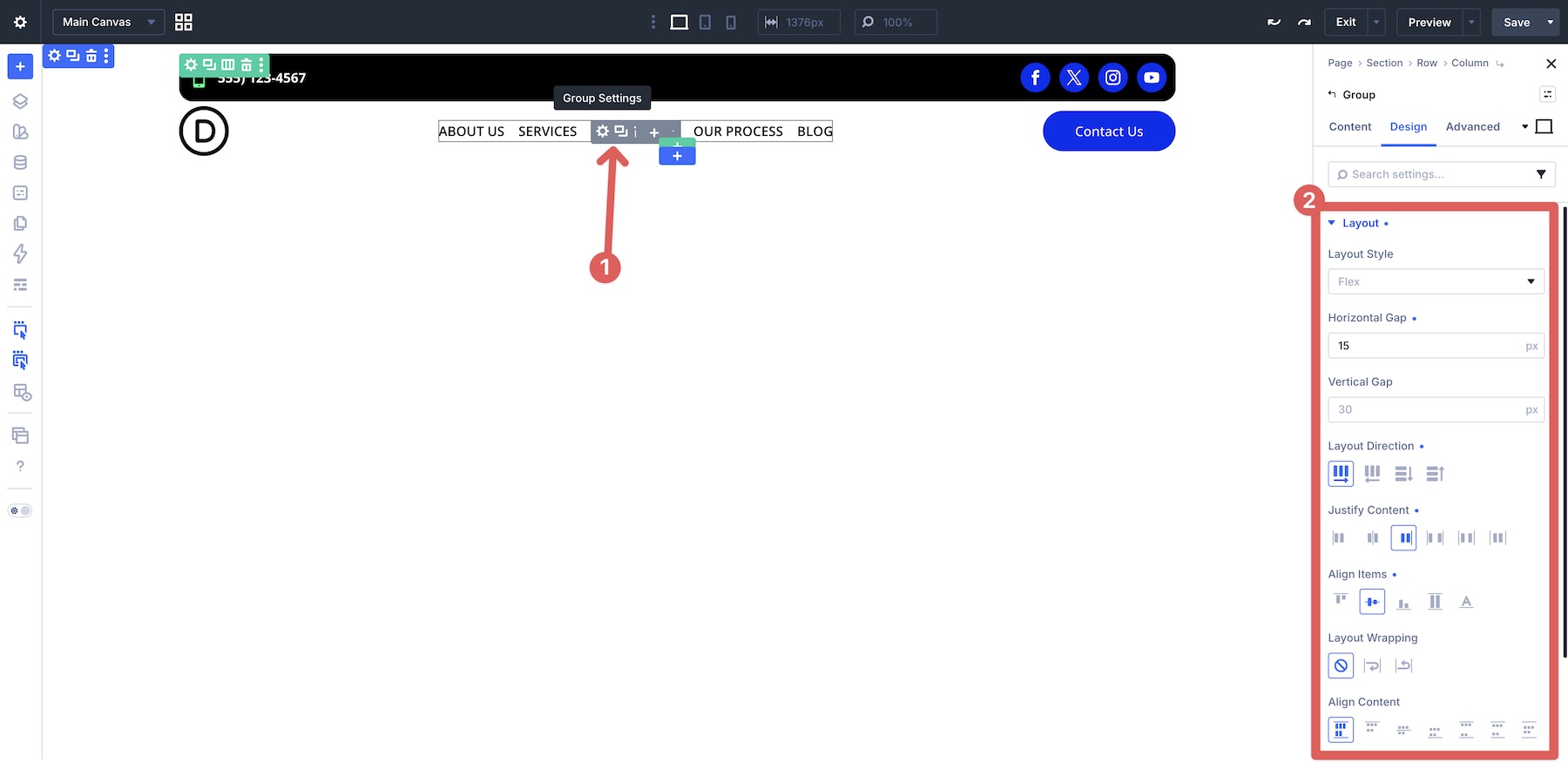
Together, these controls help you build reusable, responsive interaction rows with less manual spacing and fewer breakpoint-specific fixes.
Real-World Examples
Let’s look at five examples that show how to create flexible button, menu, and link rows using Divi 5’s Flexbox features. Each one includes the Desktop layout, the responsive challenge, and the settings used.
Example 1: Flexible Button Group
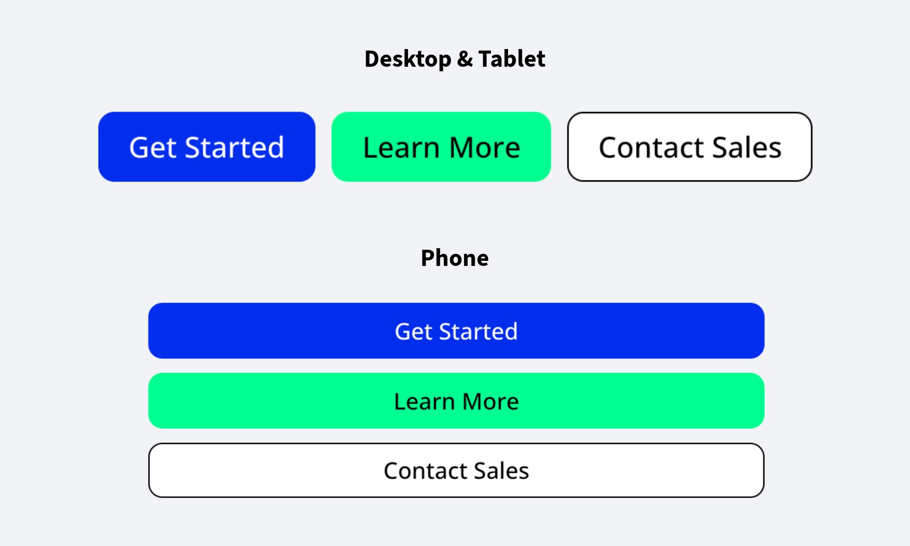
Goal: Create a row of buttons that stays neatly spaced on Desktop, then stacks and expands on Phone for easier tapping.
The Challenge: Buttons can become cramped when screen width is limited, especially when labels are longer or multiple CTAs sit side-by-side.
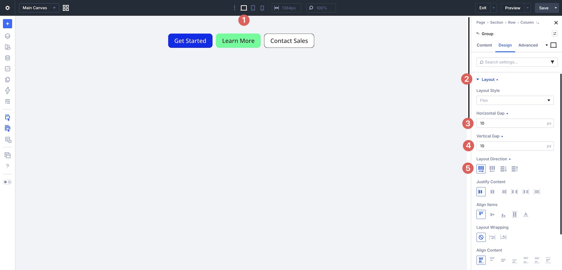
The Solution: Place the buttons inside a Module Group. Use Layout Direction > Row on Desktop and Tablet, then switch the Group to Layout Direction > Column on Phone. Use Horizontal Gap and Vertical Gap for spacing, then adjust the button sizing on Phone when you want the buttons to span most of the viewport.
Settings Used: Place a Module Group with three Button modules inside a single-column row. At the Desktop and Tablet breakpoints, set the Group’s Layout Direction to Row and apply a 10px Horizontal Gap and 10px Vertical Gap.
On the Phone breakpoint, switch the Group’s Layout Direction to Column.
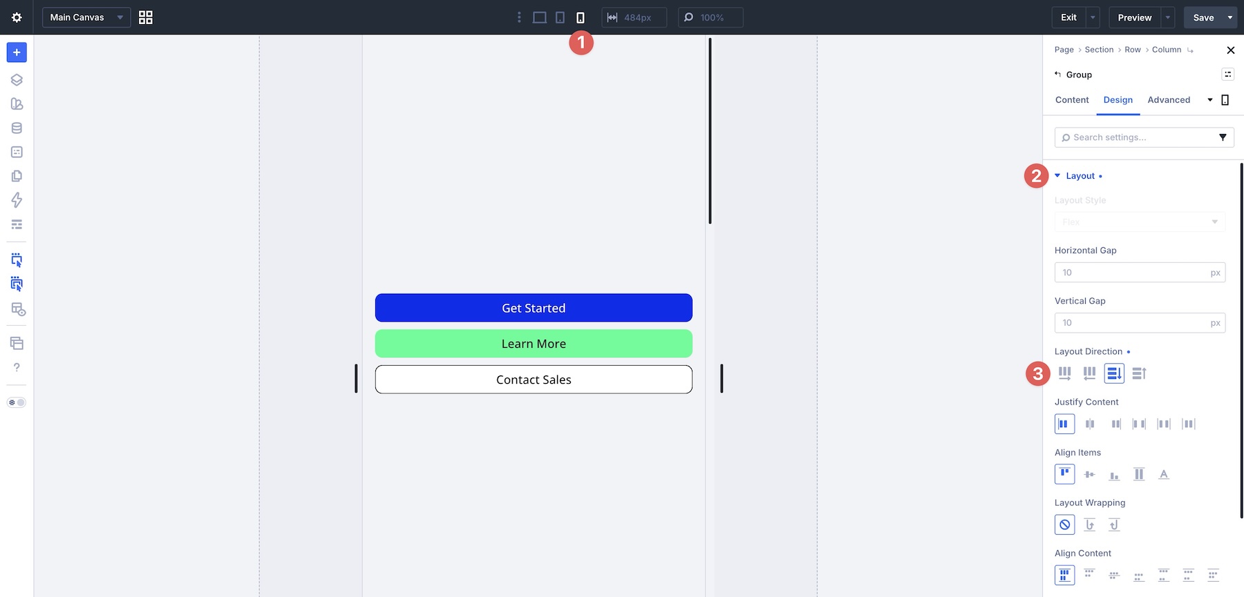
Then, widen each button on Phone using the Sizing options in the Button module’s Design tab. Set the Button Width and Button Max Width to a value such as 90vw, then set the Button module alignment to Center.
Example 2: Breadcrumb Link Row
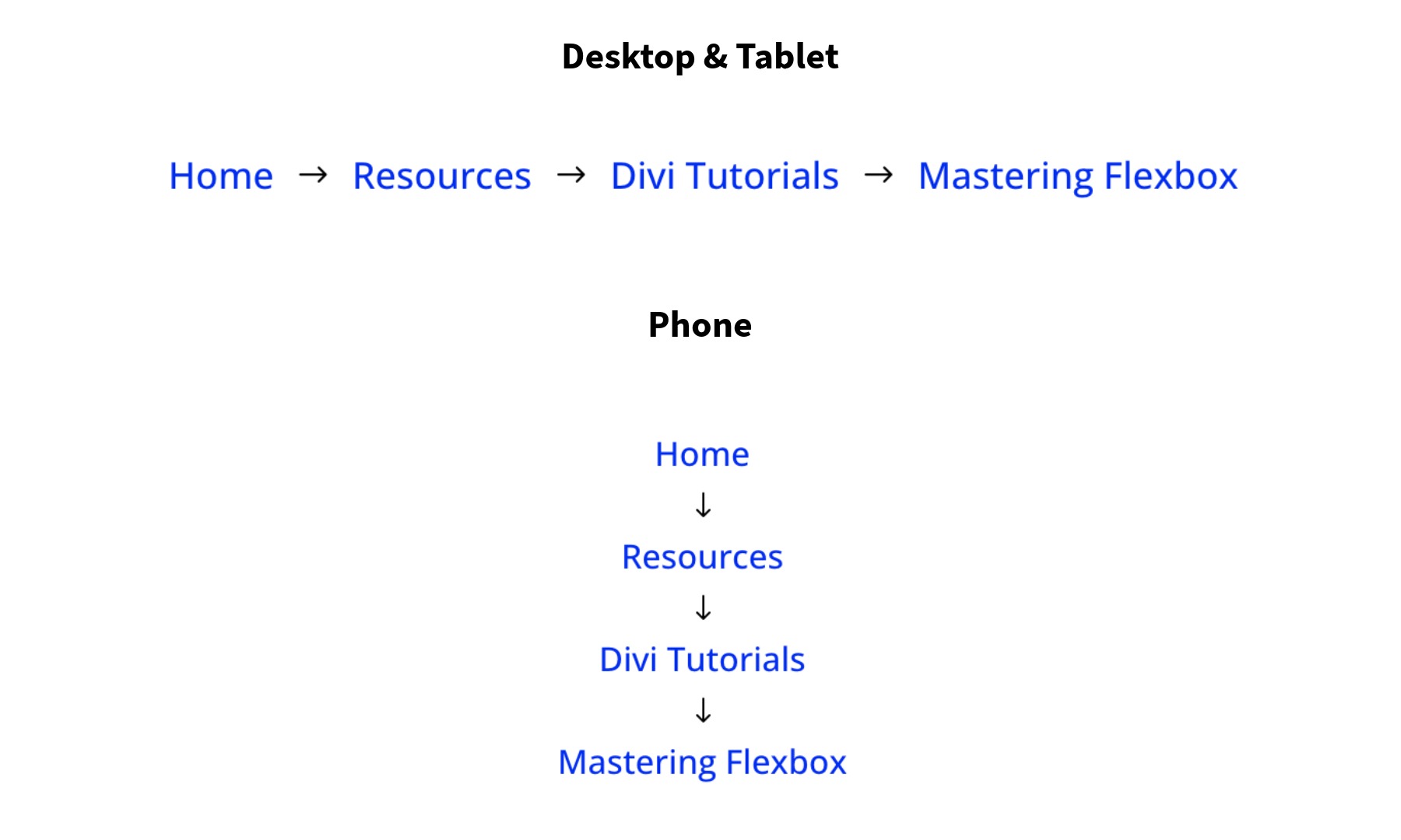
Goal: Create a horizontal breadcrumb row that remains readable on Desktop while stacking neatly on Phone.
The Challenge On Mobile: Breadcrumb links can become cramped or wrap awkwardly, making the row harder to scan and tap on smaller screens.
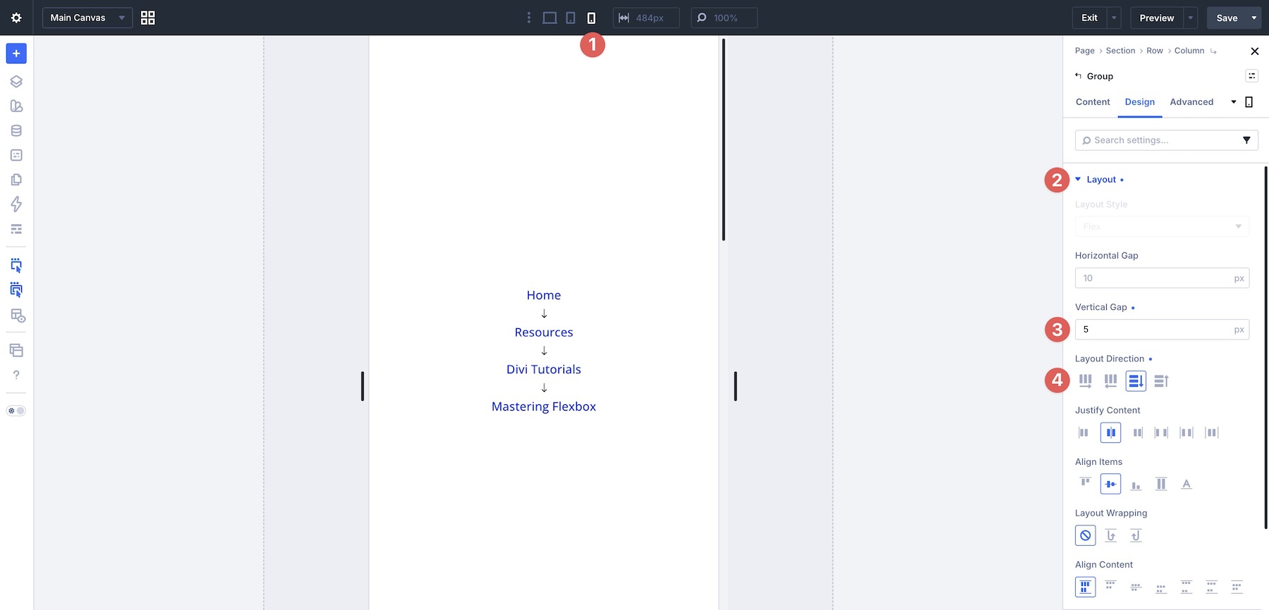
The Solution: Place the breadcrumb links inside a Module Group. Use Layout Direction > Row on Desktop and Tablet for a horizontal flow, then switch to Layout Direction > Column on Phone. Adjust the vertical spacing so the breadcrumb remains compact but readable.
Settings Used: Set the Module Group’s Layout Direction to Row on the Desktop and Tablet breakpoints. Add a 10px Horizontal Gap and 10px Vertical Gap, then set Justify Content and Align Items to Center.
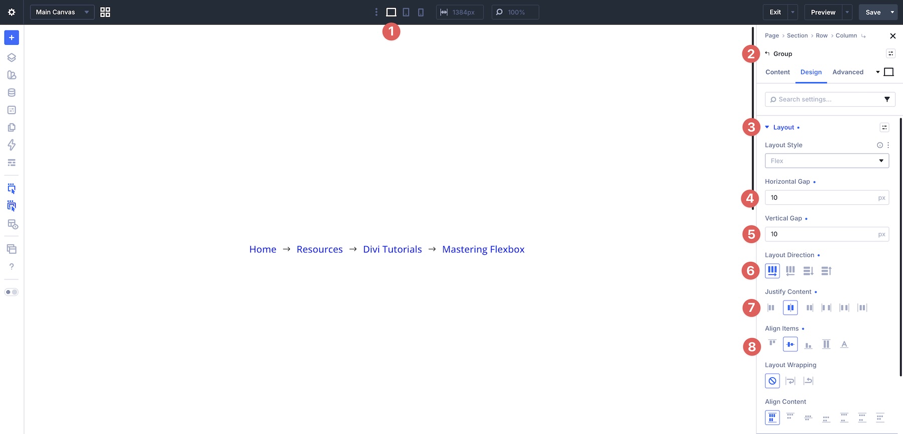
On the Phone breakpoint, set the Module Group’s Layout Direction to Column, adjust the Vertical Gap to 5px, and keep the remaining alignment settings unchanged.
Example 3: Footer With Link Groups
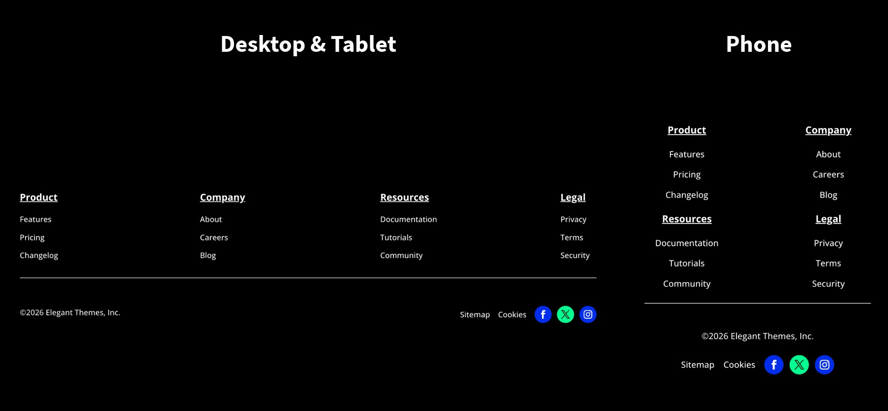
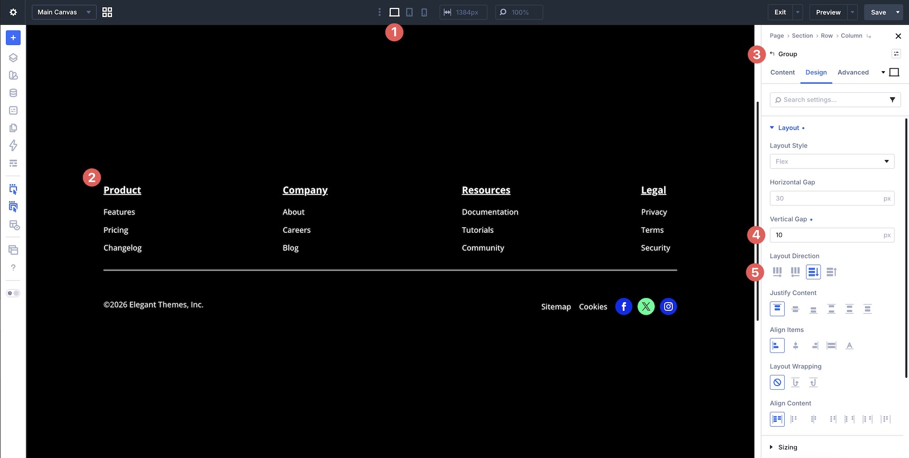
Goal: Create a multi-column footer with link groups, such as Product, Company, Resources, and Legal, that stays organized on Desktop and stacks cleanly on Phone.
The Challenge On Mobile: Footer links can become cramped, uneven, or hard to scan when the layout narrows.
The Solution: Use a row with Layout Wrapping enabled and adjust gaps at both the row and Module Group levels. At the row level, gaps control spacing between the link columns. At the Module Group level, gaps control spacing between the individual links inside each group.
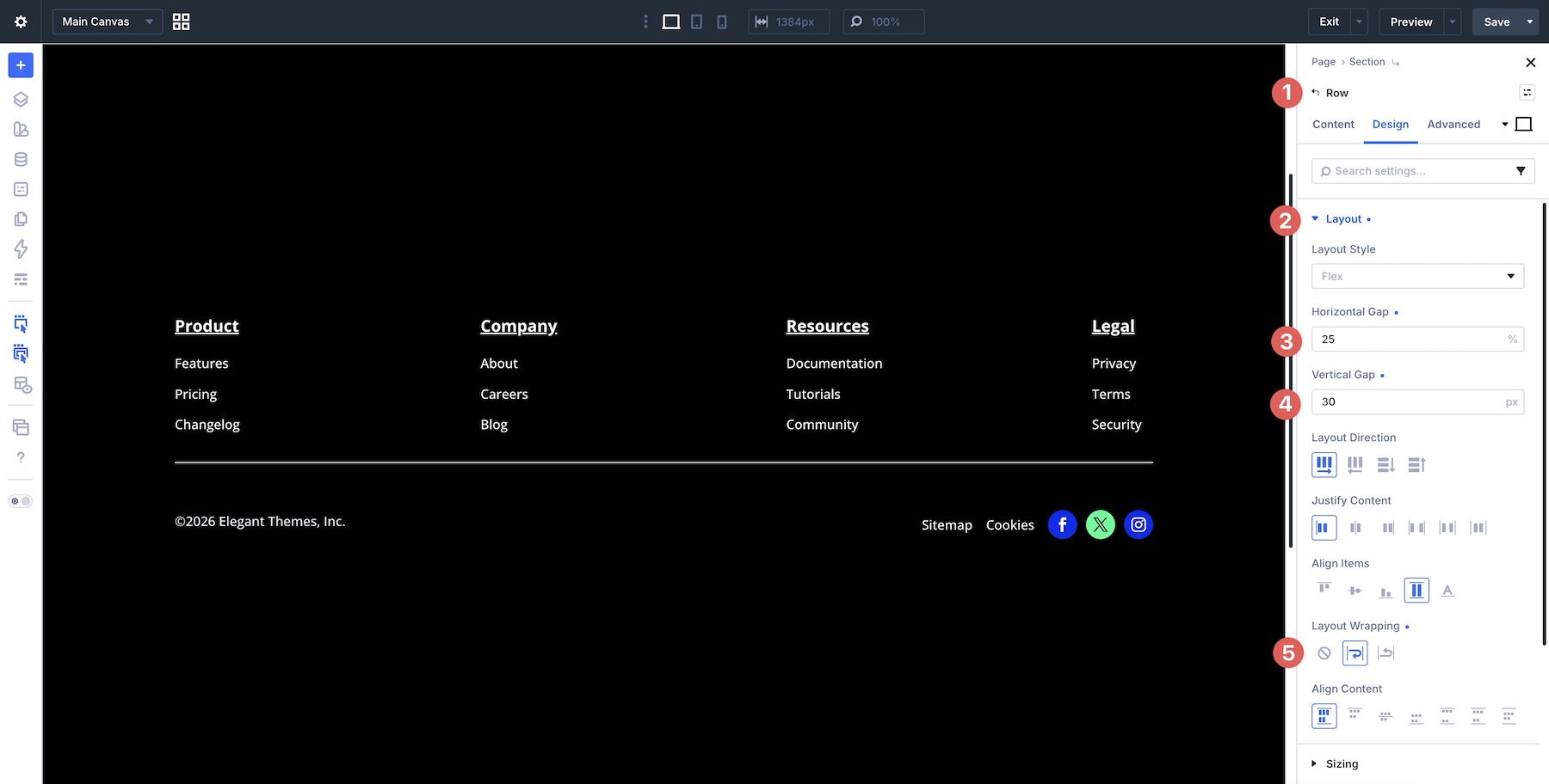
Settings Used: At the Row level, set the Horizontal Gap to 25%, the Vertical Gap to 30px, and enable Layout Wrapping.
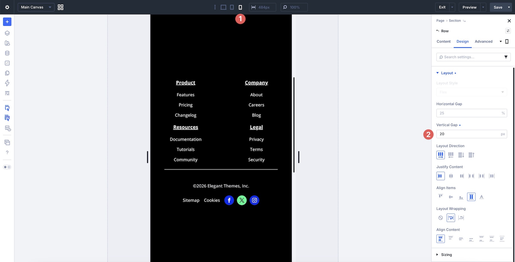
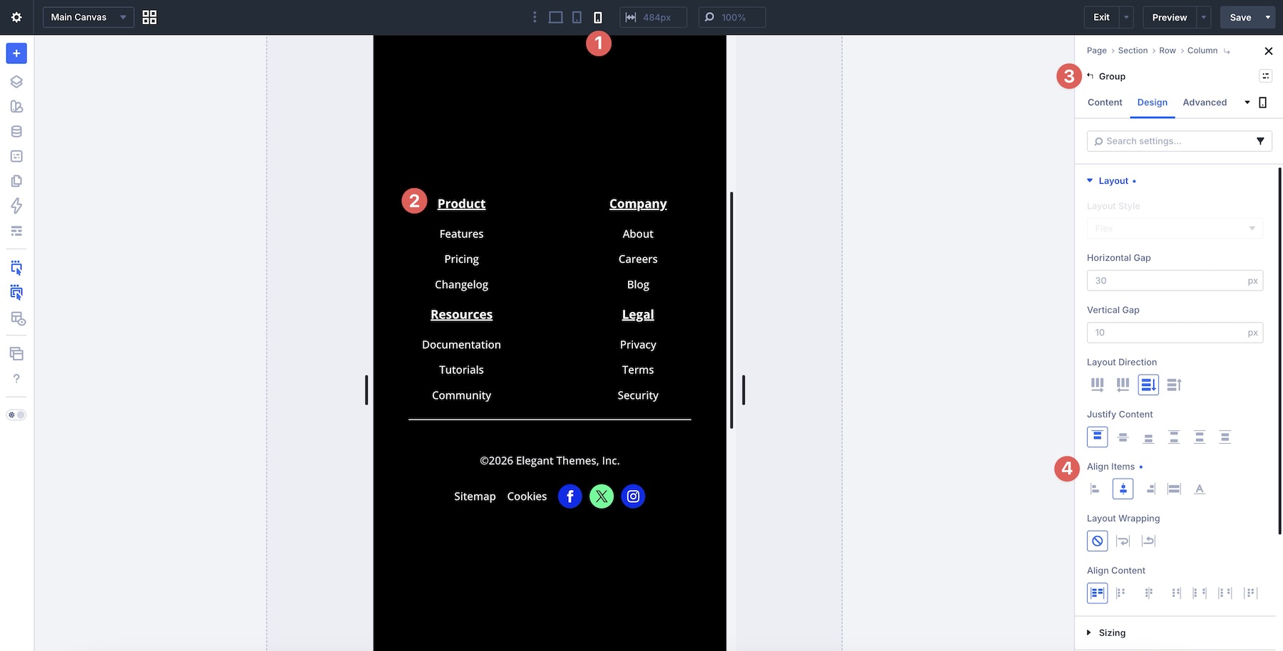
At the Row’s Phone breakpoint, set the Vertical Gap to 20px.
On the Desktop breakpoint, set each Module Group’s Vertical Gap to 10px.
For each Module Group at the Phone breakpoint, keep the spacing settings unchanged and set Align Items to Center so the link groups align neatly in the stacked layout.
Example 4: Header Navigation With A Nested Button Group
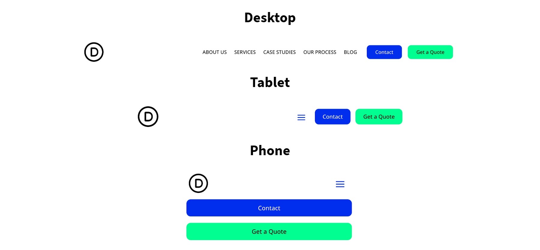
Goal: Build a header with a logo, navigation links, and a button group that stays horizontal on Desktop but adapts cleanly on Tablet and Phone.
The Challenge On Mobile: Navigation links and buttons can become cramped or misaligned, and the button group may need different sizing behavior than the main menu.
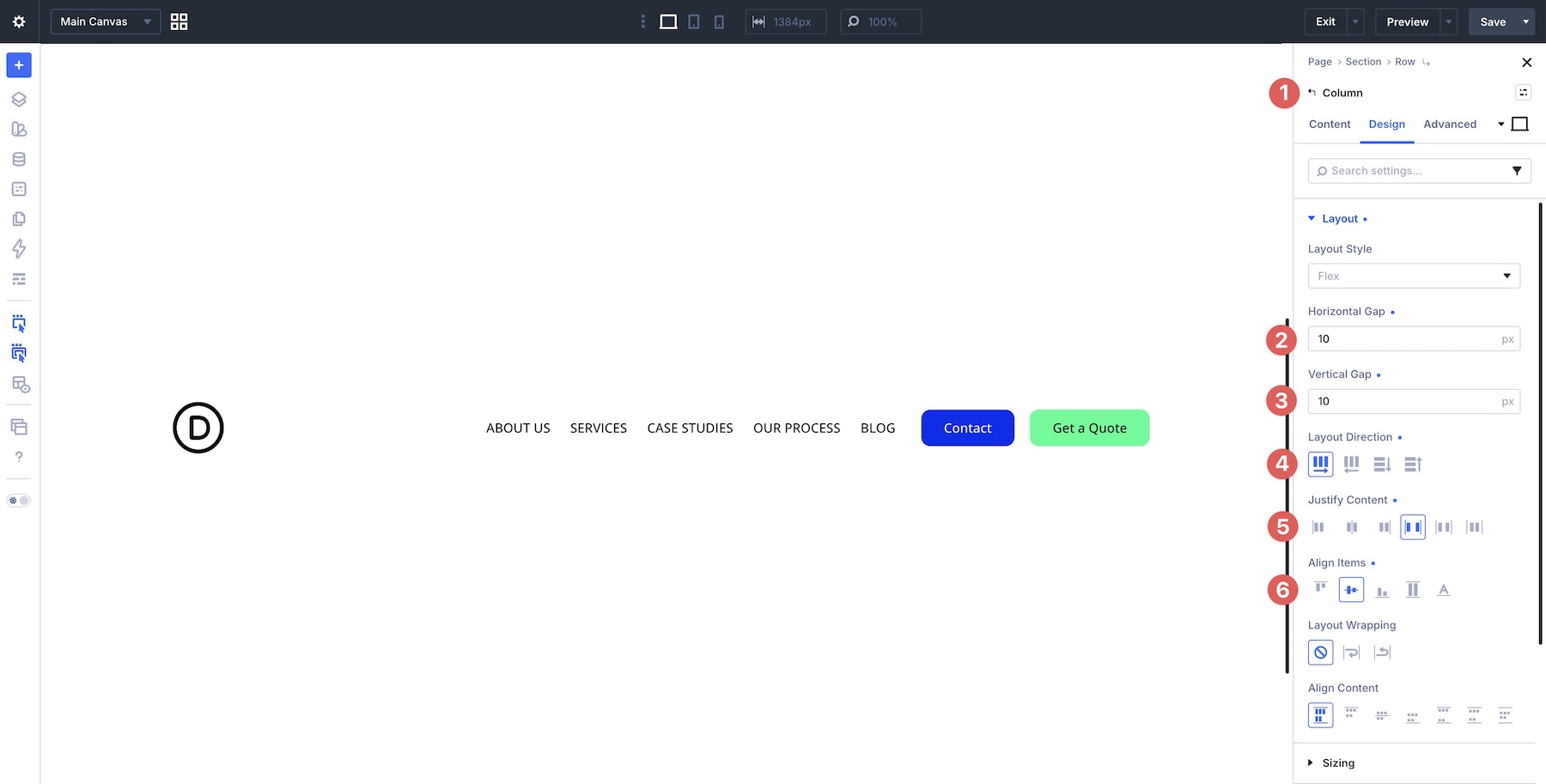
The Solution: Use a parent Column for the full header row and Module Groups for related items. The logo and menu can sit in one group, while the CTA buttons can sit in another. This gives each part of the header its own Flexbox settings and responsive sizing.
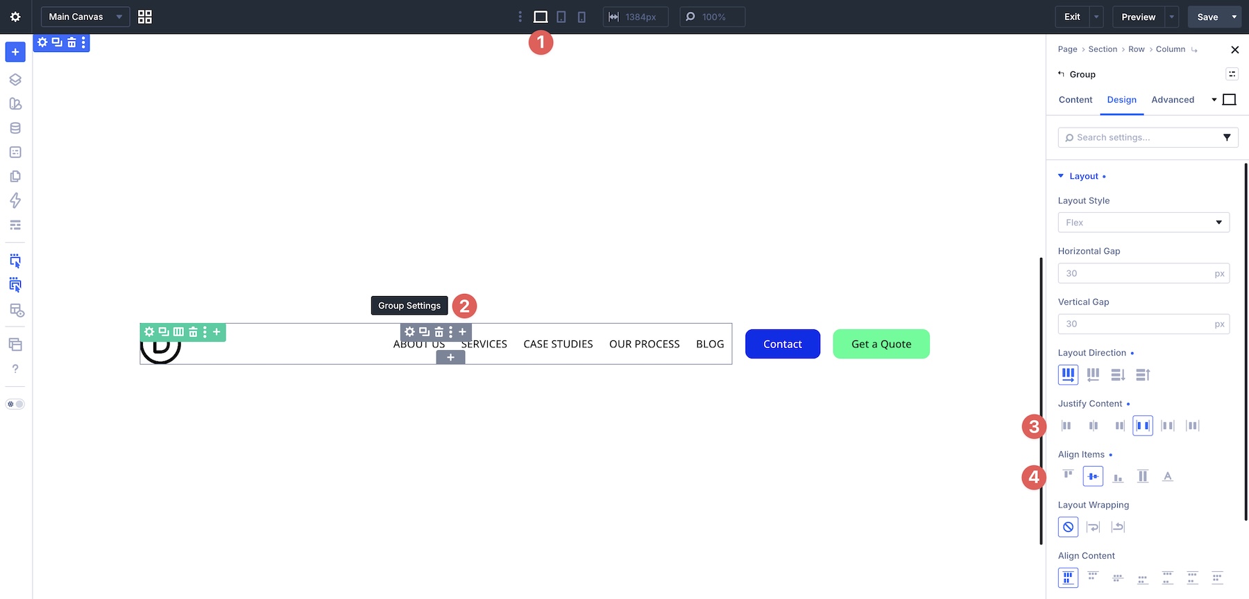
Settings Used: At the Column level, set the Layout Direction to Row, set the Horizontal Gap and Vertical Gap to 10px, set Justify Content to Space Between, and set Align Items to Center.
For the Module Group, set Justify Content to Space Between and Align Items to Center.
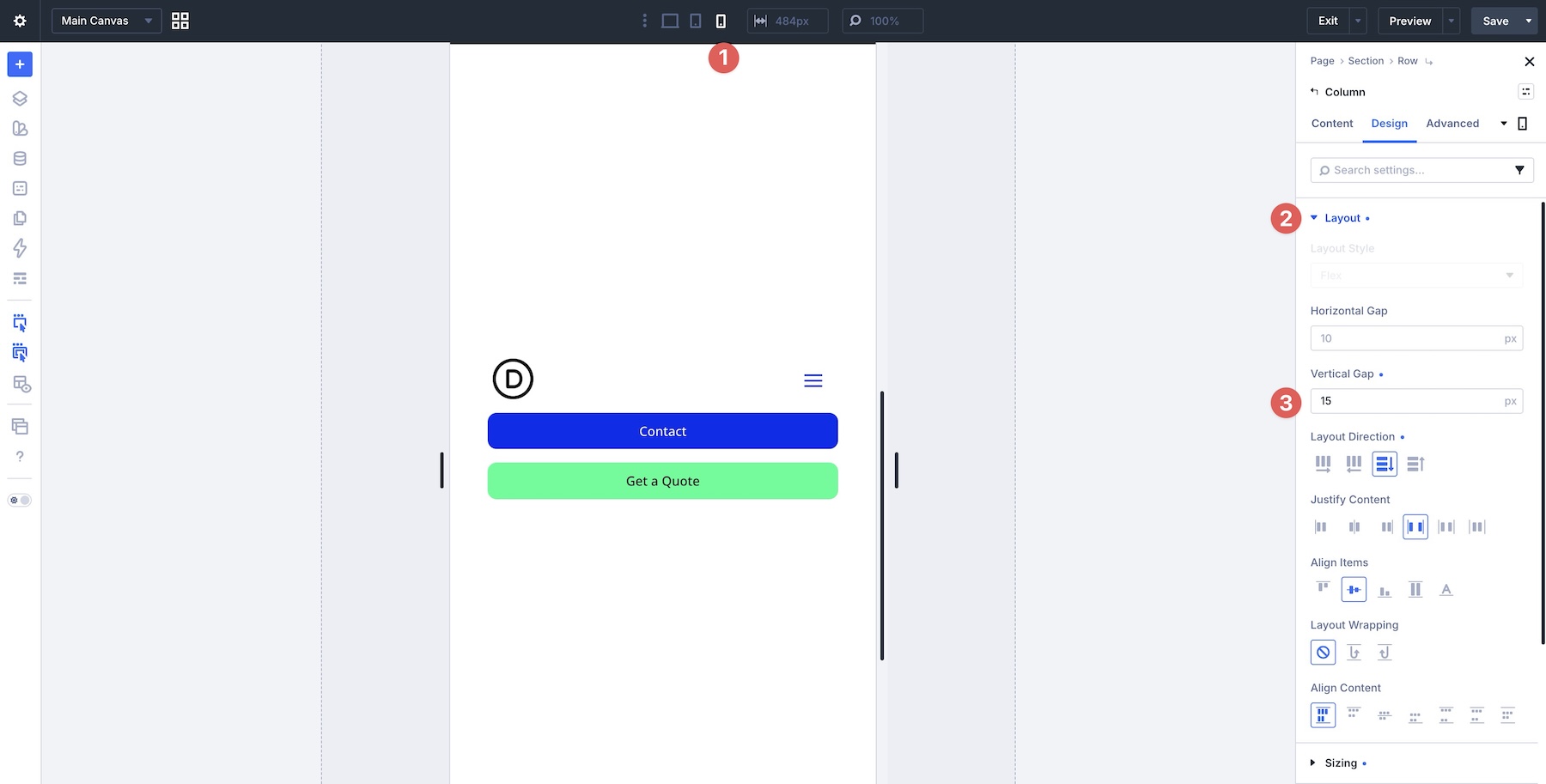
On the Phone breakpoint, set the Column Vertical Gap to 15px and leave the remaining settings unchanged unless your design needs a different mobile structure.
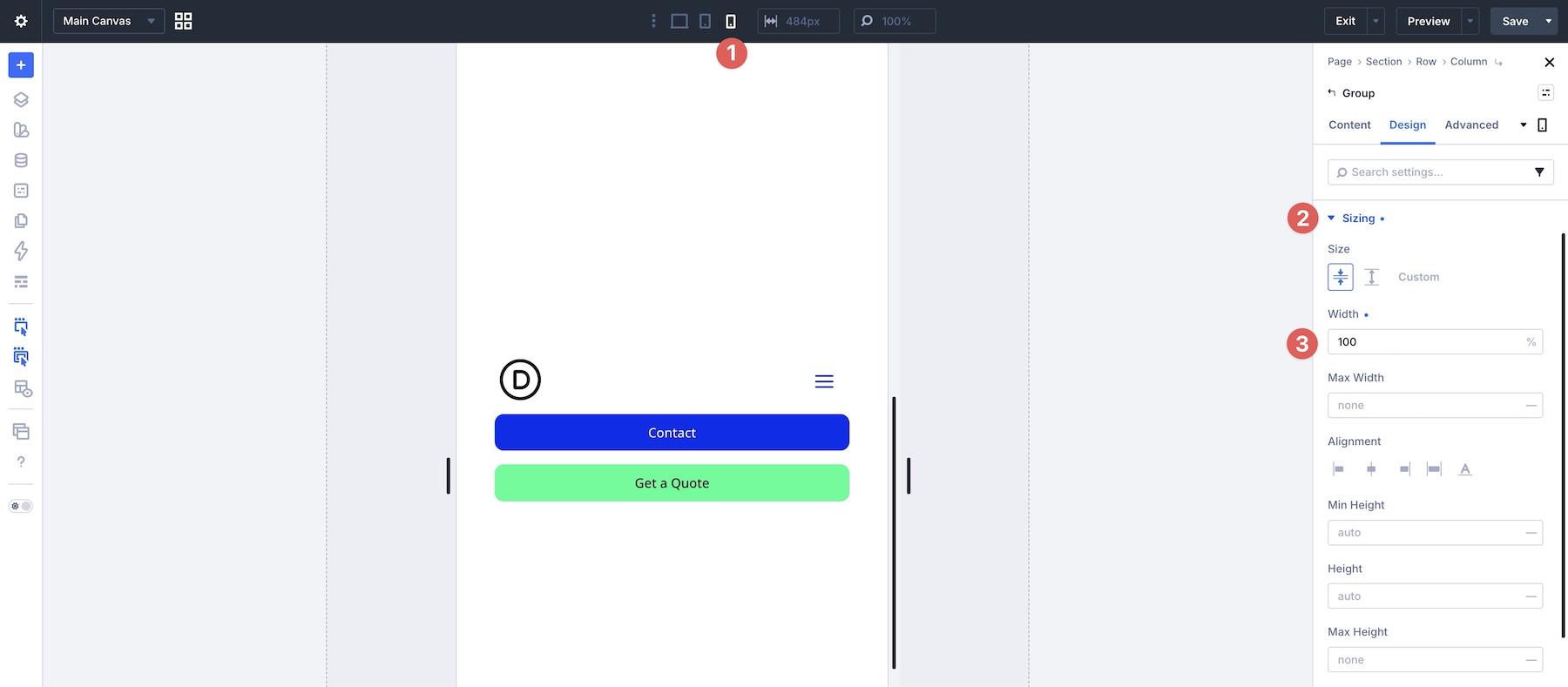
In addition to the Flexbox settings, adjust the Sizing for the Module Group across breakpoints. Set the Group width to 75% on Desktop, 65% on Tablet, and 100% on Phone. This helps the logo and menu group use the available width more effectively on smaller screens.
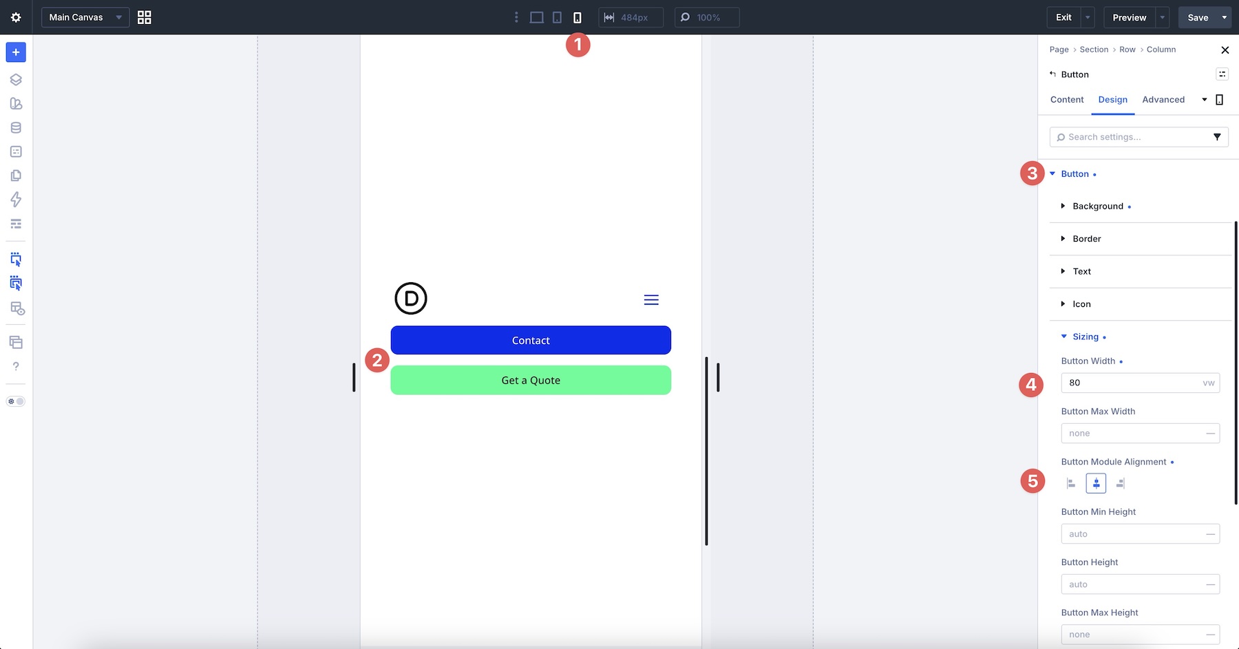
Finally, set each Button‘s width to 80vw on the Phone breakpoint so the buttons can span most of the viewport.
Example 5: Tag Cloud
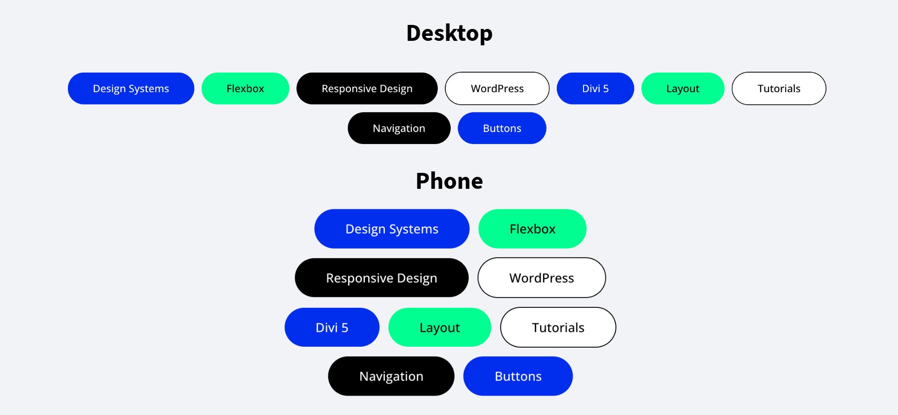
Goal: Create a flexible tag cloud or category row that flows horizontally on larger screens and wraps naturally on smaller screens.
The Challenge On Mobile: Tag clouds can become cramped, uneven, or hard to tap when tag lengths vary.
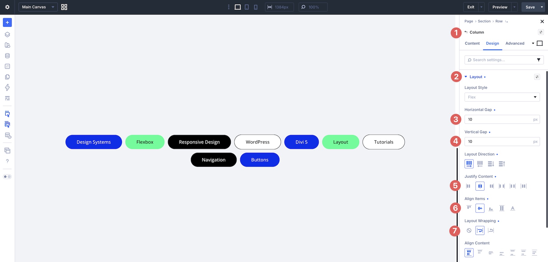
The Solution: Use a single Column or Module Group with Layout Direction > Row and Layout Wrapping > Wrap. Apply Horizontal Gap and Vertical Gap at the parent level so tags have consistent spacing as they wrap. Because the layout is designed to wrap naturally, it can often use the same Flexbox settings across breakpoints.
Settings Used: The Column uses Layout Direction > Row, a 10px Horizontal Gap, and a 10px Vertical Gap. Justify Content and Align Items are both set to Center, and Layout Wrapping is enabled. These settings remain consistent across breakpoints.
Step-By-Step Build
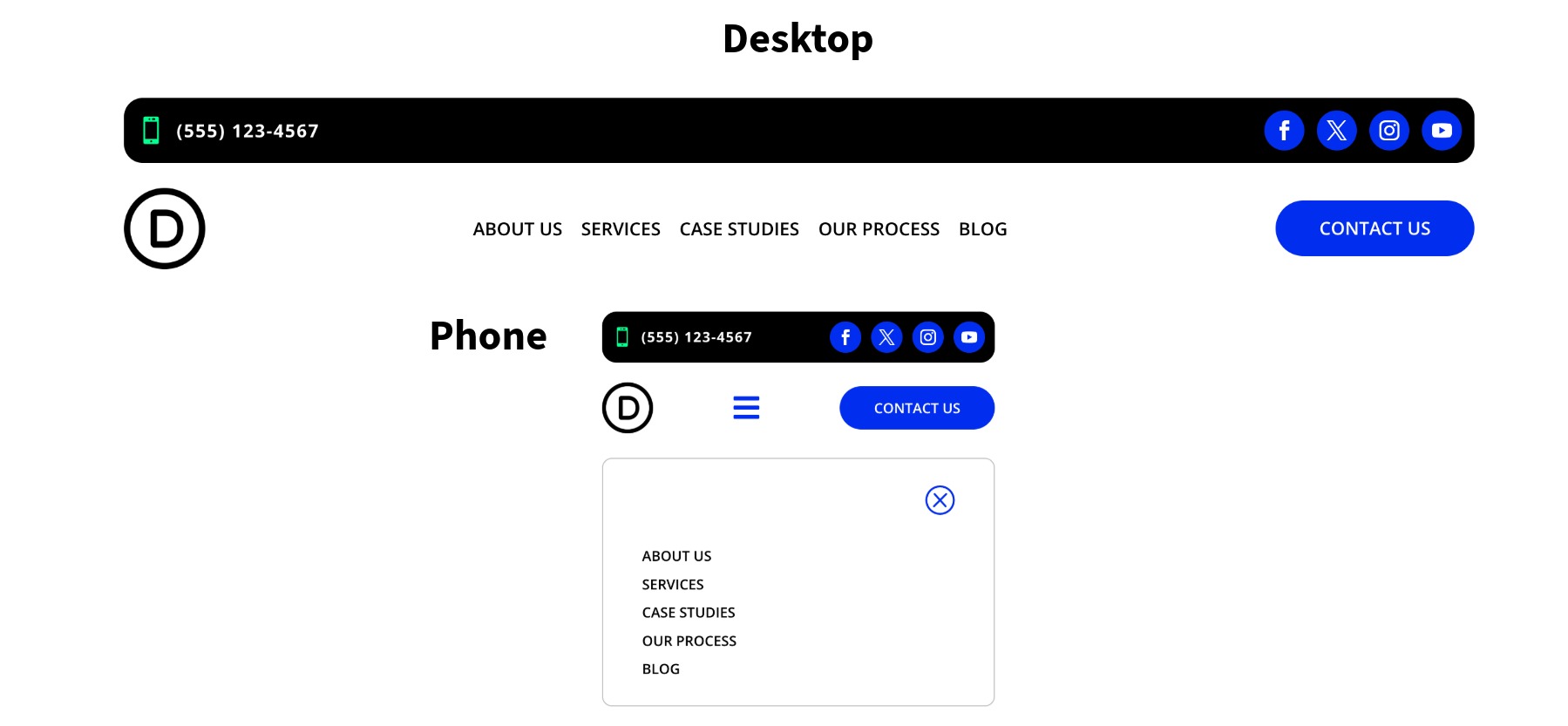
Let’s walk through building a custom menu that includes a logo, navigation links, a CTA, and a mobile menu. By the end, you’ll understand how to combine Flexbox, Module Groups, Link loops, Canvases, and Interactions for a responsive navigation workflow.
Set Up The Main Row Structure
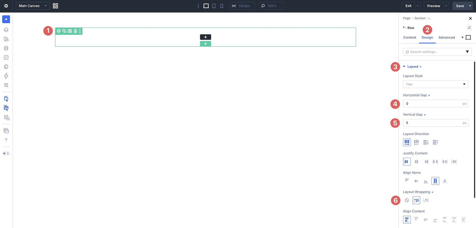
Start by adding a single-column row to a new page in the Visual Builder. If needed, select Flex as the Layout Style. In the Row’s Design tab, expand the Layout option group. Set the Horizontal Gap to 0px, set the Vertical Gap to 5px, and enable Layout Wrapping > Wrap.
Open the Column settings and go to the Design tab. In the Layout option group, set the Layout Direction to Row so items flow from left to right. Set Justify Content to Space Between, set Align Items to Center, and enable Layout Wrapping > Wrap.
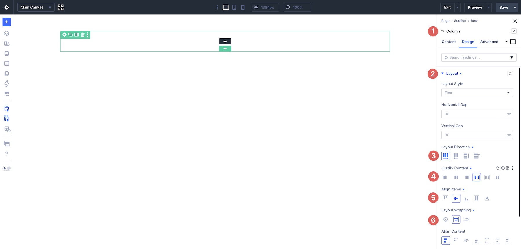
Now add another Column to the Row. In the Row’s Content tab, expand the Elements option group and click the + Add Element button to add the Column.
Switch to the Design tab for the new Column. Set Layout Direction to Row, Justify Content to Space Between, Align Items to Center, and Layout Wrapping to Wrap.
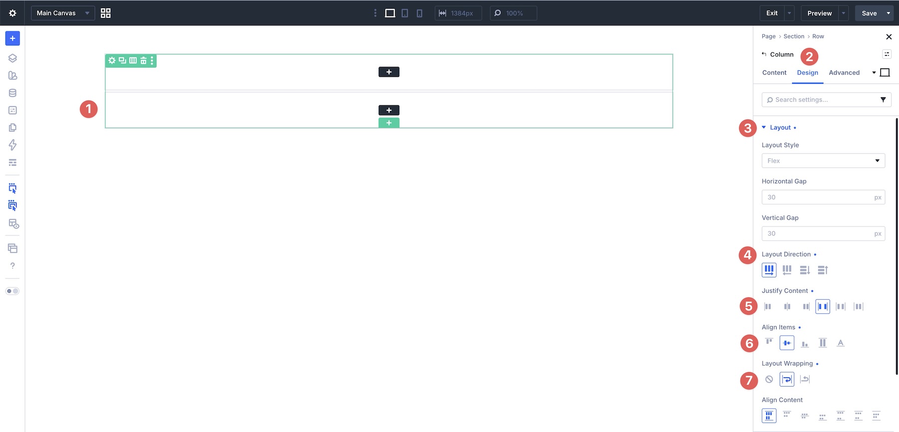
Before moving on, open the first Column and assign a Background Color, 15px Border Radius, and 10px Padding on all four sides.
Add Modules To The Row
In the first Column, add a Module Group to hold an Icon module and a Text module. Style the modules as needed. Then, in the Group’s Layout settings, set the Horizontal Gap to 10px, set Layout Direction to Row, and set Align Items to Center.
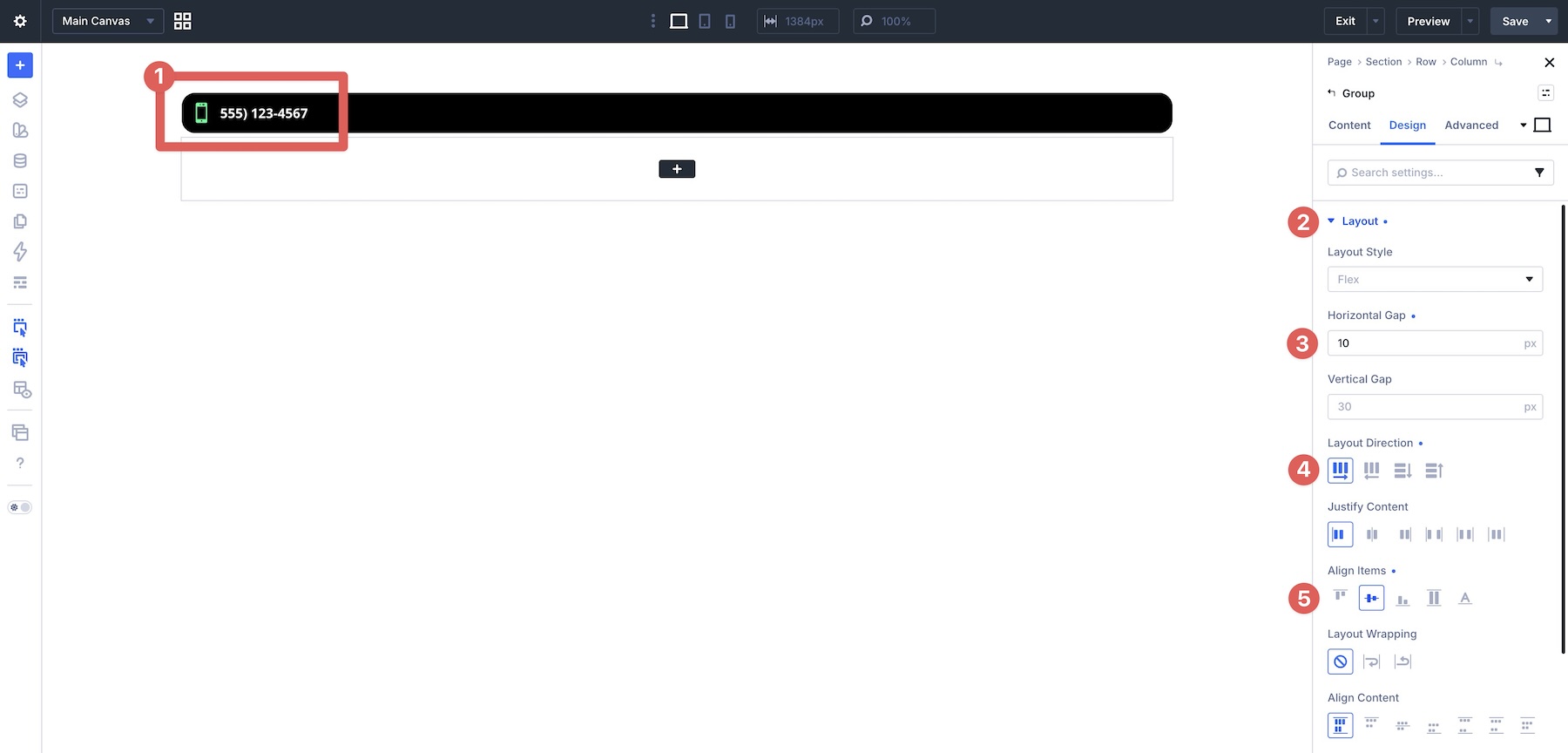
Add a Social Media Follow module outside of the Group and style it as needed.
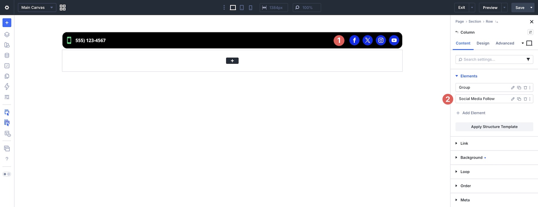
In the second Column, add an Image module and two Module Groups. The Image module will serve as the logo. The Module Groups will hold the navigation links, hidden hamburger icon, and CTA.
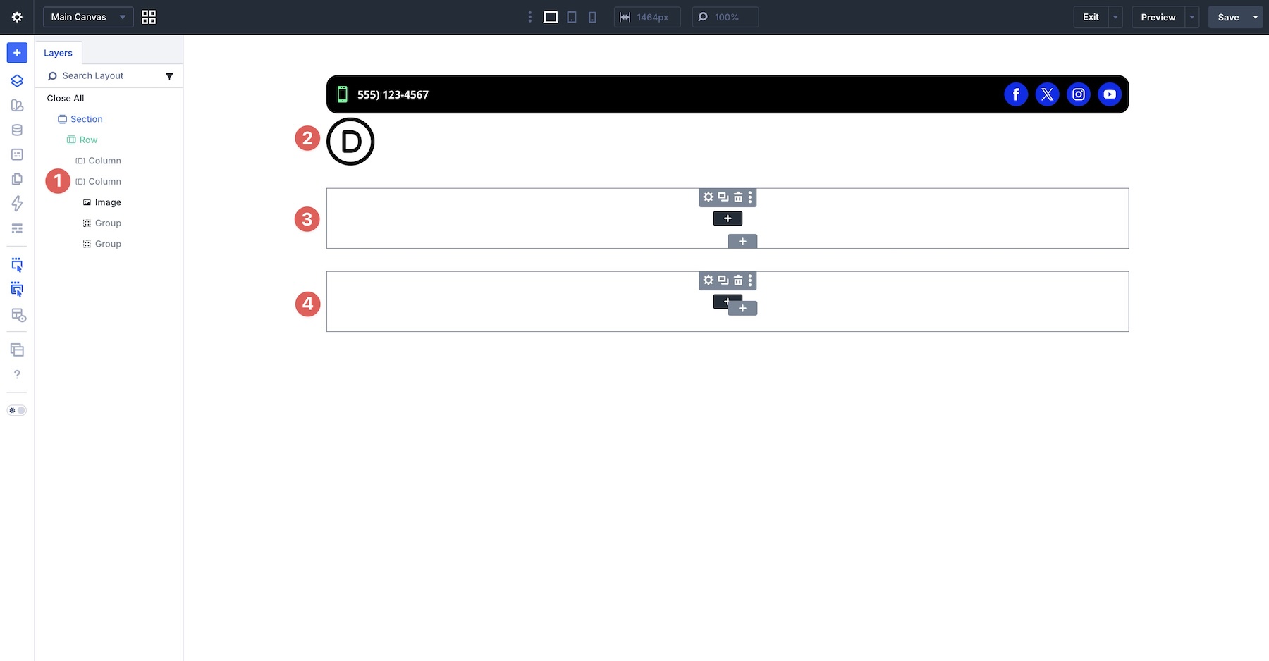
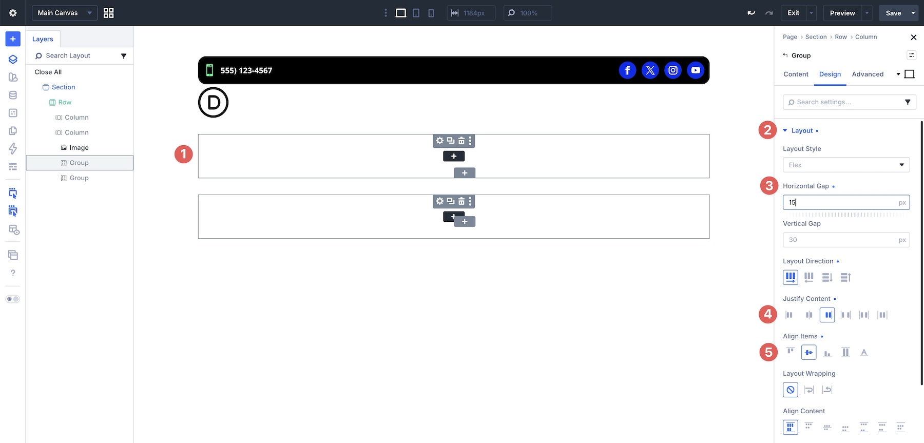
In the first Group’s Layout settings, set Horizontal Gap to 15px, Layout Direction to Row, Justify Content to End, and Align Items to Center.
Add a Link module to the Group and style the link as needed, including hover and active states.
In the Link module’s Content tab, expand the Loop option group and enable Loop Element. Select Menu as the Query Type and choose your main menu.
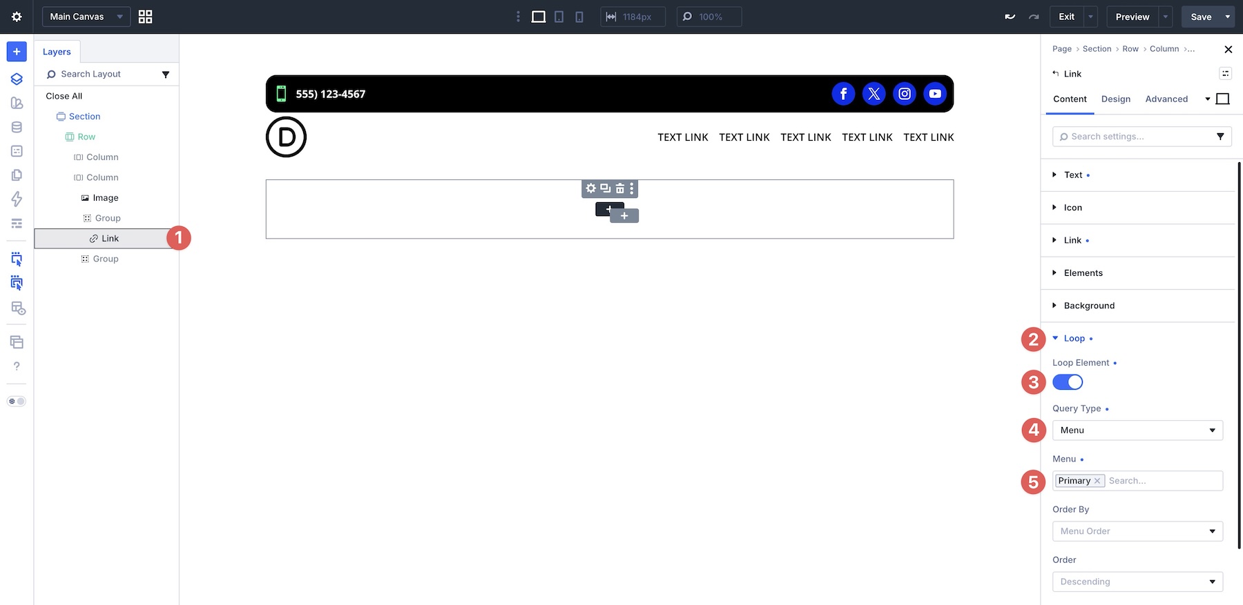
To assign the menu item names, expand the Text option group, click the Insert Dynamic Content icon, and choose Loop Menu Text.
In the second Module Group, add an Icon module and a Button module, then style them as needed. In the Group’s Design tab, set the Layout Direction to Row.
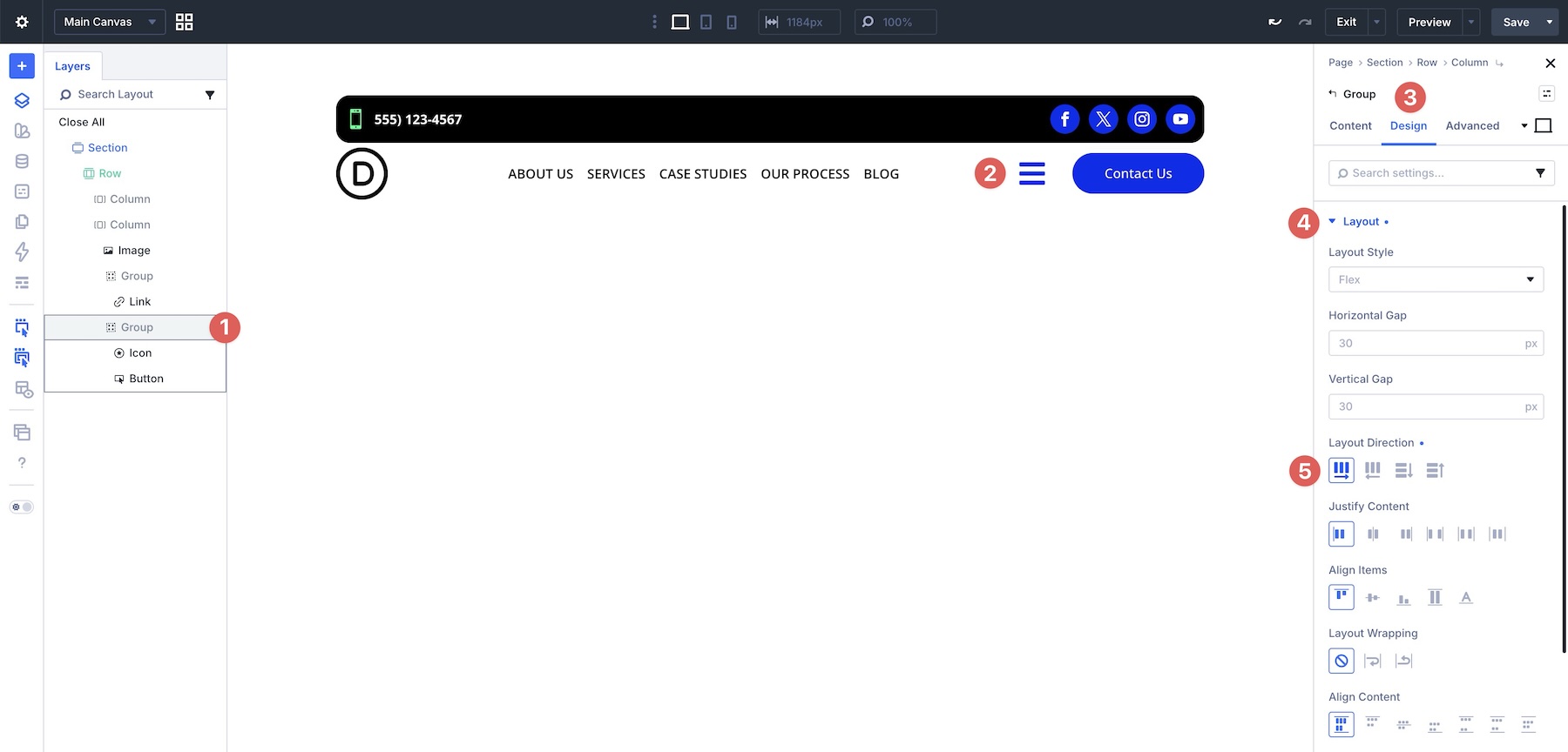
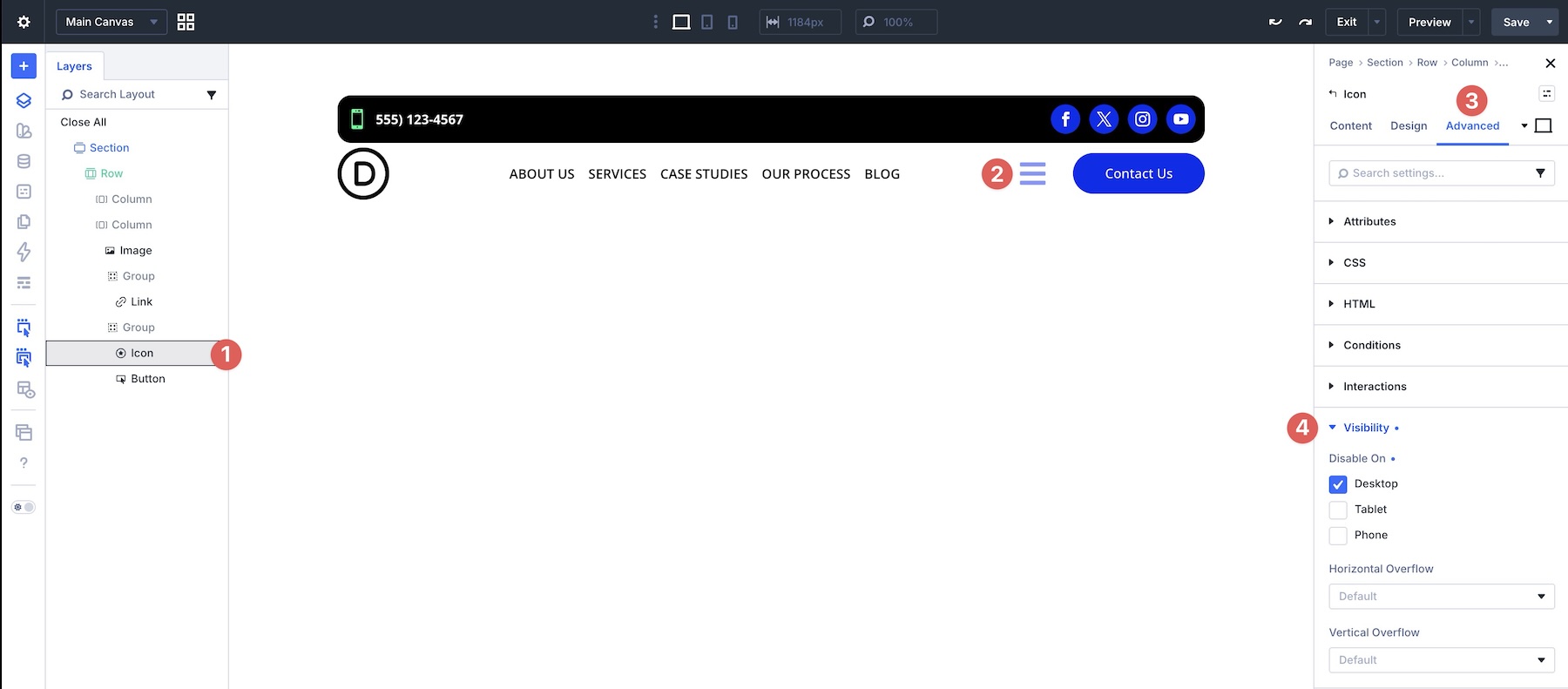
Hide the hamburger Icon module on Desktop so it only appears at the Tablet and Phone breakpoints.
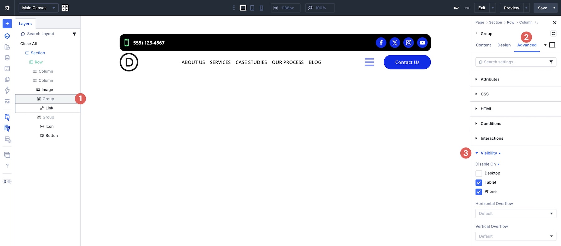
Then hide the Module Group with the desktop navigation links on the Tablet and Phone breakpoints.
Create The Mobile Menu
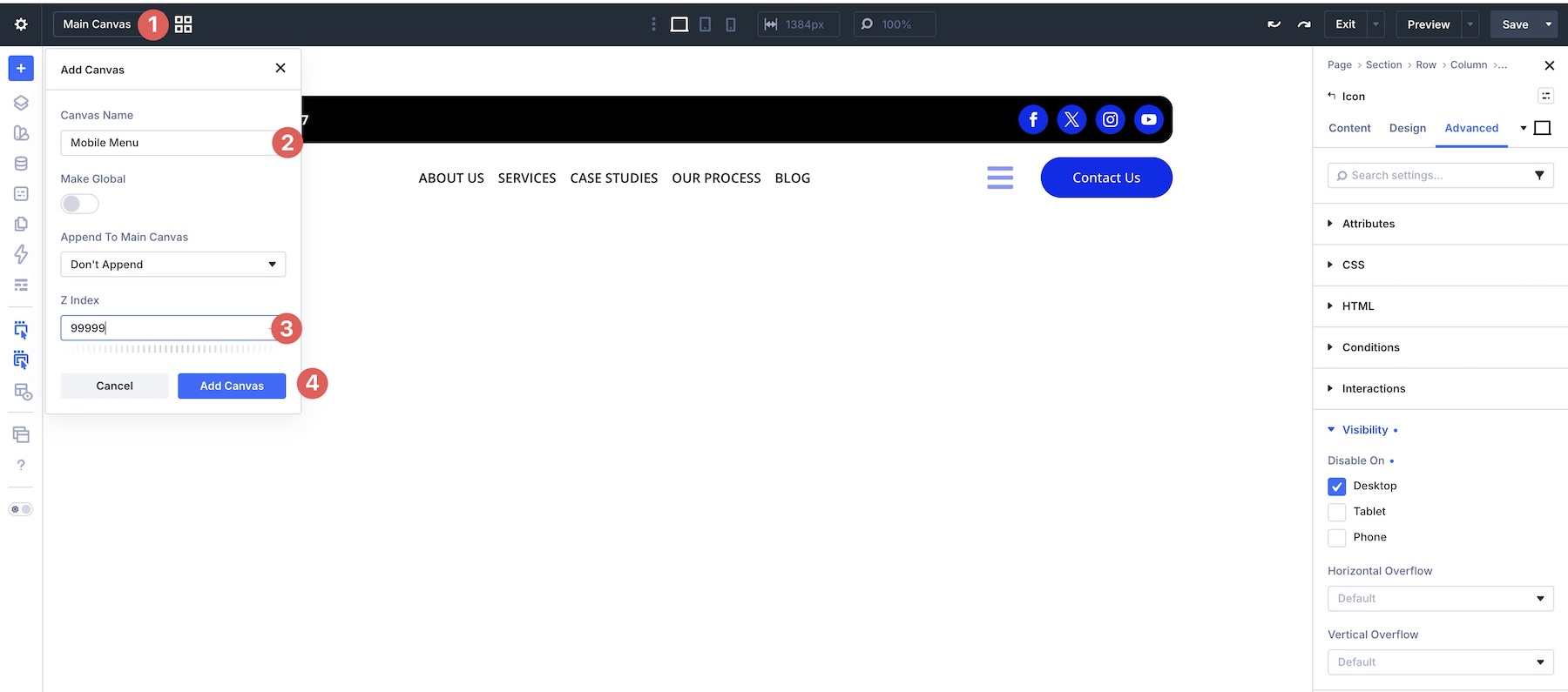
In this step, we’ll create a separate Canvas to hold the mobile menu. Click the Canvas dropdown menu, select Add Canvas, give it a name such as Mobile Menu, set a Z-Index of 99999, and click Add Canvas.
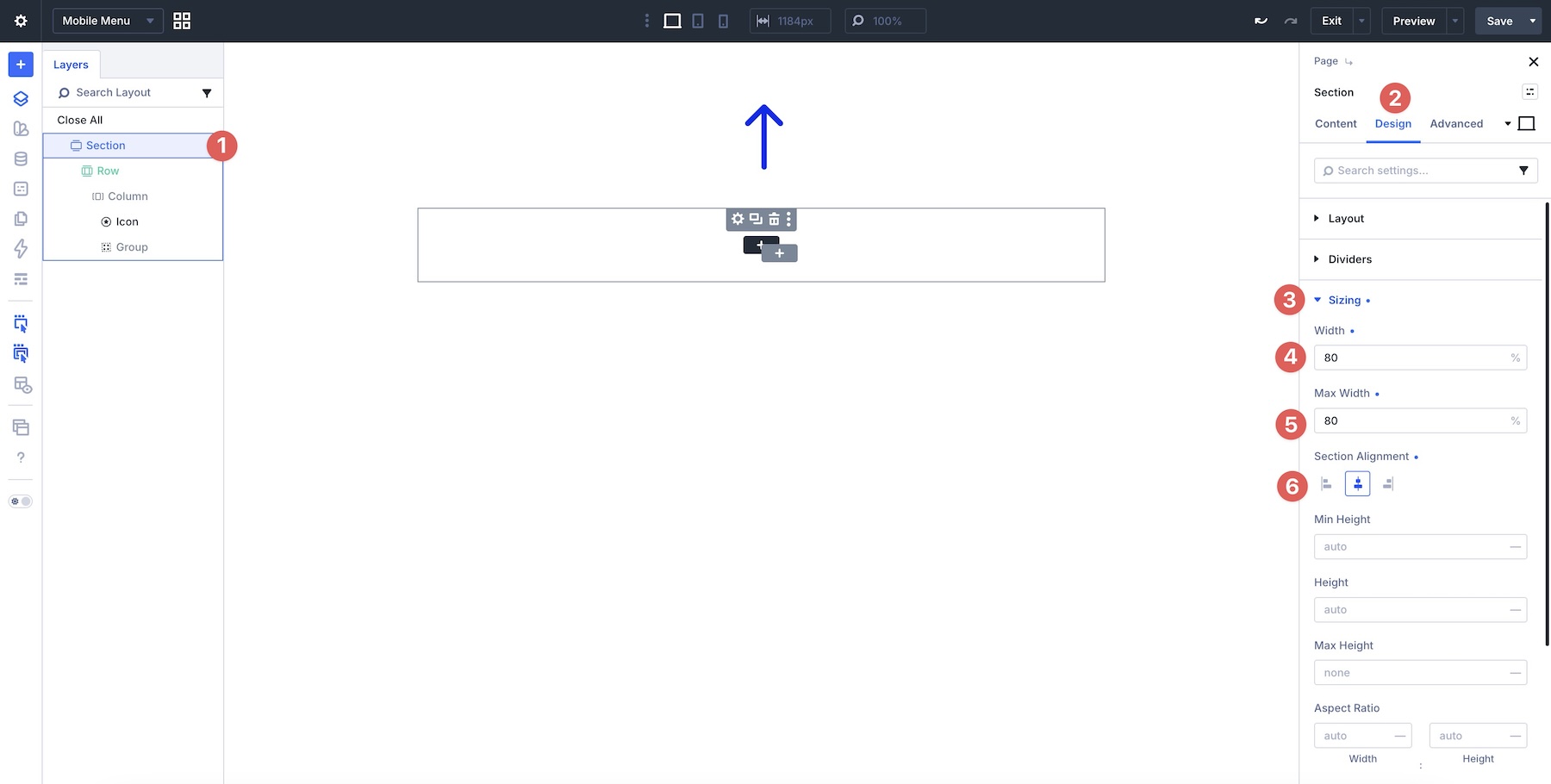
When the Canvas loads, add a single-column row with an Icon module and a Module Group. Open the Section settings and go to the Design tab. Expand the Sizing option group and set the Width and Max Width to 80%. Choose Center for the Section Alignment.
Then open the Column settings and set the Vertical Gap to 10px.
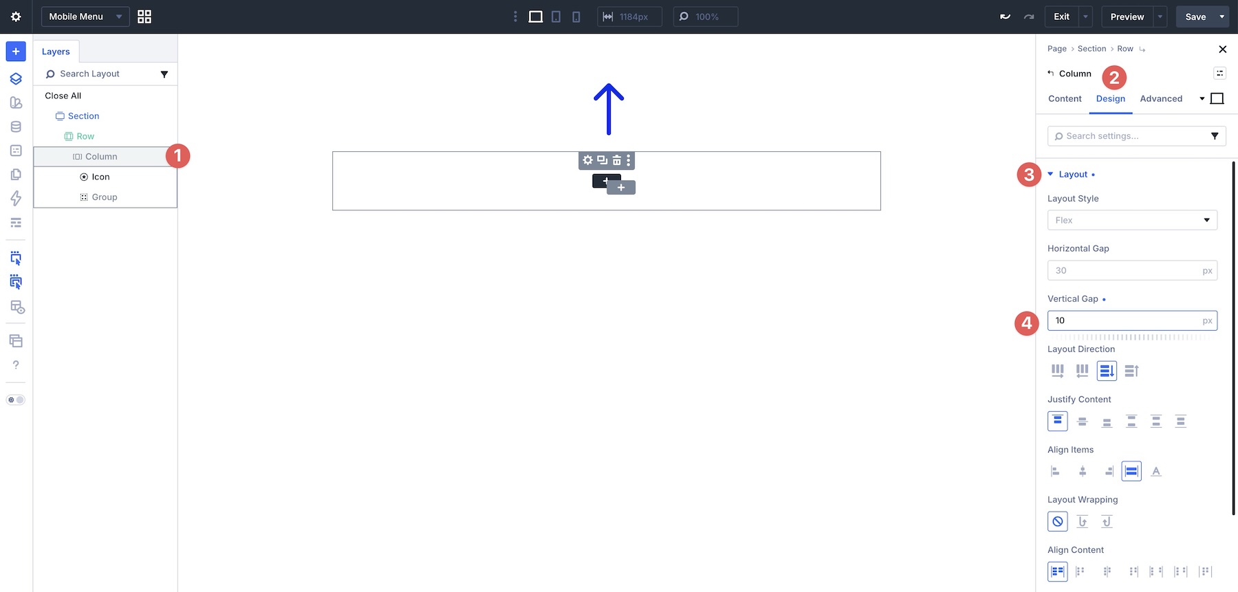
Next, open the Module Group settings and set the Horizontal Gap and Vertical Gap to 15px.
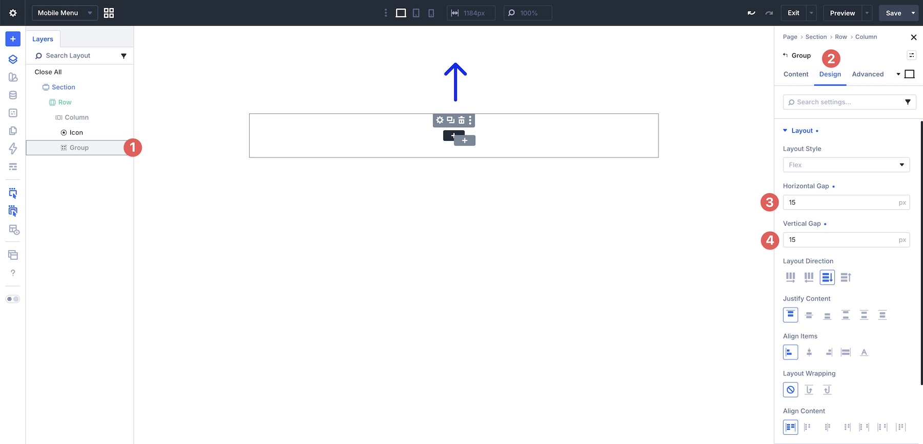
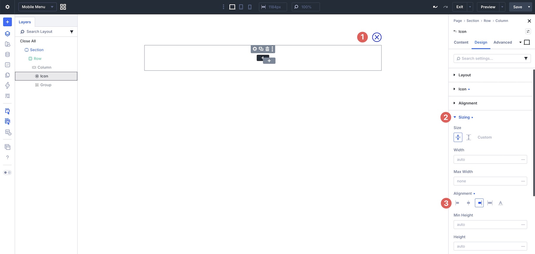
Assign a Close icon to the Icon module, set an Icon Size, and expand the Sizing option group to set the Alignment to End.
Add a Link module, style it, and enable looping for your WordPress menu.
Create The Interactions
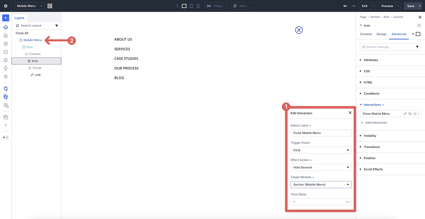
Before closing the Canvas, create an Interaction that closes the mobile menu on click. Select the Icon module and go to the Advanced tab. Expand the Interactions option group and click + Add Interaction.
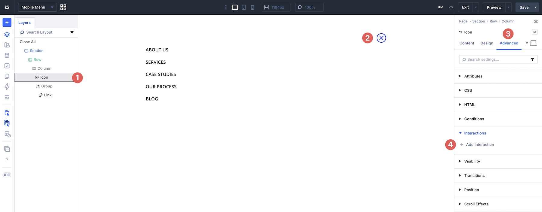
Choose Click as the Trigger Event, give the Interaction a name, choose Hide Element as the Effect Action, and choose Section (Mobile Menu) as the Target Module.
Tip: To make Interactions easier to manage, label your sections clearly so they are easy to identify in the Layers Panel.
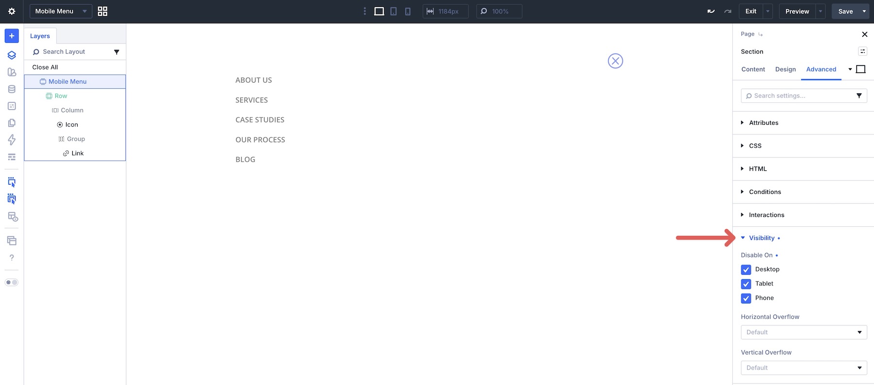
Before heading back to the Main Canvas, expand the Visibility option group and disable the mobile menu section on all breakpoints. Save the Canvas.
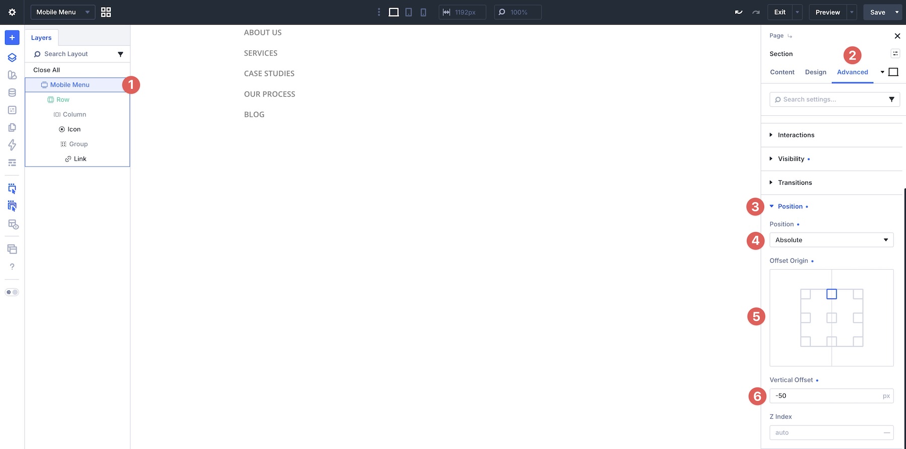
Finally, open the Position option group, set Position to Absolute, set Offset Origin to Top Center, and apply a -50px Vertical Offset so the mobile menu appears near the main menu when opened. You may need to adjust this value depending on your header height and spacing.
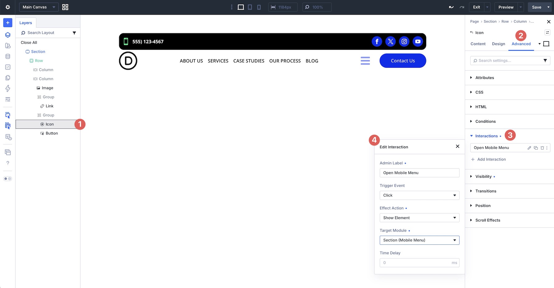
Switch back to the Main Canvas, select the hamburger Icon module, go to the Advanced tab, expand the Interactions option group, and create a new Interaction that opens the mobile menu on click.
Save the Main Canvas, open the page in a new tab, and test the functionality.
Best Practices And Tips
Here are a few practical tips to help you build better button, menu, and link rows with Divi 5.
1. Choose Wrap Vs. Column Direction Wisely
Use Layout Wrapping when you want items to flow naturally onto new lines as space becomes limited. This works well for tag clouds, link rows, and button groups that benefit from automatic wrapping.
Switch to Column direction when you need a strict vertical stack, such as a mobile menu or full-width CTA group. Avoid forcing Column direction too early, especially on Tablet, because it can make layouts longer than necessary.
2. Prioritize Important CTAs With Display Order
On mobile, you can use Display Order to move a primary button, key link, or important menu item earlier in the visual flow. A negative value, such as -1, can pull an item ahead of other elements at a specific breakpoint.
Use this selectively. A clean source order should still do most of the work, with Display Order used only when the mobile hierarchy needs a targeted adjustment.
3. Use The Loop Builder For Menu Links
When building custom menus with the Link module, you do not need to manually create a separate Link module for every page on your site. Add a single Link module, open its settings, go to the Loop option group, and toggle Loop Element on. Set the Query Type to Menu and choose your WordPress menu.
Using the Loop Builder gives you more control over link styling and helps your menu reflect updates when the connected WordPress menu changes.
4. Use Flexbox Controls For Quick Alignment
For a typical logo, menu, and button layout, set the parent container to Layout Direction > Row, set Align Items to Center, and use Justify Content > Space Between. This can position the logo, navigation, and CTA in a balanced horizontal row without relying on manual margins.
Then use Module Groups when part of the header needs its own alignment behavior, such as a menu group, social icon group, or CTA button group.
5. Build More Advanced Menus With Interactions And Canvases
You can use Divi 5’s Interactions and newer menu features to create more advanced setups, such as mobile overlays, dropdown-style menus, or mega menus. While Link modules work well for simple navigation rows, the newer Link and Dropdown modules, Canvases, Loop Builder, and Interactions make it possible to build more custom navigation patterns inside the Visual Builder.
Download The Layouts
To help you follow along, we’ve created a zip file containing the examples from this post. You’ll find an ALL file containing all sections, a folder with individual sections, and a folder containing the full step-by-step example.

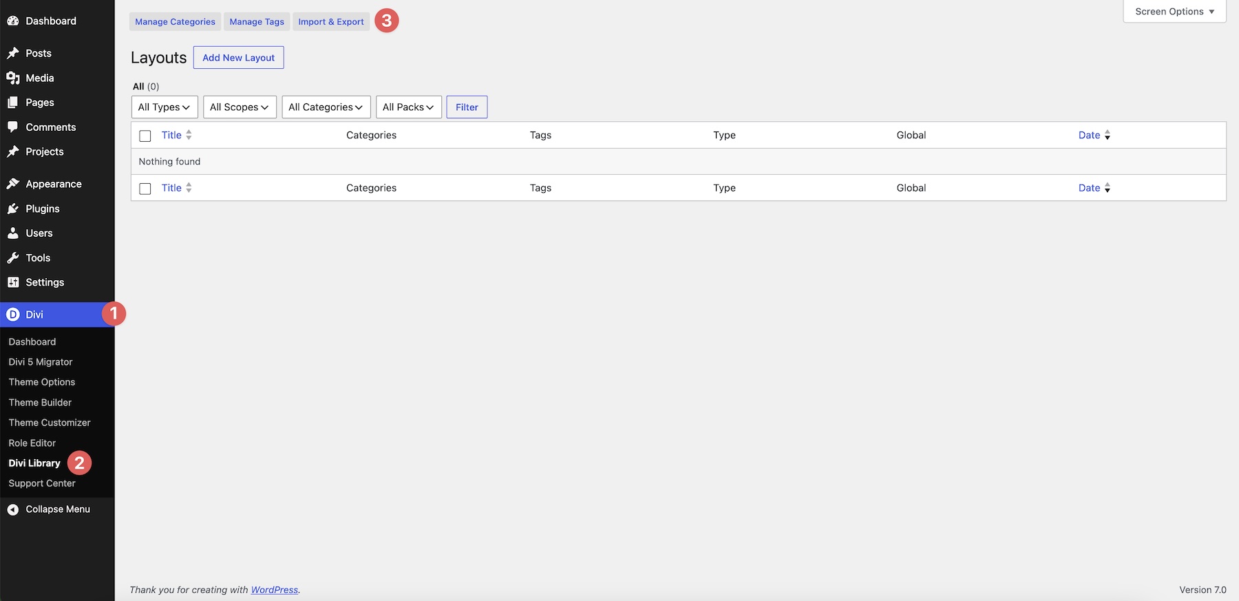
To use the ALL file or individual sections, import them into the Divi Library. Go to Divi > Divi Library and click the Import & Export button.
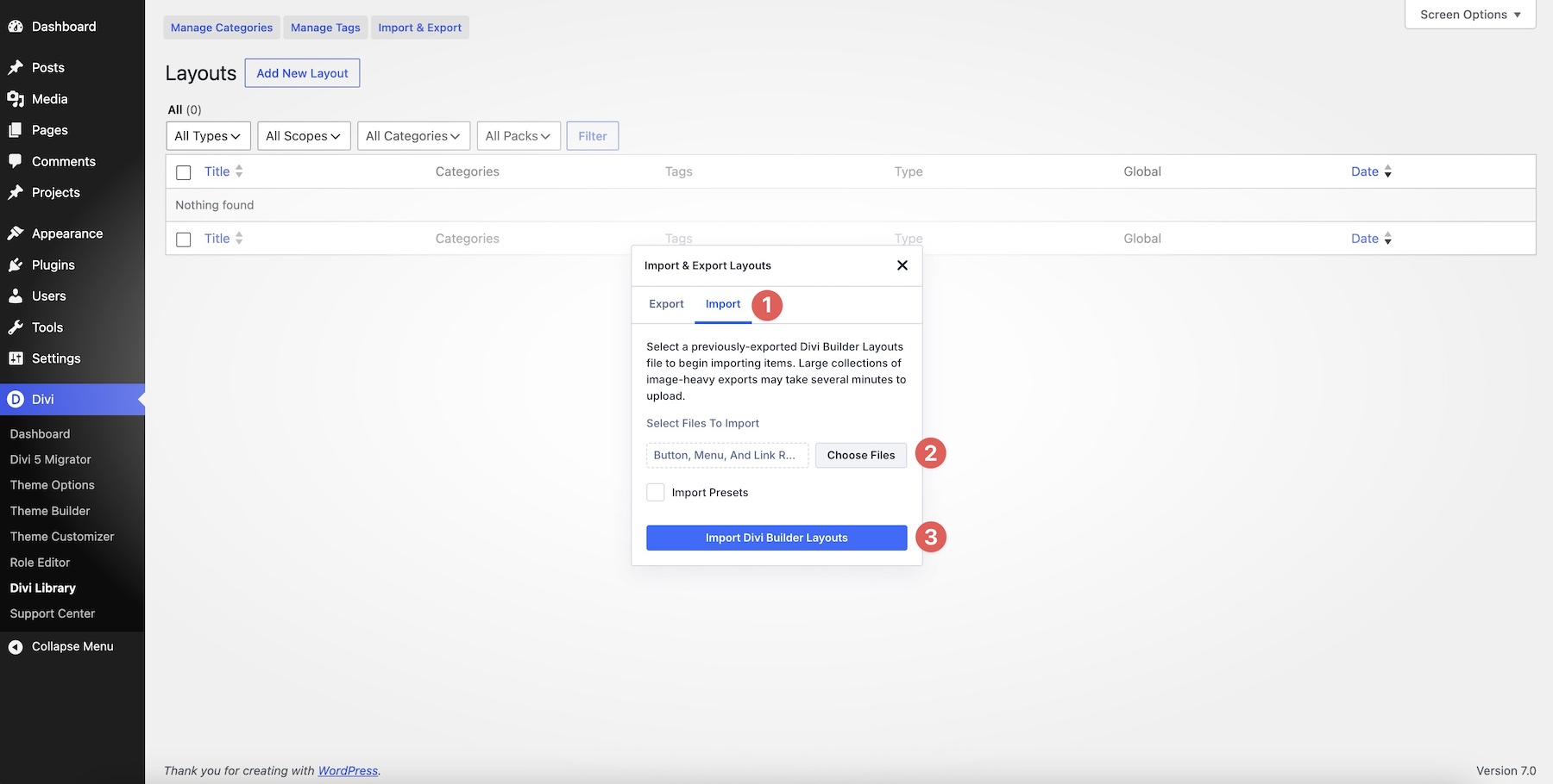
Switch to the Import tab, choose an individual JSON file or the ALL file from your computer, and select Import Divi Builder Layouts.
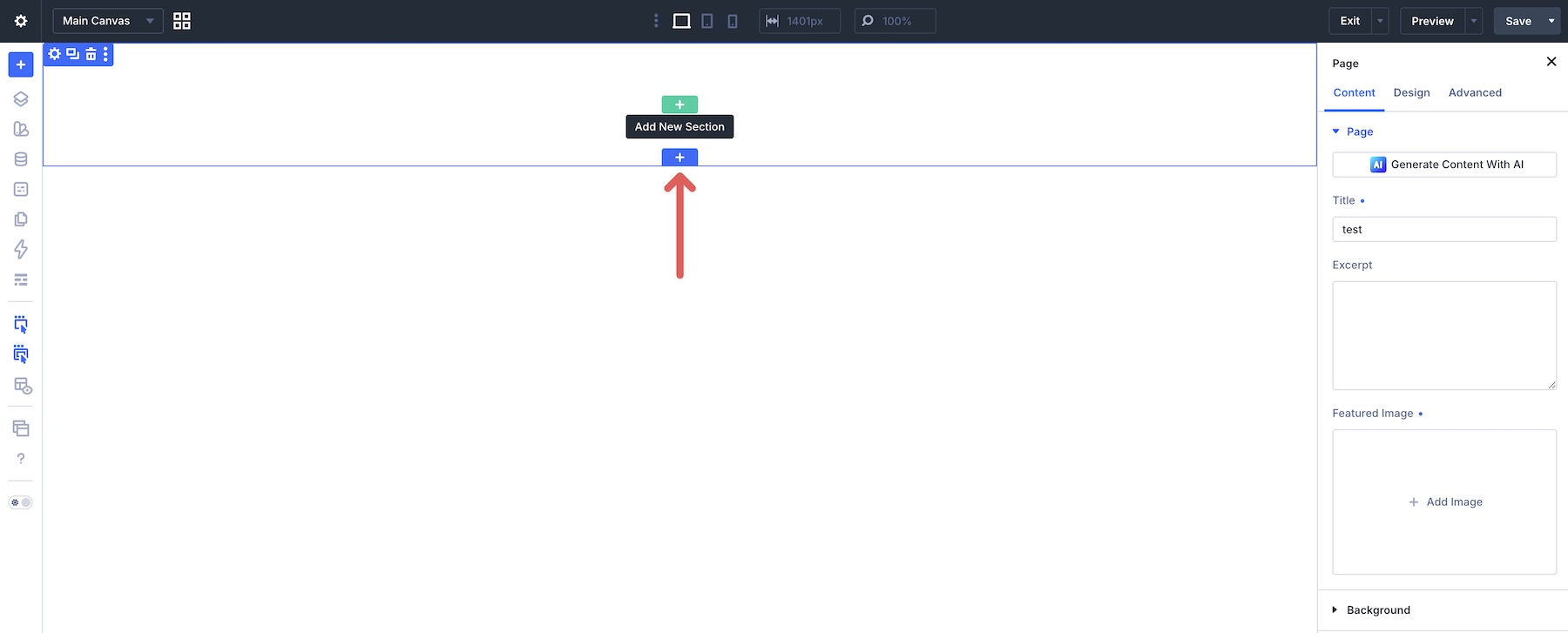
To use an imported section, open a page in the Visual Builder. Click the blue + icon to add a section to the page.
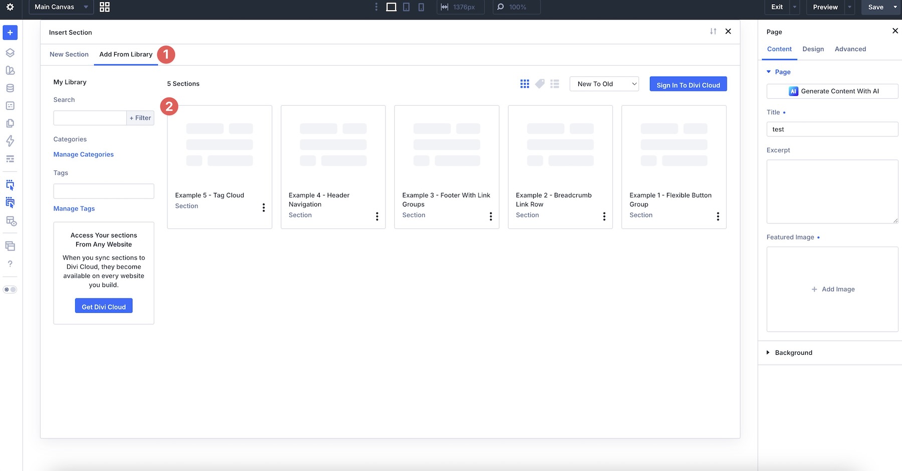
Switch to Add From Library and choose the section you want to add to the page.
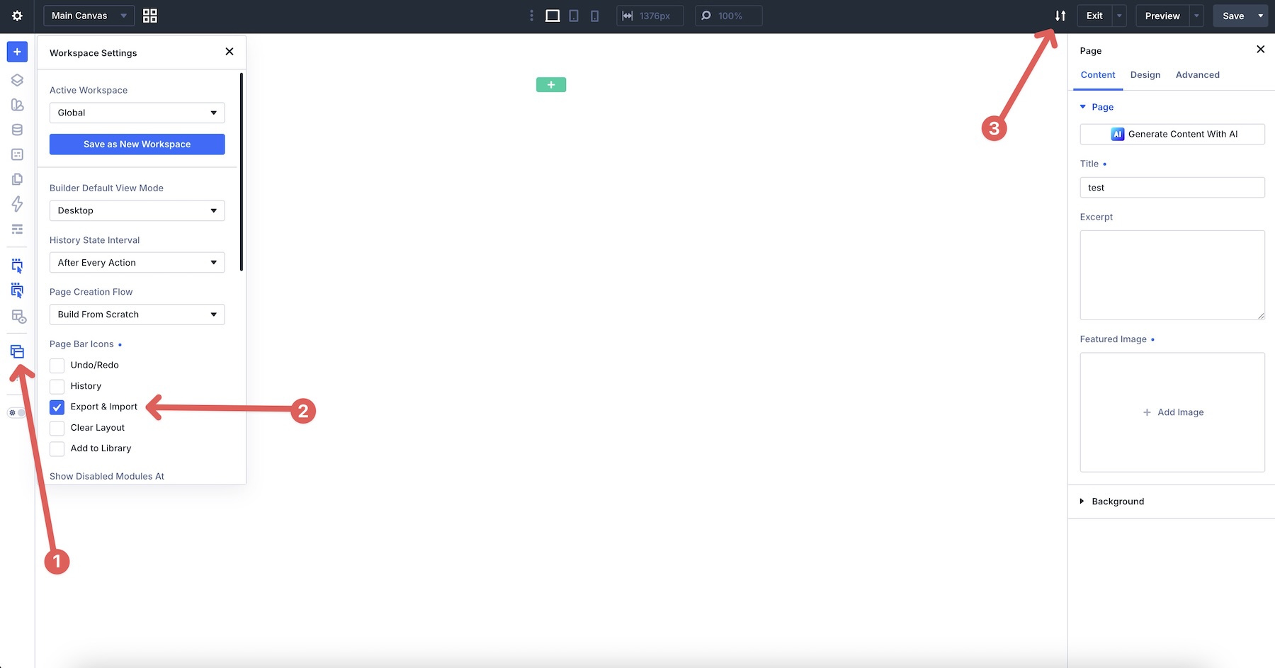
For the step-by-step example, enable the Export & Import Page Bar Icon. Click the Workspace icon in the Builder Bar, locate Export & Import under Page Bar Icons, and click the Export & Import icon in the top bar of the Visual Builder.
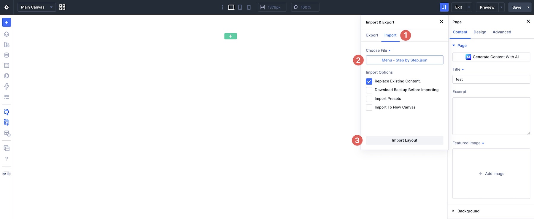
Switch to the Import tab, locate the folder containing the Menu – Step By Step.json file, and select Import Layout. This JSON file must be uploaded this way to import the Mobile Menu Canvas associated with it.
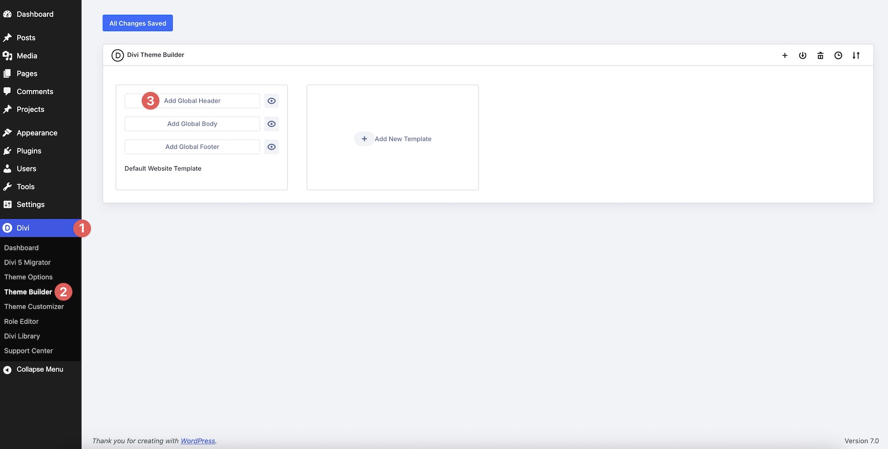
If you plan to use the example as your site’s navigation, you can add it as a Global Header in the Theme Builder after importing the layout.

Master Flexible Button, Menu, And Link Rows With Flexbox
With Divi 5 and its Flexbox Layout System, you can build button groups, link rows, custom menus, and tag clouds that adapt across screen sizes while staying easier to maintain.
The key is choosing the right structure for each pattern. Use Row direction for horizontal layouts, Column direction for strict vertical stacks, Gap for centralized spacing, Layout Wrapping for natural line breaks, and Module Groups when a set of elements needs its own layout behavior.
In Part 8, we’ll dive deeper into one of the biggest workflow shifts in Divi 5: using Gaps instead of manual margin for cleaner spacing systems.
Download Divi 5, import the example layouts included with this post, and start experimenting with flexible button, menu, and link rows. Drop a comment below and let us know which example you found most useful, or what navigation challenge you’re still working through.
The post Part 7 Of Mastering Flexbox: Building Flexible Button, Menu, And Link Rows appeared first on Elegant Themes Blog.