Grid Offset Rules control where items begin and how many rows or columns they span in Divi 5. A rule on the container can widen every fifth card, stretch a featured item across two rows, or place an item in a specific column. Repeating rules also apply to matching items as content is added or generated by a Loop.
The settings tell us what each rule does, but it can be harder to picture how several rules affect the same grid.
The CSS Grid Editor makes that relationship visible. We can resize items to create rules, see which items an existing rule affects, and adjust its values as the layout responds.
In this tutorial, we’ll read and edit Grid Offset Rules visually, create individual and repeating targets, and adjust their values for smaller screens.
How Grid Offset Rules Work
Before adding rules, it helps to understand automatic placement. In a basic grid with row-based flow and no placement overrides, child elements fill the available cells in each row before moving to the next. So, eight single-cell items in a four-column grid form two rows of four.
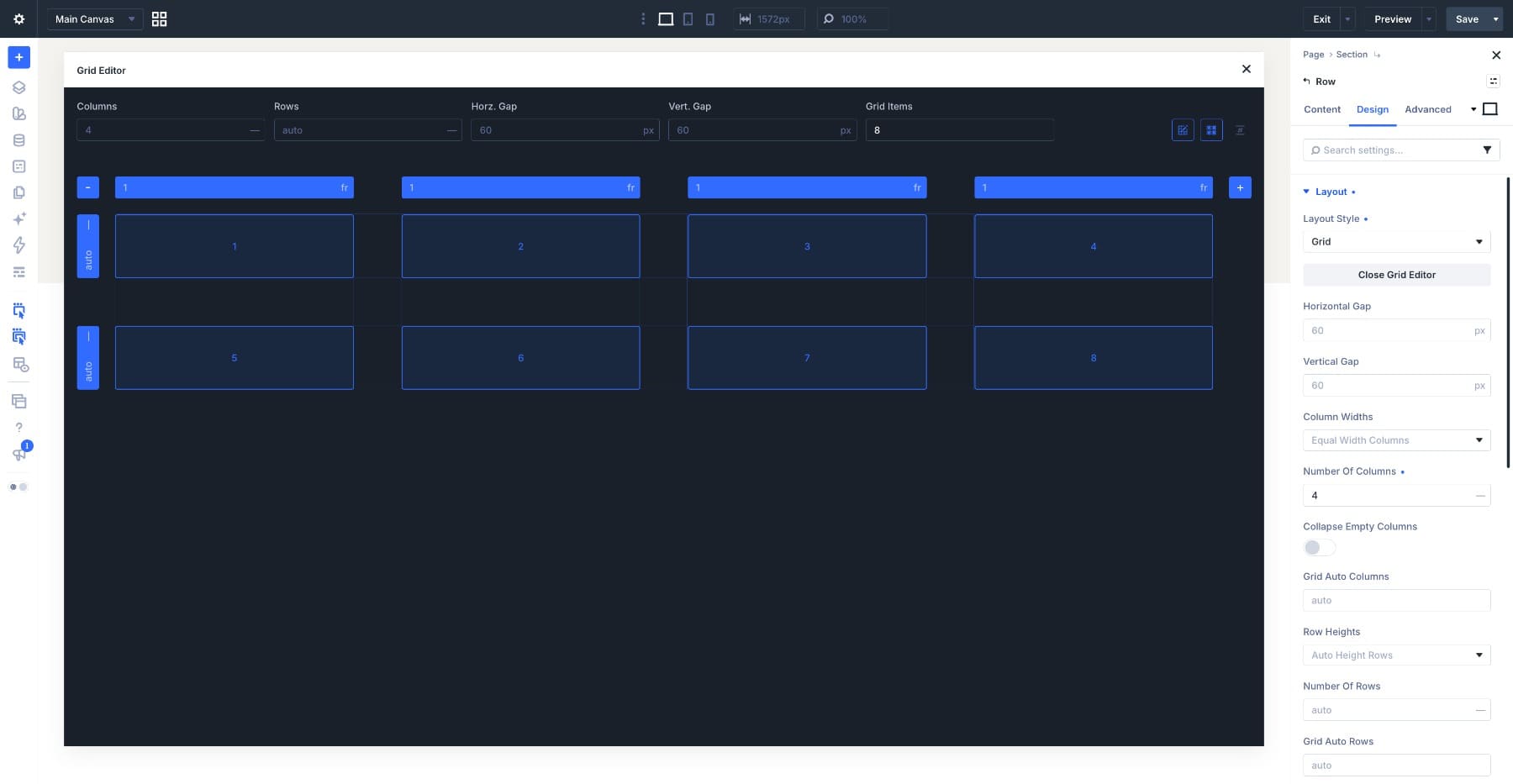
Grid Offset Rules change the placement of selected items. We can give a featured post more room, position a promotional card, or repeat a span across the grid while other items continue filling the available space automatically.
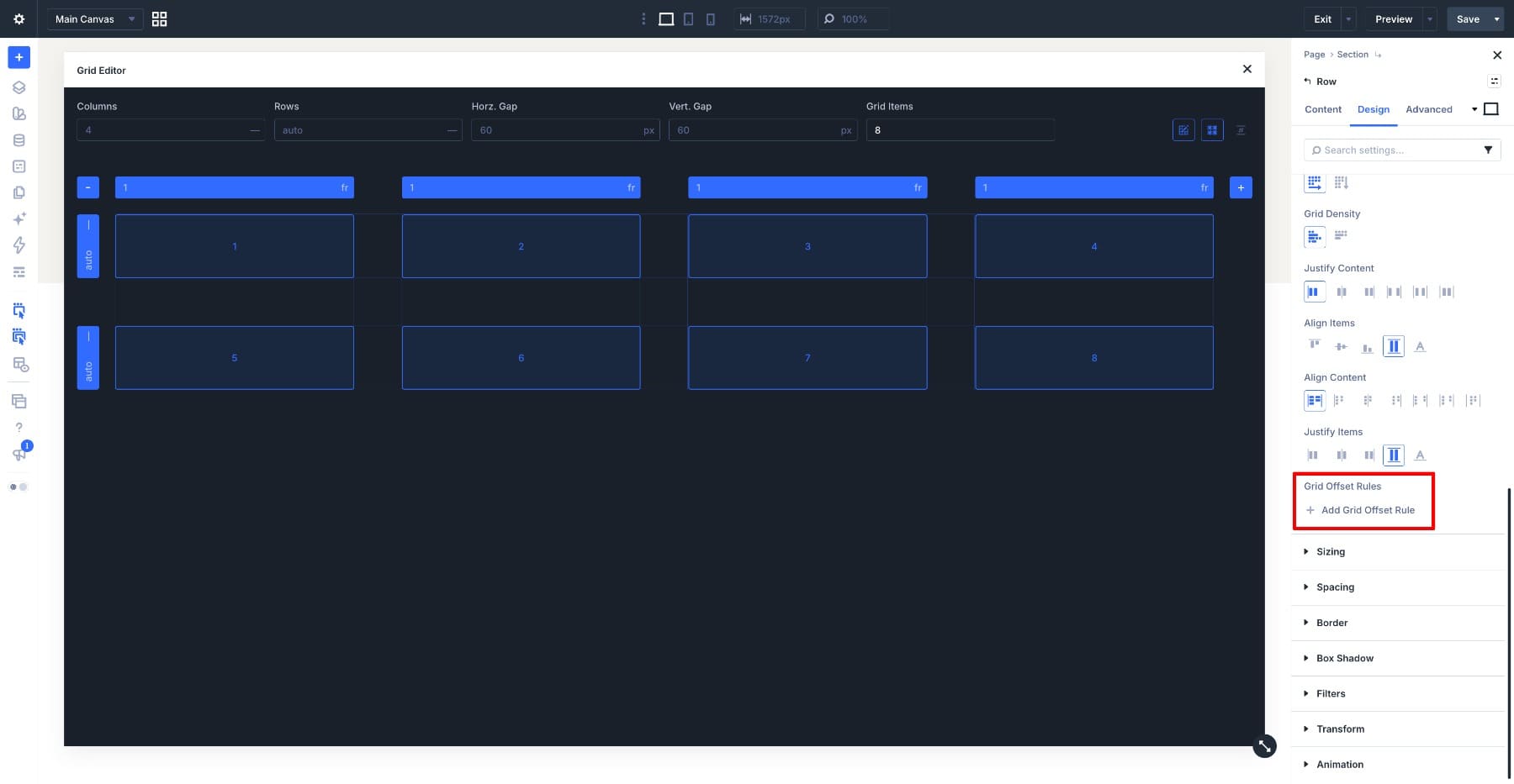
To add a rule, open the grid container’s Design → Layout settings and scroll to Grid Offset Rules.
What A Rule Is Made Of
Each rule has a target and one or more placement values.
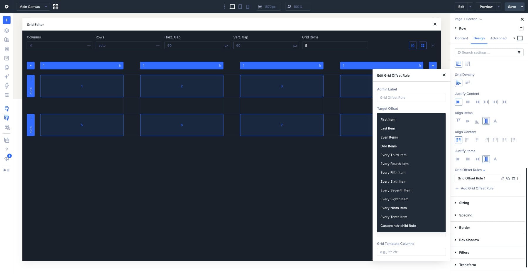
The Target Offset dropdown determines which items the rule affects. Options include First Item, Last Item, Even Items, Odd Items, and repeating targets from Every Third Item through Every Tenth Item. For a different position or pattern, choose Custom nth-child Rule.
For example, First Item affects only the first item. Every Fourth Item affects items 4, 8, 12, and so on. Even Items targets items 2, 4, 6, and every second item after that.
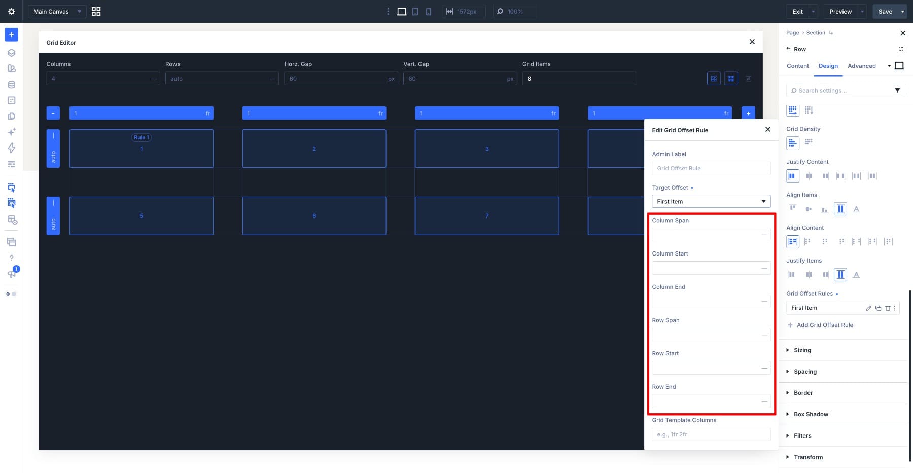
Next, enter the values that control placement:
- Column Start and Row Start specify the grid line where an item begins.
- Column Span and Row Span specify how many columns or rows it covers.
- Column End and Row End specify the grid line where it ends.
A start or end value refers to a grid line, while a span counts the tracks between lines. For example, starting at column line 2 with a Column Span of 2 covers the second and third columns.
We’ll mainly use starts and spans in the examples below.
Even a complex pattern comes back to two questions: which items does the rule target, and how does it change their placement?
Rules Live On The Container
Grid Offset Rules belong to the Section, Row, Column, or Group that defines the grid. They target child items within that container, keeping the placement pattern separate from each item’s content.
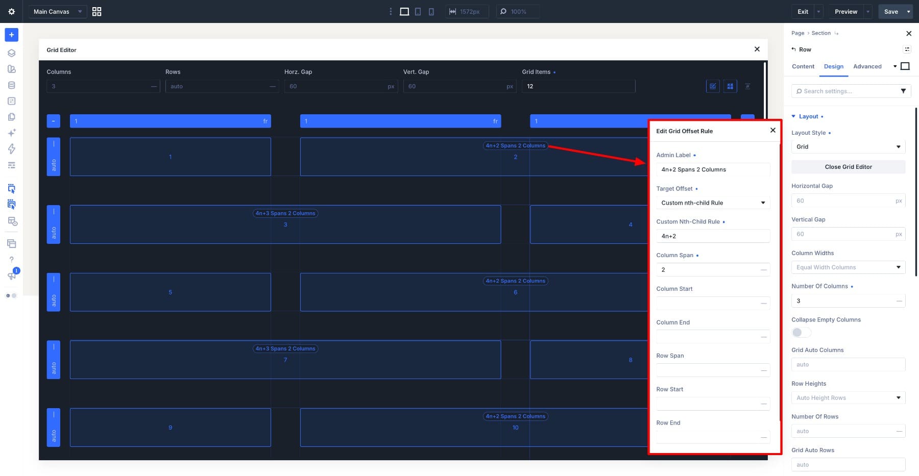
In the example below, we increase Grid Items from 8 to 11 to preview the pattern with more items. The existing 4n+2 and 4n+3 rules apply to the additional matching positions without needing another rule.
The Grid Items control lets us visualize a pattern with placeholder items. Increasing this count is not the same as adding content modules or changing how many results a Loop returns.
On the page, the container’s rules apply to the actual matching child items as content is added, duplicated, or looped.
Rules Count Items In Source Order
Offset targets count items in their source order, not by their apparent position on the finished grid. For manually added elements, Layers View helps us follow that sequence.
Consider a four-column grid where the first item spans two columns and two rows. With the remaining items using automatic placement and a single-cell span, items 2 through 5 fill the space beside it. Item 6 then begins the third row.
Although item 6 appears to be the first item in that row, it is still the sixth in the sequence. To target it individually, use Custom nth-child Rule with a value of 6.
Spanning or visually repositioning an item does not change its source position. However, inserting, removing, or reordering items in the structure can change which content occupies a targeted position.
Where The Grid Editor Fits
The settings panel gives us direct access to each rule’s target and values. As more rules interact, though, it becomes harder to picture the result from those values alone.
The Grid Editor brings the structure, items, and rule indicators into one view. We can compare the values in the settings panel with the space each item occupies on the canvas.
This makes it easier to identify which rule is widening an item, why another item has moved, or where a repeating pattern leaves an empty cell.
Working With Grid Offset Rules In The Grid Editor
We’ll start with placeholder grids so each change is easy to follow. The same placement principles apply to grids containing modules or items generated by a Loop.
Opening The Grid Editor
For a new Row, choose a Grid structure from the Insert Row window. Open the Row’s settings and click Open Grid Editor.
For an existing container, make sure its Layout Style is set to Grid, then use the Open Grid Editor button in its settings.
The editor opens over the Visual Builder and displays the grid’s structure and numbered items. Rule indicators appear on the affected items, so we can read the layout and its placement rules together.
To test a longer pattern, increase the preview’s item count. In the example below, we change the grid from three to five columns and increase Grid Items from four to twelve. The existing repeating rules continue applying to matching positions.
Changing the column count changes the grid structure. Changing the preview item count helps us see how that structure and its rules handle more content.
Creating Rules By Dragging
Resizing an item on the canvas creates the corresponding Grid Offset Rule on its container.
Hover over an item and drag a corner anchor across the cells it should cover. In the example below, dragging the first item’s bottom-right corner one column to the right and one row down makes it span two columns and two rows.
Open the generated rule to see the target and its Column Span and Row Span values.
We can resize other items in the same way. Here, we stretch item 8 across a four-column row. The resulting rule targets position 8 with a Column Span of 4.
Checking the generated values helps connect the visual action to the rule. We can then refine that rule from the settings panel.
Creating Rules From The Rule List
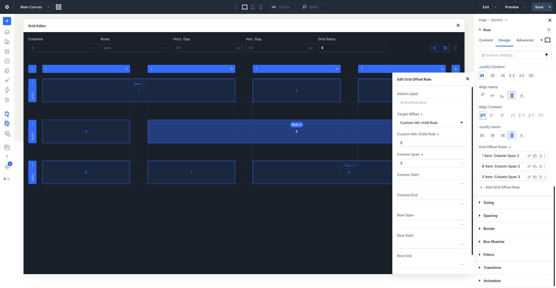
We can also create a rule directly from the container’s Design → Layout → Grid Offset Rules settings. To match the example below, click Add Grid Offset Rule and enter:
- Target Offset: Custom nth-child Rule
- Custom Nth-Child Rule:
5 - Column Span:
3
This targets only item 5 and makes it span three columns. The other rules already present in this example give items 1 and 8 their wider spans.
For a repeating variation, choose Every Fifth Item instead and set Column Span to 2. That rule targets items 5, 10, 15, and so on. Increase the preview’s Grid Items count if you want to see more than one match.
A spanning item may move to the next row when it cannot fit in the remaining cells. With normal row-based placement, this can leave an empty cell behind. Dense placement can allow later items to fill such gaps, so the result also depends on the container’s flow settings.
Reading Rules On The Canvas
The canvas labels help us identify which rules affect each item. In the example below:
4n+2targets items 2, 6, 10, and so on.4n+3targets items 3, 7, 11, and so on.
Read these as “start at the second or third item, then repeat every four items.” Only matching positions within the current preview count will appear.
Match the rule in the list with its indicators on the canvas, then check the numbered items it affects. This is especially useful when spans make the visual arrangement differ from the item sequence.
Editing Rules
Open an existing rule from the Grid Offset Rules list while keeping the canvas visible.
In this gallery, a 9n+3 rule gives item 3 a Column Span of 2. That target also matches items 12, 21, and subsequent positions if the grid contains enough items.
Change Column Span to 1 and set Row Span to 2. Item 3 changes from a wide placement to one that occupies two rows, and the surrounding items adjust as the values change.
Use an Admin Label to make a rule easier to recognize later. Names such as “Feature Card Span” or “Wide Every Fifth” are more useful than a generic label when several rules are active.
Deleting a rule removes its placement instructions. The affected items return to automatic placement where no other rule or setting controls their position or span.
Multiple rules can affect the same item. For example, one can set its Column Span while another sets its Row Start. If overlapping rules assign different values to the same property, they compete. Keep those overlaps intentional and check the result on the canvas.
Rules On Tablet And Phone
A grid can use a different column count at each breakpoint. In this gallery, desktop uses four columns, tablet uses three, and phone uses one.
The rules still target the same item positions, but their placement values may need responsive overrides. Switch to the breakpoint you want to adjust, then open the Grid Editor to inspect the layout.
In this example, the existing spans still work within the three-column tablet grid. We can keep them, while checking that the content remains readable and the spacing still suits the smaller screen.
The phone layout needs more adjustment. An inherited two-column span does not become a single-column span simply because the container now has one column. It can introduce an extra grid track and disrupt the intended stack.
For the item shown here, set Column Span and Row Span to 1 at the phone breakpoint. This gives it a single-cell placement in the one-column layout.
Enter explicit phone values where needed. Clearing a responsive value can restore an inherited value from a larger breakpoint rather than remove the span.
If other rules specify start or end lines, review those too. A single-column layout should not retain instructions that place an item in a second or third column.
Finally, check the layout with its actual content at each breakpoint. Placeholder items make the placement pattern easier to read, while the page preview shows how images, text, and spacing fit within it.
Try The CSS Grid Editor In Divi 5 Today
The Grid Editor in Divi 5 connects placement values to their visible effect. We can see which items a rule targets, how their spans change the layout, and whether a repeating pattern still works with more content or fewer columns.
Start with the item’s number, identify the rule affecting it, and adjust the relevant start or span value. That gives us a practical way to understand an existing grid and refine it without keeping the entire layout mapped out in our heads.
For more examples, explore how we built an asymmetric photo gallery with the Grid Editor and how repeating targets work in Build Fancy Loops With Divi 5’s New CSS Grid Editor.
The post How To Read And Edit Grid Offset Rules Visually In Divi 5 appeared first on Elegant Themes Blog.