Marketing pages from Stripe, Linear, and Notion often use asymmetry to create movement, establish hierarchy, and give important content more visual weight. The layout may feel spontaneous, but the underlying structure is usually precise.
With Divi 5, that structure can begin with the CSS Grid system. The new Grid Editor adds a visual canvas where you can adjust tracks, gaps, placement, and spans while viewing the result directly in the Visual Builder.
In this post, we will use those tools to build four asymmetrical layouts: the Full-Left Banner, Z-Pattern Split, Weighted Corner, and Tetromino. Each design begins with a clear grid and introduces imbalance only where it supports the composition.
How Asymmetry Works As A Design Choice
Symmetrical layouts distribute visual weight evenly. They can feel stable, familiar, and easy to scan, which makes them a strong choice for many interfaces. Asymmetrical layouts use a different kind of balance. Instead of mirroring elements, they balance objects with different sizes, colors, positions, or amounts of negative space.
Consider a page where the Heading is centered, the images match on both sides, and the supporting content follows an even rhythm. The structure feels orderly because the visual weight remains close to the center.
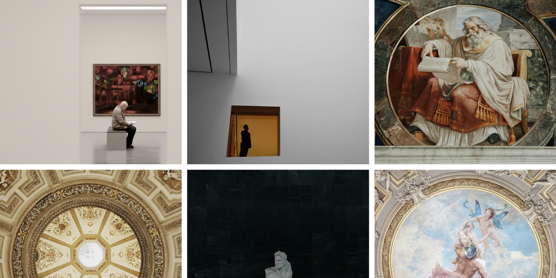
Now move a large image to the left, place a dark color block on one side, or leave more open space on the right. The composition no longer mirrors itself, but it can still feel balanced. The difference in visual weight creates tension, and that tension can direct the eye from one area to the next.
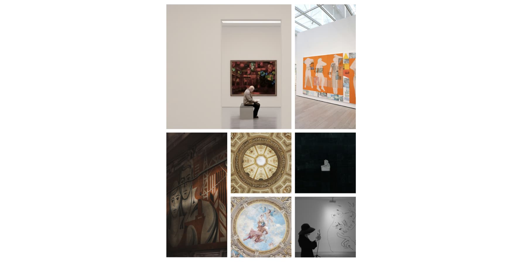
Visual weight does not come from size alone. A small black block can attract more attention than a large gray image when its contrast is stronger. Typography, color, texture, placement, and negative space can all influence which element visitors notice first.
The goal is not to make one side feel unfinished. A successful asymmetrical composition still has equilibrium, but the balancing elements are not identical. A large photograph might be balanced by a compact area of bold typography. A dark block on one side might be balanced by several lighter elements and more open space on the other. Alignment and repetition keep those different pieces connected.
Content order should guide the visual decision. Decide what visitors need to notice first, what should explain it, and where the action belongs. Then use scale, contrast, and placement to support that sequence. When the visual hierarchy and message hierarchy agree, the imbalance feels intentional.
That first point of attention matters. Research summarized by CXL found that it took viewers about 2.6 seconds for their eyes to settle on a key area of a web page. Asymmetry is not automatically more effective than symmetry, but it gives you another way to establish a focal point and create a deliberate reading path.
What Is CSS Grid?
CSS Grid is a two-dimensional layout system. It lets you organize content across rows and columns at the same time, making it especially useful for editorial compositions, galleries, card systems, and layouts with items that span multiple tracks.
Flexbox and Grid solve different layout problems. Flexbox is generally strongest when content needs to flow along one primary axis. Grid is designed for layouts where both horizontal and vertical relationships matter.
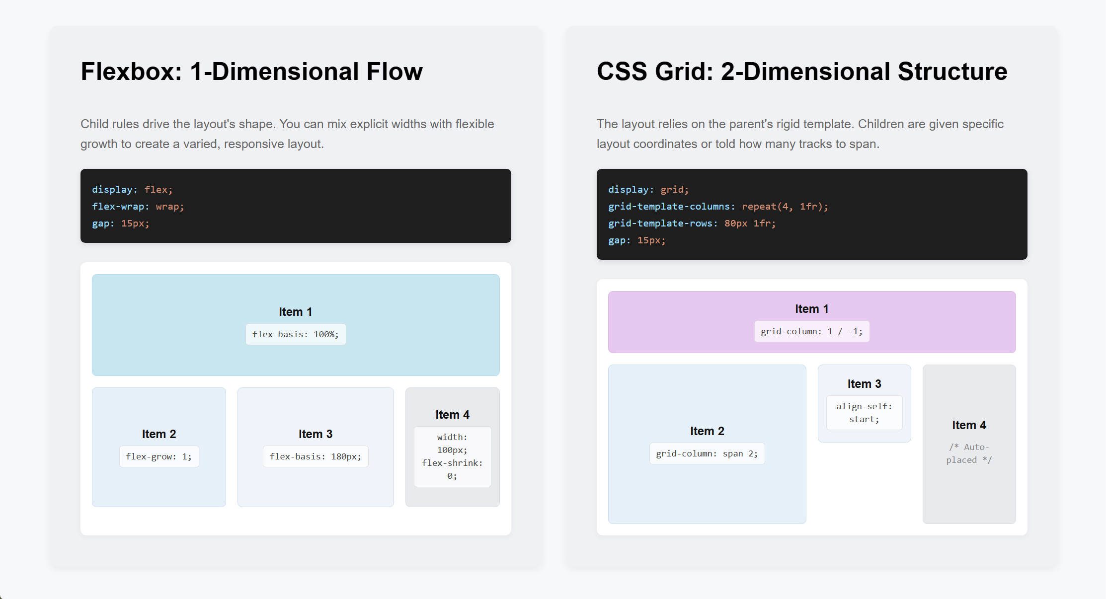
At the parent level, a Grid Container defines column and row tracks, gaps, alignment, and the general placement flow. Its direct children become Grid Items. Those items can follow the automatic flow or receive their own placement rules, such as a specific starting line or a span across several rows or columns.
The tracks do not have to be equal. You can combine flexible fr units, fixed values, percentages, and other supported CSS units to create wider and narrower areas. Rows can follow their content automatically or use a manual template when the design needs a more controlled rhythm. Gaps then create consistent separation without adding individual margins to every child.
That combination makes asymmetry easier to control. The parent grid provides a consistent framework, while selected Grid Items can break the repeated pattern without abandoning it. The result can feel uneven by design while remaining aligned underneath.
How Grid Works In Divi 5
Divi 5 brings CSS Grid controls into the Visual Builder. Open a supported Container, such as a Section, Row, Column, or Group, select the Design tab, and set Layout Style to Grid.
You can begin with one of Divi’s prebuilt Grid Templates or define the Column Tracks, Row Tracks, gaps, and alignment settings yourself. The four layouts in this tutorial can be built visually without writing custom CSS.
Grid Offset Rules give you more control over individual or repeating Grid Items. A rule can target the first item, last item, every fourth item, or a custom nth-child pattern, then change properties such as Column Start, Row Start, Column Span, or Row Span.
This gives each asymmetrical layout two levels of control: the overall Grid Container establishes the structure, and selected Grid Items create the deliberate imbalance.
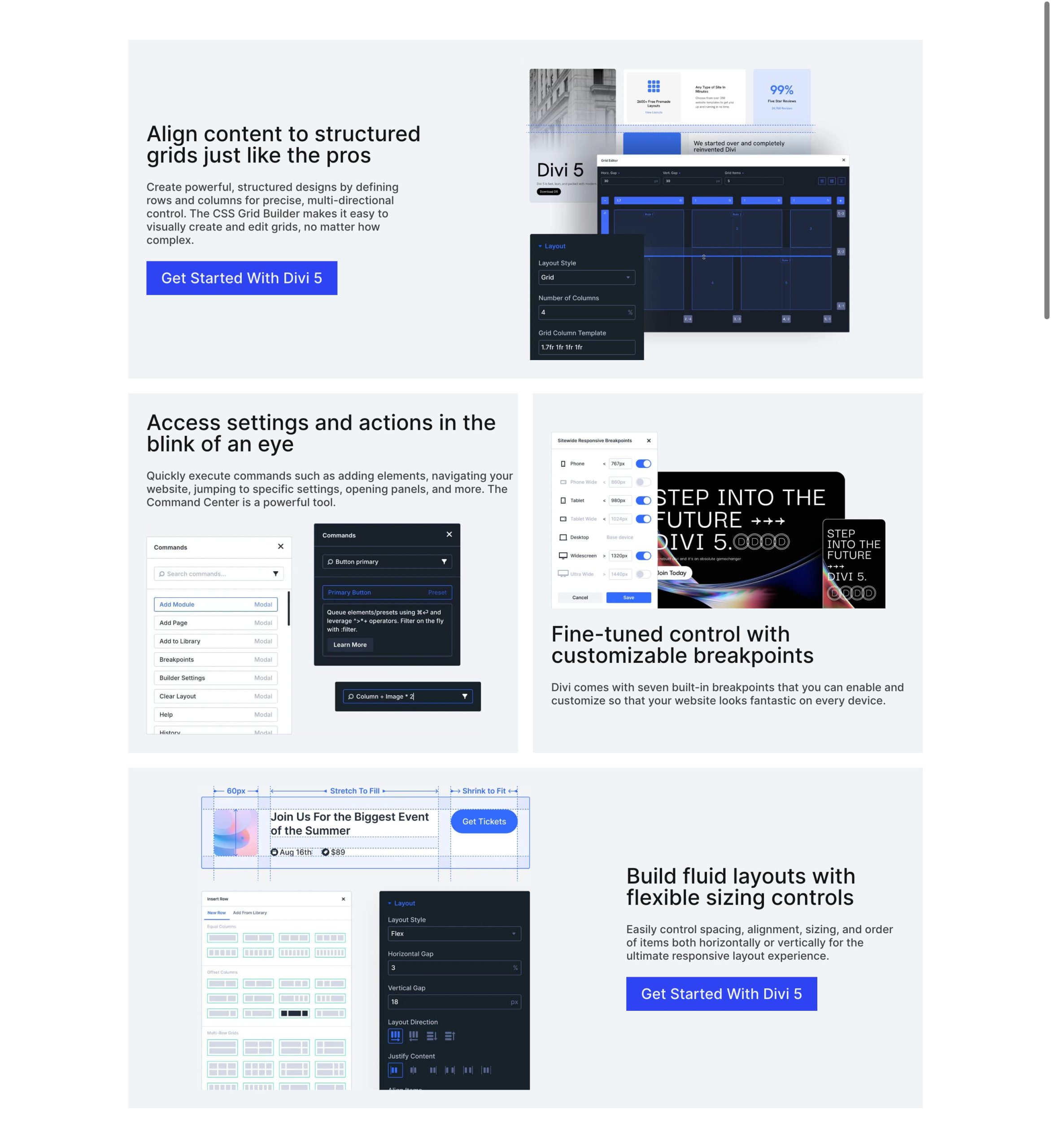
Build Grids Visually With The Grid Editor
Divi’s Grid settings already control columns, rows, gaps, alignment, and item placement. The Grid Editor adds a visual canvas for editing those same settings directly.
When you open the editor inside a Grid Container, a floating panel displays the tracks and Grid Items. You can drag track boundaries to change Column Widths or Row Heights, adjust horizontal and vertical gaps, reposition items, and use the corner handles to make an item span additional tracks.
The canvas and the settings remain synchronized. A visual adjustment updates the corresponding grid rule, while a value changed in the settings appears on the canvas. You can also add preview Grid Items to test a longer pattern before the Container holds that many actual child elements.
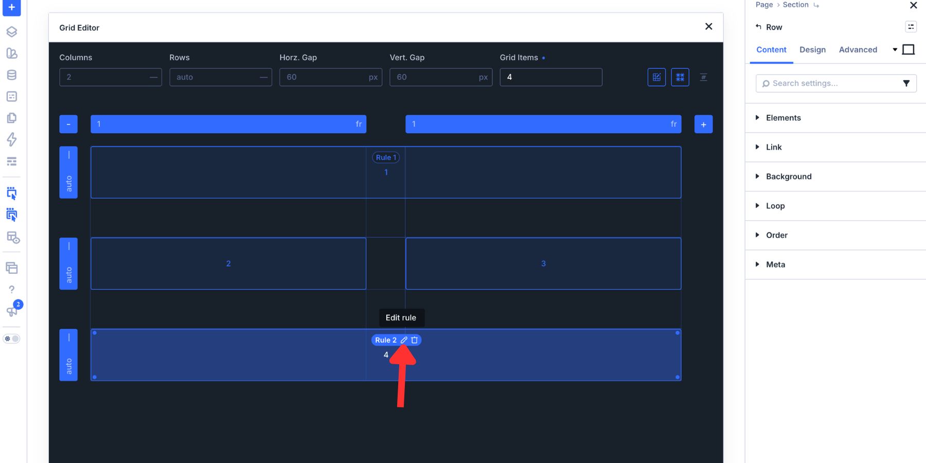
When a Grid Item has a placement rule, the editor displays a rule pill that identifies the affected item. Those pills are also editable. You can change a rule that targets one item into a repeating offset, such as Every Fourth Item, without recreating the span across each Column manually. The editor highlights the other items affected by that rule, making the repeated pattern easier to inspect.
That full-layout view is particularly helpful for asymmetrical work. You can see how a span or position change affects the entire composition instead of adjusting one Grid Item without the surrounding context.
How To Open The Grid Editor In Divi 5
There are two ways to begin: create a new Grid layout or open the editor for a Container that already holds content. When building from scratch, select the green plus icon and choose one of the available Grid Templates.
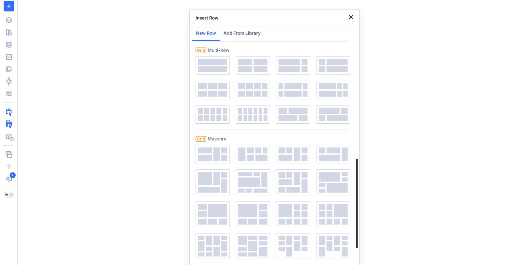
To define your own structure, select Build Custom Grid.
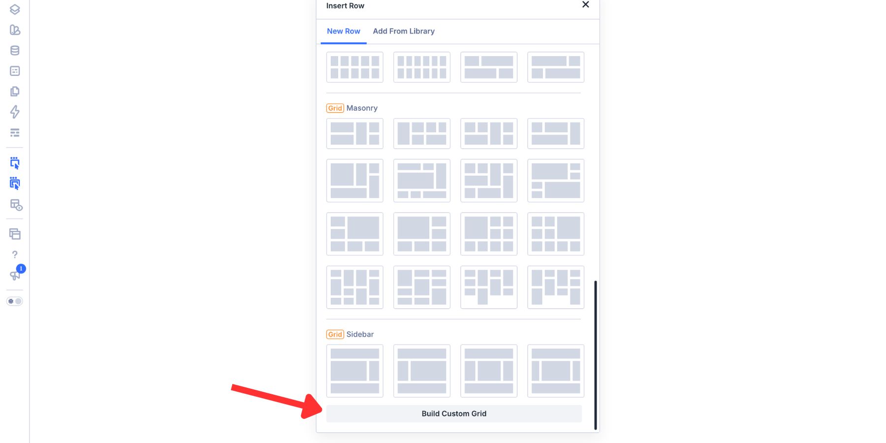
The Grid Editor can open before the new Container contains child elements. Add preview Grid Items to visualize the intended pattern, define its tracks, and then add the real Columns or other child elements in the builder.
This is useful when the structure is easier to plan than the content. You can decide that a layout needs two Columns, three Rows, and one tall anchor before choosing the Heading, images, or Buttons that will occupy those areas. The preview remains a planning aid until corresponding child elements are added.
For an existing Container, open its settings, select the Design tab, and set Layout Style to Grid.
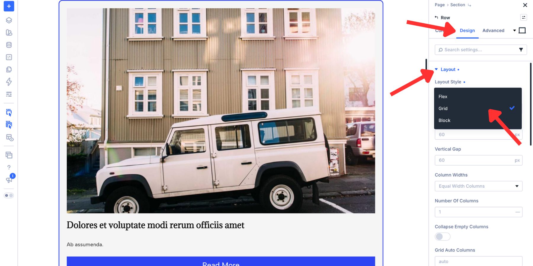
Then select Open Grid Editor.
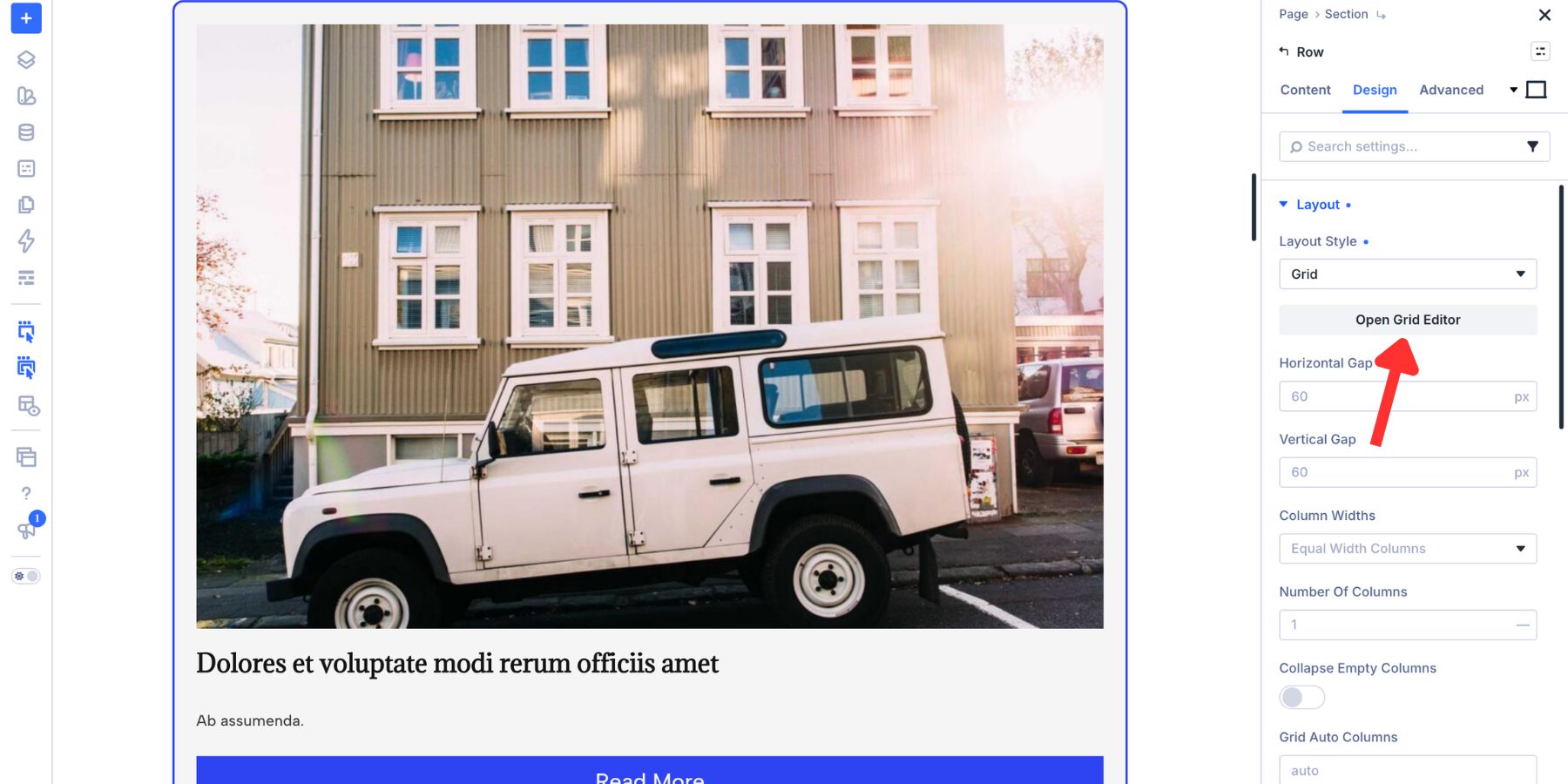
The panel appears beside the Visual Builder with the Container’s current child elements represented on the canvas. Changes to tracks, gaps, placement, and spans update the actual layout immediately.
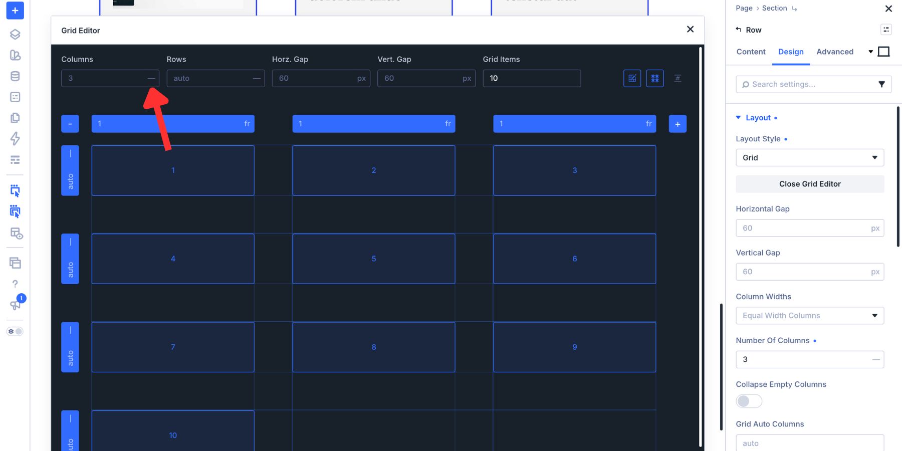
Both paths lead to the same visual interface. The important distinction is that preview Grid Items help you test a pattern, while the actual content still comes from the Columns, Modules, or other child elements inside the Grid Container.
Style The Grid In Divi 5
Once the structure is in place, use the horizontal and vertical gap controls to set the space between tracks independently. Wider gaps create more separation, while smaller gaps make the Grid Items feel like parts of one composition. The canvas updates while you work.
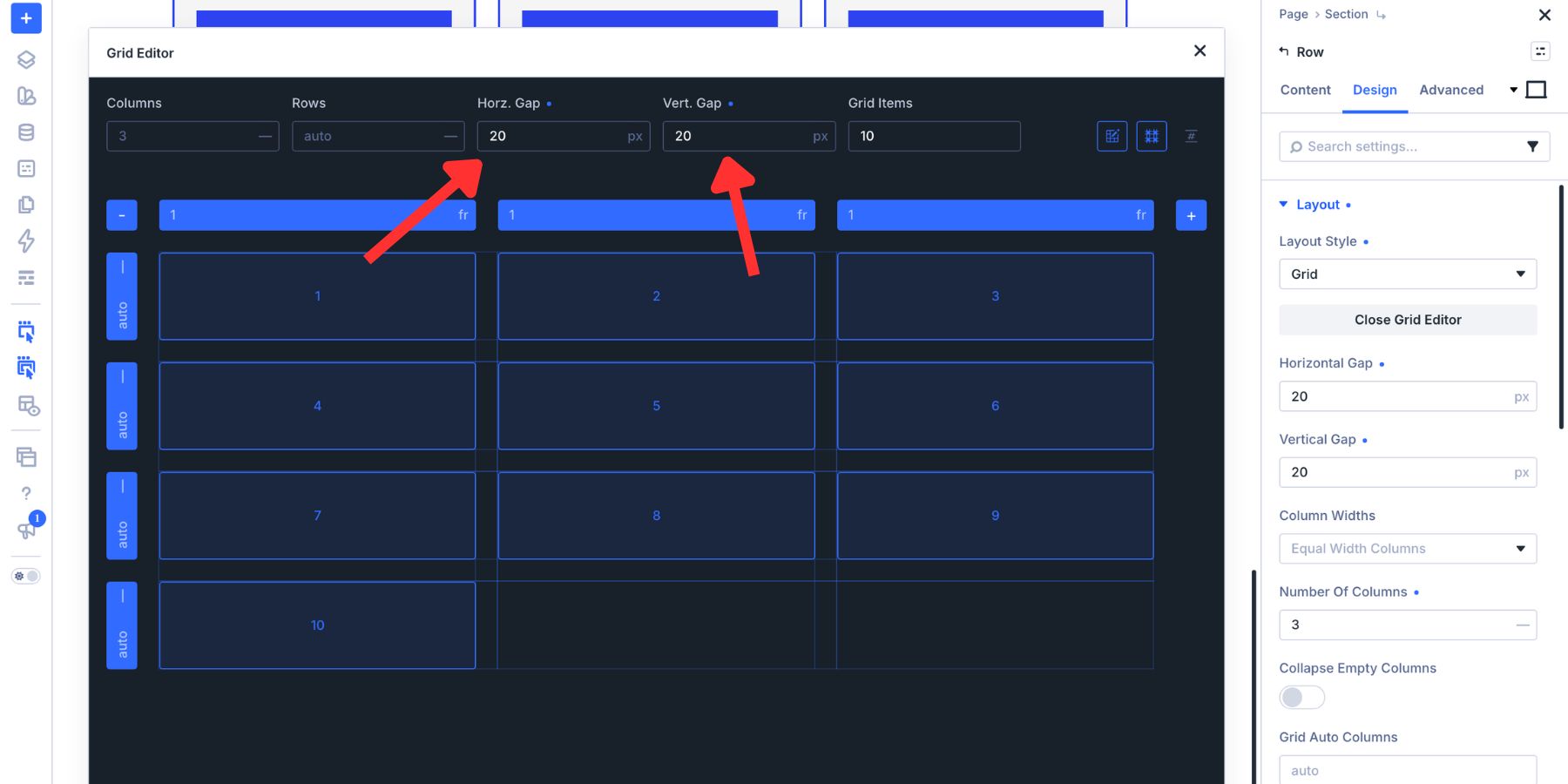
The Columns inside a Grid Row retain their own design controls. You can style their backgrounds, borders, spacing, and content individually. Pair those settings with Design Variables to reuse colors, typography, sizing, and spacing values across the composition.
We will combine those structural and visual controls in each of the four layouts below.
Four Asymmetrical Layouts To Build In Divi 5
Each example starts with a simple Grid Container, then introduces one dominant move: a tall item, a repeating diagonal, a weighted corner, or an interlocking span. Color and spacing reinforce that structure after the placement is established.
As you follow the steps, make sure the Row contains the required number of actual Columns. The extra Grid Items displayed in the Grid Editor are visualization aids and do not add content Containers to the layout.
The Full-Left Banner
The Full-Left Banner places one large visual on the left and stacks three supporting blocks on the right. The difference in scale creates a clear focal point, making the layout useful for hero sections, product introductions, and feature callouts.
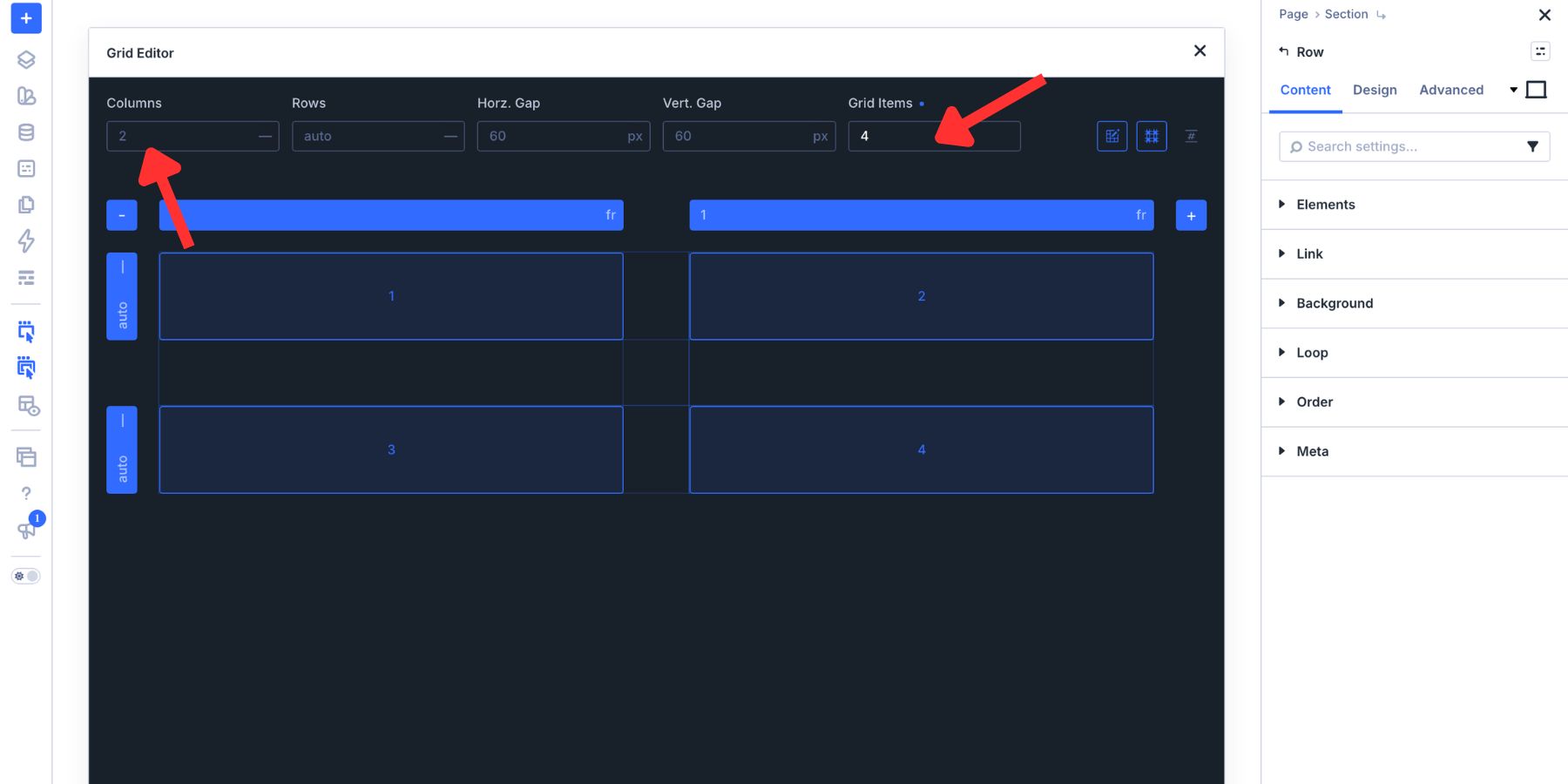
Open the Grid Editor and set the Grid to two Columns. Add four preview Grid Items so the canvas represents the four Columns the finished layout will use. This produces a two-column structure with four item placeholders, not four side-by-side tracks.
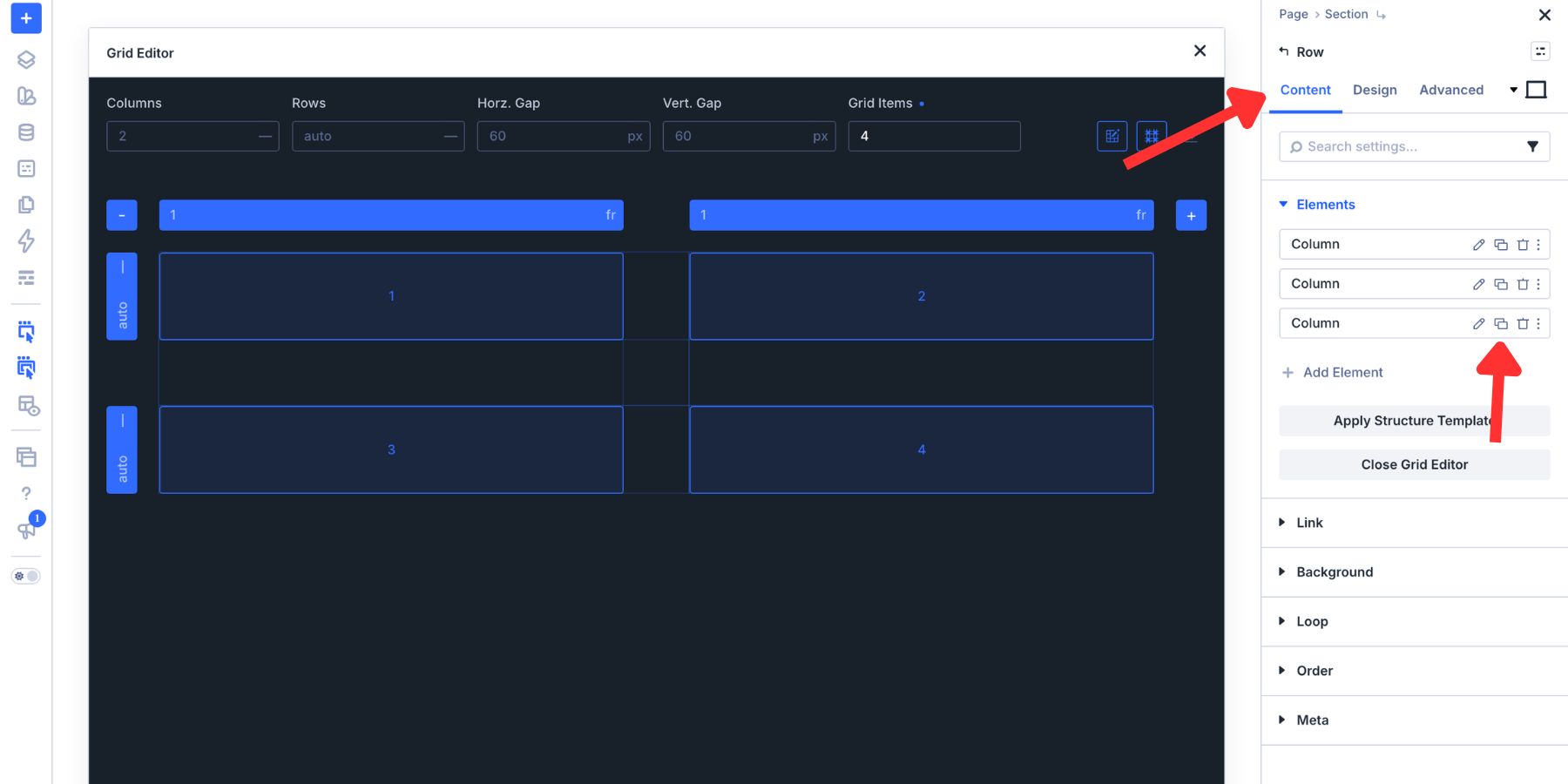
Preview Grid Items do not create actual Columns. If the Row currently contains only three Columns, open the Row’s Content tab and add a fourth. The new Column will become another Grid Item and follow the parent Grid settings.
Back in the Grid Editor, drag the bottom-left handle of the first item downward until that item spans three Rows. The other three items remain one track tall and stack in the right Column. This single span creates the layout’s dominant visual anchor.
Use the large left Column for an image or graphic. The three right Columns can hold a Heading, supporting copy, and a Call To Action. Keeping each content role in its own block makes the hierarchy easy to scan.
Style The Full-Left Banner
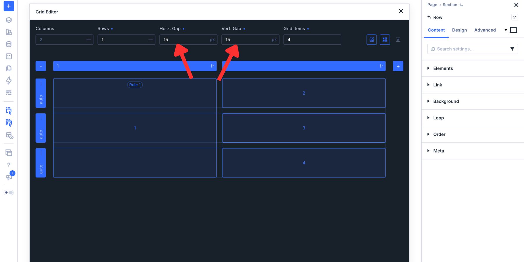
Start with the gaps. A 15px horizontal and vertical gap lets the Section background show through as a consistent divider between the four surfaces.
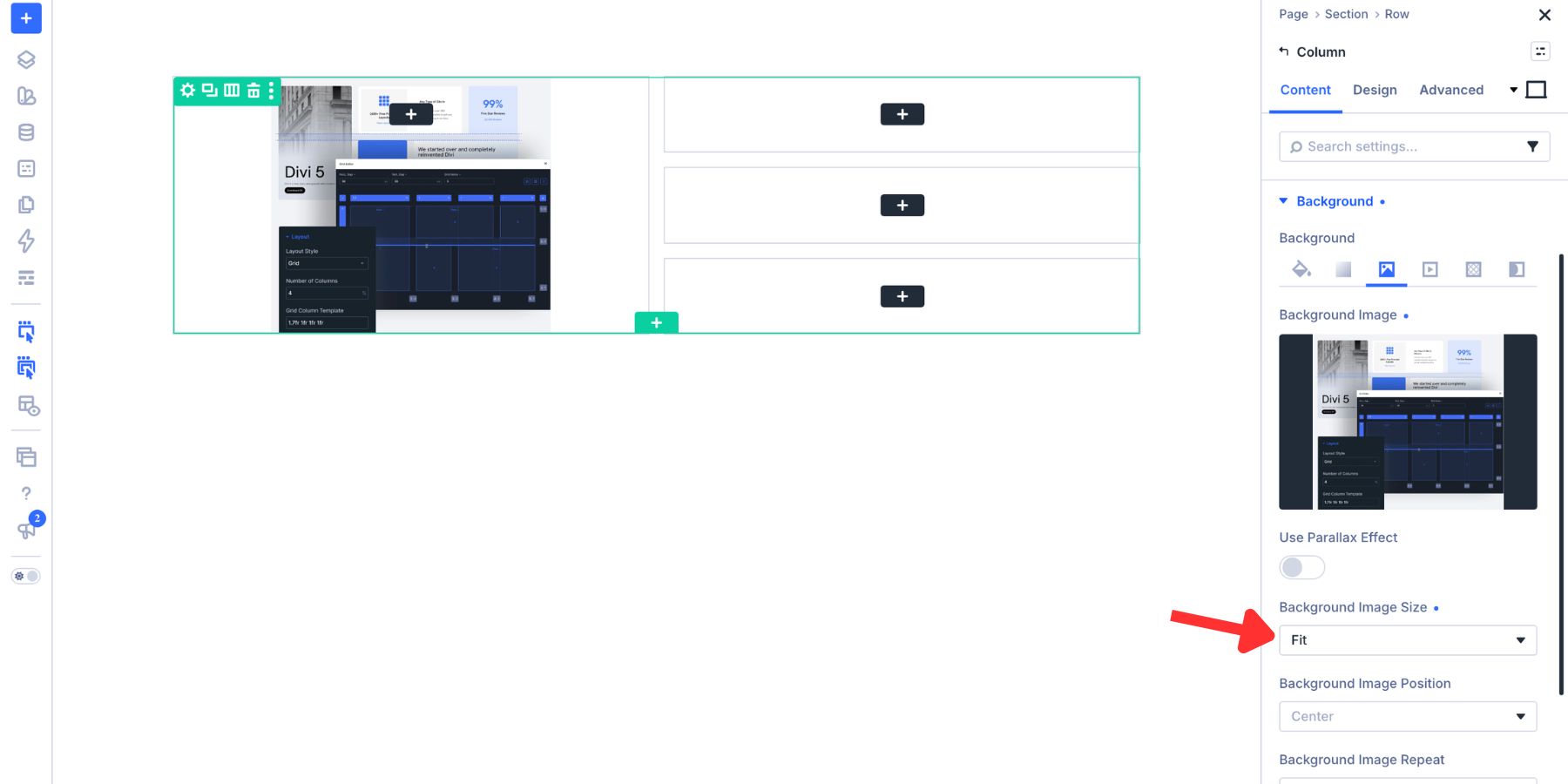
Set a background image on the large left Column. In this example, the background image uses Fit so the complete artwork remains visible within the available space.
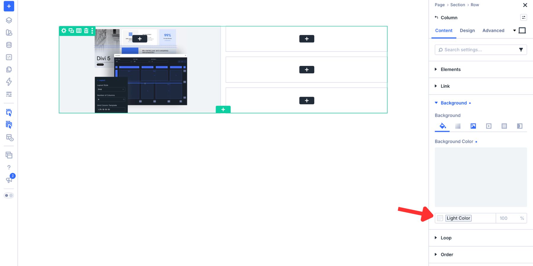
Next, give the Column a background color that matches the image. Referencing a Color Variable keeps that value connected to the broader design system and prevents an unintended edge from appearing around the fitted image.
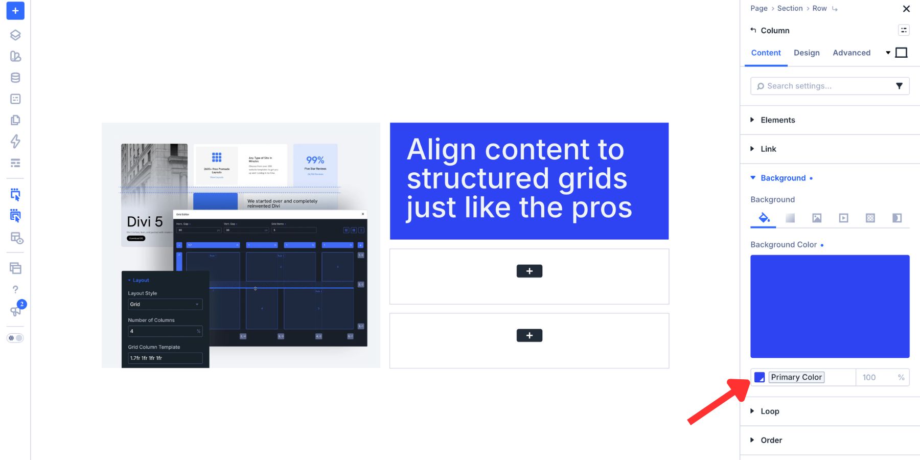
Use the first supporting Column for the Heading and apply the strongest brand color. The higher contrast gives the primary message enough weight to balance the large visual.
Place the supporting copy in the next Column and use a lighter tint of the brand color.
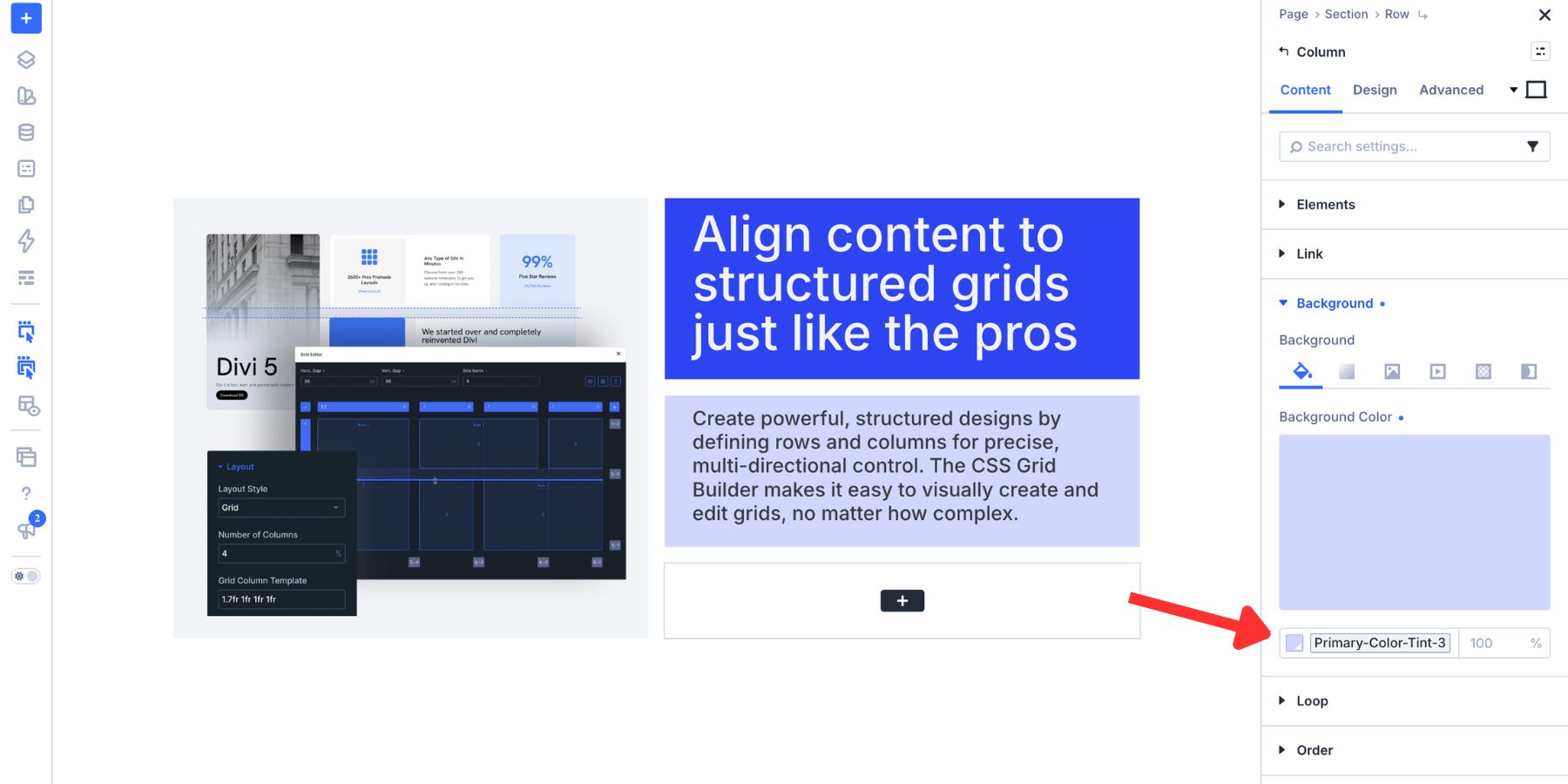
We created this tint with Divi 5’s Variable Generator, then saved it as a Color Variable for reuse.
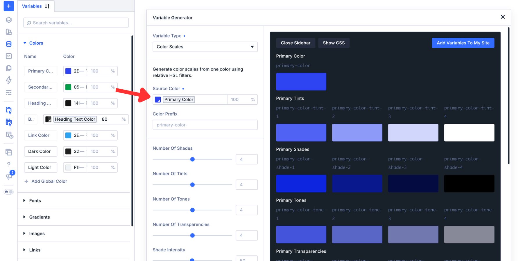
Use the final supporting Column for the Call To Action. Its background can use the lightest tint, while the Button returns to the main brand color. This creates a visible endpoint without competing with the Heading.
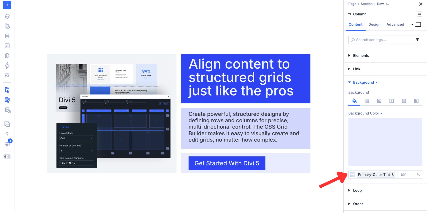
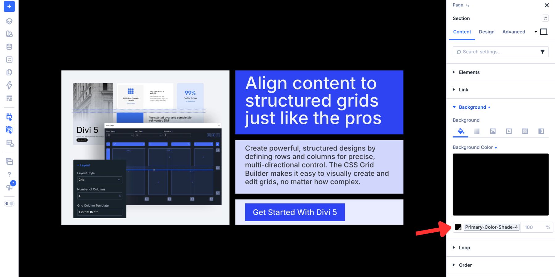
Finally, apply the darkest brand shade to the Section background. Because that color appears through the 15px gaps, it visually frames the four Columns and connects the asymmetrical pieces.
The Z-Pattern Split
The Full-Left Banner concentrates most of its weight on one side. The Z-Pattern Split distributes that weight across diagonal points. In a left-to-right reading context, the eye can move from the upper left toward the upper right, then continue through the lower portion of the layout.
This structure works well for feature lists, service collections, and other repeating content where selected cards need more emphasis without separating them from the wider set.
Open the Grid Editor and begin with two Columns and at least four Grid Items. Drag the bottom handle of the first item downward so it spans two Rows. That tall item establishes the upper-left anchor.
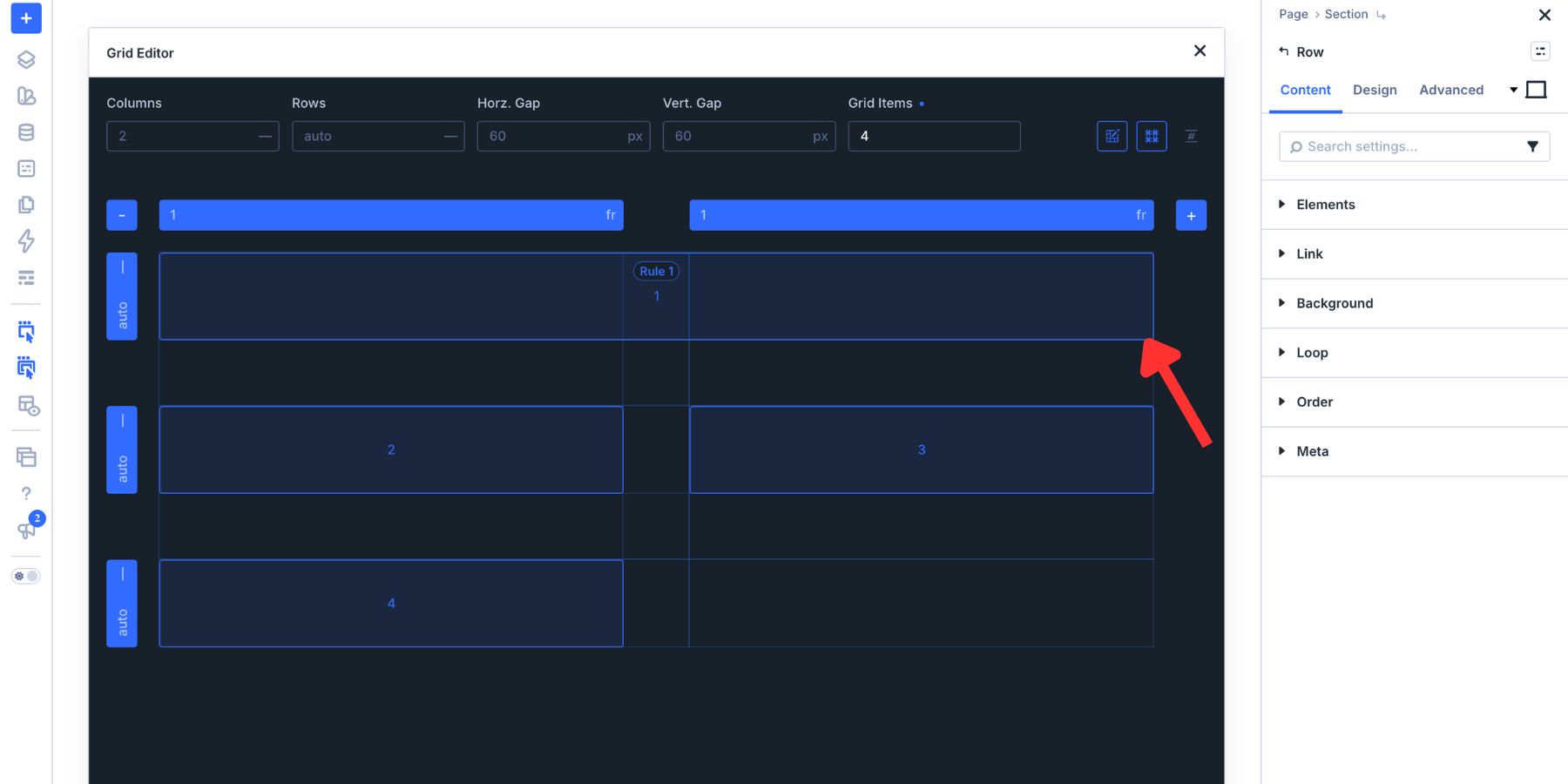
Give the fourth item the same two-row span. Then hover over its rule pill and select the edit control.
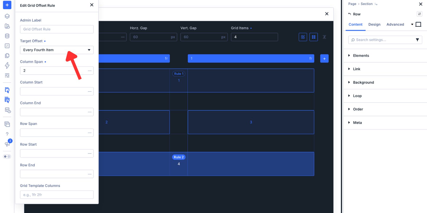
Change Target Offset to Every Fourth Item. The Row Span rule can now repeat on items 4, 8, 12, and onward, which preserves the pattern when more content is added.
Keep the source order meaningful when using repeated offsets. Grid placement can change where an item appears visually, but it should not turn an understandable content sequence into a confusing reading or keyboard order. Build the Columns in a logical sequence first, then use the offset pattern to add emphasis without changing the meaning.
Use Color To Reinforce The Diagonal
The repeating Row Span establishes the geometry. A consistent 20px horizontal and vertical gap gives each Grid Item enough separation for the pattern to remain visible.
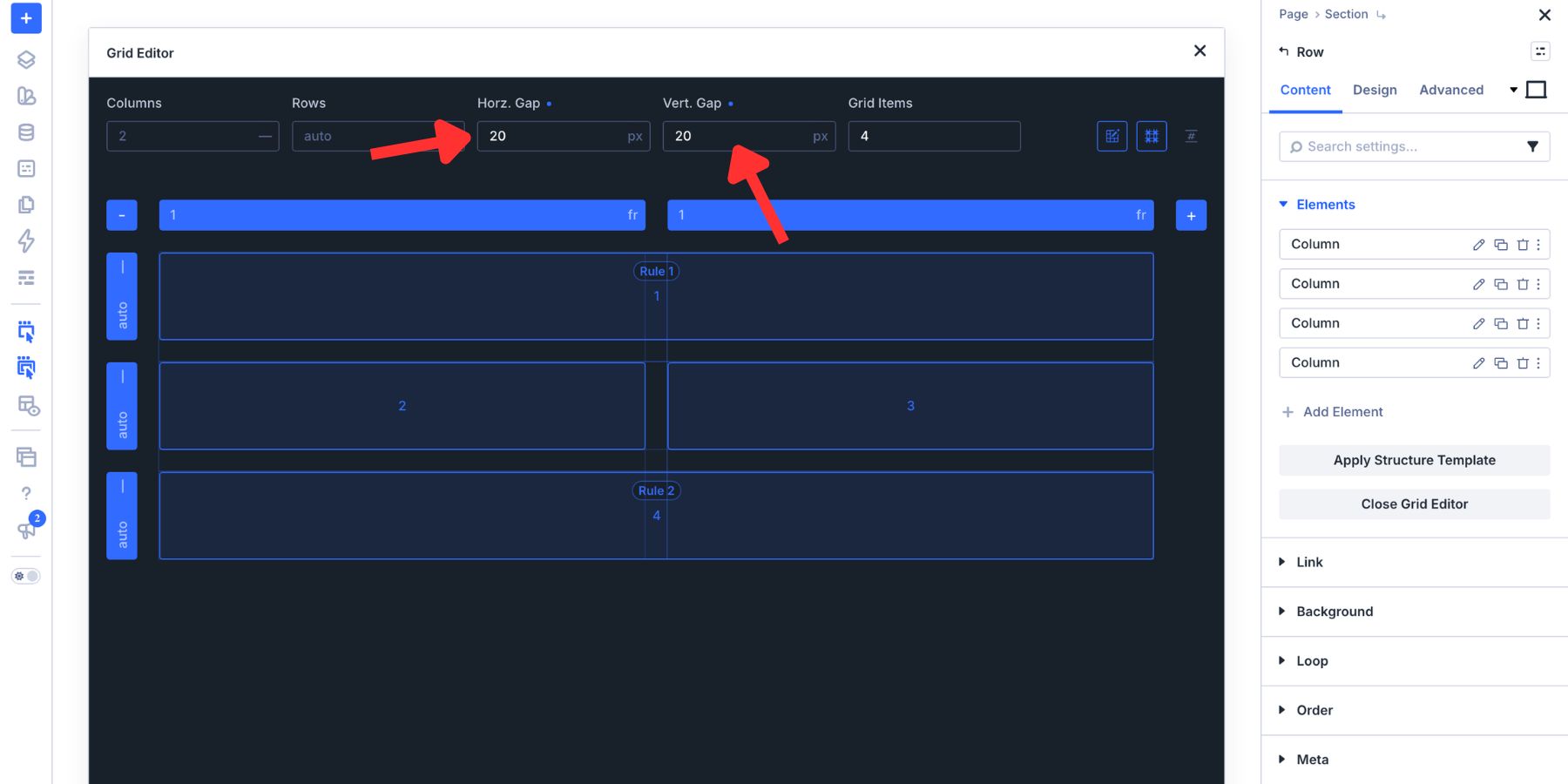
Keep the base treatment consistent across the repeating cards, then use one controlled accent on the tall items. That accent might be a border, Button, image treatment, or background color. Repeating it along the offset pattern strengthens the diagonal without giving every card a competing focal point.
The Weighted Corner
The Weighted Corner concentrates the strongest visual element in one corner. Smaller surrounding cards create a quiet field, while one larger item becomes the destination of the composition.
This layout works well for pricing sections, portfolio collections, dashboards, and feature grids where one offer, project, or action needs more emphasis than the rest.
Open the Grid Editor and set four Columns with nine Grid Items. The first eight items fill two complete Rows, while the ninth begins a third Row.
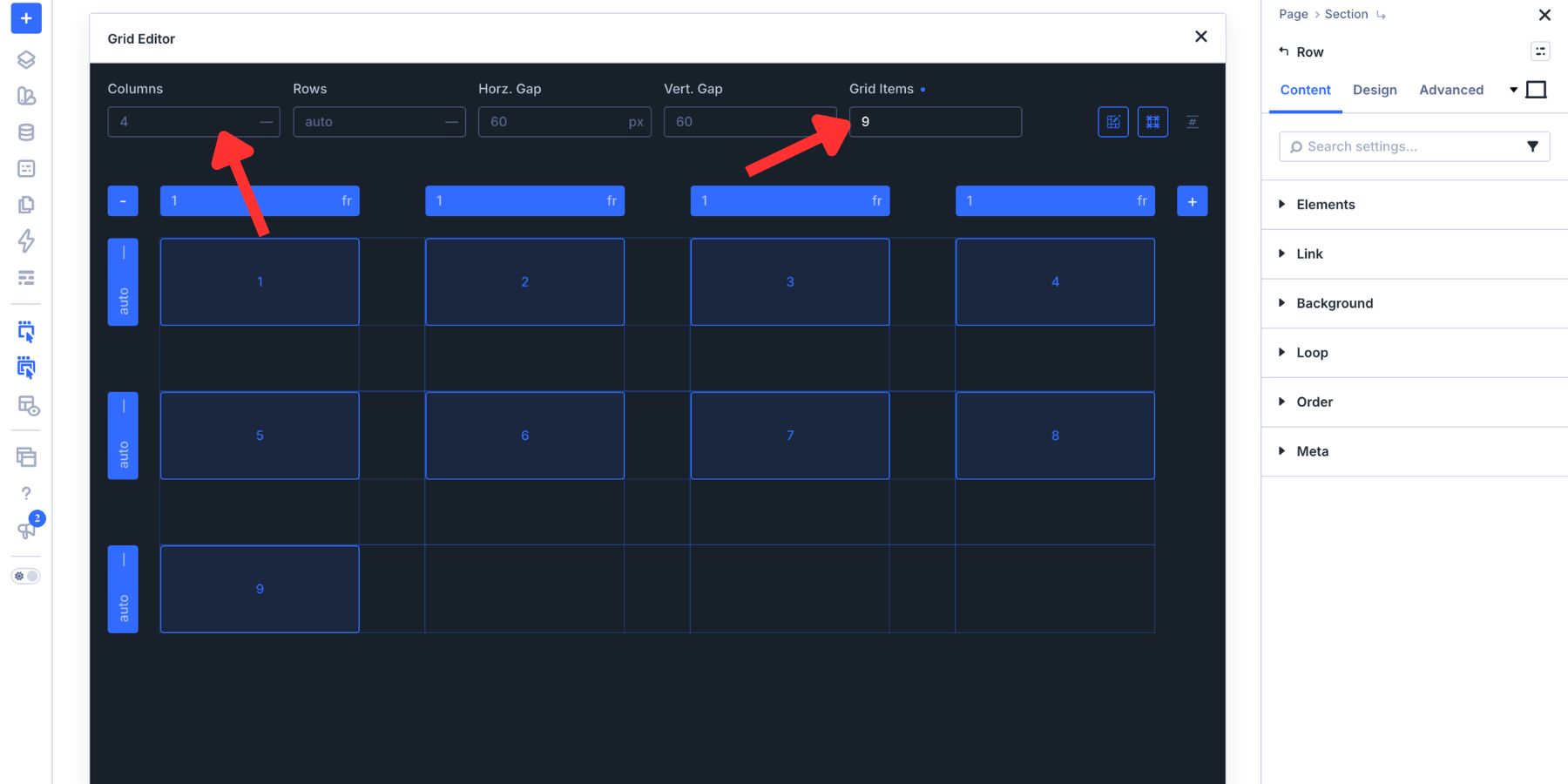
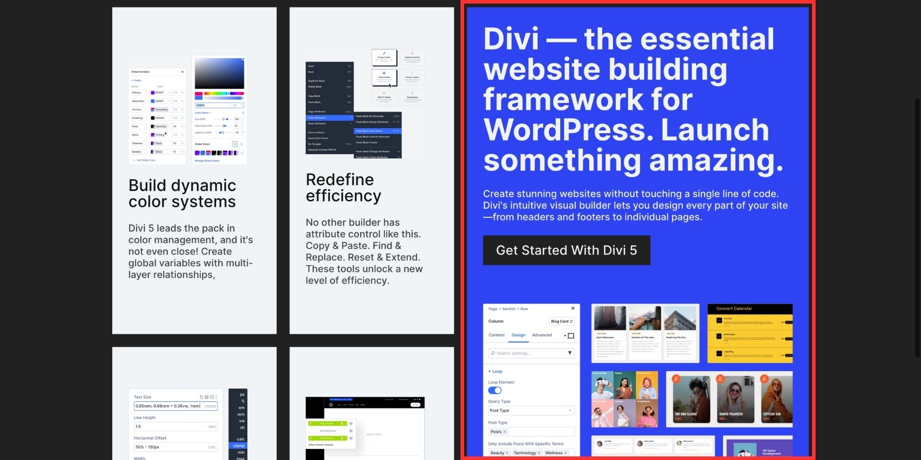
Drag the ninth item to the lower-right corner. Then drag its top-left handle upward and to the left until the item spans two Columns and two Rows. The browser places the other Grid Items around that explicit area, leaving the larger block anchored in the corner.
You can apply the same idea to any corner. A bottom-right anchor follows the natural completion point of many left-to-right interfaces, while a top-left anchor creates a more immediate focal point. Choose the position that matches the content order and the surrounding page.
Create Contrast With Color
The anchor needs enough contrast to remain dominant, but the smaller cards do not have to disappear. Give the surrounding items a consistent neutral treatment with lower-contrast backgrounds and restrained typography. Their repetition creates the field around the anchor.
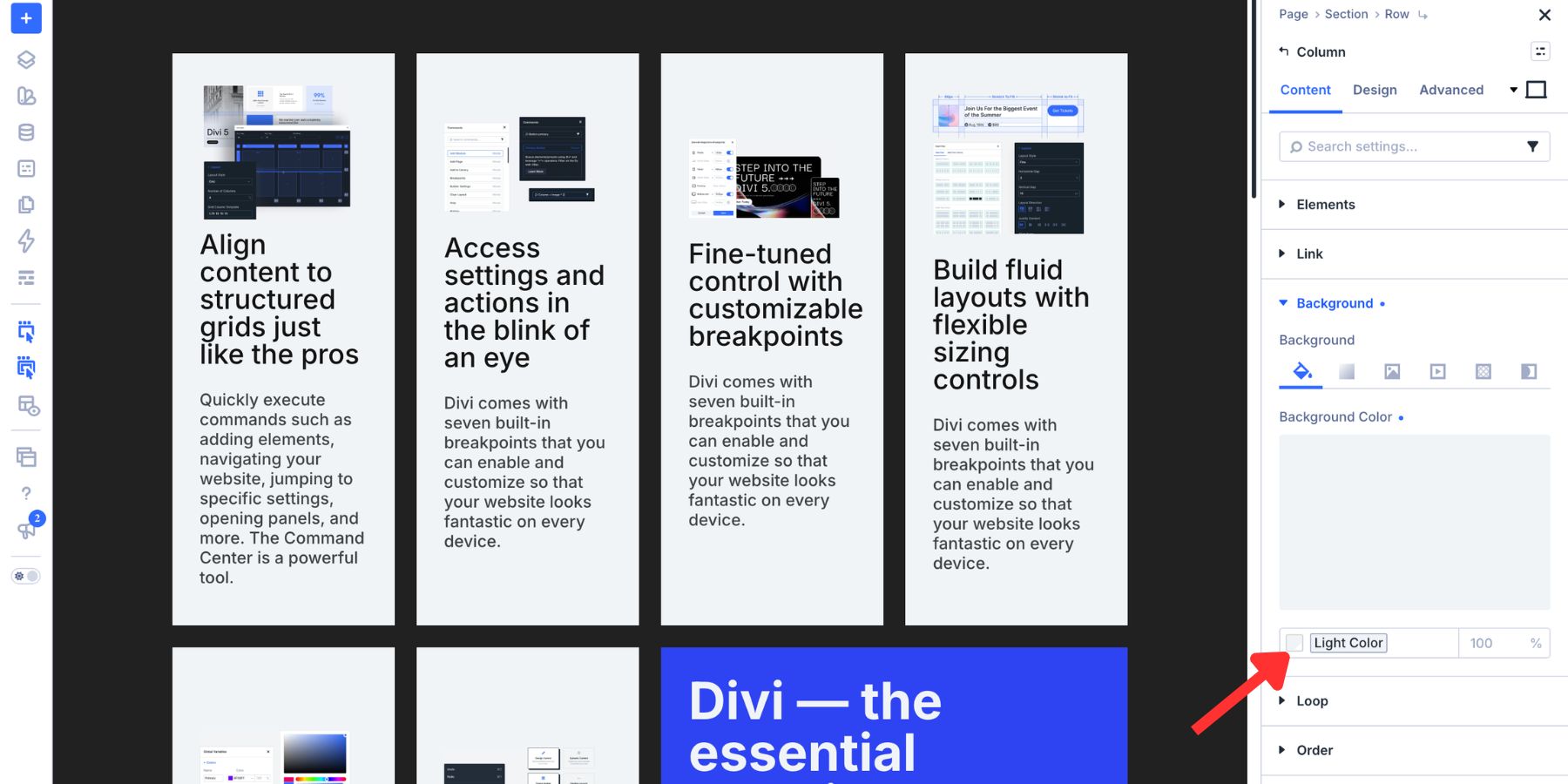
The corner item can then use a stronger background color, a prominent image, or a dark fill with light text. In this example, removing its Border Radius reinforces the Grid’s geometry and distinguishes the anchor from the softer surrounding cards.
The Tetromino
The Tetromino layout borrows its visual logic from geometric pieces that lock together edge to edge. Two smaller blocks occupy the top Row, while a third spans the full width below them. Shared color then makes selected areas read as one interlocking shape.
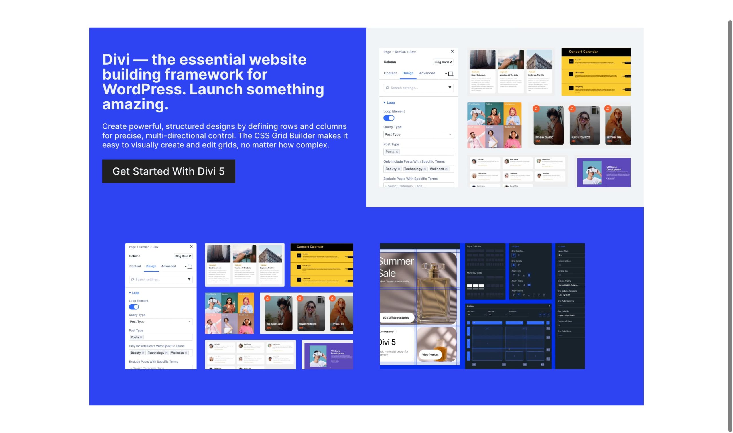
This structure suits content that builds toward a broader conclusion, such as two features leading into a summary, two statistics followed by context, or a pair of testimonials above one Call To Action.
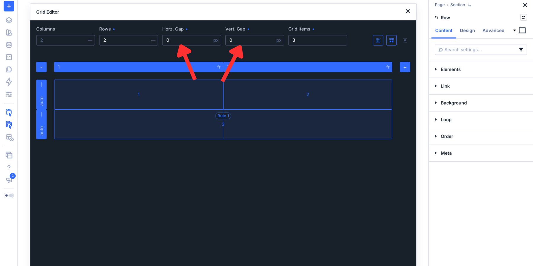
Open the Grid Editor and set two Columns, two Rows, and three Grid Items. The first two items fill the top Row, and the third begins in the lower-left cell.
Drag the right handle of the third item across the second Column. It now spans the full bottom Row and matches the combined width of the two items above.
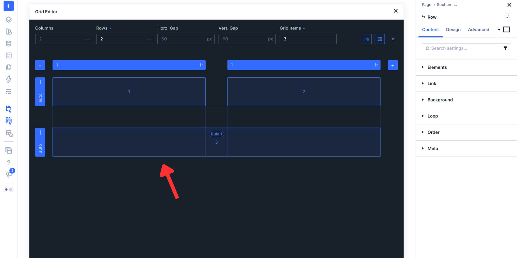
Set both gap values to 0. Removing the horizontal and vertical gaps turns the three separate Grid Items into one connected surface.
Design The Combined Shape
The zero-gap structure connects the blocks, but color determines how the final shape reads.
Give items 1 and 3 the same fill. Because the first item sits above the left side of the full-width item, the repeated color creates an L-shaped piece. The relationship comes from the styling rather than an additional structural change.
Use a contrasting fill for item 2. It occupies the upper-right cell and appears to lock into the shared shape formed by items 1 and 3. Reference Color Variables for both fills so the relationship stays connected to the site’s design system.
Keep the seam between the first and second items clear. Sharp corners reinforce the assembled geometry, so this example removes the Border Radius from all three items. You can still use internal Padding to keep the content comfortably separated from the edges.
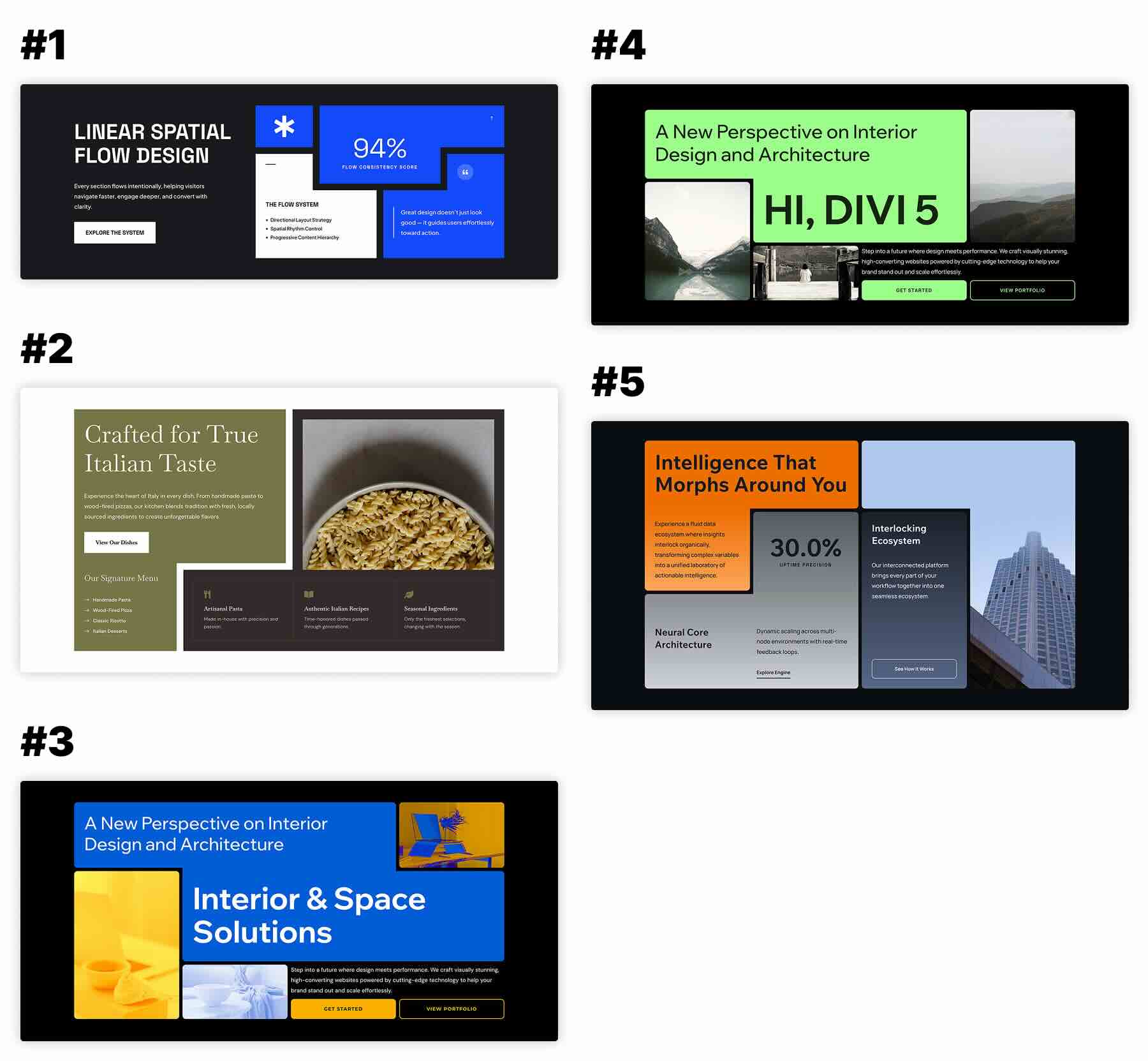
To explore the concept further, download our five free Tetris Designs for Divi 5. The pack includes ready-made landing page, feature, portfolio, and content sections based on similar interlocking structures.
Build Asymmetrical Layouts With A Clear Structure
Each layout in this tutorial began with a simple Grid. The distinctive result came from one deliberate change to a span, placement rule, or repeated offset pattern. The Grid Editor keeps those relationships visible while you work, making it easier to introduce tension without losing alignment.
Before publishing, review each design at tablet and phone breakpoints. A four-column desktop composition may need fewer Columns on smaller screens, while large Row or Column spans may need to be reduced or removed. Preserve the content hierarchy even when the geometry changes.
Also review the layout without relying on color alone. Contrast can strengthen the asymmetry, but the Heading structure, content order, labels, and Call To Action should still communicate the same hierarchy. If an offset moves a visual element far from its place in the source order, test the keyboard and screen-reader experience before keeping that arrangement.
Open a Row in Divi 5, set Layout Style to Grid, and use the Grid Editor to test one of these patterns. Start with the structure, establish the focal point, and let the surrounding elements support it.
The post How To Design Cool Asymmetrical Layouts With The New Grid Editor appeared first on Elegant Themes Blog.