Sometimes a reusable section needs more than a different heading or button label. One page might need a workshop schedule, while another needs a booking form. You still want the surrounding design to look consistent and update from one place.
Slots in Divi 5 provide an area for those different layouts inside the same Component. Keep the shared structure and design connected, then build the content each instance needs inside its Slot.
We’ll turn a workshop section into a Component, add a Slot to its right column, and use that area for a schedule in one instance and a booking form in another.
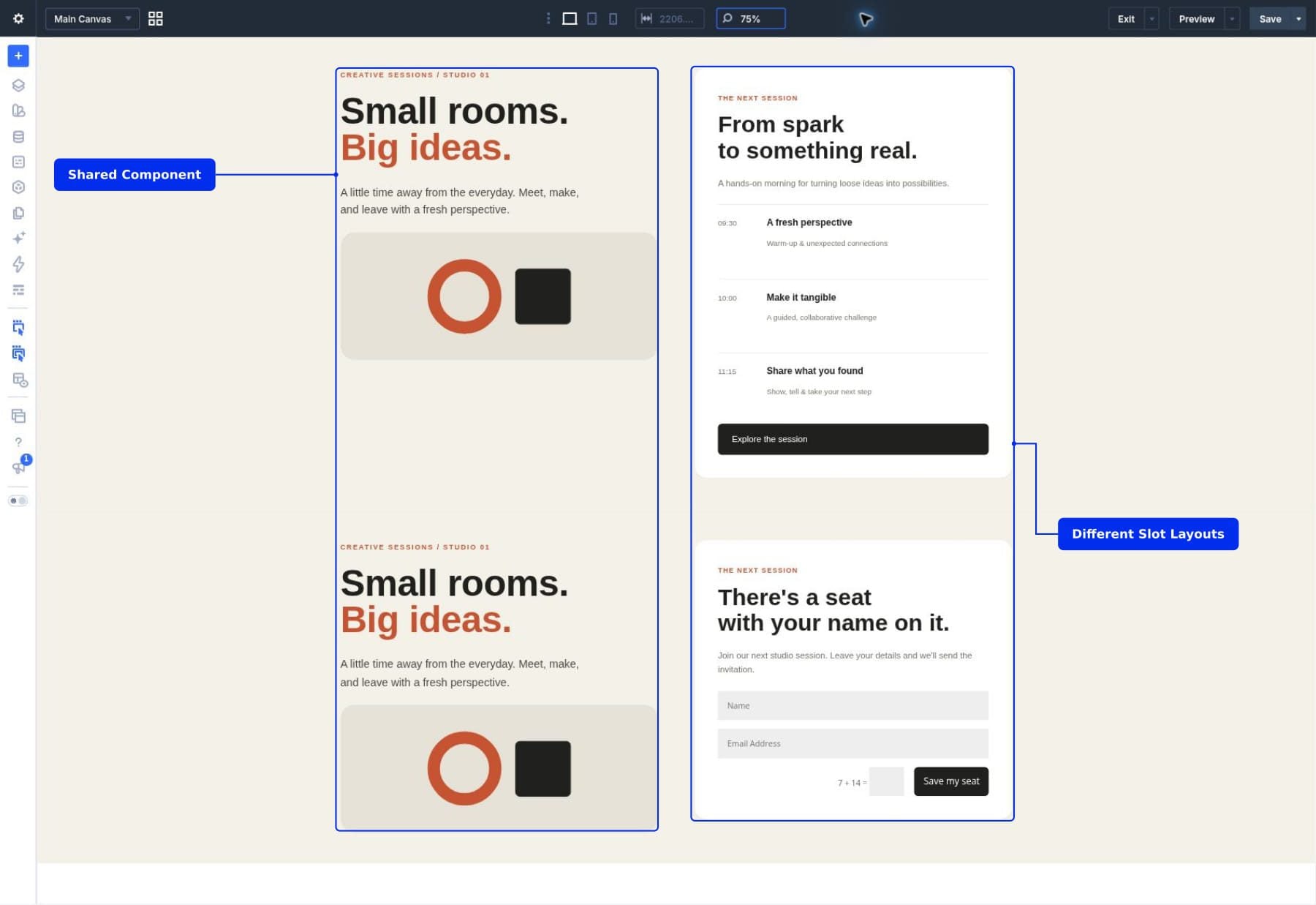
What Are Slots In Divi 5?
A Slot is a container inside a Component that holds content belonging to an individual instance. The Component defines where the Slot goes in the shared layout. Each instance defines the modules placed inside it.
An instance is a use of the Component on a page. Its source is the saved version that controls the shared structure and settings.
A Slot can contain a different collection of modules in each instance. You can use headings and Groups to build a schedule in one instance, then use a form or another arrangement of modules in a second instance. The surrounding Component stays connected to its source.
We introduced Slots alongside Components in our Components and Slots release. Components handle the reusable design; Slots provide room for local layouts within it.
The Shared Container And Its Local Content
It helps to think about the Slot in two parts:
- The container: Its place in the Component and its shared design are configured in the source.
- The contents: The modules inside it belong to the instance you are editing.
For example, a Slot can occupy the right column of every workshop section, while the schedule or booking layout placed inside it can be different on each page. In our example, a local Group provides the white card around the schedule.
Slots vs Editable Component Settings
Editable Component settings are useful when the module structure stays the same. A reusable Button module can keep its design while allowing a different label and link. A testimonial can keep its arrangement while allowing a different quote and author.
Use a Slot when the modules themselves need to change. A schedule, a form, and a video layout are more than different values in the same fields. They contain different elements and may need different arrangements.
The two approaches can work together. A Component can expose a heading for local editing and include a Slot for a larger area of custom content. Choose the amount of freedom that matches the purpose of the section.
For the workshop, editable settings would be enough if every instance used the same three schedule items with different times and titles. A Slot becomes useful when one instance needs those schedule items and another needs form fields. You can change the contents without creating a separate source for the entire section.
What Changes Across Instances?
Where you make a change determines its scope. In our example, the shared introduction sits outside the Slot, while the white card Group and its modules sit inside it.
Edit the Component source to update shared elements:
- Workshop introduction: Changing this text in the source updates the introduction in connected instances.
- Slot position and container spacing: Changing these settings in the source updates the shared Slot container across connected instances.
Edit the modules inside an instance’s Slot to update local content:
- A schedule item’s time or title: Edit its local Text or Heading module to change that instance’s schedule.
- The schedule’s module arrangement: Replace its local modules with a form or another layout to change that instance without replacing the shared section.
- The white card’s background: Edit the Group inside the Slot to change that local card. Each copied Group has its own settings, so another card’s background stays unchanged.
Before You Start
Use a Divi 5 installation that includes Components and Slots, and open a page in the Visual Builder. You can follow along with a two-column section of your own; matching our illustration isn’t required to learn the feature.
Click the stacked-layers Layers icon in the left builder sidebar. Expand the arrows beside Section, Row, and Column to see their children. Select a layer to open its settings, and right-click it to access actions such as Copy or Duplicate. Our guide to adding and organizing elements explains these controls if they are unfamiliar.
A Section contains the overall workshop layout. Its Row arranges two Columns. A Group inside the right Column keeps the card’s modules and styling together. We’ll save the Section as a Component, then put that Group inside a Slot.
Download And Import The Starter Layout
Download the starter layout to follow along with the workshop design. It contains an ordinary workshop Section and its schedule card, with no Components or Slots. You’ll create those connections during the tutorial.

- Create a blank practice page and open it in the Divi Visual Builder.
- Open the Page Menu and choose Import to open the page’s Import & Export window.
Select the starter file and configure the import for your blank practice page:
- Click Choose File and select slots-starter-layout.json.
- Leave Replace Existing Content checked. Leave Download Backup, Import Presets, Import Components, and Import To New Canvas unchecked.
- Click Import Layout. When the workshop section appears, save the page with the top-right builder Save button.
This file uses the page’s import controls. You don’t need to import it through the Divi Library. Use a blank page for replacement import. To preserve an existing design, export a backup first or enable Import To New Canvas for a separate canvas.
After importing, open Layers and inspect the right Column’s complete schedule Group. Keep it in place until step 1 asks you to copy it.
Our Example: A Creative Workshop Section
For this walkthrough, we’re starting with a workshop section already built using native Divi modules. It uses a cream background, charcoal text, and burnt orange accents. At this stage, it is an ordinary section on the page. We haven’t saved it as a Component or added a Slot yet.
If you imported the starter, its structure and styling are already in place. Read this section to identify the elements, then continue to step 1. To prepare your own starting layout, add a Section and a two-column Row. In the left Column, add a Heading and Text module for the workshop introduction. In the right Column, open Content > Elements > Add Element and choose Group. Select that Group and use its own Content > Elements > Add Element controls to add a Heading, introductory Text, and Button.
Between the introduction and Button, add a nested Group for the schedule items. Within it, use three Groups containing a time Text module, a Heading, and a short Text description. Apply the white background, padding, and rounded corners to the outer card Group. This gives you a complete card to copy later. Use your own spacing and colors; avoid a fixed card height.
Our finished starting section contains one Row with two columns:
- The left column: A workshop introduction with the heading Small rooms. Big ideas., supporting text, and an abstract geometric illustration. This is the content we want to share across instances.
- The right column: A white schedule card built inside a Group. It contains an introduction, three timed sessions, and a button. This is the area we’ll replace with a Slot so each instance can use a different layout.
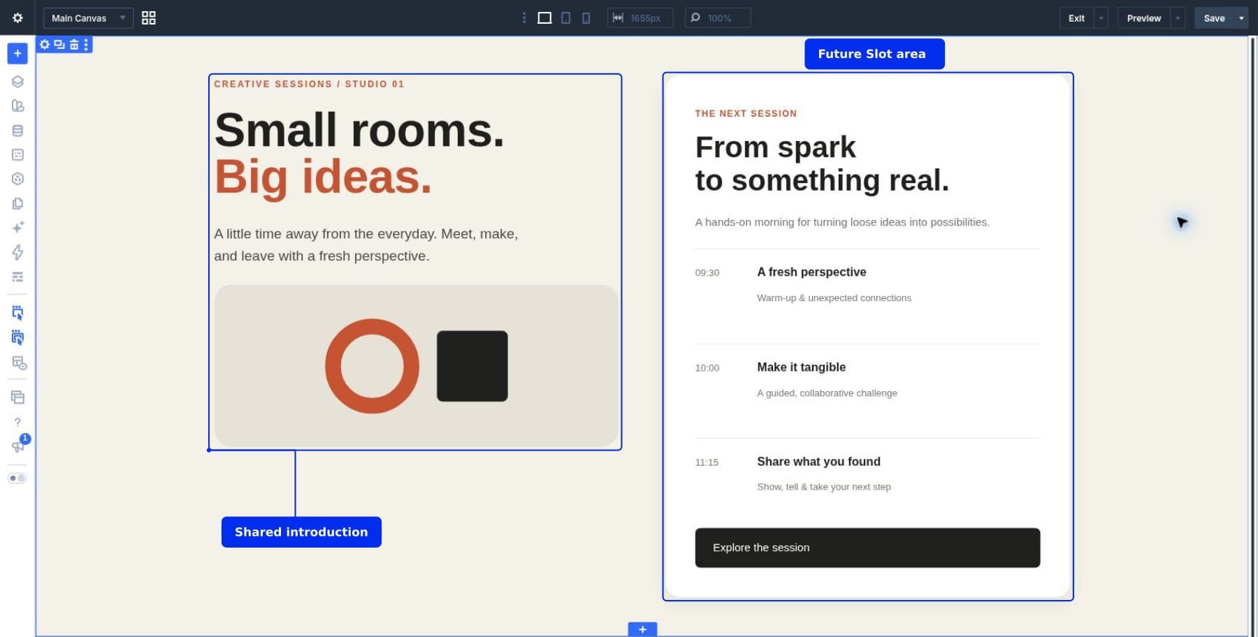
You don’t need to reproduce our design exactly. To follow along, create a two-column section with an introduction on the left and a Group containing several modules on the right. A Heading, Text, and Button module inside that Group are enough to demonstrate the process.
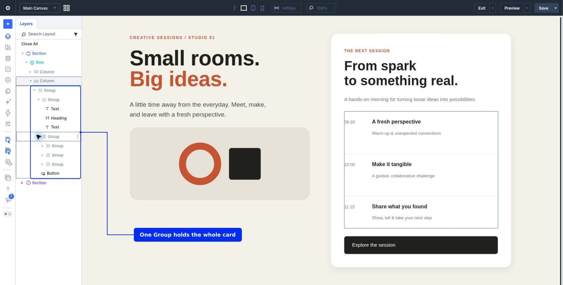
A Group is a container that holds other modules together. Keep the right-hand content inside one outer Group. In our example, this Group also provides the schedule card’s white background, rounded corners, and padding. Grouping the content lets us copy the entire card and later place it inside the Slot without rebuilding its modules or styling.
Open Layers view and expand the section to check its structure. The schedule Group should appear inside the right column, with its introduction, session Groups, and button nested beneath it. Expand the inner Groups to inspect their Heading and Text modules.
We’ll turn the complete section into a Component named Creative Workshop, then replace the schedule Group in its shared source with a Slot named Session Content. Finally, we’ll place the schedule inside one instance’s Slot and create a booking form inside another.
How To Add A Slot To A Component
1. Copy The Content You’ll Move Into The Slot
Before creating the Component, find the right Column in Layers and expand its children. Right-click the outer Group that contains the complete white card and choose Copy. This uses Divi’s element clipboard, which stores the layout and settings; copying the card’s visible text is a different action.
Copy the outer card Group to preserve its nested modules and styling together. Copying an individual heading would leave out the rest of the card; copying the Column would include the parent container we want to keep in place.
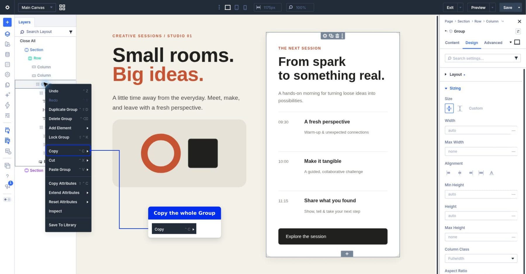
Leave the original Group in place for now. We’ll remove it from the shared Component source after saving the section, then paste the copied Group into the page instance’s Slot. Avoid copying another element in between, so the schedule Group stays available to paste.
2. Save The Section As A Component
A Component is a reusable element connected to a shared source. Saving our complete section as a Component will let us reuse its surrounding design and update that design from one place.
Right-click the outer Section and choose Save To Library. Name it Creative Workshop, enable Save As Component, and click Save To Library.
Save the entire Section so the Component includes the introduction and illustration alongside its two-column layout. Saving only the schedule Group would exclude those shared elements.
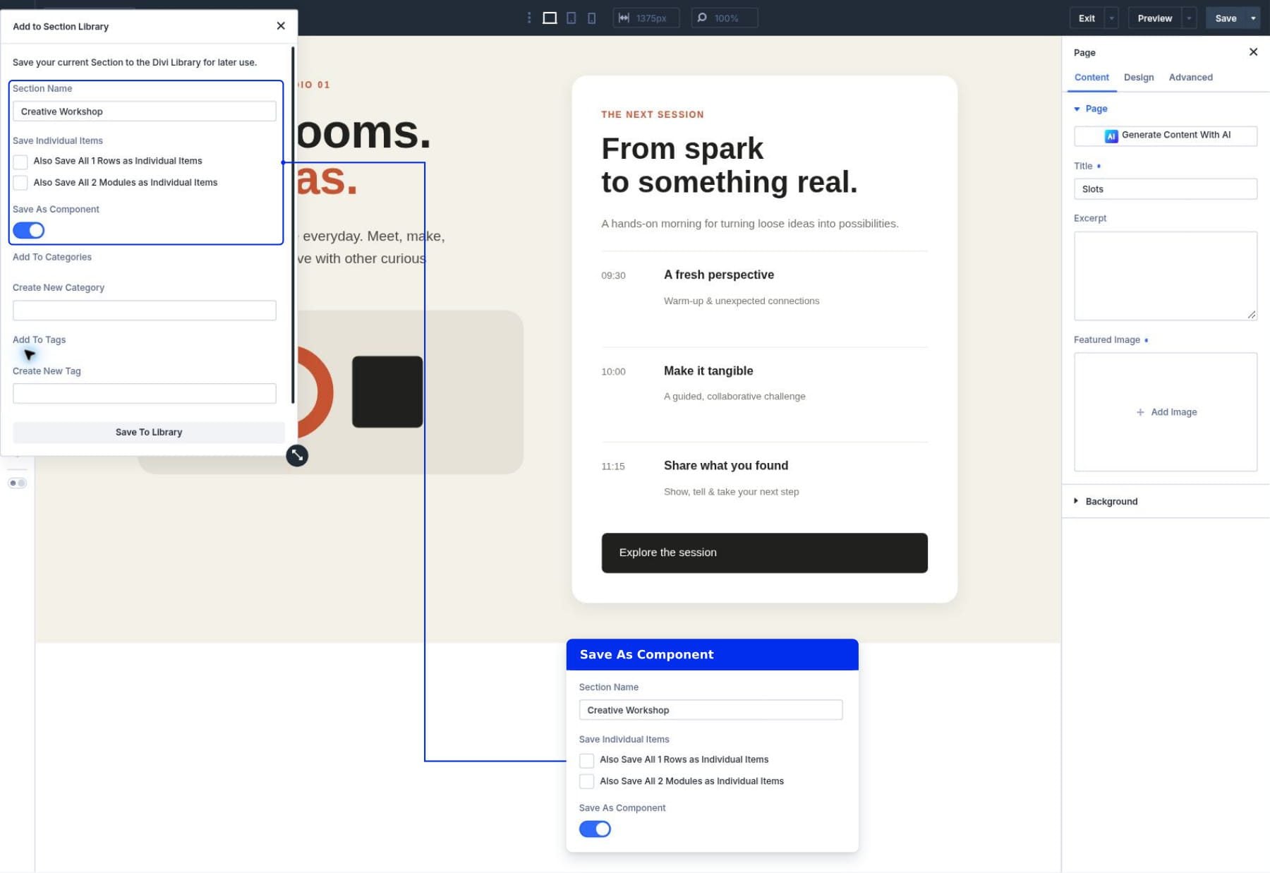
The section on the page is now an instance connected to the saved Component source. It still contains the original schedule Group. Next, we’ll replace that Group in the source with a Slot.
3. Open The Shared Component
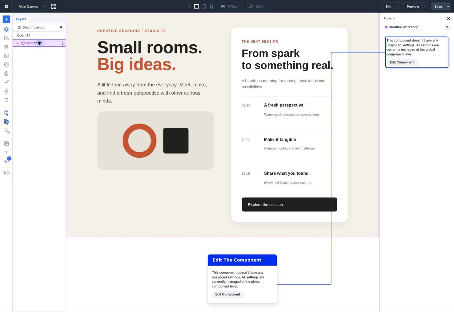
Select the connected Section in Layers to open its settings. Click the Component menu beside the element name at the top of the settings panel, then choose Edit Component. This opens the source, where you define the common structure and the Slot’s position.
Source editing includes Component Settings and bottom Save and Cancel controls, alongside the Content, Design, and Advanced tabs. Purple styling identifies connected elements in both source and instance contexts, so check those source controls to confirm where you are working.
Changes made here affect connected instances, so keep the introduction and illustration in place while preparing the right column for local content. When you select another element in Layers, check whether the source controls remain visible. If they do, continue editing the source. Otherwise, choose Edit Component for the selected element. Saving and confirming a source update returns you to instance editing; reopen the source when another shared change is needed.
4. Add The Slot In The Right Column
With the complete card already copied, select its parent right Column in Layers. If Component Settings and the bottom Save and Cancel controls are still visible, continue in that source context. Otherwise, open the Column’s Component menu and choose Edit Component. Under Content > Elements, find the outer card Group and click its trash icon. Remove the Group from this source child list; keep the parent Column in place to hold the Slot. Removing only a nested session item would leave the remaining card in the shared layout.
Stay in the right Column’s source settings and click Add Element in the same Elements list. Search for Slot in the module picker and select it. The Slot should appear directly beneath that Column in Layers. Save and confirm the source update before changing its label.
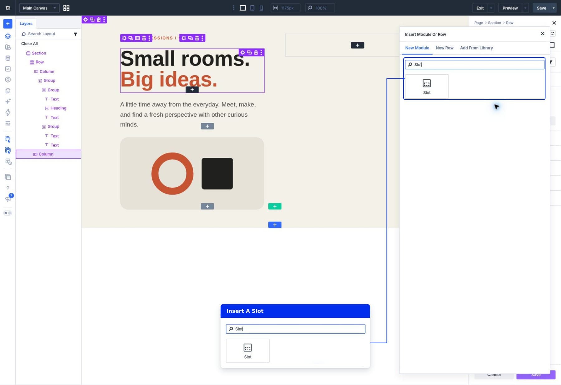
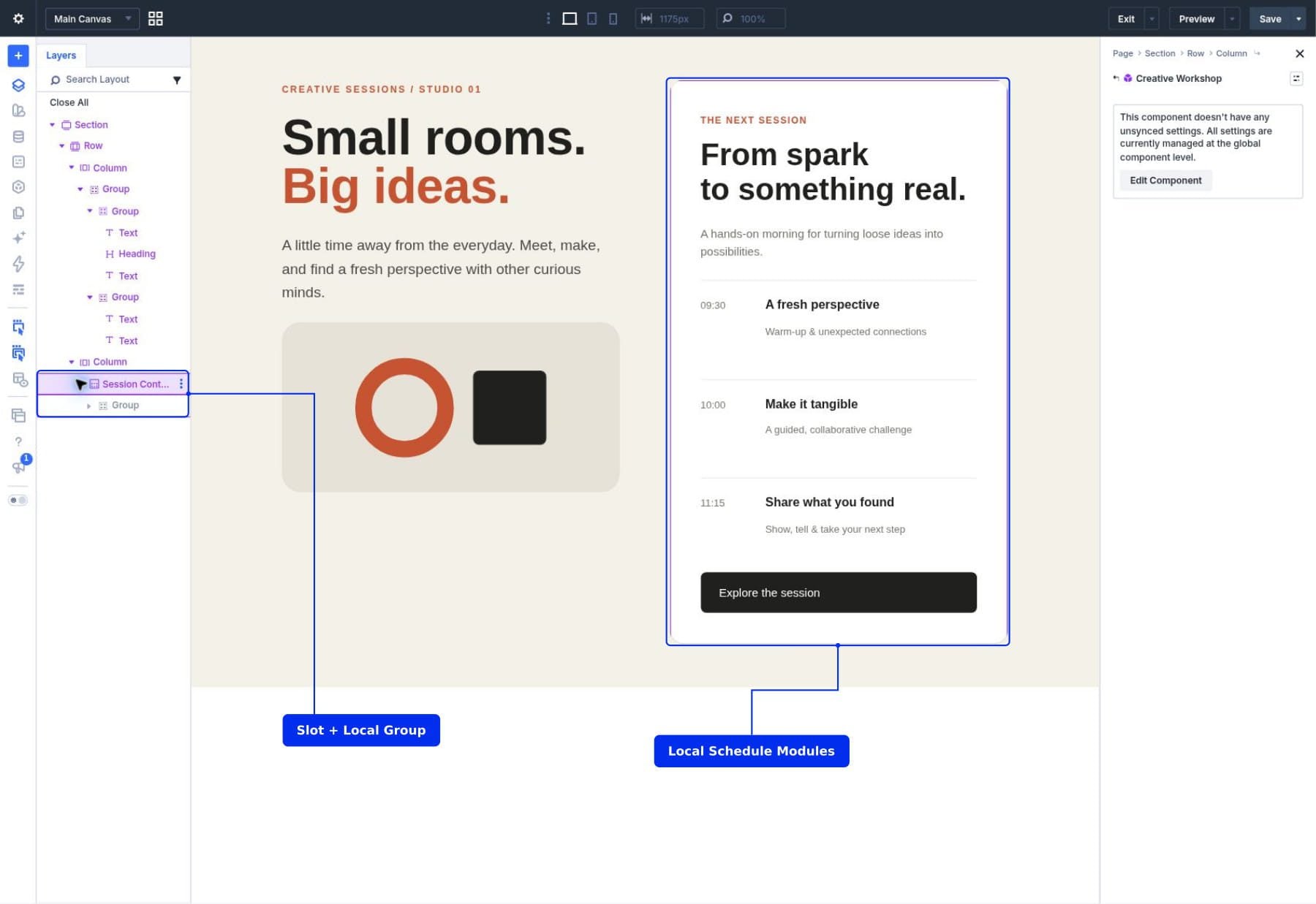
Select the new Slot in Layers and choose Edit Component to open its source settings. Under Content > Meta > Element Label, name it Session Content. This identifies its purpose in Layers. The shared source now contains an empty Slot in the right column.
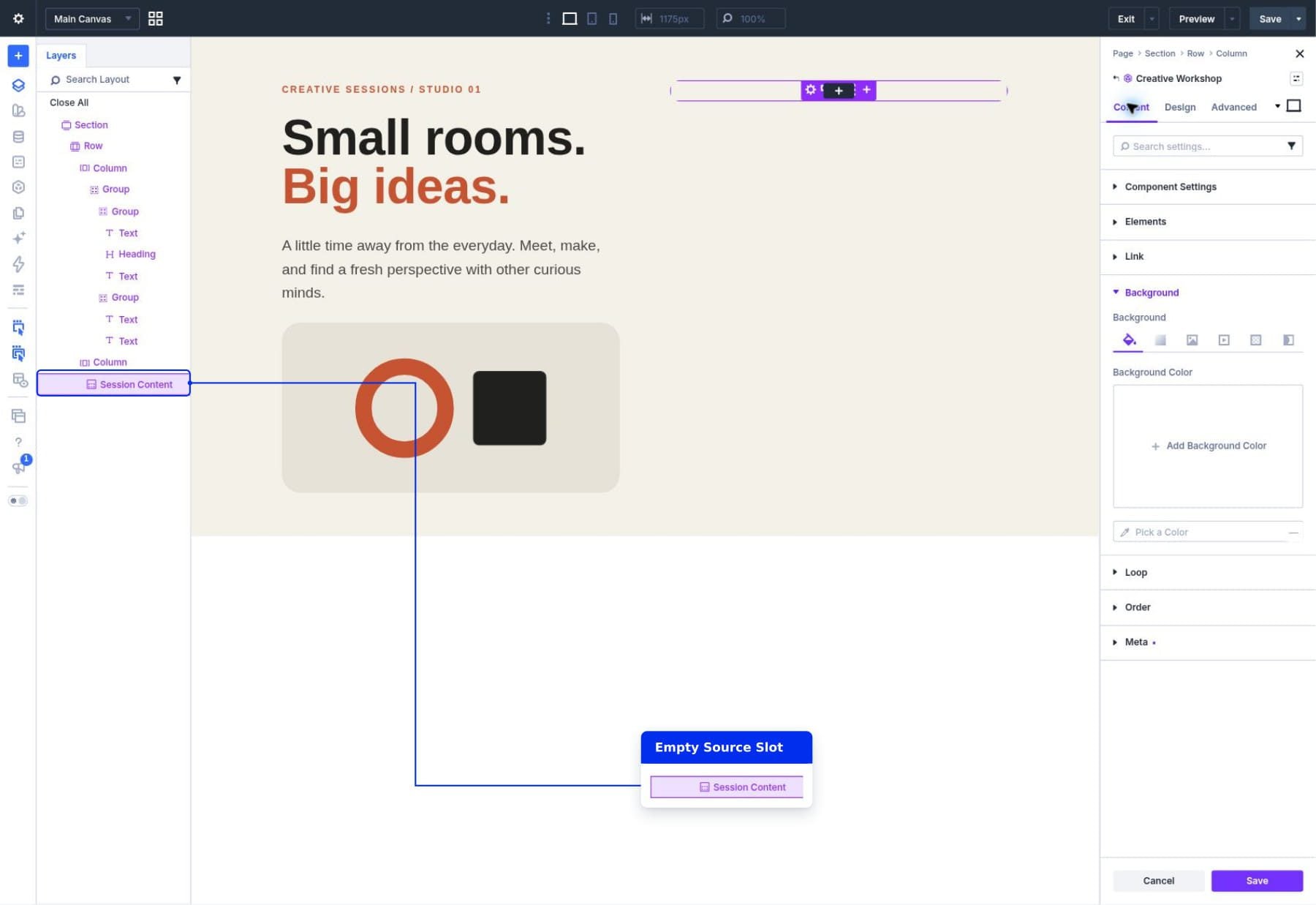
The Slot can provide shared container styling, while its local modules can have their own design. For this walkthrough, the copied schedule Group already provides the white background, rounded corners, and internal spacing. Keep that Group inside the Slot rather than rebuilding those styles on every schedule module.
Keep content height automatic. A schedule and a form can have different lengths, so a fixed height can leave unnecessary space or squeeze the local content.
Decide Where The Card Styling Belongs
There are two useful ways to style this area:
- Style the shared Slot container: Put the background, border radius, and padding on the Slot when every instance should have the same card treatment.
- Style a local Group inside the Slot: Put those settings on an inner Group when each local layout needs control over its own card.
Our example keeps the Slot transparent with zero padding and uses a local Group for the white card. This preserves the original schedule design when we paste it back. The booking card starts with the same copied styles, but each Group’s background can be edited independently.
Avoid applying the same padding to both the Slot and its inner Group. Those values add together and can leave too little room for form fields on smaller screens.
5. Save The Shared Slot Container
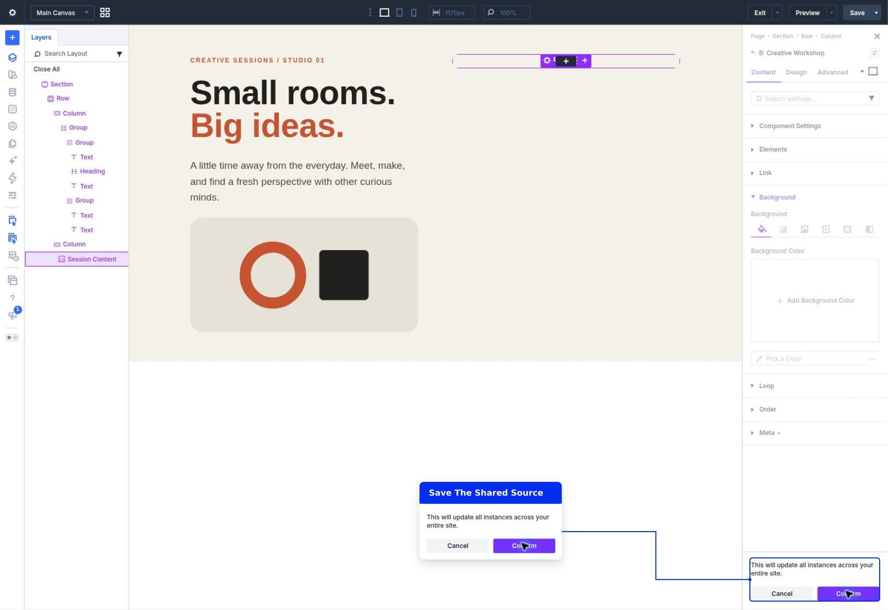
Click Save at the bottom of the Component settings and confirm the update to its instances. Close the source settings with the X at the top right. In Layers, select Session Content beneath the page’s Section again.
The Slot may show a message that all its settings are managed at the Component level. That is expected in this example: its container remains shared, while the modules you add inside it will be local. Use those child modules’ settings to edit their content and design.
The Slot’s child content is local. Build it in the page instance; the source defines the Slot’s container and position. A newly added Slot provides an empty area for the instance’s modules in the builder. Add local content to display a card in that area on the front end.
The parent column and section spacing remain in place when a Slot is empty. If an instance leaves that area empty, review the complete section and adjust its surrounding layout as needed.
6. Build The Local Schedule
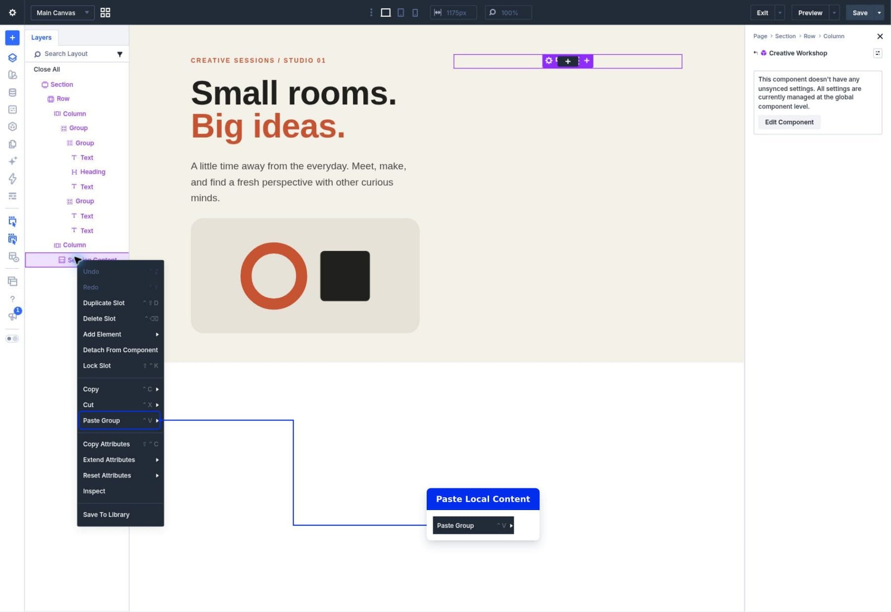
After leaving source editing, right-click Session Content in Layers and choose Paste Group. Its copied headings, text, nested Groups, and Button now form this instance’s local content.
If Paste Group is unavailable because another element replaced the copied layout, rebuild the card inside the empty Slot using its Add Element control. Add the outer Group first, then insert its child modules through that Group’s Content > Elements settings.
Our schedule includes three session items:
- 09:30: A fresh perspective. Warm-up & unexpected connections.
- 10:00: Make it tangible. A guided, collaborative challenge.
- 11:15: Share what you found. Show, tell & take your next step.
Use Layers view to check that the pasted Group appears beneath Session Content. Expand it to inspect the schedule’s nested modules. If it appears beside the Slot under the right Column, it is outside the local content area.
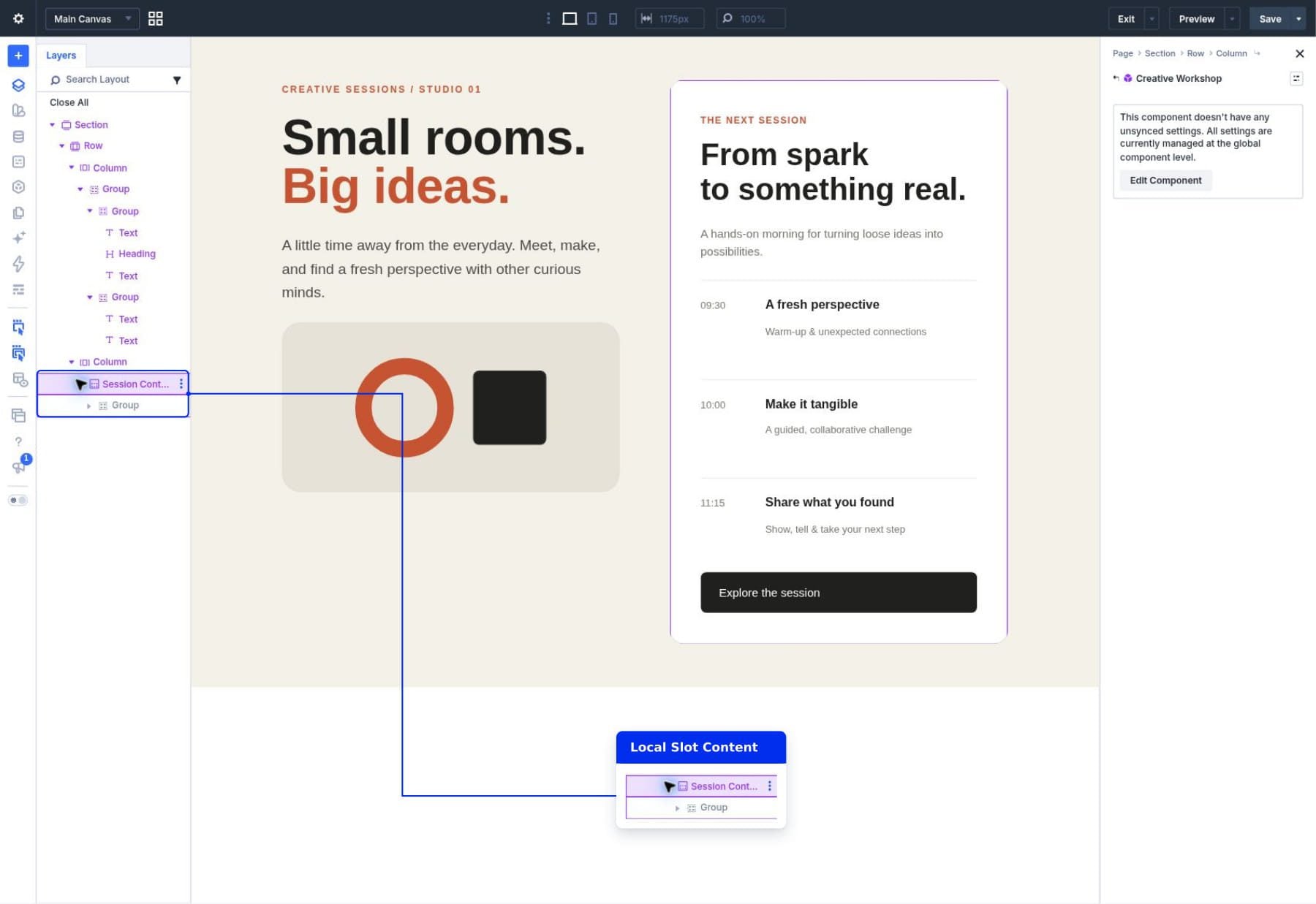
Click the page Save button in the top-right builder bar to retain its local layout. The bottom Save button used earlier updates the Component source; the top page Save retains this page’s instance content and layout.
Use A Different Layout In Another Instance
With source editing closed, right-click the outer connected Section in Layers and choose Duplicate. Duplicate the whole workshop Section, not its Slot or an inner Group. The new section is a second instance of the same source on the page.
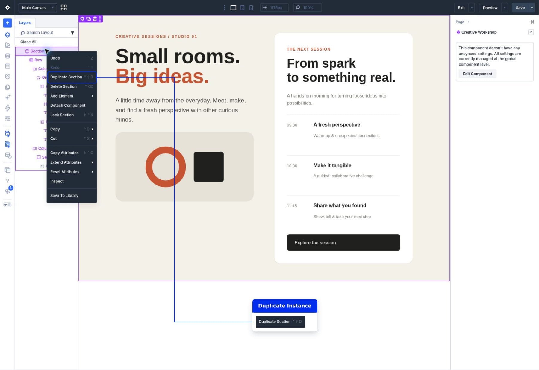
Duplication copies the instance’s current local Slot content. Open the second instance’s Session Content Slot and replace the copied schedule layout with the modules needed for booking. The first instance remains a schedule.
In Layers, find Session Content beneath the second Section and expand its outer white card Group. Keep that Group and its introductory modules. Right-click its nested schedule Group and choose Delete, then delete the original Button module. Select the local Heading and Text modules to change their contents. Change the local heading to There’s a seat with your name on it. and the description to Join our next studio session. Leave your details and we’ll send the invitation.
Replace the removed schedule modules with a native Contact Form in the second Slot’s local layout. Our example uses Name and Email fields with a Save my seat button.
To prepare the booking form:
- Select the outer local card Group beneath the second Session Content Slot. Open Content > Elements > Add Element, search for Contact Form, and select it.
- Open the new Contact Form’s Content > Elements list. Click the trash icon beside Message, leaving Name and Email Address.
- Expand the form’s Content > Text settings and change Submit Button to Save my seat.
- Return to Content > Elements and click the pencil icon beside Name. This opens that individual Field‘s settings.
- In the Field settings, open Design > Sizing > Column Class and choose 100% from the picker. The selected value displays as Fullwidth. This puts Name on its own line.
- Use the Contact Form breadcrumb at the top to return to the form. Open the Email Address field with its pencil icon and apply the same Fullwidth setting.
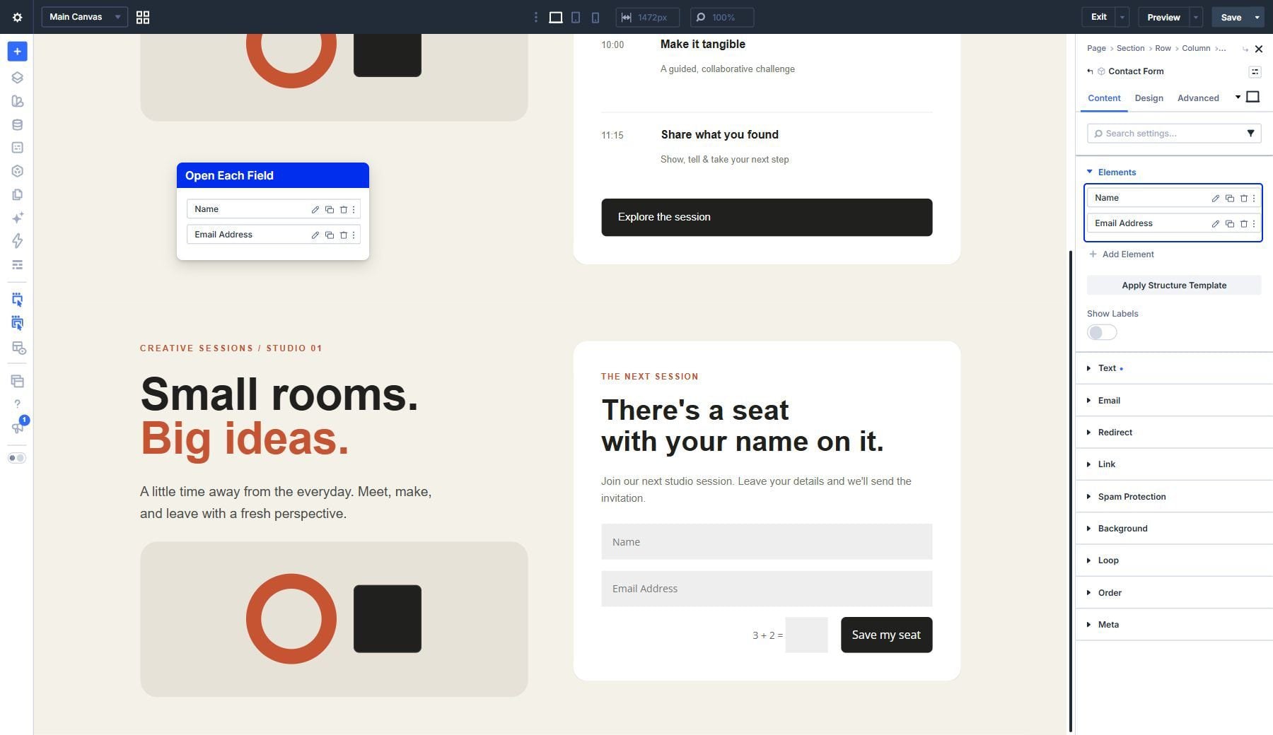
The pencil opens the Field editor, where Design > Sizing contains the Column Class setting shown below. Apply Fullwidth to each field individually.
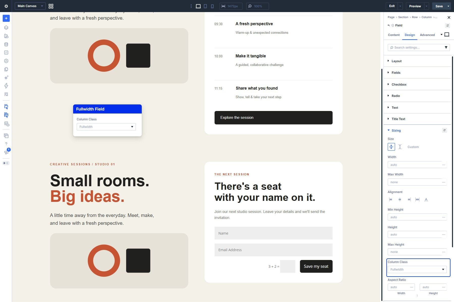
Leave the form’s Layout Style set to its default Flex so Column Class controls its field widths. Our form field widths guide covers other arrangements and device-specific widths.
The first instance keeps its schedule. You have two local layouts within one shared section design. Click the top-right page Save to retain the new local form. Before using it on a live website, open the Contact Form’s Content > Email settings and enter its recipient address. Review the success message and spam protection, then test submission and delivery. The Contact Form documentation explains those settings. Here, it demonstrates a different local module arrangement.
Update The Shared Design
In Layers, select the introduction Text module outside Session Content. Open that module’s Component menu and choose Edit Component, then open Content > Text > Body. This edits the shared introduction. Our example uses A little time away from the everyday. Meet, make, and leave with a fresh perspective.
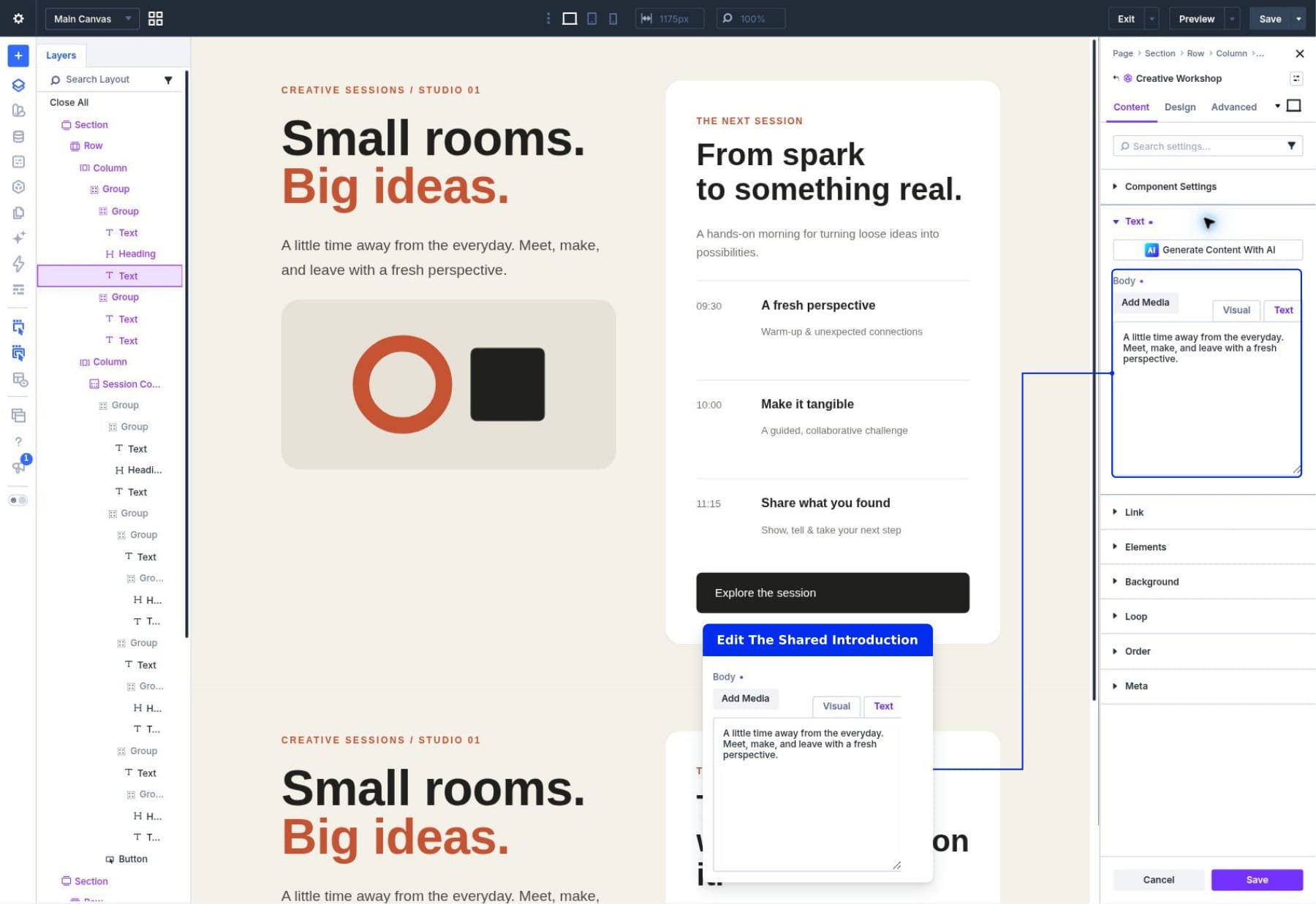
Both instances now display that introduction while retaining their different local content: the first has its schedule, and the second has its booking form.
Click the bottom Component Save button and confirm This will update all instances across your entire site. Close source settings with the X, then click the top-right page Save to retain its local layouts. Our saved example retains the updated introduction and its different Slot contents.
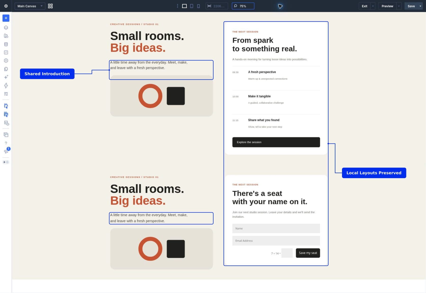
If you want to change the design of a module inside one Slot, edit that local module. Changing the shared Slot container and changing a heading within its contents are different operations.
Check Each Layout On Smaller Screens
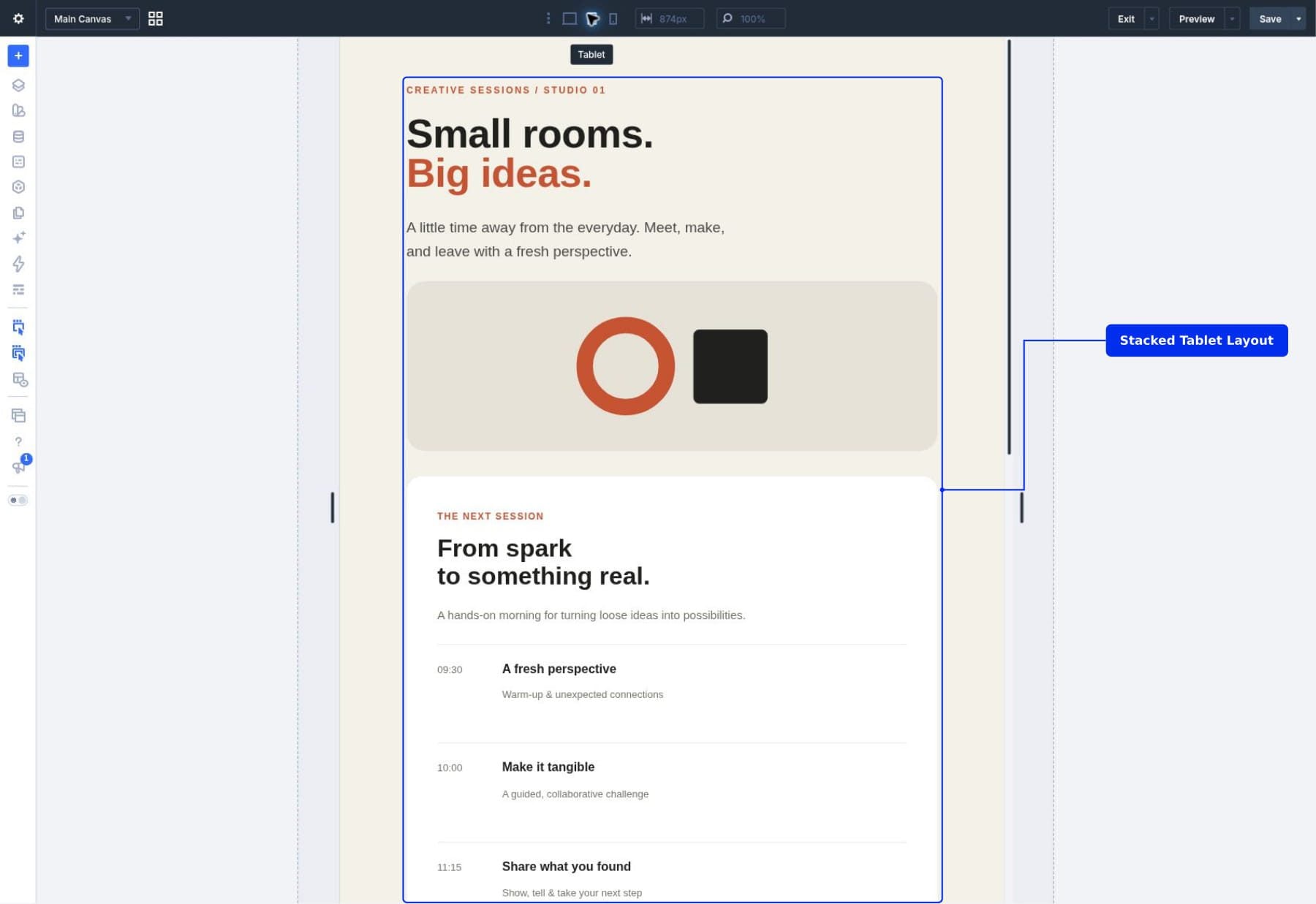
Use the tablet and phone icons in the top builder bar to preview each device layout. Responsive settings for the shared section and Slot container provide the common foundation. The local modules still need their own review.
Our workshop stacks the introduction above the Slot in its 874px tablet preview and 375px phone preview. The section’s responsive layout settings control that arrangement. Check the modules within each Slot too, since their content and widths can differ.
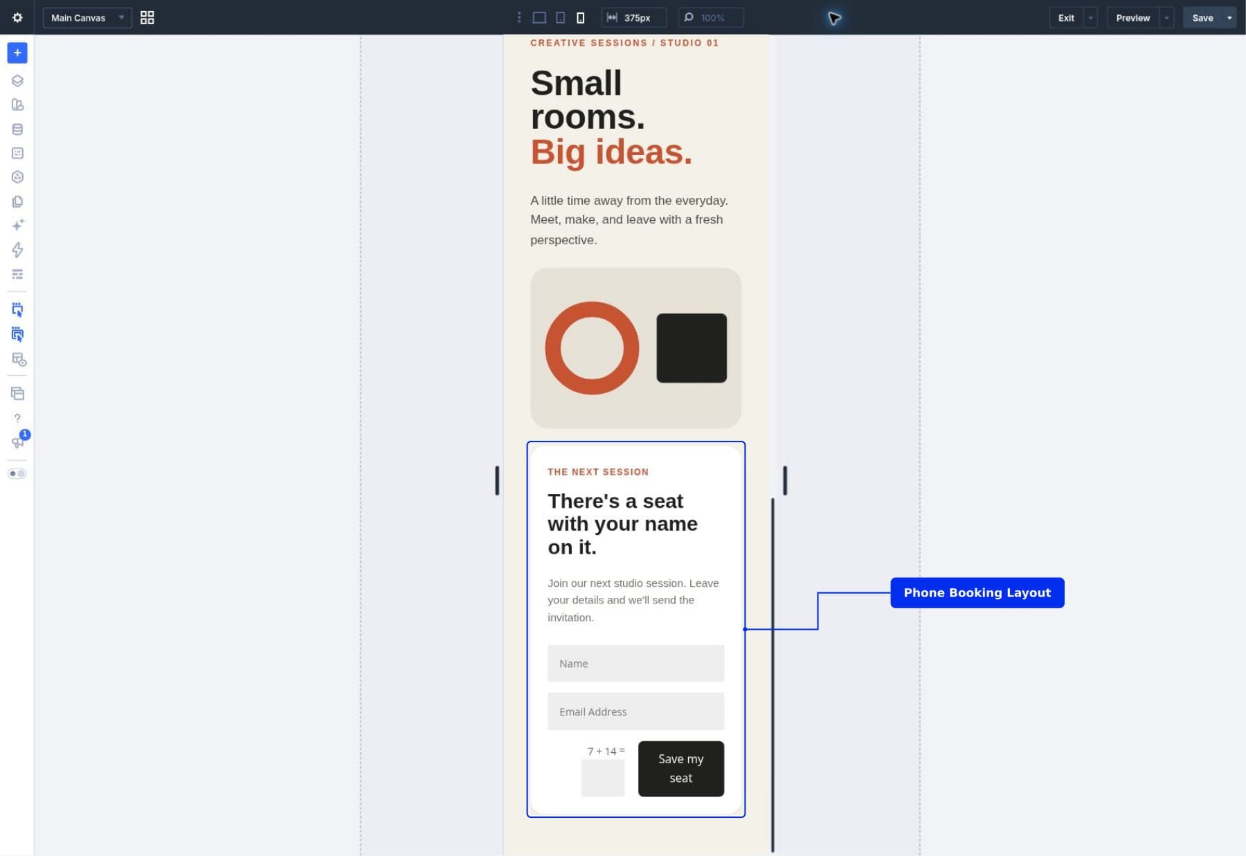
The booking form needed a local adjustment: its original half-width fields clipped the Email placeholder within the phone card. Setting both fields to full width made Name and Email clear at 375px. The button text wraps within the card without extending outside it.
The schedule also needs a phone adjustment. Its side-by-side time and session details can overflow the narrow card. Stack those two elements within each session row on phones:
- Select the builder’s Phone preview at 375px.
- In the first instance’s Session Content Slot, expand the local schedule card and its nested schedule Group. Select the first session-row Group containing a time Text module and an inner Group for the session heading and description. Edit this local Group directly.
- Open Design > Layout, keep Layout Style set to Flex, and change the phone Layout Direction to Column. Leave desktop and tablet at Row.
- Repeat the phone-only change for the other two session-row Groups, then use the top-right page Save button to retain these local responsive settings.
Check every variation. A schedule’s narrow time column and a form’s fields have different needs even when they share the same outer container. Look for text wrapping, crowded controls, and horizontal overflow. Reduce padding and typography where appropriate and let each local layout determine its own height.
When Should You Use Slots?
Slots work well when a repeated design needs a defined area for flexible content:
- Event sections: Use the same introduction with a schedule, registration form, or recording.
- Service sections: Pair a consistent service overview with a gallery, enquiry form, or detailed list.
- Campaign sections: Keep the surrounding design while changing the promotional content and its module arrangement.
- Resource sections: Reuse a shared presentation while each instance contains different supporting media.
If only the text or image needs to vary within a fixed arrangement, editable Component settings may be enough. Add a Slot when you want to make room for a different layout.
Common Questions About Slots
Why Can’t I Find Slot In The Module Picker?
Slot insertion depends on context. Select a parent that accepts nested Group content, such as the right Column inside our Component. Check for Component Settings and the bottom source Save and Cancel controls. If they aren’t visible, choose Edit Component for that Column. Then open Content > Elements > Add Element and search for Slot.
Slots cannot be nested inside other Slots or used as Carousel slides. Use Groups to organize the modules within a Slot, and add separate Slots to the shared source when you need additional independent content areas.
Will A New Instance Include My Schedule?
The schedule belongs to the page instance, not to the source Slot. Inserting a fresh instance of the Component gives you its shared design and an empty Slot to fill. Duplicating the populated page instance copies its local schedule, which is why our second example started with the same card and session items.
Duplicating a Slot in the Component source is another operation: it creates a new empty Slot. It does not copy every page’s existing local content into that new area. Choose the operation according to whether you want another instance of the design or another content area within the design.
Can One Component Have Multiple Slots?
Yes. Each Slot provides an independent area for instance content. A workshop Component could have one Slot for the main session details and another for supporting resources. Name them by purpose so it is clear where each layout belongs.
Keep the shared structure useful. If nearly everything needs to vary, consider whether a smaller Component would be easier to maintain. Slots work best when the surrounding design still provides a meaningful common foundation.
Can A Slot Contain Another Component?
Yes, provided the nesting does not create a circular relationship. For example, a local booking layout could include a reusable call-to-action Component alongside its form. That nested Component keeps its own connection to its source, even though its placement is part of this instance’s Slot content.
Local Slot content therefore does not mean every element inside it must be independently styled. You can combine local modules with nested Components and reusable styling tools, choosing the appropriate scope for each part.
Does Renaming A Slot Replace Its Content?
Changing its Element Label changes how you identify the Slot in the builder. Its local content is associated with the Slot itself, rather than that display label, so renaming it does not turn it into a new content area.
Removing a Slot from the shared source has a wider effect: it removes that area from connected instances. Before removing one, preserve any local content you still need elsewhere.
Keep Local Modules Visually Consistent
You can use Presets and Design Variables to coordinate the styling of your local modules. Our guide to using Design Variables with Presets explains how those reusable styling tools fit together.
For example, the schedule and booking layouts can use the same heading and button Presets while containing different modules. This lets you reuse their visual treatment without expecting a copied local Group to behave like a shared Component.
Build More Flexible Components With Slots
Slots let you keep a reusable design while giving each instance room for the modules it needs. In our workshop example, one shared section can support a schedule and a different booking layout without requiring separate sources for the surrounding design.
Start with one Component, one Slot, and two meaningfully different layouts. That gives you a clear way to explore how shared design and local content work together in Divi.
The post Exploring Slots For Components In Divi 5 appeared first on Elegant Themes Blog.