When you’re building in Divi, you generally expect design controls to stay consistent no matter where you are in the builder. Open the sub-element settings inside certain modules, though, and the available options can be more limited than you expect. Controls that are available elsewhere may be missing, and a simple styling decision can turn into a workaround.
Composable Settings in Divi 5 solve that by letting you enable additional design option groups for module sub-elements. Even better, those enabled option groups can be saved inside presets. That means you can configure a sub-element once and make those controls available by default every time you use that preset.
What Are Composable Settings In Divi 5?
Take the Contact Form module as a starting point. When you open the Button settings in the Design tab, you will find core styling options like color, font, and border. But option groups like Transform and Animation may not be enabled for that button by default. Settings farther down in the module panel apply to the full Contact Form, not the button sub-element on its own.
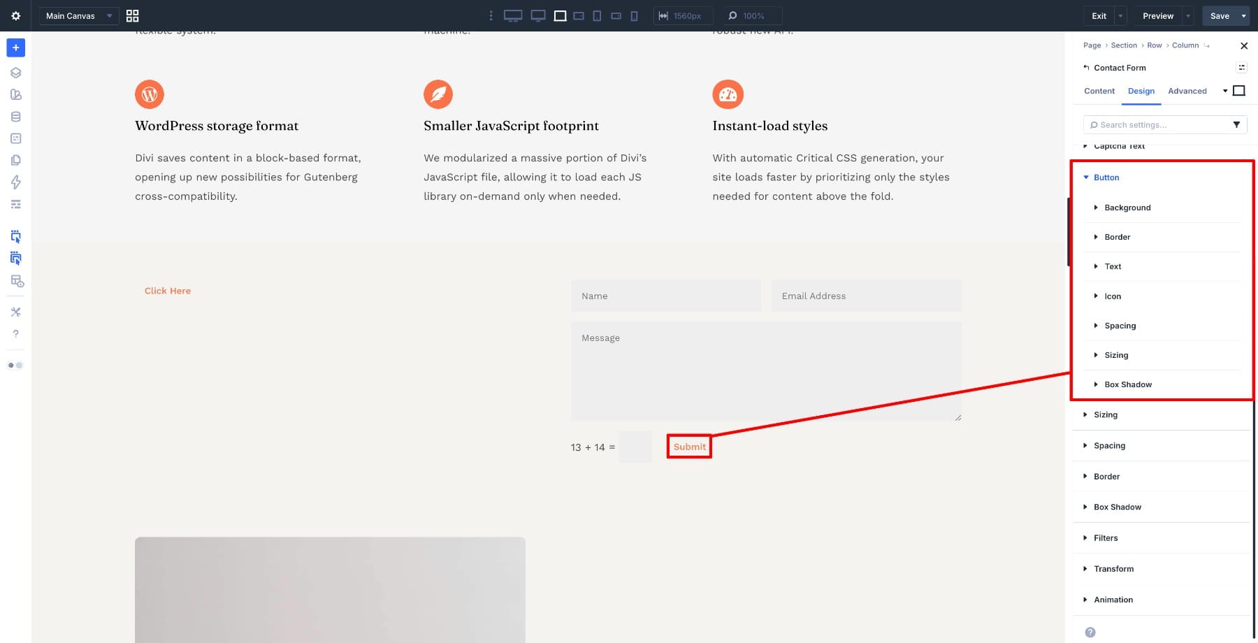
That reflects how many Divi modules are structured. A module often contains smaller parts, such as titles, body text, images, buttons, and icons. These are sub-elements. Divi keeps many sub-element panels focused by default, so the builder does not show every possible option group all the time.
Composable Settings let you expand those controls when you need them. You can enable option groups like Transform, Background, Spacing, Border, Box Shadow, or Sizing for a specific sub-element. That gives you more control over one part of a module without affecting the rest of the module.
To access them, open a module’s Design settings, navigate to the sub-element you want to expand, and click the Toggle Options icon.
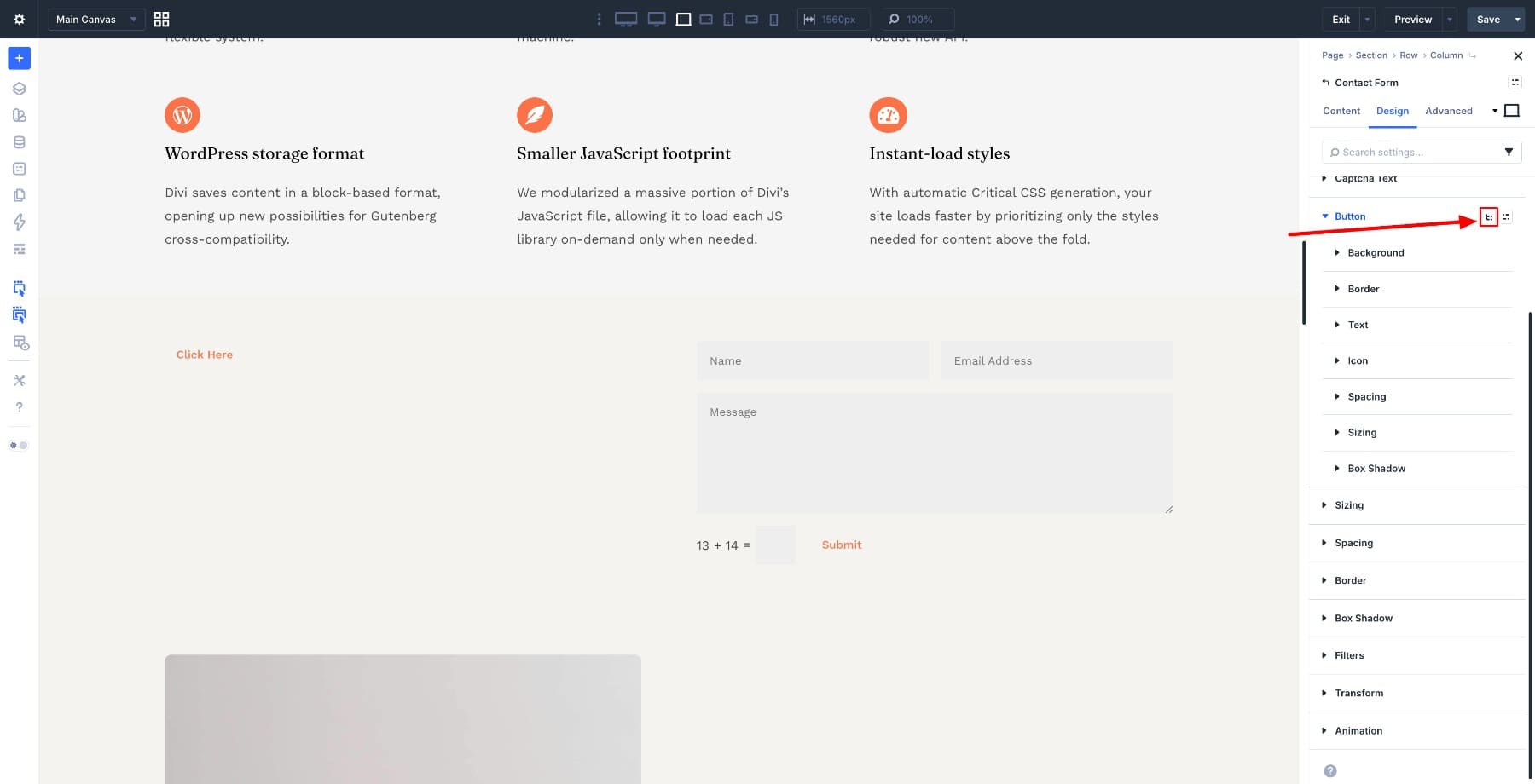
A dropdown opens with the available option groups. Check the groups you want to enable, and they will appear directly in that sub-element’s settings panel.
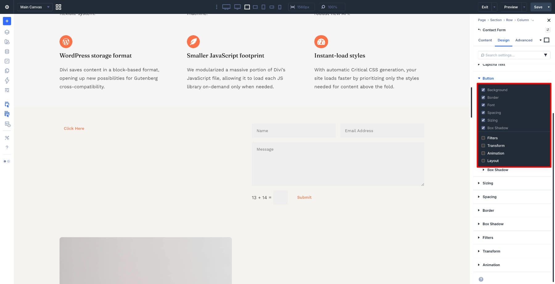
Enable Transform, for example, and it appears under the Button settings ready to use.
From there, you can style the button with direct controls where they belong, without adding custom CSS for routine adjustments. The next question is how to make that setup reusable, so every new Contact Form can start with those same option groups already available.
Learn Everything About Composable Settings In Divi 5
Carrying Composable Settings Forward With A Default Preset
At this point, you have enabled Transform on one Contact Form button, and the setting is available where you need it. Now imagine adding another Contact Form on a different page, or ten more across a site. Each one would require the same setup unless you save that configuration.
Presets solve this at the source. In Divi 5, Composable Settings work with presets. If you enable specific option groups inside a preset, those groups appear automatically when editing an element that uses that preset. If you want those option groups enabled by default, toggle them on inside your default preset.
After you have set up the Contact Form button the way you want it, save that configuration as a preset.
Set the preset as the default.
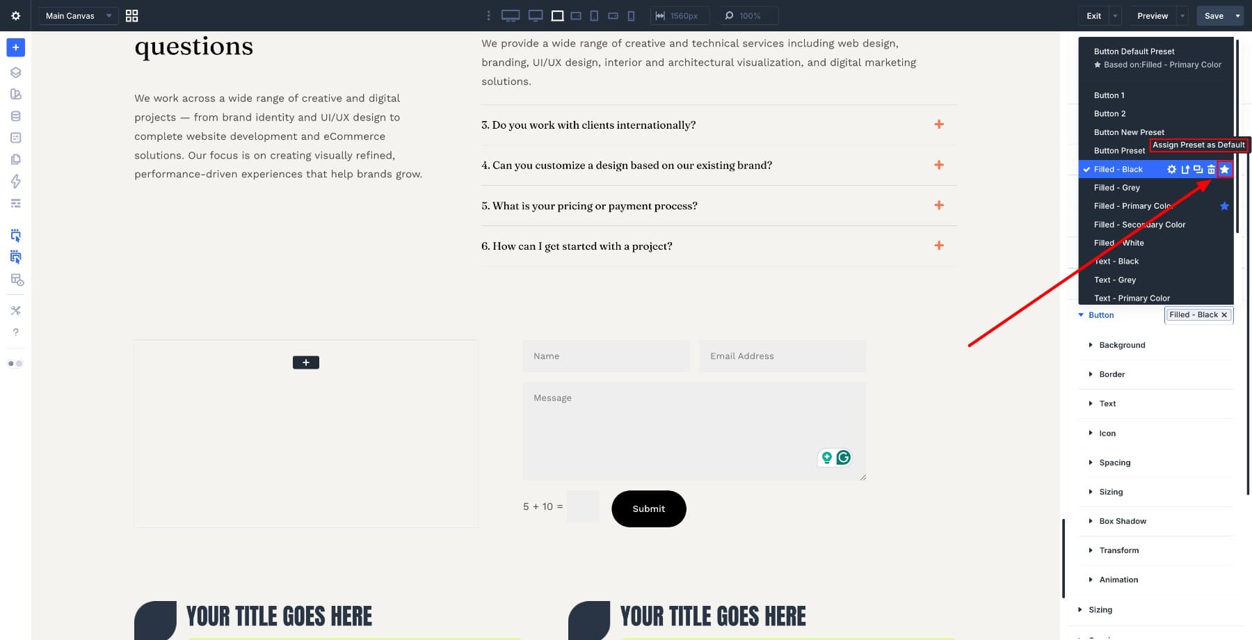
Now the next Contact Form you add will already have Transform available under its button settings, with nothing left to enable manually.
A default preset does something quietly useful. The next time you add a Contact Form, the module already starts with the option groups you decided were important. That also helps other people working on the same site because the module behaves consistently from the moment it is added.
Working this way changes how you build. You stop configuring the same sub-element controls one module at a time and start defining how those modules should behave across the site.
Real Examples Of What You Can Do With Composable Settings
Here are four scenarios where saving Composable Settings inside default presets can reduce repeated setup work.
1. Add Subtle Attention To Form Buttons Without Rebuilding
A Contact Form button that scales slightly on hover is a small detail, but it can make the form feel more polished. The default button controls may not expose everything you need for that effect. With Transform enabled through Composable Settings, you can apply it directly to the button sub-element.
Go to the Contact Form module’s Button settings in the Design tab and edit its preset. Click the Toggle Options icon and enable Transform.
Save the preset and set it as default. Then switch to the Hover state and apply a slight scale under the Transform settings for the button.
Preview the result, and the button gently scales on hover without changing the module structure.
2. Turn Blurb Headings Into Labels Without Extra Modules
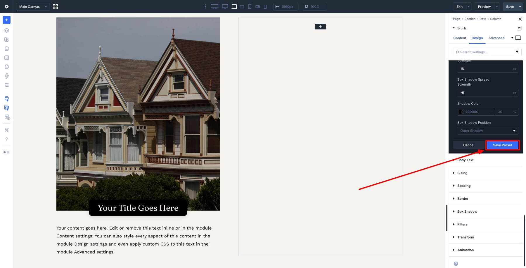
If your design calls for a Blurb title that reads more like a label or category tag, the default title options may not be enough. Enabling Background, Border, Box Shadow, and Spacing through Composable Settings gives you the controls to style the title directly inside the preset.
Open the Blurb module and go to Title Text settings in the Design tab. Edit its Heading 3 preset, click the Toggle Options icon, and enable Background, Border, Box Shadow, and Spacing.
Style the title directly. Add a background color, adjust the padding, and layer in border or shadow settings to create a label-like look.
Save the preset and set it as default.
The next time you apply this heading style in a compatible module, those enabled option groups and label styles come with it.
3. Create Full-Width CTAs Inside Blurbs Without Layout Hacks
Getting a Blurb button to span the full width of its container can lead to unnecessary layout adjustments if the button itself does not expose the sizing controls you need.
Enable Sizing through Composable Settings and set the button width to 100%. That handles the layout from inside the button sub-element.
Save this to a preset and set it as default, and every new Blurb that uses that preset can start with the full-width button setup already available.
4. Highlight Blurb Body Text Without Adding Extra Modules
Body text inside a Blurb often starts with basic typography controls, but sometimes that content needs more visual separation. Enabling Background, Border, and Spacing through Composable Settings lets you turn the body text area into a styled callout without adding another module.
Add a background, adjust the padding, and layer in a border if the design calls for it. The result sits cleanly inside the module without changing the layout structure.
Save this to a preset and set it as default to make the highlighted text style available in every new Blurb that uses that preset.
Start Building In Divi 5 Today!
The setup covered in this article pays off over time. Every module you configure this way becomes more ready for the next time you use it. Start with the modules you reach for most often, enable the Composable Settings that match how you tend to style them, save those configurations as default presets, and let that work compound.
Over time, your Divi 5 setup begins to reflect the decisions you have already made. You spend more time building and less time reopening the same settings just to make the same controls available again.
The post How To Enable Composable Settings By Default Using Presets In Divi 5 appeared first on Elegant Themes Blog.