A strong hero section does more than introduce a page. It establishes the visual language, hierarchy, and direction for everything that follows. In this free pack, you’ll get 7 UI Hero Sections for Divi 5, built around bold interface-inspired compositions, structured typography, layered visuals, and modern product presentation.
These designs work as starting points for SaaS websites, technology companies, software products, creative studios, agencies, and other digital-first brands. Import a hero, replace the sample copy and visuals, and adapt the colors and interface elements to your own project.
The collection explores several different approaches to UI-focused hero design. Some put the interface itself at the center of the composition, while others use cards, dashboards, grids, and supporting content to build a stronger sense of product context.
Preview
Here’s a look at the seven UI Hero Sections included in the pack. The download is further down the post.
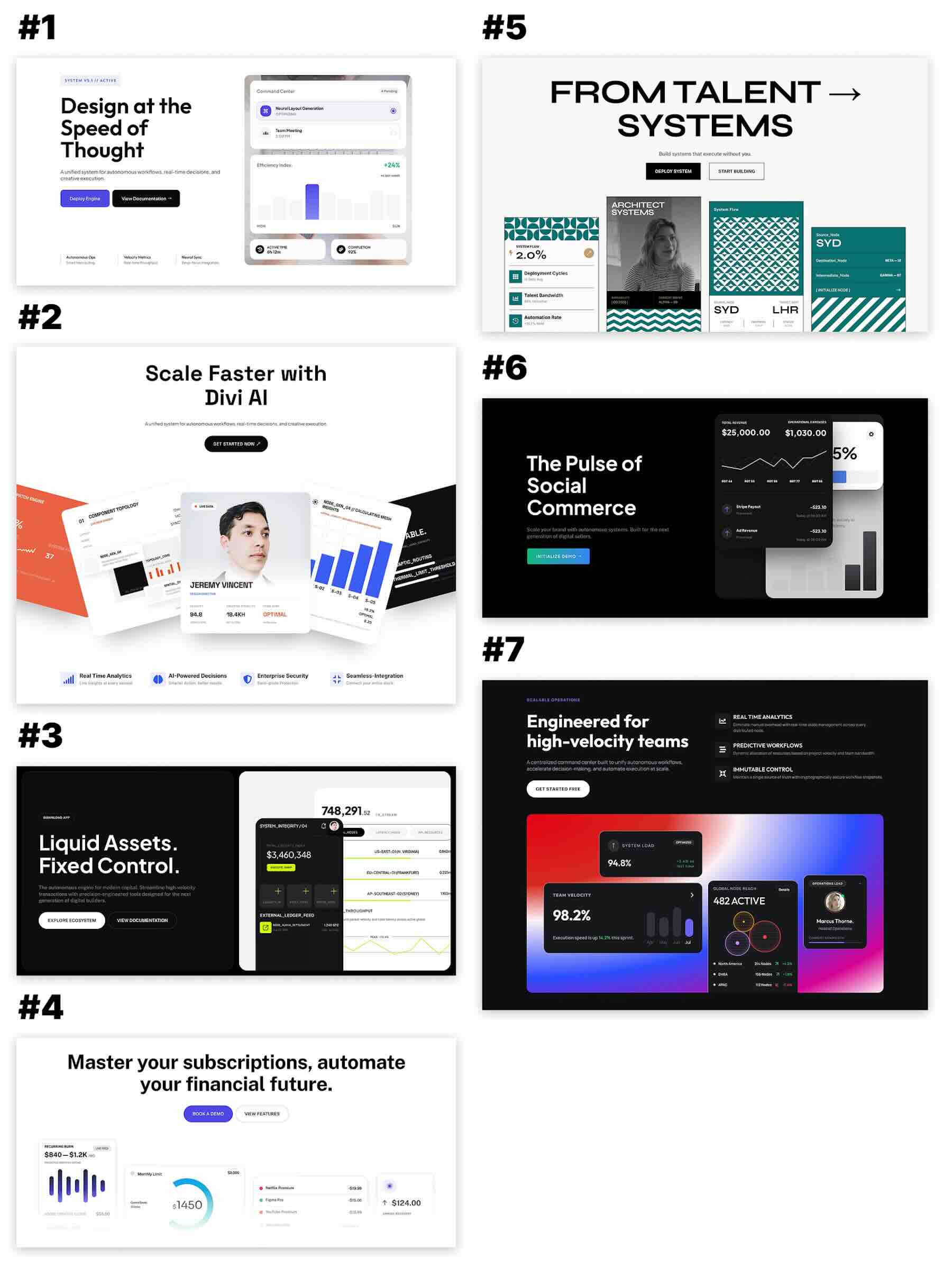
The designs range from restrained layouts with a single interface preview to more layered compositions built from several UI cards. This gives you options for products that need a straightforward introduction as well as pages where the interface itself should become a major part of the visual identity.
Download 7 UI Hero Sections For Divi 5
Get all seven hero sections for free. Download the ZIP file, unzip it on your computer, and import the included JSON files into your Divi Library.

What’s Included (8 Exports)
Inside the download, you’ll find seven individual hero section exports and one combined export containing the complete collection.
- UI Hero Section 1.json
- UI Hero Section 2.json
- UI Hero Section 3.json
- UI Hero Section 4.json
- UI Hero Section 5.json
- UI Hero Section 6.json
- UI Hero Section 7.json
- UI Hero Sections (All).json
Choose an individual JSON file when you only need one design, or import the combined file to add the full collection to your Divi Library at once.
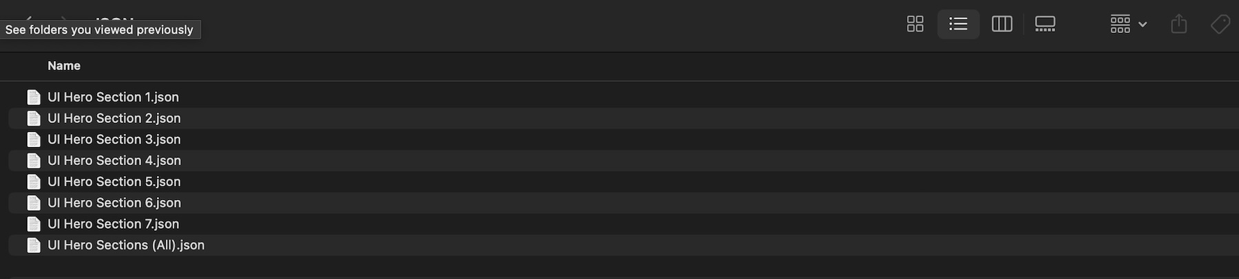
Each section is already styled with example typography, interface imagery, calls to action, spacing, and supporting visual elements. Treat them as starting points rather than finished pages, then replace the example content with assets that represent your own product.
A Closer Look At The UI Hero Designs
The collection uses interface imagery in different ways. In some sections, the product preview acts as one large focal point. Others break the interface into several cards or panels so visitors can understand different parts of the product before they scroll any further.
A Product Dashboard As The Main Visual
One of the darker designs places the headline and supporting feature copy above a large dashboard-inspired composition. Bright gradients behind the interface cards create contrast against the dark section while keeping the product UI at the center of attention.
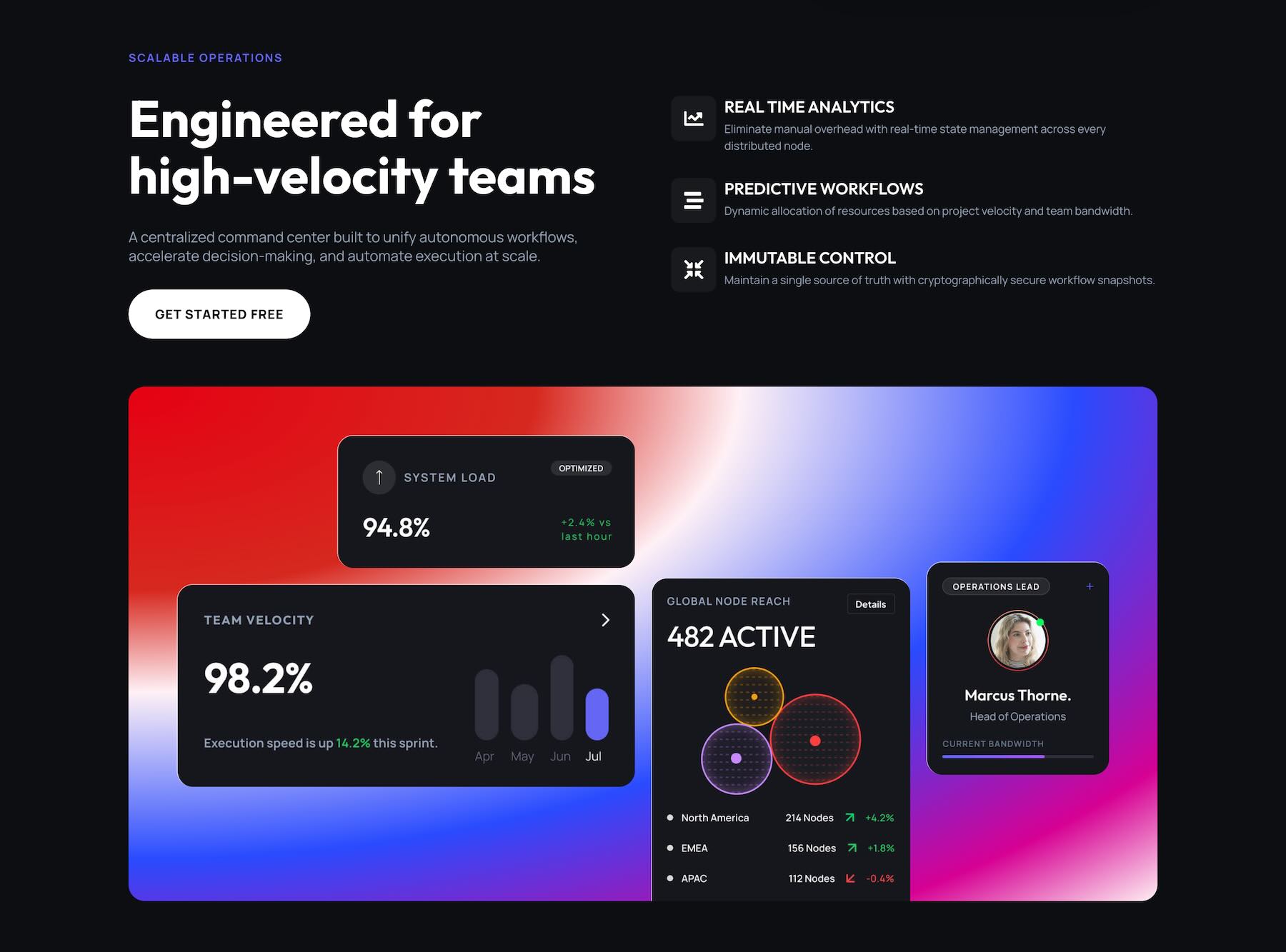
This kind of hero works well for SaaS platforms, analytics products, AI tools, and other applications where showing the interface immediately helps explain what the product does.
When adapting the section, replace the sample UI imagery with your own screenshots or mockups. Keep the most important interface elements large enough to remain recognizable rather than trying to show every screen at once.
A Modular System Built From Multiple Cards
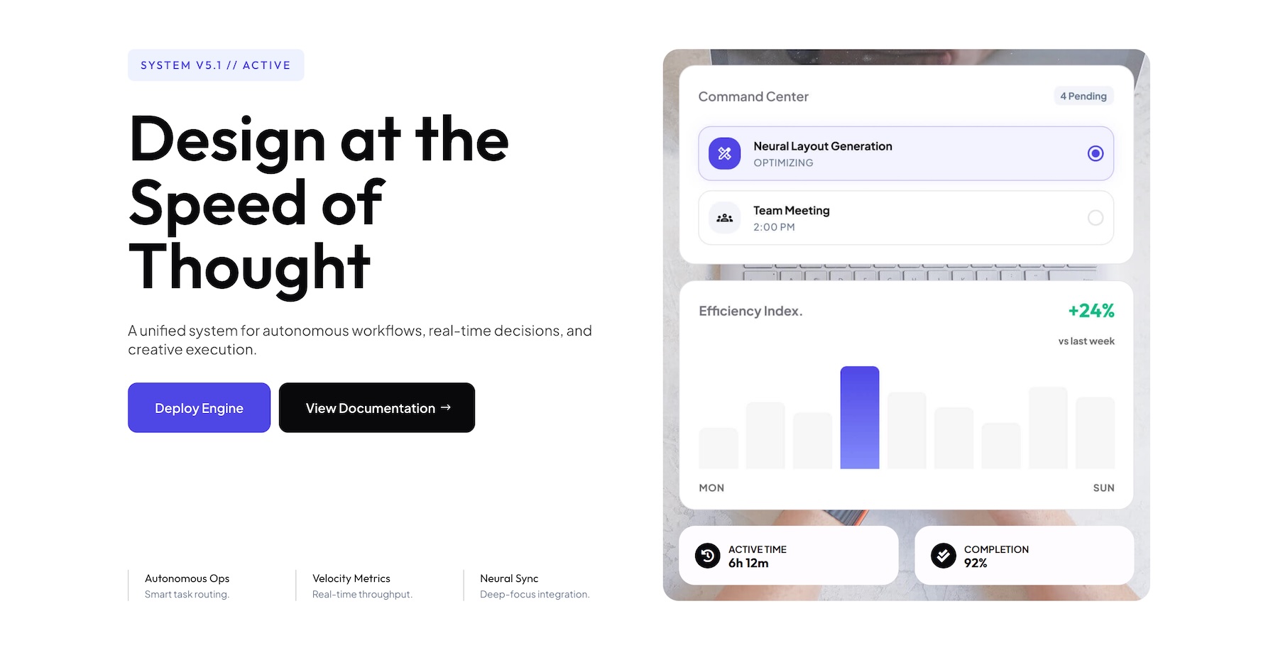
Another design takes a lighter editorial approach, combining a large headline with several vertically arranged UI cards. Instead of showing one complete dashboard, the composition presents the product through several separate visual components.
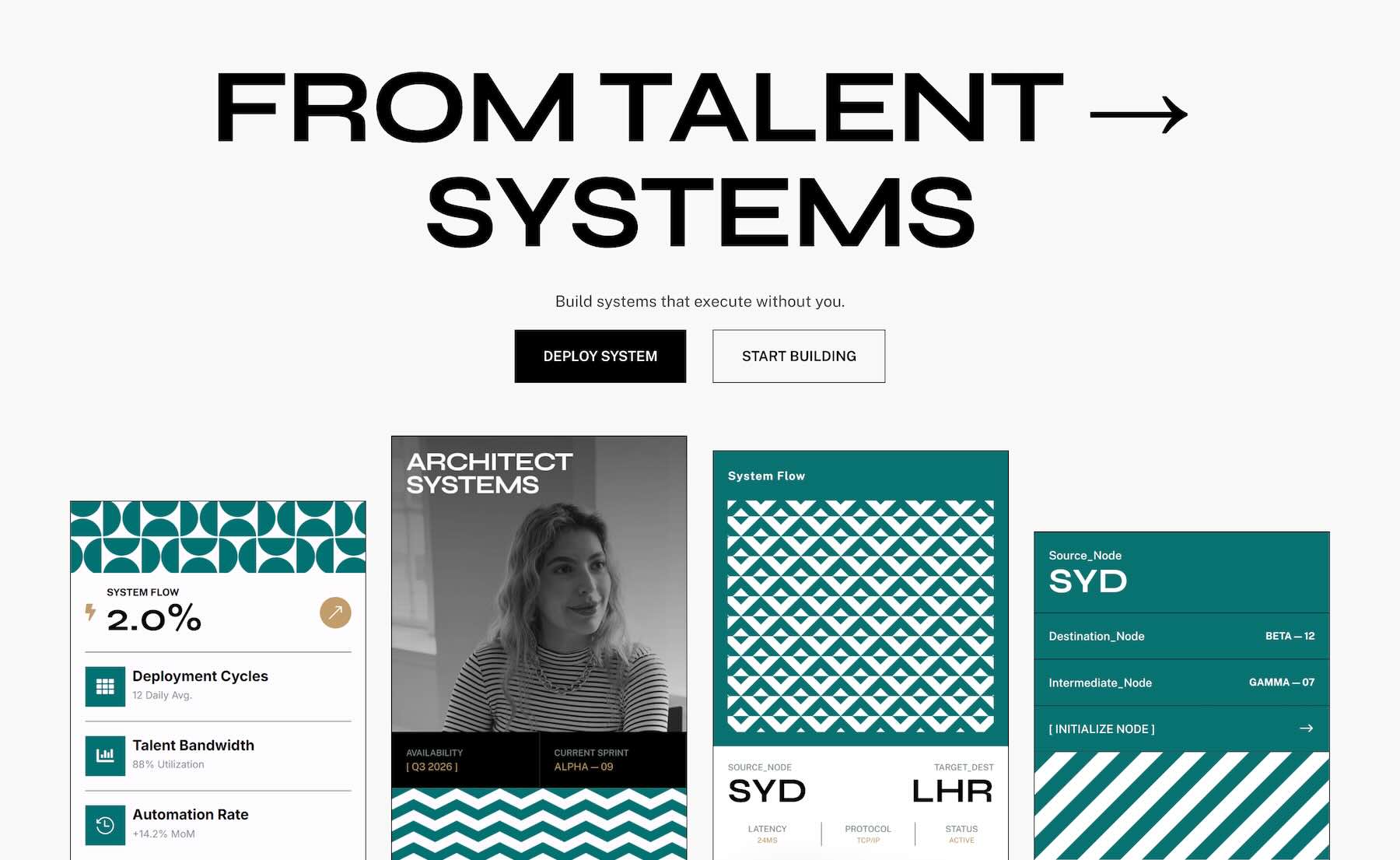
This can work especially well for platforms with several distinct tools, workflows, or features. Each card can represent a different part of the system while the headline provides the larger message tying everything together.
The cards also give you more flexibility when replacing the example content. You can mix screenshots, statistics, diagrams, profile cards, or other product visuals without requiring every asset to use the same proportions.
How To Use The UI Hero Sections
Keep your unzipped download folder handy. We’ll import one of the sections into Divi, add it to a page, and then customize the content and UI visuals.
1. Import The Hero Sections Into The Divi Library
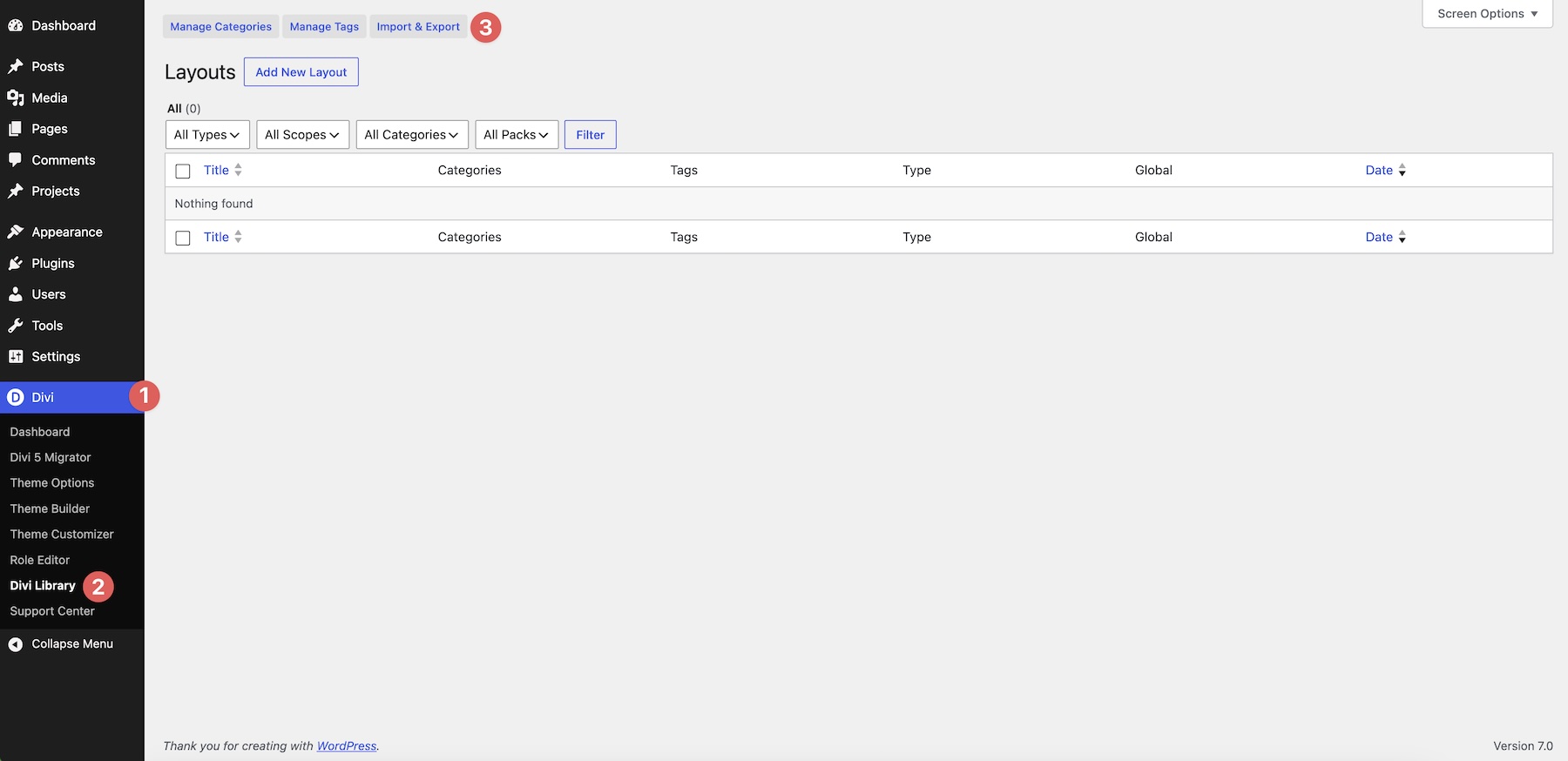
In your WordPress dashboard, go to Divi > Divi Library. Click Import & Export at the top of the screen.
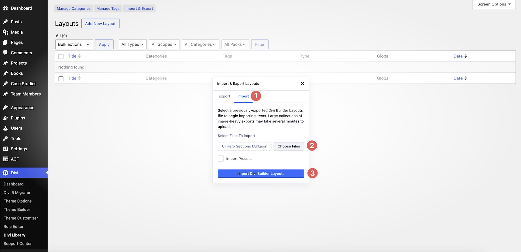
Open the Import tab and click Choose File. Select one of the individual UI Hero Section JSON files, or choose UI Hero Sections (All).json to import the entire collection. Click Import Divi Builder Layouts and wait for the import to finish. Select the JSON file itself rather than the ZIP archive.
2. Add A Hero Section To Your Page
Open your page in the Visual Builder and add a new section where you want the hero to appear. Choose Add From Library, select the imported hero, and click Use This Section.
The imported section gives you the complete starting composition. Before changing individual modules, take a moment to review its overall structure in the Layers panel. UI-heavy designs often rely on several neighboring or overlapping elements to create the final composition.
3. Replace The Headline And Supporting Copy
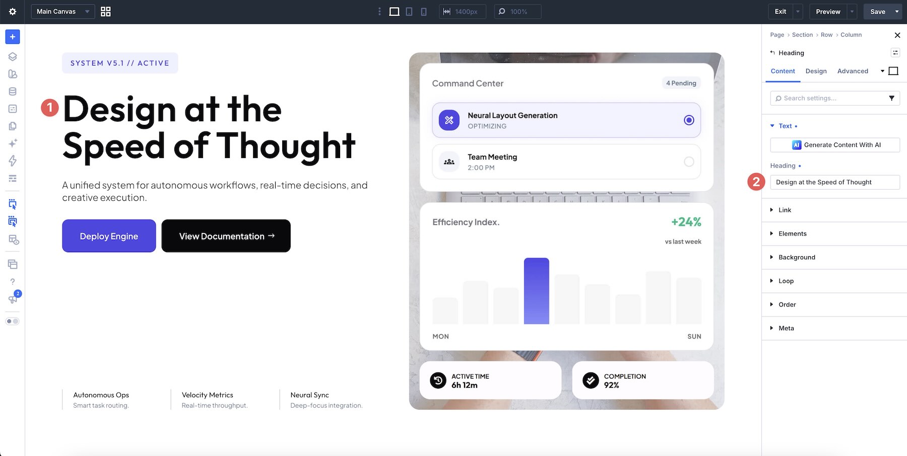
Start with the primary message. Open the heading settings and replace the example text with a concise headline that explains the product, service, or outcome visitors should understand first.
Then work through the supporting copy. Depending on the selected hero, this may include a short description, labels, feature descriptions, statistics, or smaller pieces of UI-related text.
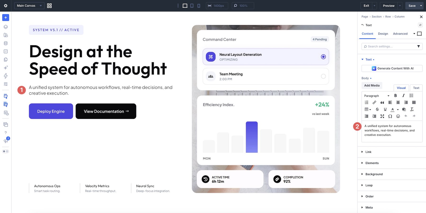
Keep the initial wording reasonably close to the amount of content used in the original composition. A significantly longer headline can change wrapping and push the interface preview further down the section.
4. Update Buttons And Calls To Action
Replace the sample button labels with actions that make sense for your website, such as starting a trial, exploring a product, booking a demo, or viewing more information.
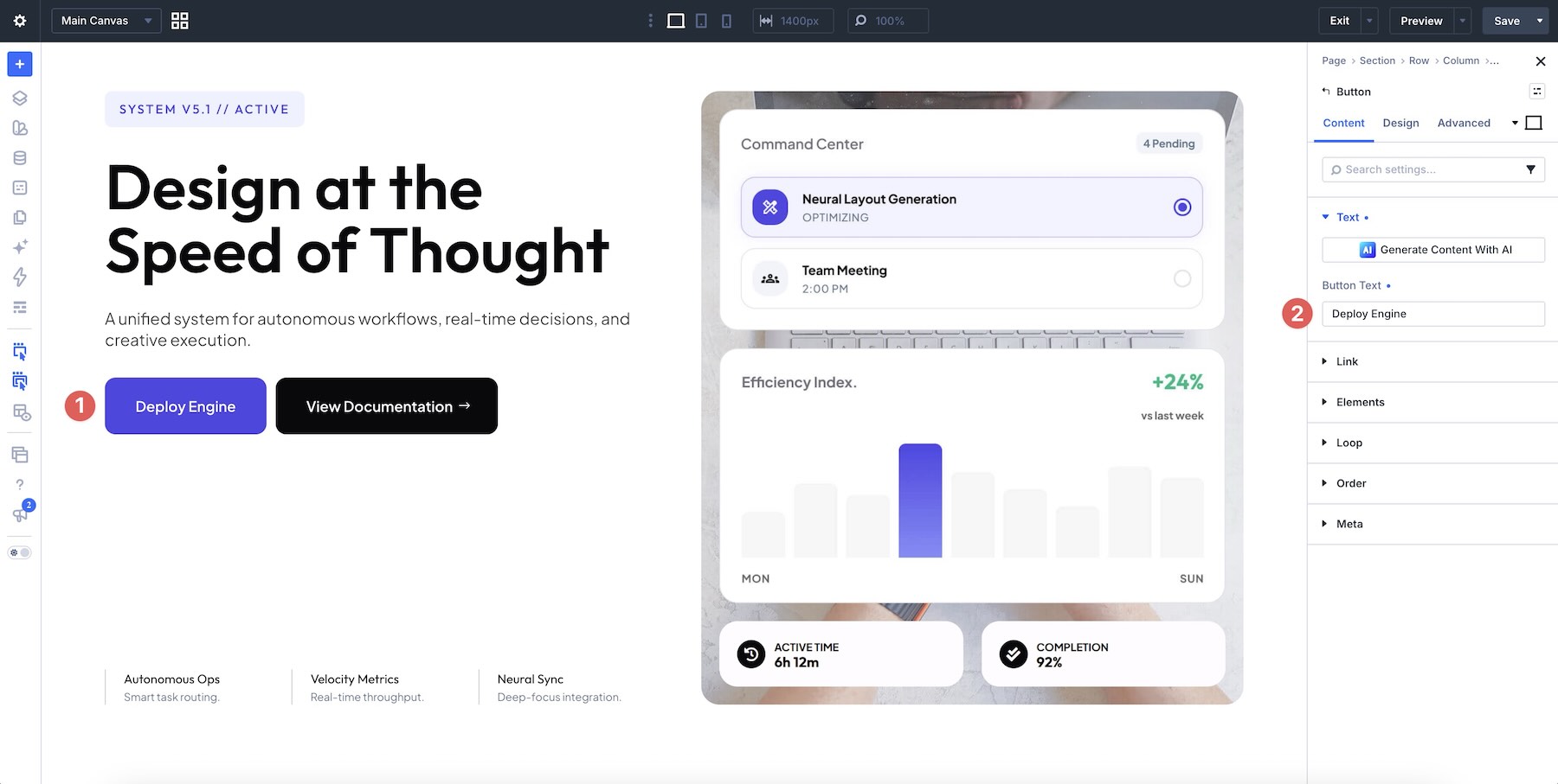
Update the destination URLs at the same time. If the hero contains more than one call to action, give each one a distinct purpose rather than sending both buttons to the same place.
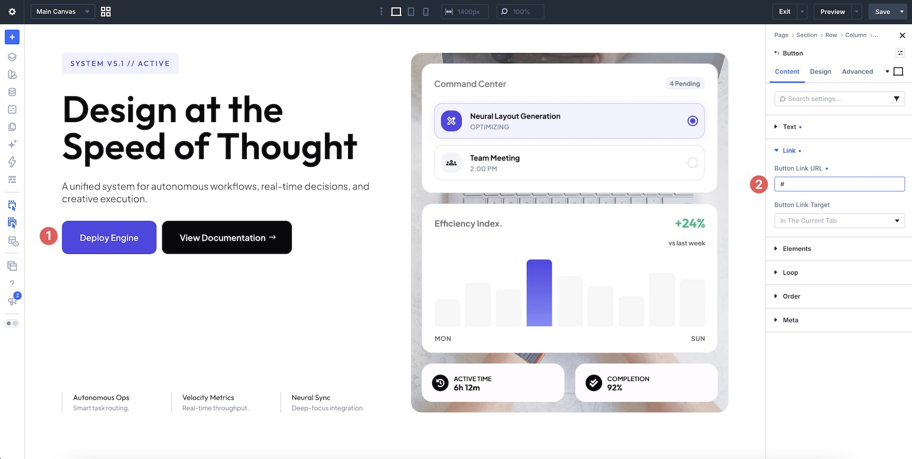
Review the visual hierarchy as well. The primary action should remain easier to notice, while secondary links or buttons can use a quieter treatment.
5. Replace The UI Imagery
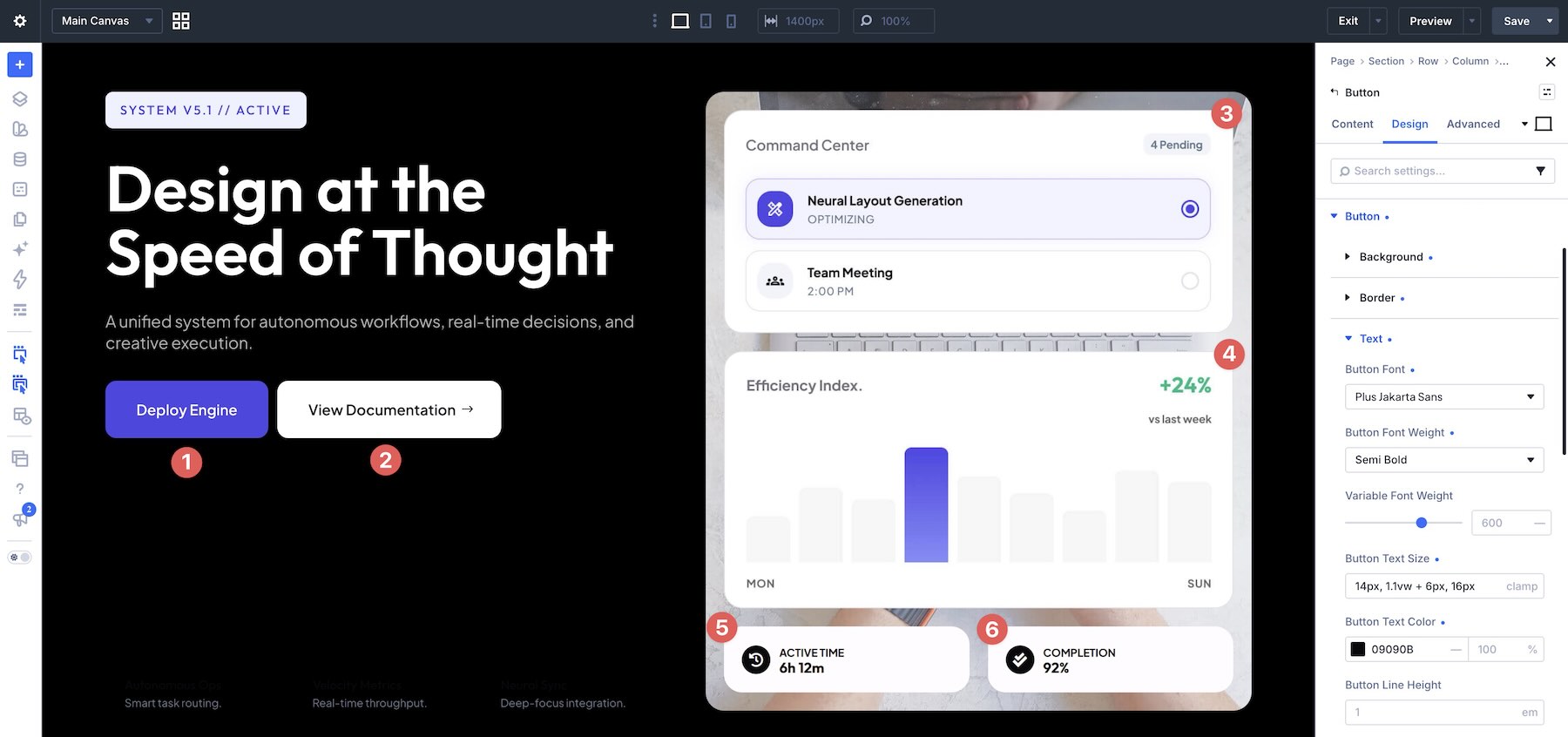
The interface visuals are one of the most important parts of these hero designs. Replace the sample images with screenshots, mockups, dashboards, cards, or other visuals from your own product.
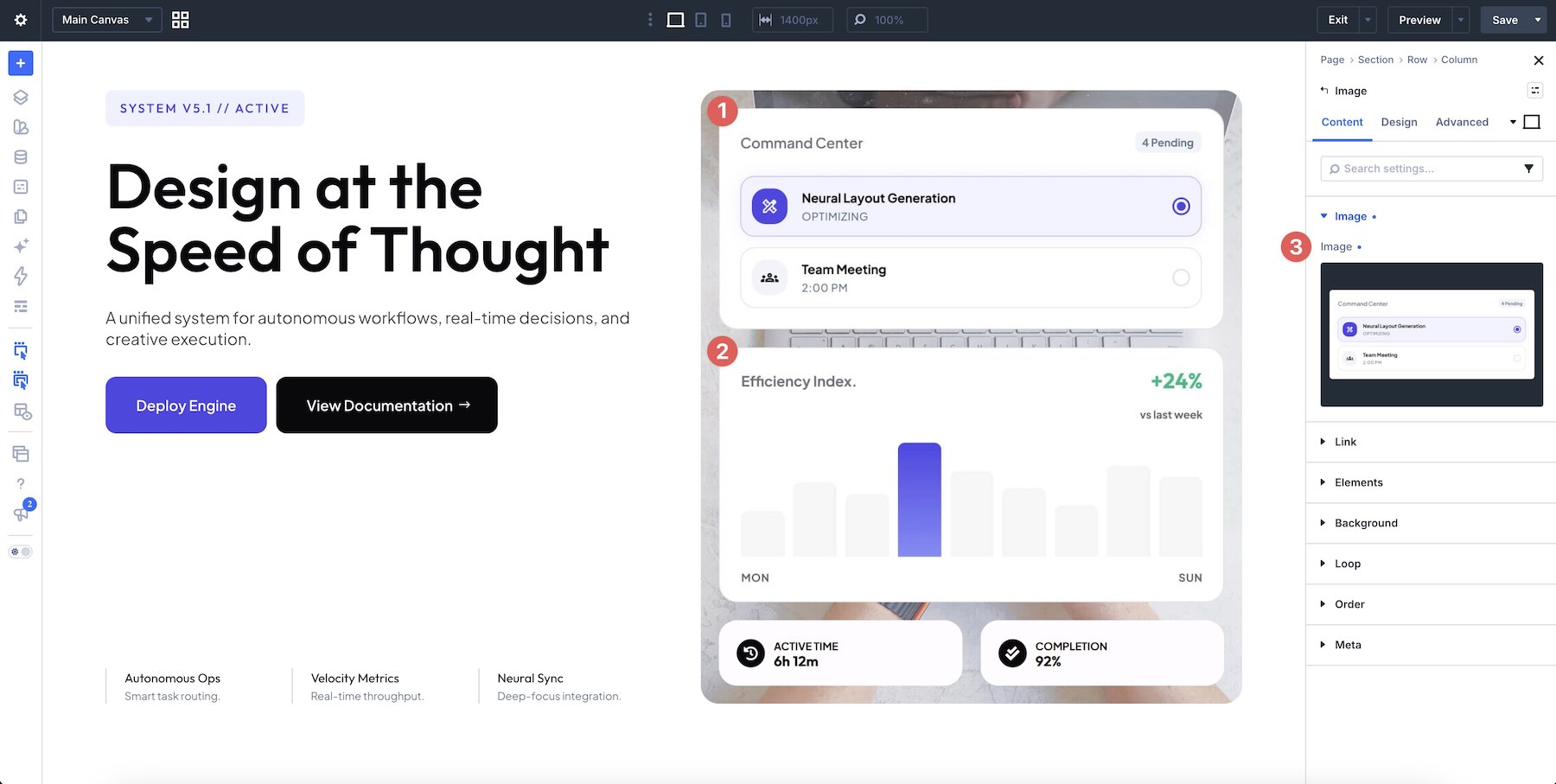
Pay attention to the role each image plays in the composition. A large central screenshot can contain more detail, while a smaller floating card should communicate one clear piece of information at a glance.
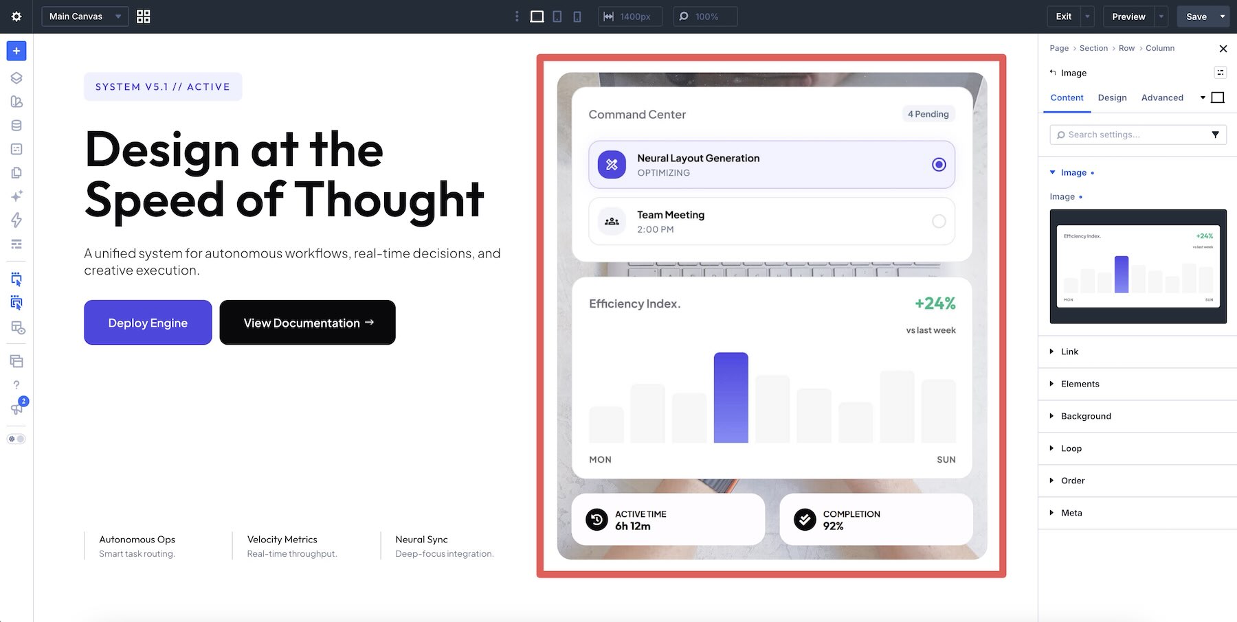
Try to keep replacement assets close to the proportions of the originals. If the aspect ratio changes dramatically, review the image sizing and crop so the surrounding composition remains balanced.
For layered designs, use the Layers panel when an image is difficult to select directly on the canvas.
6. Adapt The Colors To Your Brand
Replace the sample colors with your own palette while preserving the contrast that makes the interface elements readable.
Dark UI heroes can work particularly well with bright accents, gradients, or illuminated interface cards. Lighter layouts may benefit from a more restrained palette where one or two stronger accent colors guide attention toward important elements.
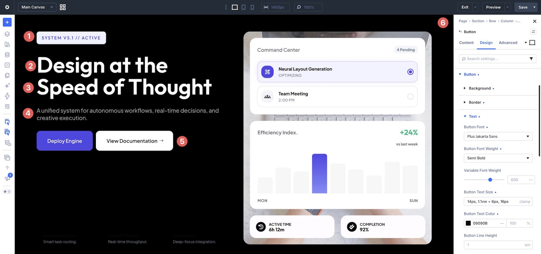
If you plan to reuse colors throughout the site, save them as Design Variables and assign those variables to the relevant settings. This makes later palette changes easier to manage.
7. Refine The Supporting UI Elements
Some of the heroes use more than a simple screenshot. Cards, labels, framed images, decorative panels, buttons, and smaller content blocks all contribute to the interface-inspired look.
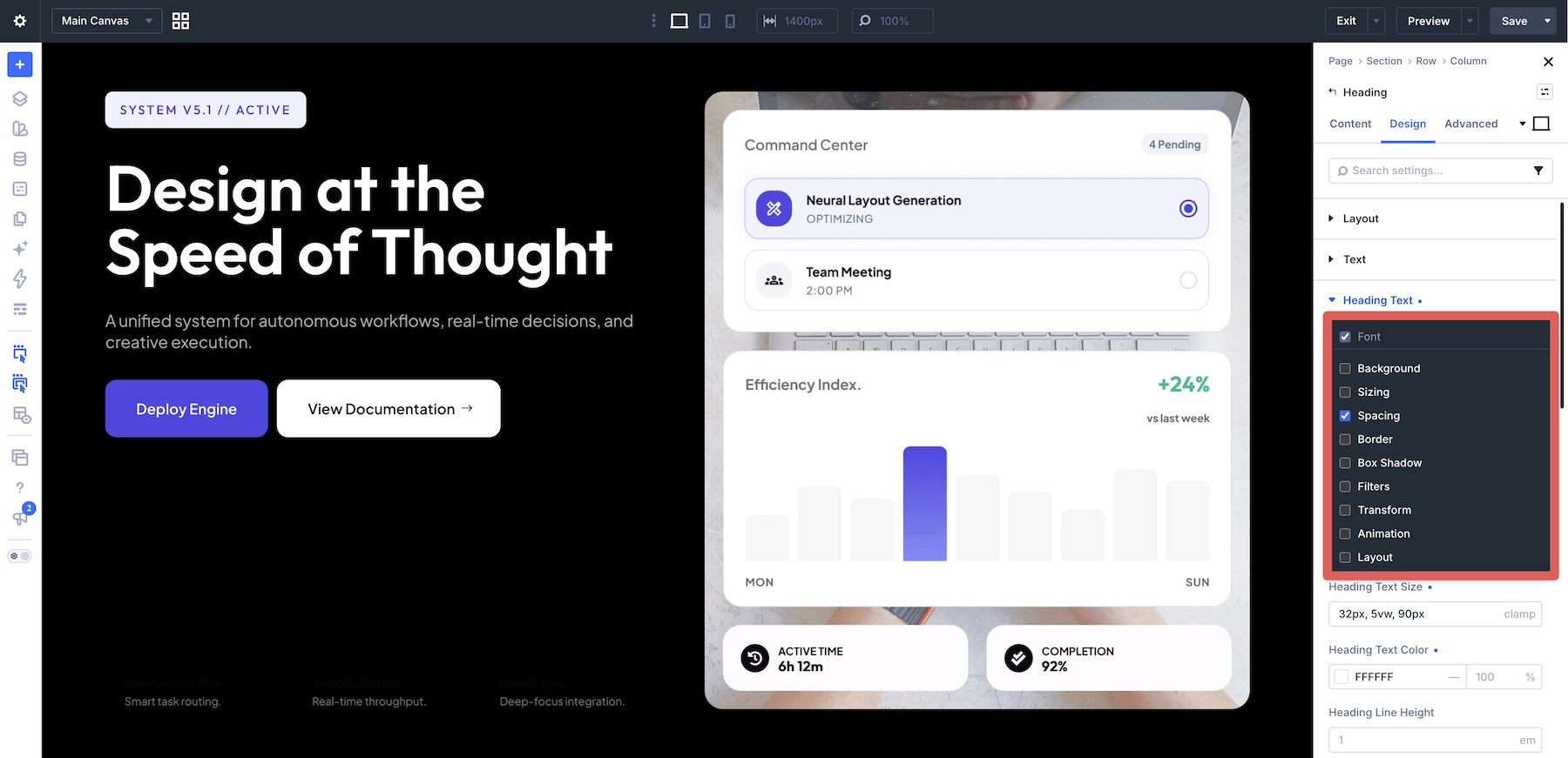
Use Divi 5’s Composable Settings when you need additional styling controls for a module sub-element. This can be useful when adjusting backgrounds, borders, spacing, transforms, and other settings without introducing additional elements simply for styling.
Keep decorative UI elements secondary to the actual message. The composition should feel detailed without making visitors search for the headline or primary action.
8. Check The Hero Across Breakpoints
Review the completed section on desktop, tablet, and phone. Interface-heavy hero designs can require more responsive adjustment than a simple text-and-image layout because several visual elements may share the same space.
Check headline wrapping, card sizes, image crops, button placement, spacing, and the order in which supporting UI elements appear.
On smaller screens, prioritize clarity over reproducing the exact desktop arrangement. Reduce oversized interface previews where necessary and give important text and actions enough room to remain easy to read and select.
Preview the page outside the builder as well and confirm that the hero does not introduce unwanted horizontal scrolling.
Tips For Effective UI Hero Sections
UI-focused heroes work best when the interface helps explain the product rather than acting only as decoration.
Show The Most Recognizable Part Of The Product
You rarely need to fit the entire application into the hero. Choose the dashboard, workflow, feature, or screen that communicates the product most quickly.

A focused screenshot usually creates a stronger composition than shrinking a large interface until none of its details can be understood.
Create A Clear Visual Hierarchy
The headline, call to action, and primary interface preview should remain the most important elements. Smaller cards and decorative UI components can provide context without competing with those focal points.
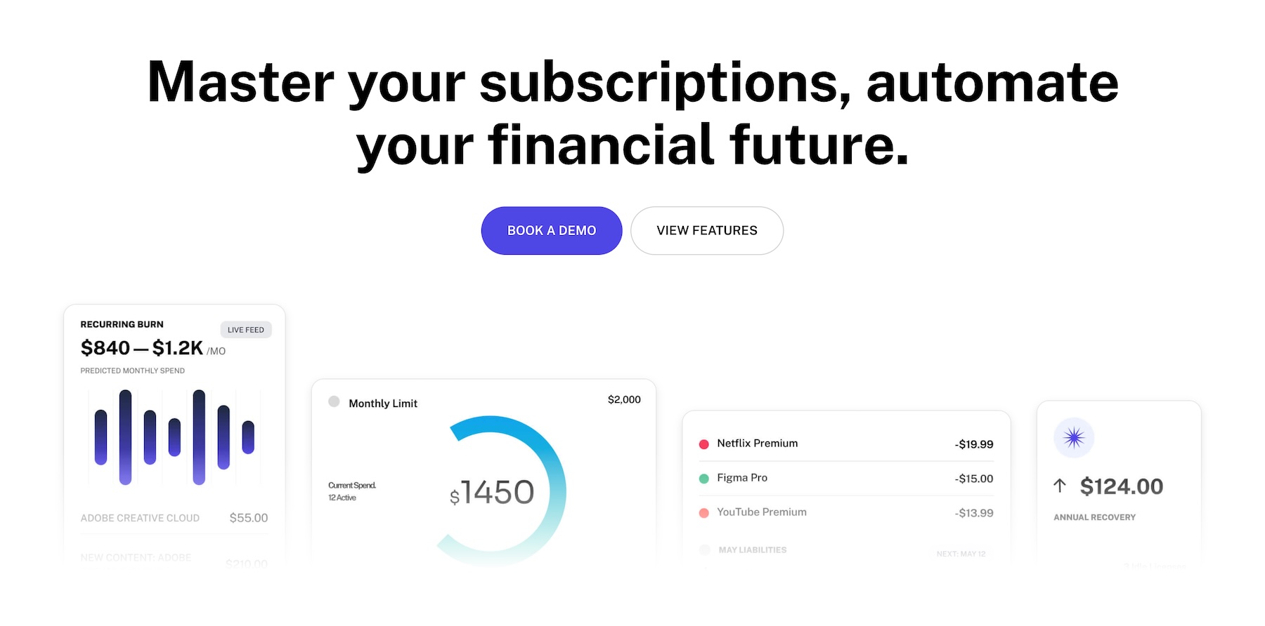
When several cards are used together, vary their scale or placement so they read as one composition rather than several equally important boxes.
Keep Interface Details Legible
A UI mockup may look impressive at full resolution but become unreadable once placed inside a hero. Avoid relying on tiny labels or statistics to communicate essential information.

Let the overall interface shape establish context, then use larger text outside the screenshot to explain what visitors need to know.
Use Contrast To Separate The UI From The Background
Give interface previews enough visual separation from the surrounding section. A subtle border, shadow, background panel, contrasting surface, or gradient can help the UI read as a distinct layer.

The effect does not need to be dramatic. It only needs to make the product visuals easy to distinguish from the page around them.
Replace Generic UI With Real Product Context
The included interface imagery helps establish the composition, but replacing it with visuals from your own product will make the hero substantially more useful.
Use real screenshots where possible, or create simplified mockups that accurately represent the experience visitors will find after clicking through.
Start Building In Divi 5 Today!
These 7 UI Hero Sections give you ready-made starting points for introducing software, products, services, and digital experiences with a strong interface-led visual direction.
Import the design that best fits your project, replace the example UI and copy, and adapt the typography, colors, and calls to action to fit your brand.
Use the collection as a starting point for your next hero section in Divi 5.
The post 7 UI Hero Sections For Divi 5 (Free Download!) appeared first on Elegant Themes Blog.