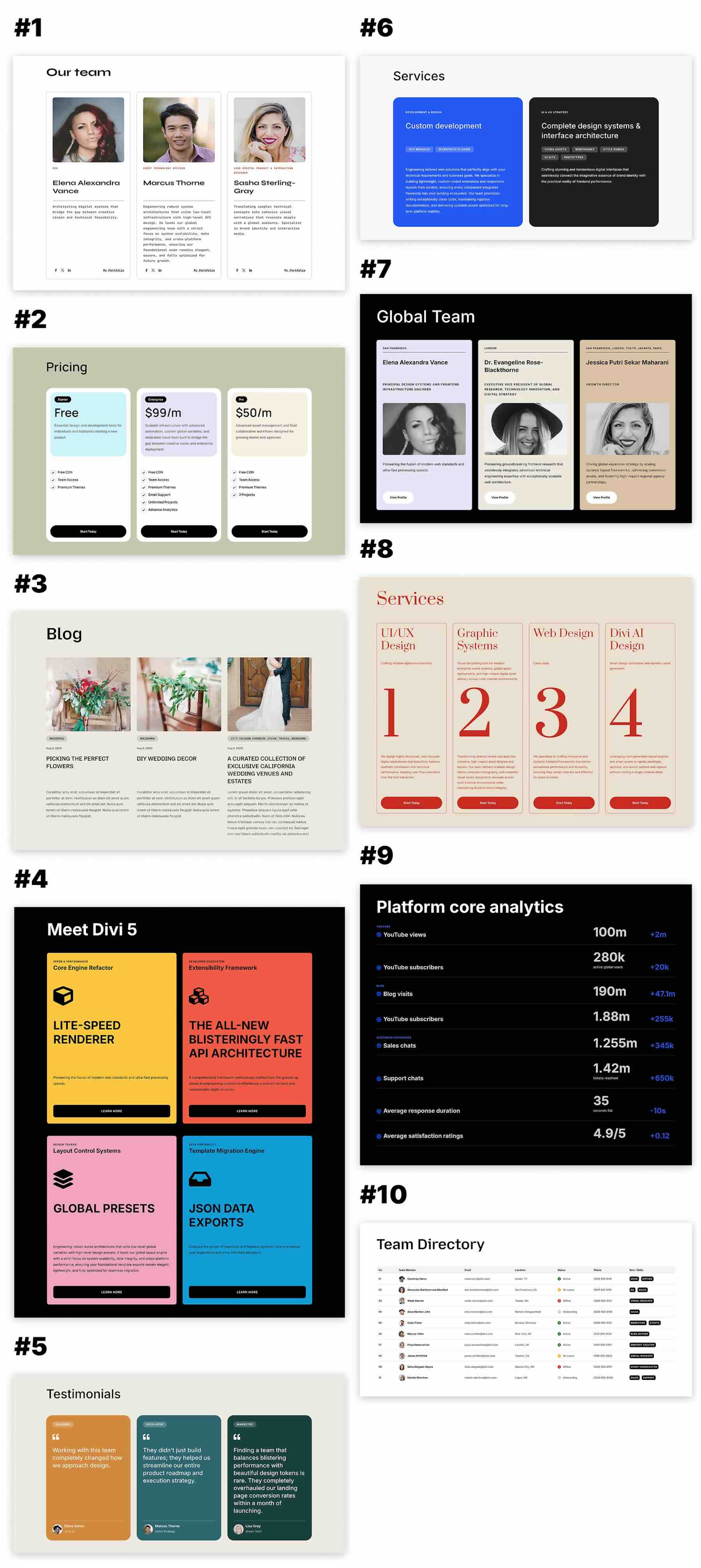
Divi 5 brings the flexibility of CSS Grid into the Visual Builder, making it possible to create structured layouts with precise control over rows, columns, gaps, and alignment. In this free pack, you’ll get 10 CSS Subgrid Layouts for Divi 5 that are perfect for testimonials, services, feature cards, team sections, project showcases, comparison layouts, process steps, and other repeated content.
Subgrid allows a nested grid to use track sizing from its parent grid along a selected axis. This is especially useful for repeated cards because corresponding areas can remain aligned across the layout even when headings, descriptions, images, or other content vary in length. Import your favorite section, replace the example content, customize the styling, and adapt the structure to your website.
Preview
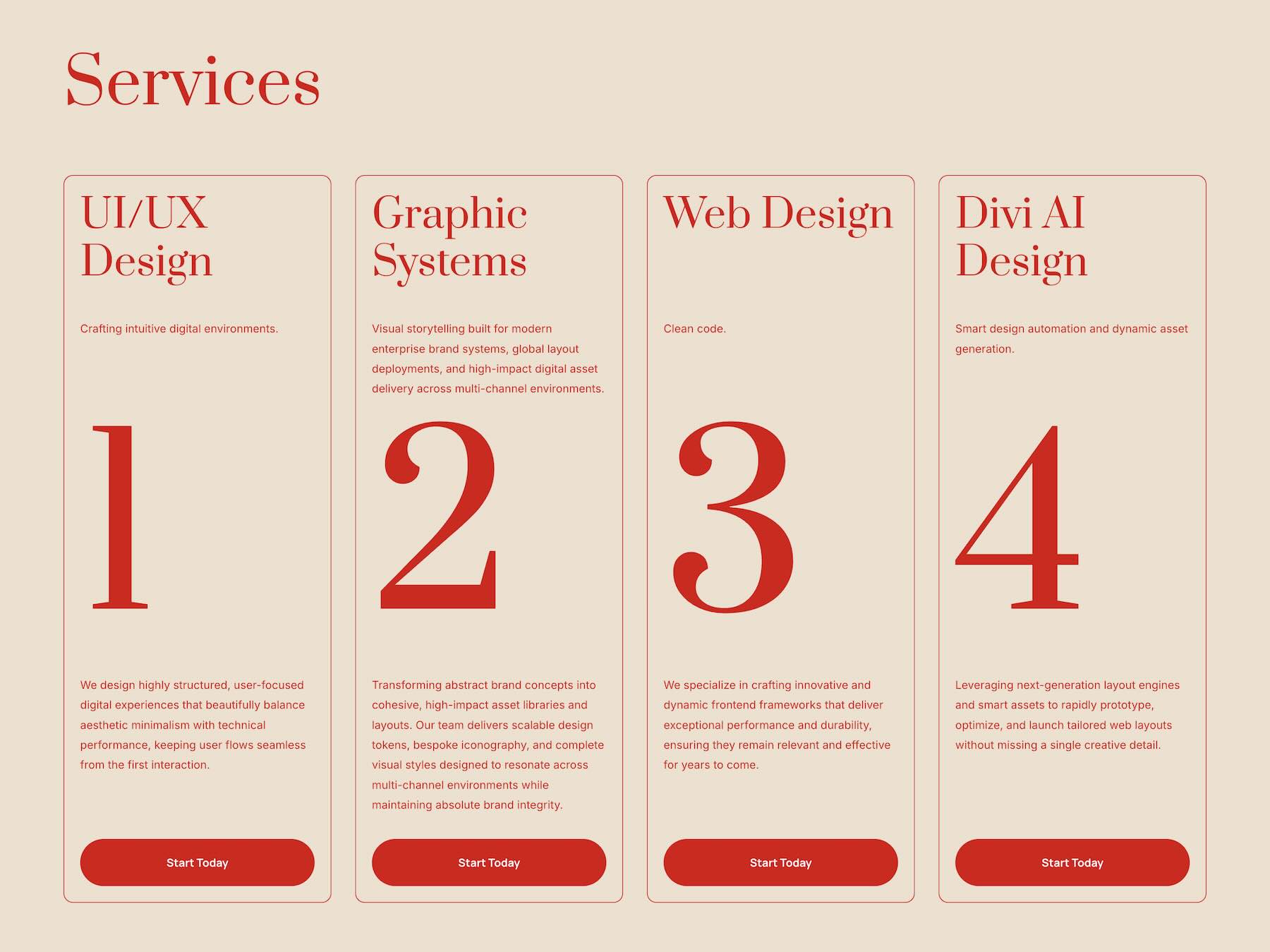
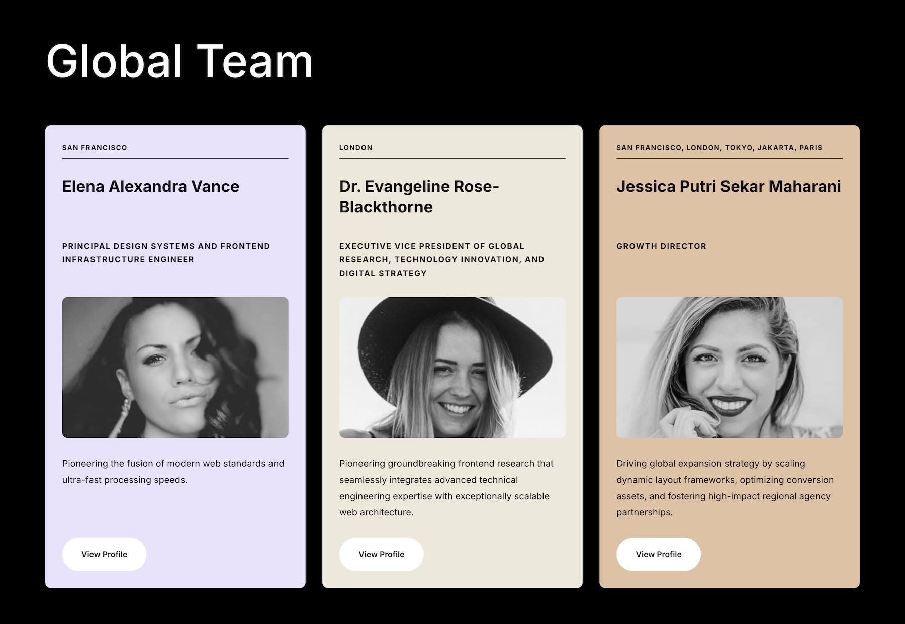
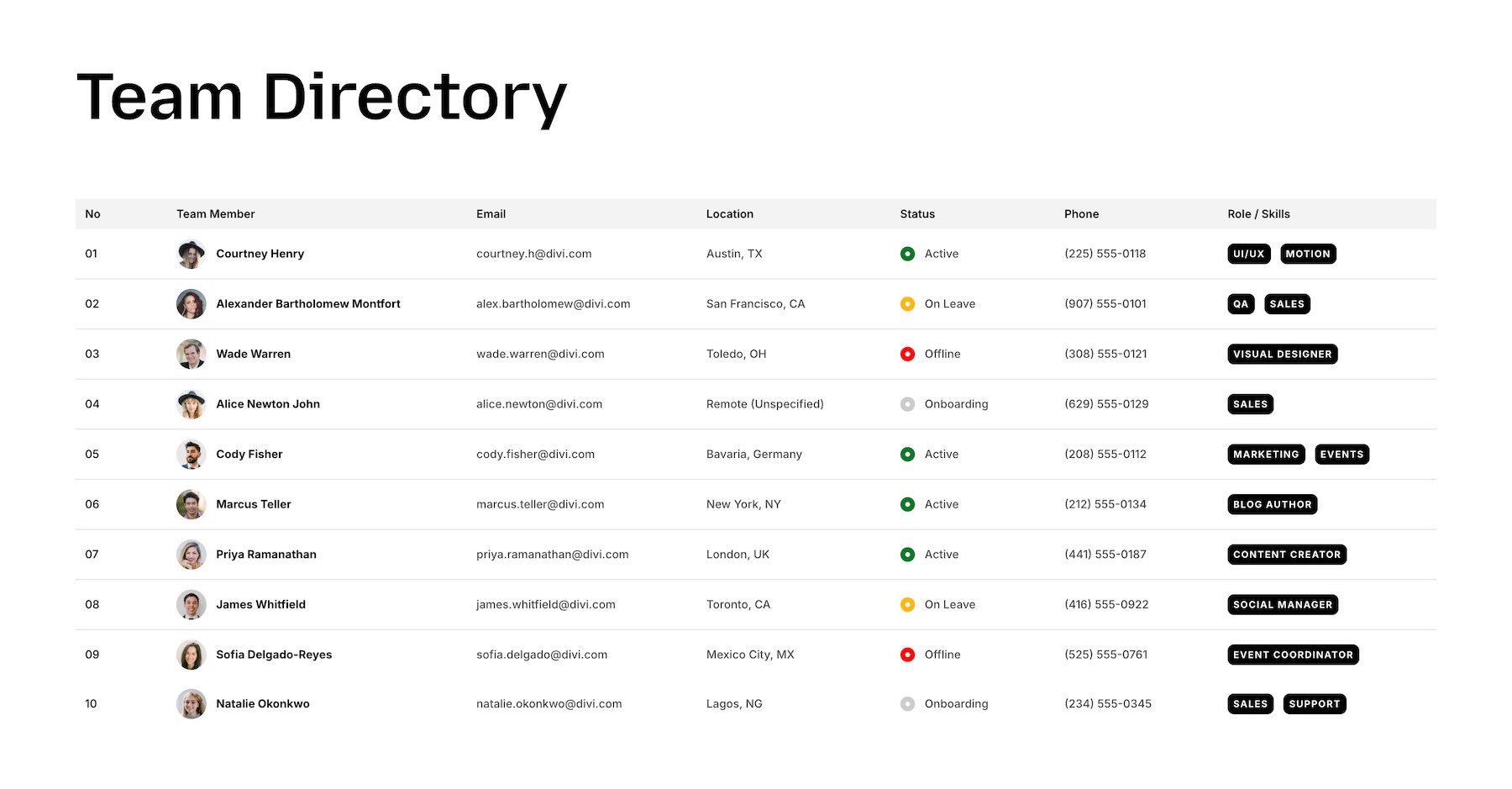
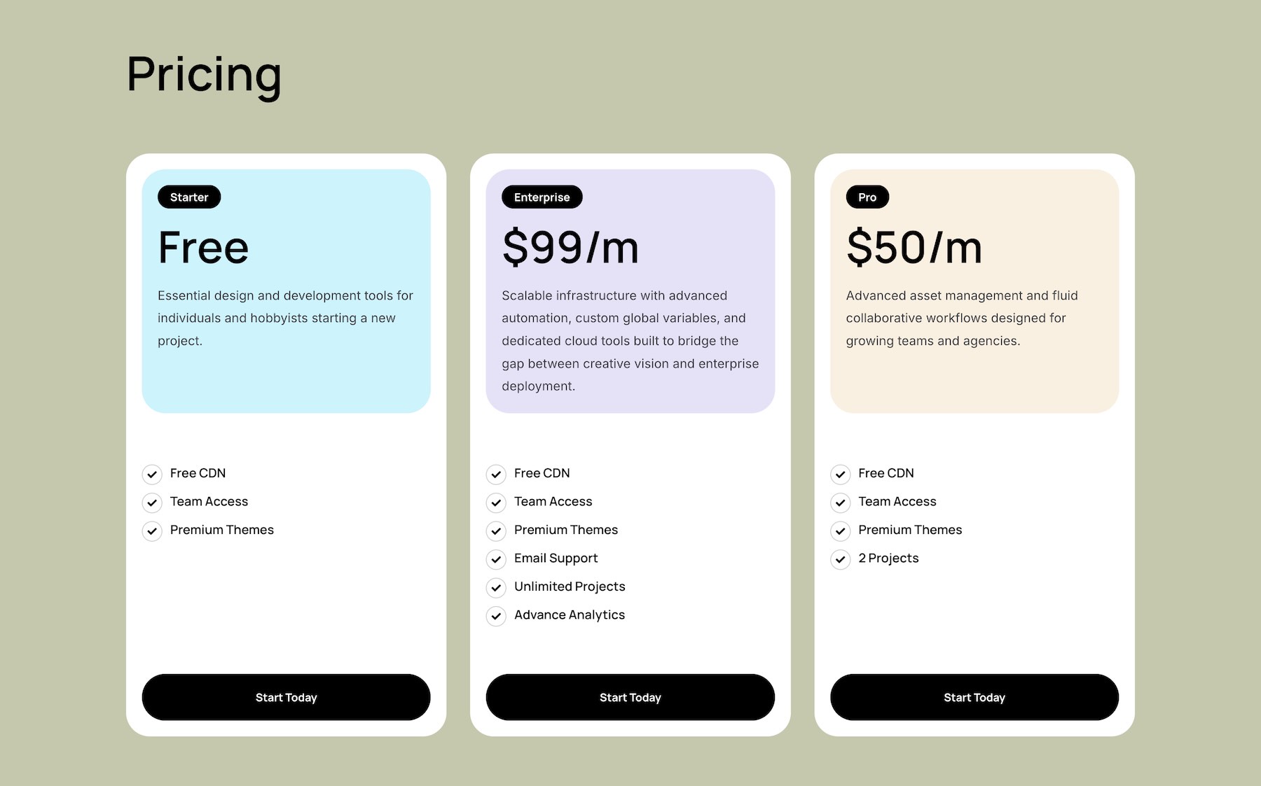
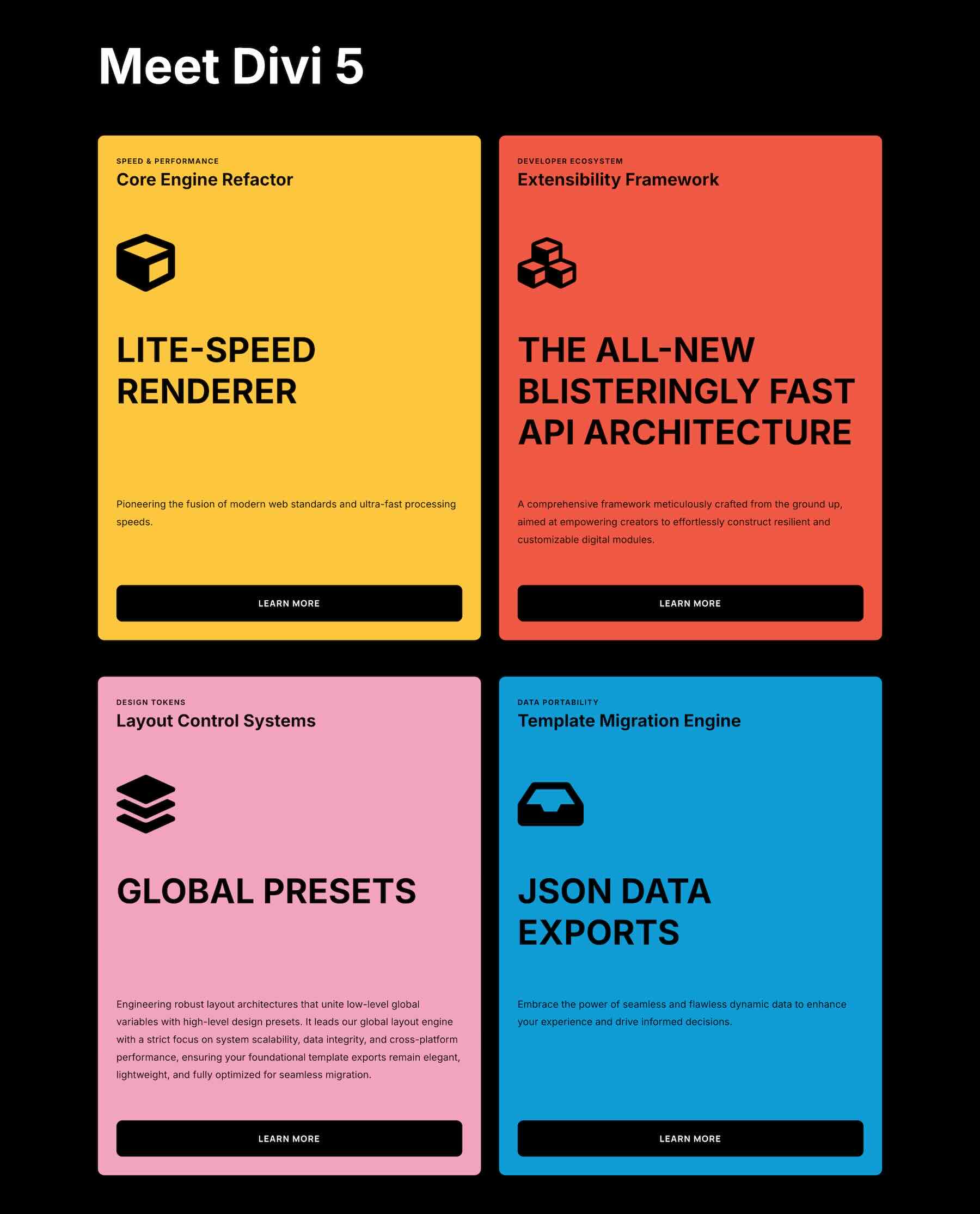
Here’s a quick look at the 10 CSS Subgrid Layouts included in the pack. The download is further down the post.
Download 10 CSS Subgrid Layouts For Divi 5
Get all 10 sections for free. Import them into your Divi Library and add them to any page in the Visual Builder.

What’s Included (11 Exports)
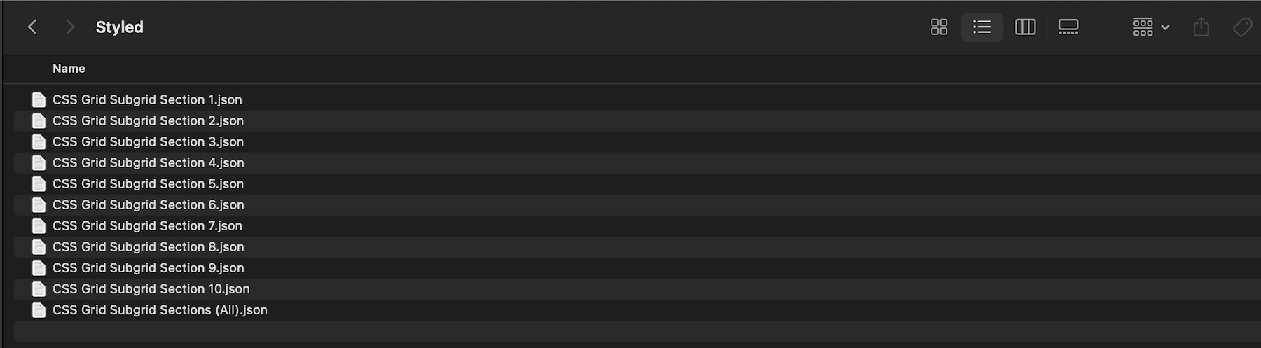
After you download and unzip the file, you’ll find 10 individual CSS Subgrid section exports, plus 1 file containing all layouts.
CSS Grid Subgrid Section 1 to 10 (10) → Ten fully styled layouts featuring different combinations of repeated cards, imagery, headings, descriptions, labels, numbers, buttons, and supporting details arranged with CSS Grid and Subgrid.
CSS Grid Subgrid Sections (All) → Imports all 10 designs into your Divi Library at once.
How To Use The CSS Subgrid Layouts
Keep your download folder handy. We’ll import the files, add a CSS Subgrid section to a page, replace the example content, and customize the design while preserving its alignment system.
1. Import Sections Into The Divi Library
Go to Divi → Divi Library. Click Import & Export at the top of the screen.
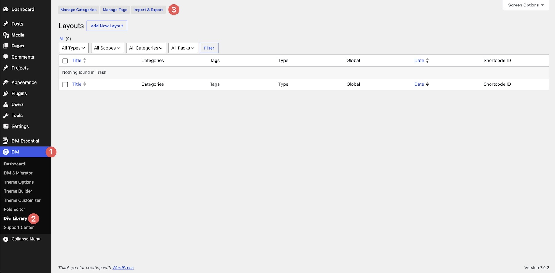
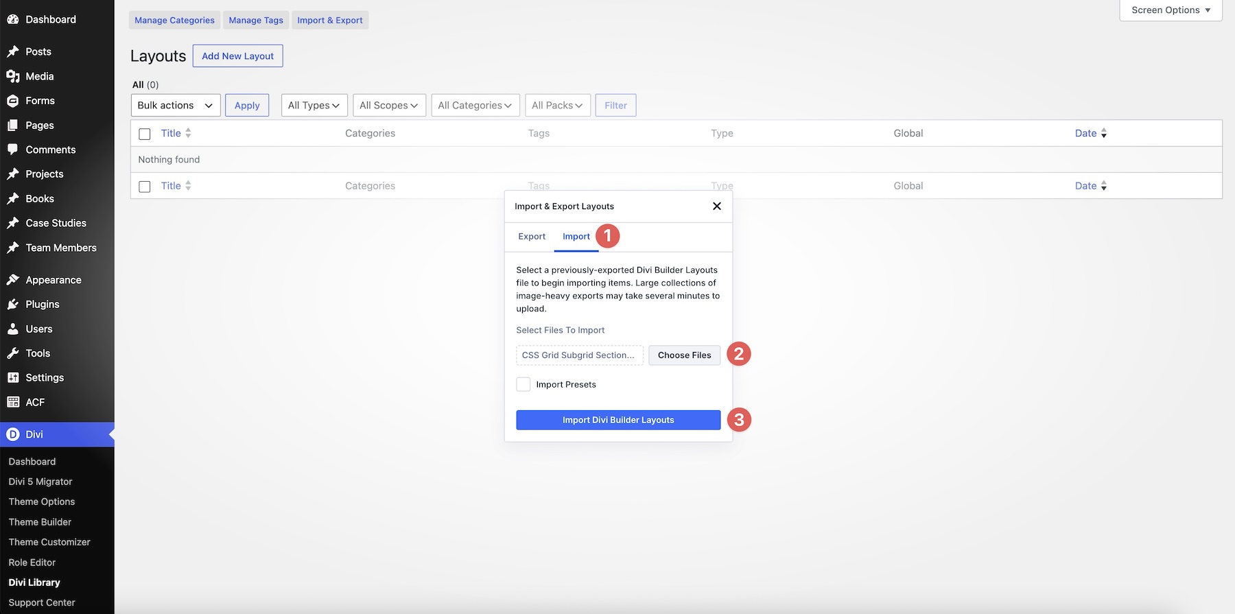
In the Import & Export Layouts modal, switch to the Import tab, then click Choose File. Select any individual CSS Grid Subgrid Section JSON file if you only want one design. To import every layout at once, choose CSS Grid Subgrid Sections (All).json instead.
Click Import Divi Builder Layouts and wait for the import to complete.
2. Add A CSS Subgrid Section To Any Page
Open a page in the Visual Builder and add a new Section where you want the layout to appear.
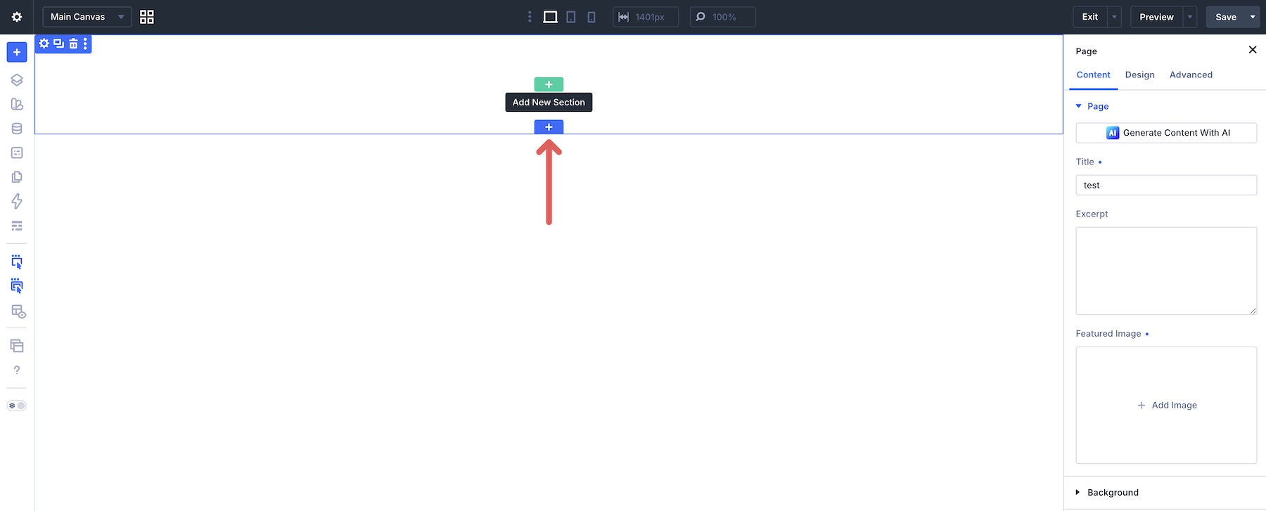
Click Add From Library and select one of the CSS Subgrid sections you imported.
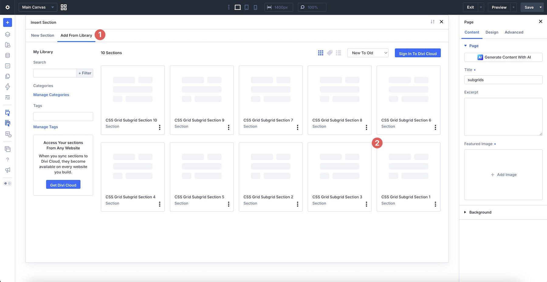
The complete design will be added to the page with its original modules, nested containers, Grid settings, Subgrid relationships, colors, typography, and spacing intact.
3. Replace The Example Content
Start by replacing the example headings, descriptions, labels, numbers, names, roles, buttons, images, and other supporting details with your own content.
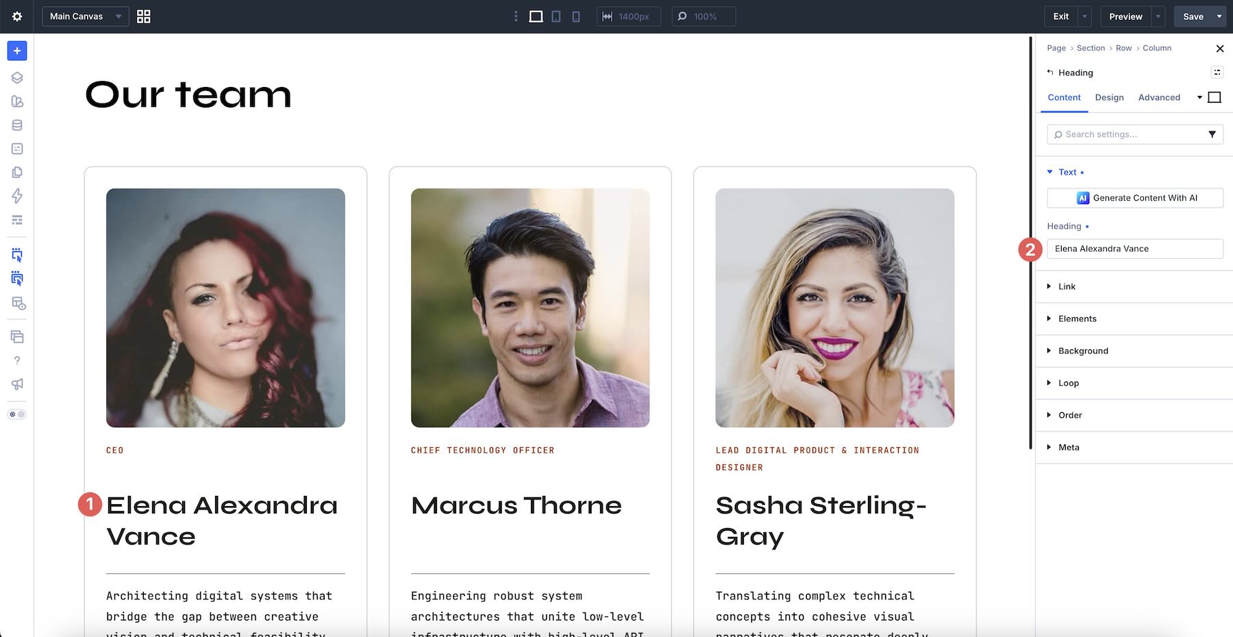
Work through one repeated item at a time. Replace every piece of content inside that item, then move to the next card or block. This makes it easier to keep the structure consistent across the full section.
The layouts are designed to accommodate natural differences in content length while keeping corresponding areas aligned. However, extremely short or long copy can still change the balance of a card, so review the section as a complete composition after adding your content.
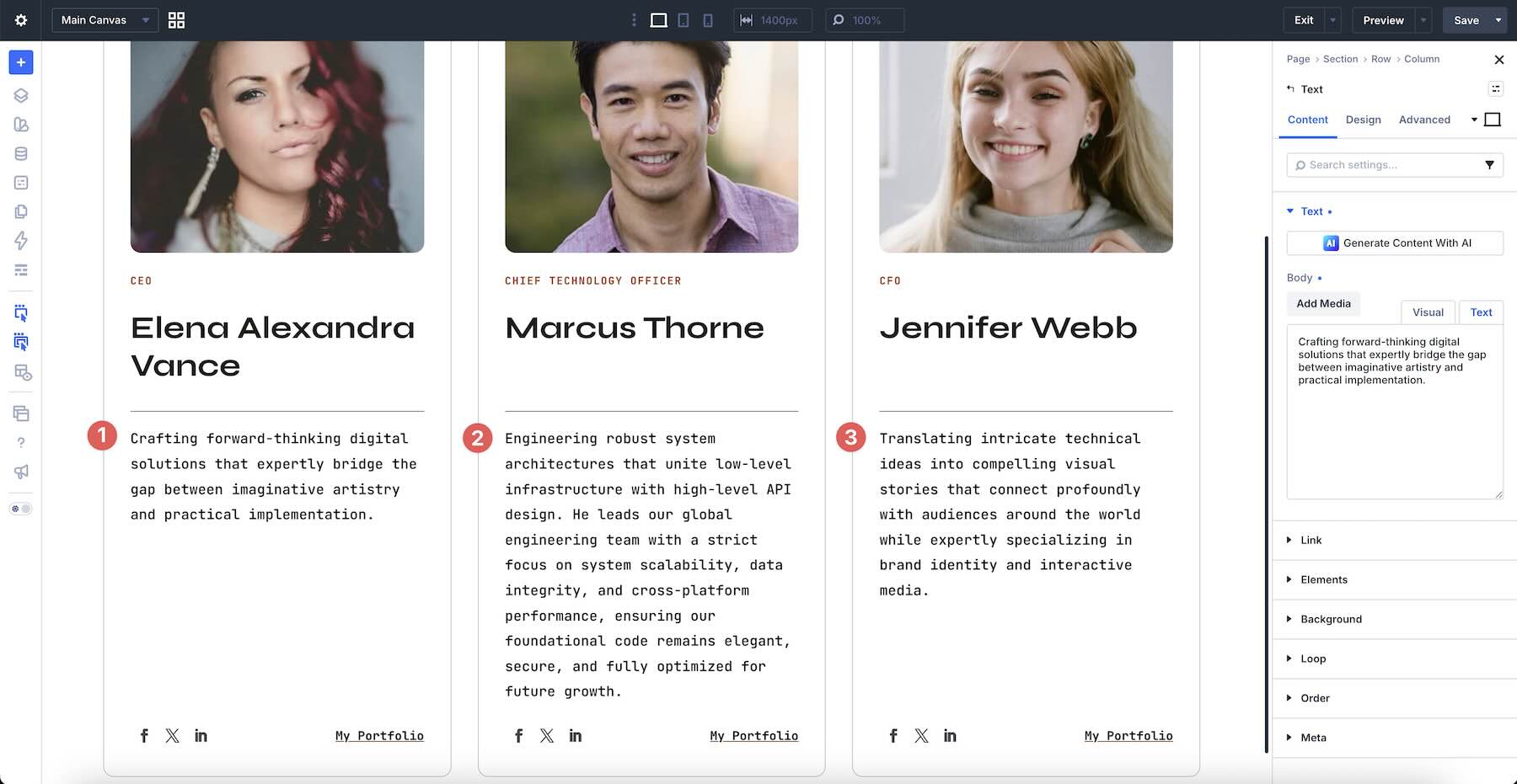
When replacing buttons or linked elements, update their destination URLs and make sure the labels clearly describe the action visitors can take.
4. Understand The Parent Grid And Subgrid Structure
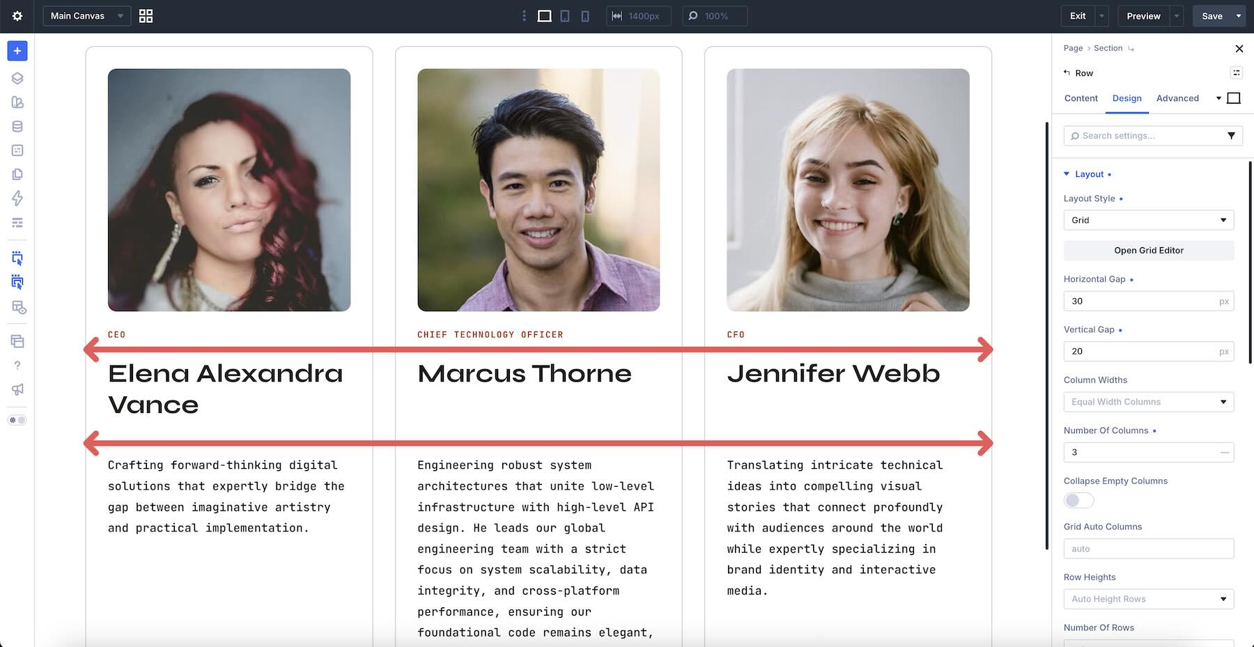
Each design uses a parent grid to establish the larger layout and nested grid containers for the repeated content. Subgrid allows those nested containers to follow the relevant row or column tracks defined by the parent instead of creating unrelated tracks of their own.
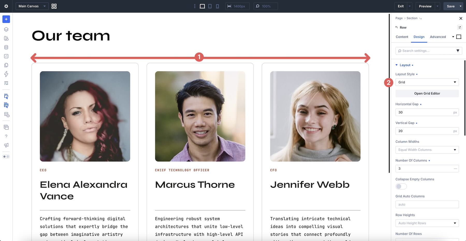
This shared structure helps corresponding elements line up across neighboring cards. For example, headings can occupy the same track, descriptions can begin and end within coordinated areas, and buttons or author details can remain aligned toward the bottom.
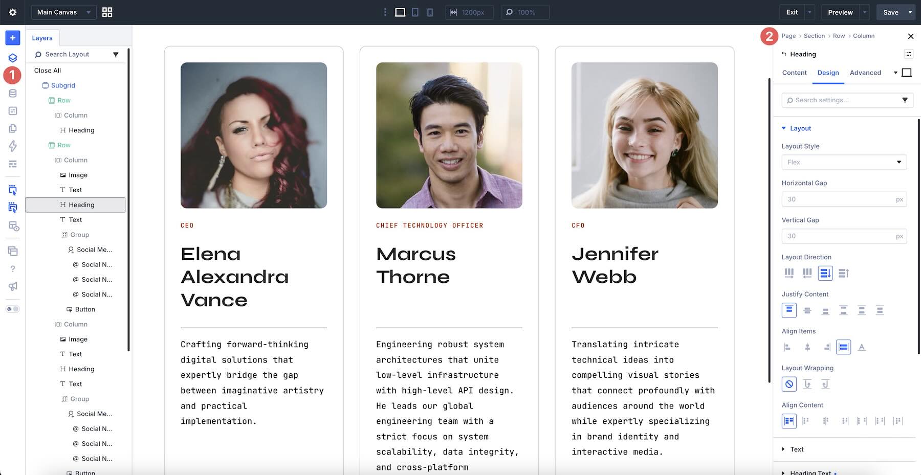
When exploring a layout, use Divi’s Layers panel or Element breadcrumbs to understand which elements belong to the parent grid and which sit inside the nested grid containers. Identifying that hierarchy before making structural changes will help you preserve the intended alignment.
Avoid removing a nested container solely because it appears to add another layer. That container may be responsible for the Subgrid relationship that coordinates its internal content with neighboring items.
5. Adjust The Grid Without Breaking Alignment
If you want to change the number or width of the main columns, begin with the parent grid container. Use its Grid settings or open Divi 5’s CSS Grid Editor where appropriate to review the larger structure, track sizes, and gaps.
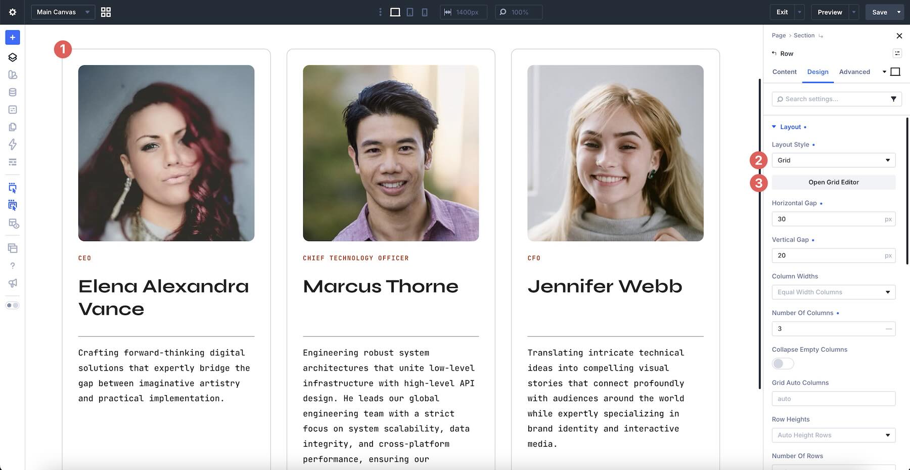
Make one structural change at a time and then check every repeated item. Because the nested grids depend on tracks established by the parent, changing the parent can affect alignment throughout the section.
To add another service, testimonial, feature, or other repeated item, duplicate the complete item container rather than copying only its visible modules. This preserves the nested structure and gives the new item the same alignment behavior as the existing ones.
If you remove an item, check whether the parent grid still has the right number of columns for the remaining content. Adjust the column structure when necessary so the section does not leave an unintended gap.
6. Customize The Styling
These CSS Subgrid Layouts are already styled, but you can customize their colors, backgrounds, typography, borders, images, spacing, buttons, and other design settings to match your website.
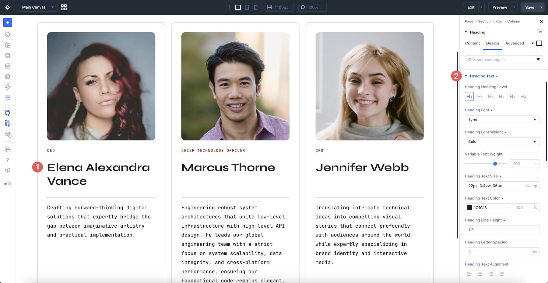
Start with shared visual decisions such as the section background, card colors, heading styles, border treatments, and button appearance. Repeating a focused set of values helps the individual items read as parts of one system.
When changing internal padding or gaps, apply the values consistently across comparable items. Subgrid coordinates track alignment, but inconsistent spacing inside individual elements can still make the design feel uneven.
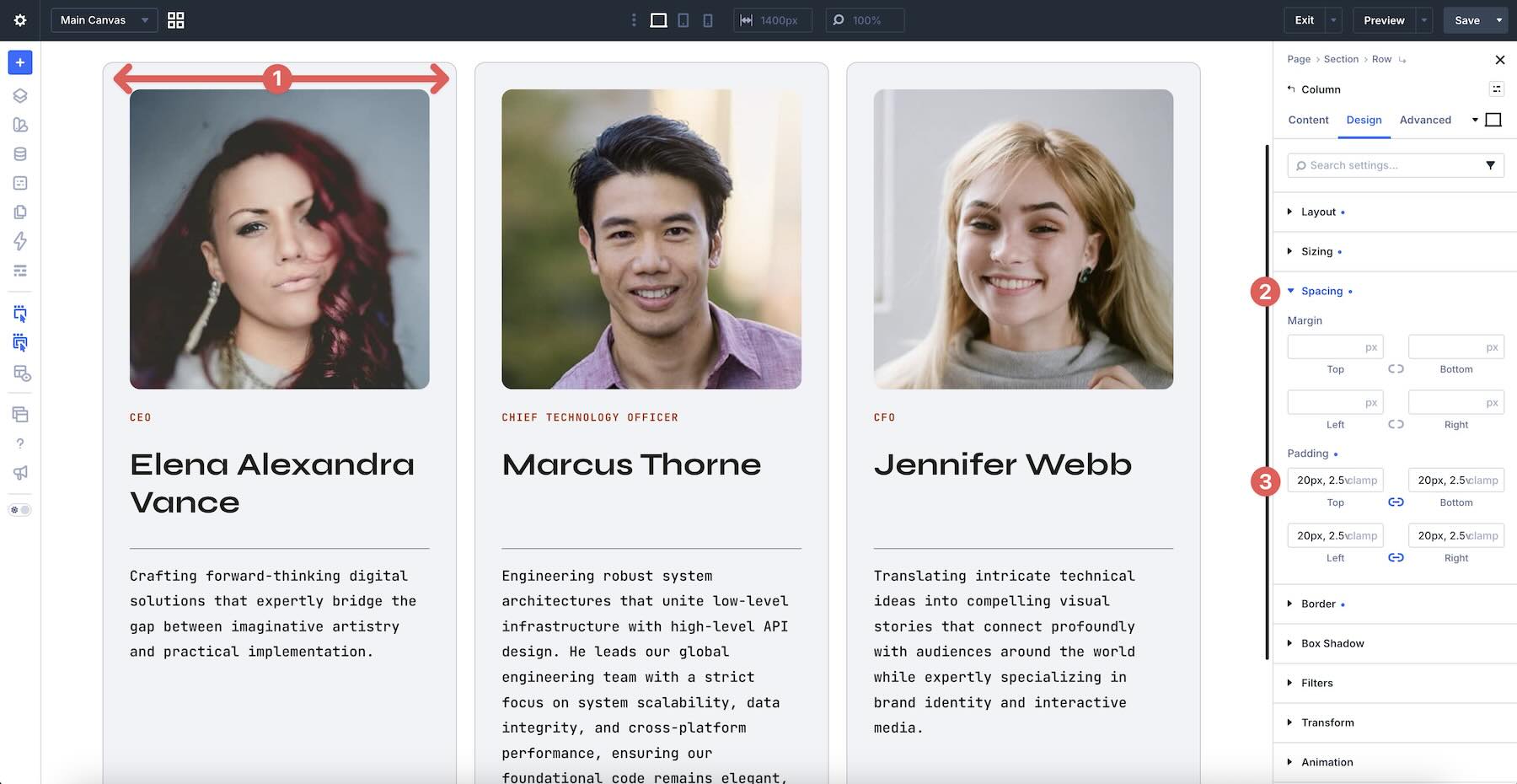
For layouts that use contrasting cards, you can vary background and accent colors while keeping typography, borders, spacing, and component order consistent. This adds visual variety without weakening the shared structure.
7. Check The Layout On Smaller Screens
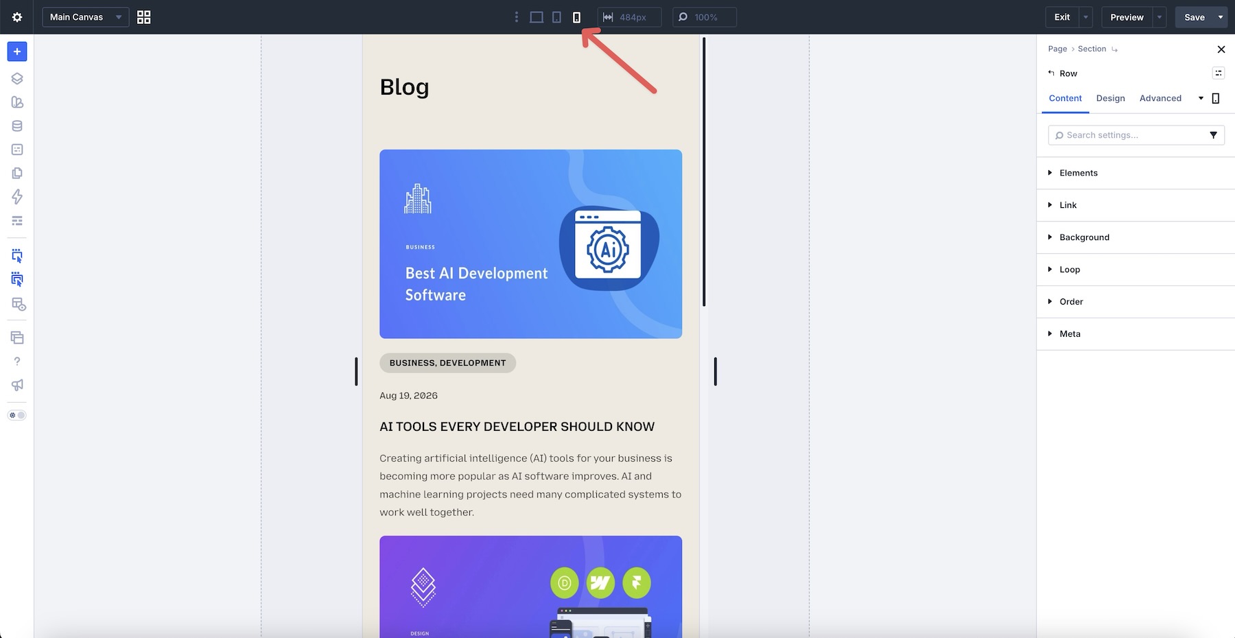
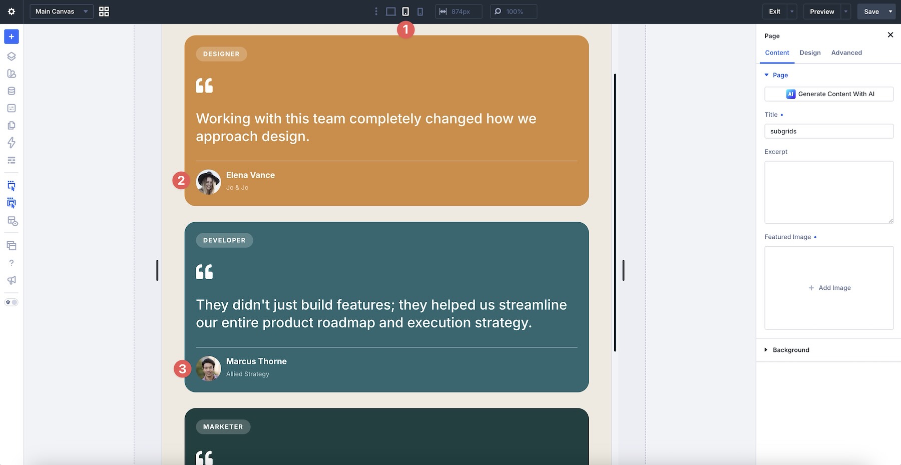
Repeated multi-column layouts often need a different structure on narrower screens. Use Divi’s responsive editing tools to review the section on desktop, tablet, and phone before publishing.
Pay particular attention to the number of columns, stacking order, nested alignment, card spacing, text length, button placement, and image sizing. A row of four cards on desktop may work better as two columns on tablet and one column on phone.
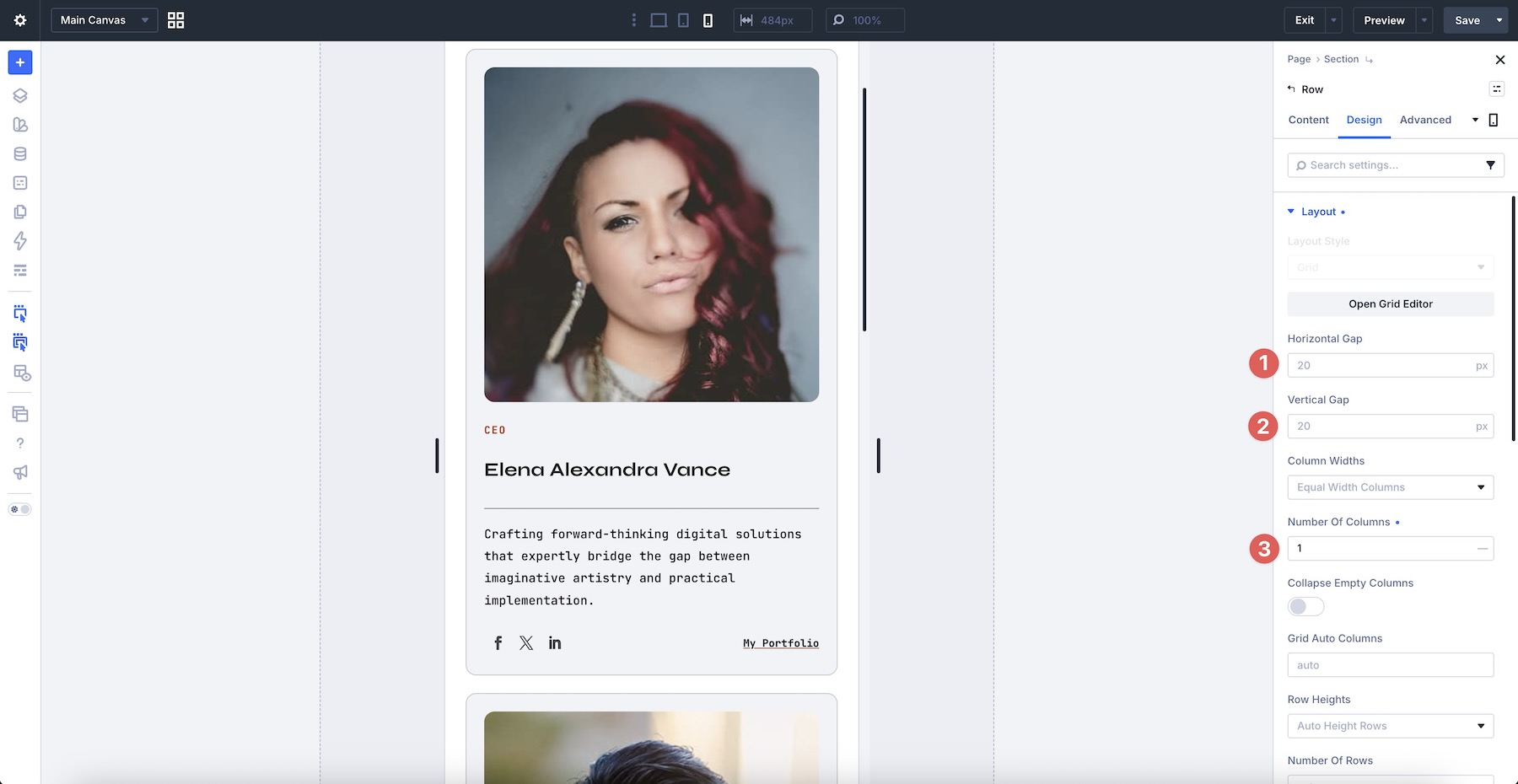
If you change the parent grid at a smaller breakpoint, review the nested items at that same breakpoint. Confirm that each card still contains its content in a logical order and that the Subgrid structure continues to support the intended alignment.
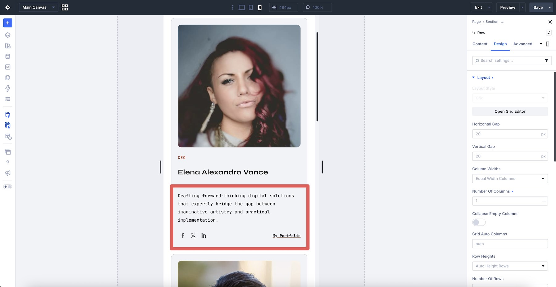
Check the live page as well as the builder previews. This will help you confirm that the content remains readable and the repeated items feel balanced at different viewport widths.
Tips For Effective CSS Subgrid Layouts
Subgrid is most useful when multiple nested components need to share a larger alignment system. Use these tips to preserve that relationship while adapting the designs to your content.
Keep The Component Structure Consistent
Repeated items should generally contain the same types of elements in the same order. A consistent internal structure makes it easier for corresponding headings, descriptions, metadata, and buttons to align across the grid.
Let The Parent Grid Lead
Treat the parent grid as the main source of structure. Decide how many columns the section needs, how wide those tracks should be, and how much space belongs between them before fine-tuning individual content elements.
Use Subgrid Where Alignment Adds Value
Subgrid is especially helpful for testimonials, service cards, feature comparisons, team profiles, and other repeated components where matching internal rows make the content easier to scan. Simpler elements without shared alignment needs may not require the same nested structure.
Allow For Real Content Differences
Test the layout with realistic copy rather than identical placeholder text. Different heading and description lengths will reveal how the structure behaves and whether any item needs editorial tightening.

Keep Calls To Action Aligned
When cards include buttons or links, consistent placement makes the section easier to scan and interact with. Preserve the track that holds the calls to action so varying description lengths do not push each button to a different position.
Avoid Spacing Fixes That Fight The Grid
Large fixed heights, excessive padding, and manual offsets can hide an alignment issue at one screen size while creating another elsewhere. Adjust the parent tracks, nested structure, or shared gaps before adding isolated spacing corrections.
Preserve A Logical Reading Order
The visual arrangement should support the underlying content order. This becomes particularly important when several columns stack vertically on smaller screens, where visitors encounter each item in sequence.
Test Every Responsive Breakpoint
Do not assume the desktop alignment will translate automatically to every screen size. Review the parent and nested grids together on tablet and phone, and make responsive adjustments wherever the column count or content flow changes.
Start Building In Divi 5 Today!
These 10 CSS Subgrid Layouts give you flexible starting points for testimonials, services, features, team members, projects, comparisons, process steps, and other repeated content. Import your favorite design, replace the example content, customize the styling, and use the coordinated Grid and Subgrid structure to create polished sections with Divi 5’s Visual Builder.
The post 10 CSS Subgrid Layouts For Divi 5 (Free Download!) appeared first on Elegant Themes Blog.