Divi 5 represents a shift from a traditional page builder to a modern design system built for long-term scalability. It combines the familiar drag-and-drop Visual Builder with new features like Flexbox and CSS Grid support, infinite nesting for complex layouts, global Design Variables for effortless consistency, and dynamic features like the Loop Builder and Interactions, all within one cohesive system. It enables lighter page output, smarter page rendering, fast builder performance, and a scalable foundation ready for tomorrow’s web standards.
In this post, we’ll cover everything you need to know about Divi 5, including how to get started, a full tour of the revamped Visual Builder, and insights into the new features that set it apart from other page builders.
What you’ll learn in this post:
- How Divi 5 works and what changed under the hood
- A tour of the Visual Builder and where the core tools live
- How to build modern layouts with Flexbox and CSS Grid
- How to stay consistent using Design Variables and Presets
- How dynamic features like Loop Builder and Interactions work
- How migration and backward compatibility work if you’re upgrading
Before You Begin
If you’re starting from scratch, the steps below will get you from a fresh WordPress install to your first Divi 5 page in minutes.
- Install WordPress on your domain and hosting.
- In WordPress, go to Appearance and upload/activate the Divi 5 theme (from your Elegant Themes Members Area download).
- Create a new page and click Edit With Divi to launch the Visual Builder.
- Choose a starting point: a premade Layout Pack, Divi Quick Sites, or a blank page.
Do I Need To Switch Over To Divi 5?
Yes. Divi 5 is now officially the version you should use to build your websites. It delivers a faster Visual Builder, modern layout tools like Flexbox and CSS Grid, and a rebuilt foundation designed for long-term performance and scalability.
If you are starting a new website, you should begin directly in Divi 5. There is no advantage to starting on Divi 4, because anything you build in Divi 5 is native from day one. If you have an existing Divi 4 website, you should still switch, but do it safely.
Divi 5 includes a Backward Compatibility System that uses the Divi 4 framework only where needed, on a per-page and even per-module basis. This keeps your existing layouts and third-party modules stable while you transition, so you can move over without rebuilding everything at once.
Important: Always migrate on a staging site first. Even with backward compatibility, staging gives you a zero-risk place to run the compatibility scan, confirm your key pages and Theme Builder templates render correctly, and test third-party extensions before making any changes on your live site.
The safest approach is:
- New site: Start directly in Divi 5.
- Existing site: Create a staging site, run the Divi 5 Migrator compatibility scan, review the report, migrate on staging, then repeat the same migration steps on your live site only after everything checks out.
- Mixed sites: Expect a transition period. Backwards compatibility may be needed while third-party products catch up with Divi 5, allowing your site to keep working smoothly as those tools become fully compatible over time.
Divi 5 Offers A Completely Rebuilt System
Divi 5 is a complete rebuild from the ground up, designed to power next-generation websites. We started fresh with a modern tech stack, eliminating the legacy shortcode system to create a leaner, more efficient platform that’s faster, more scalable, and packed with advanced capabilities.
Divi 5 adopts a block-based storage format, similar to WordPress’s native Gutenberg editor. This keeps your content clean, compatible with core WordPress features, and free of extra bulk, resulting in lighter pages that load faster and work smoothly with other tools.
The Visual Builder has been completely redesigned to feel lighter and more spacious. You get customizable panels you can dock or unpin from the toolbar, light and dark mode options, right-click menus, breadcrumbs for easy navigation, and an intuitive setup that gives you more room to see and edit your content. Every action, from hovering to clicking to dragging, happens instantly because the system is built for speed.
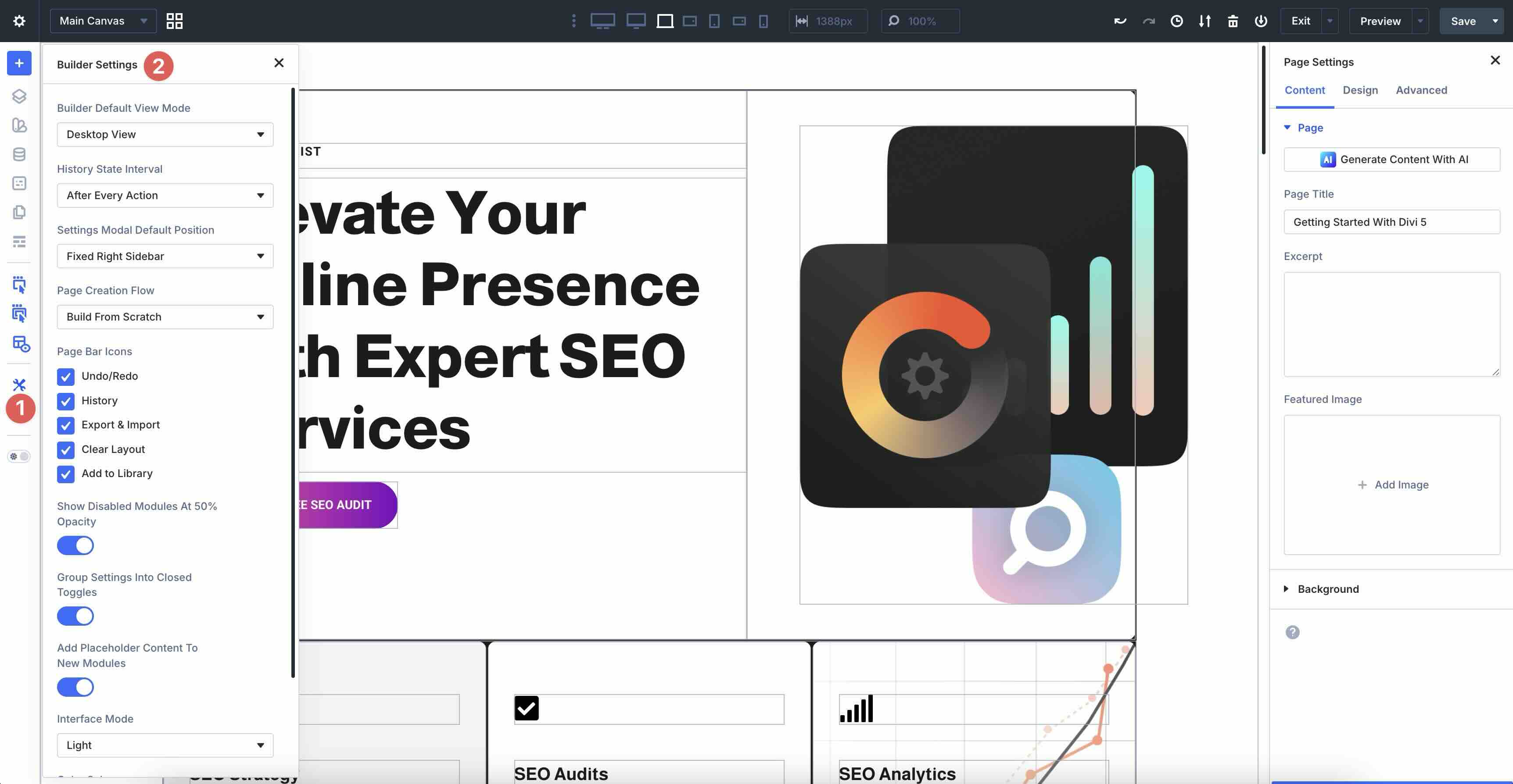
Click the settings icon in the left sidebar to open Builder Settings, where you can set defaults for View Mode, Settings Modal Default Position, Page Bar Icons, Interface Mode (light or dark), and more.
These small tweaks let you tailor the workspace to your style, making long design sessions more enjoyable and productive.
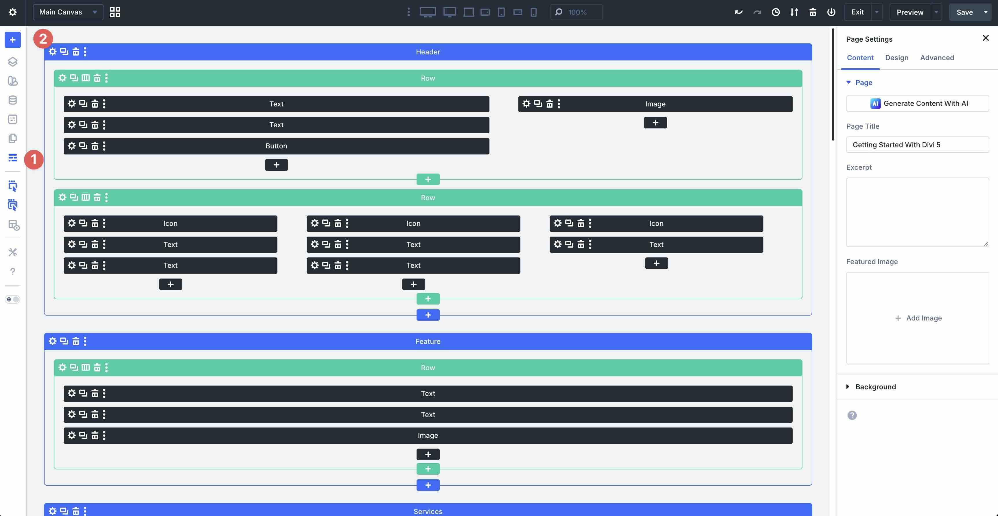
A Look Inside The Visual Builder
The Visual Builder is organized into four main areas that work together seamlessly:
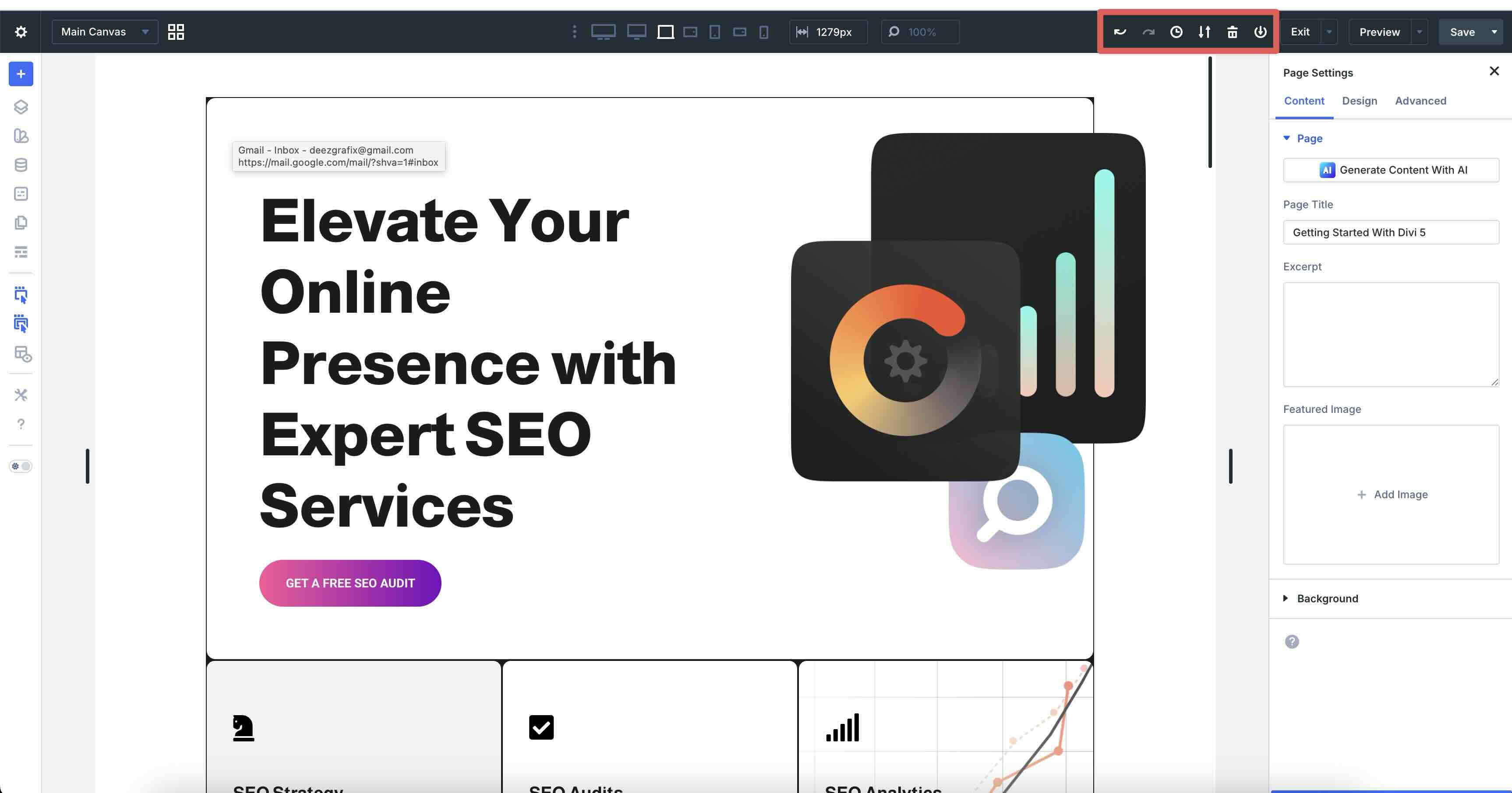
Page Bar
At the top of the Visual Builder, you have a quick-access command center for page-level controls. At the far left, you’ll find access to Divi 5 Canvases, where you can create and edit off-screen or special elements like popups, menus, or slide-in headers.
There are also Customizable Responsive Breakpoints that allow you to swap between seven customizable breakpoints for ultra-wide desktops to smartphones, along with fields to adjust widths to specific pixels and zoom in and out.
Page Bar Icons allow you to undo or redo layout changes, see layout history, export and import layouts, clear your layouts, and add them to the Divi Library.
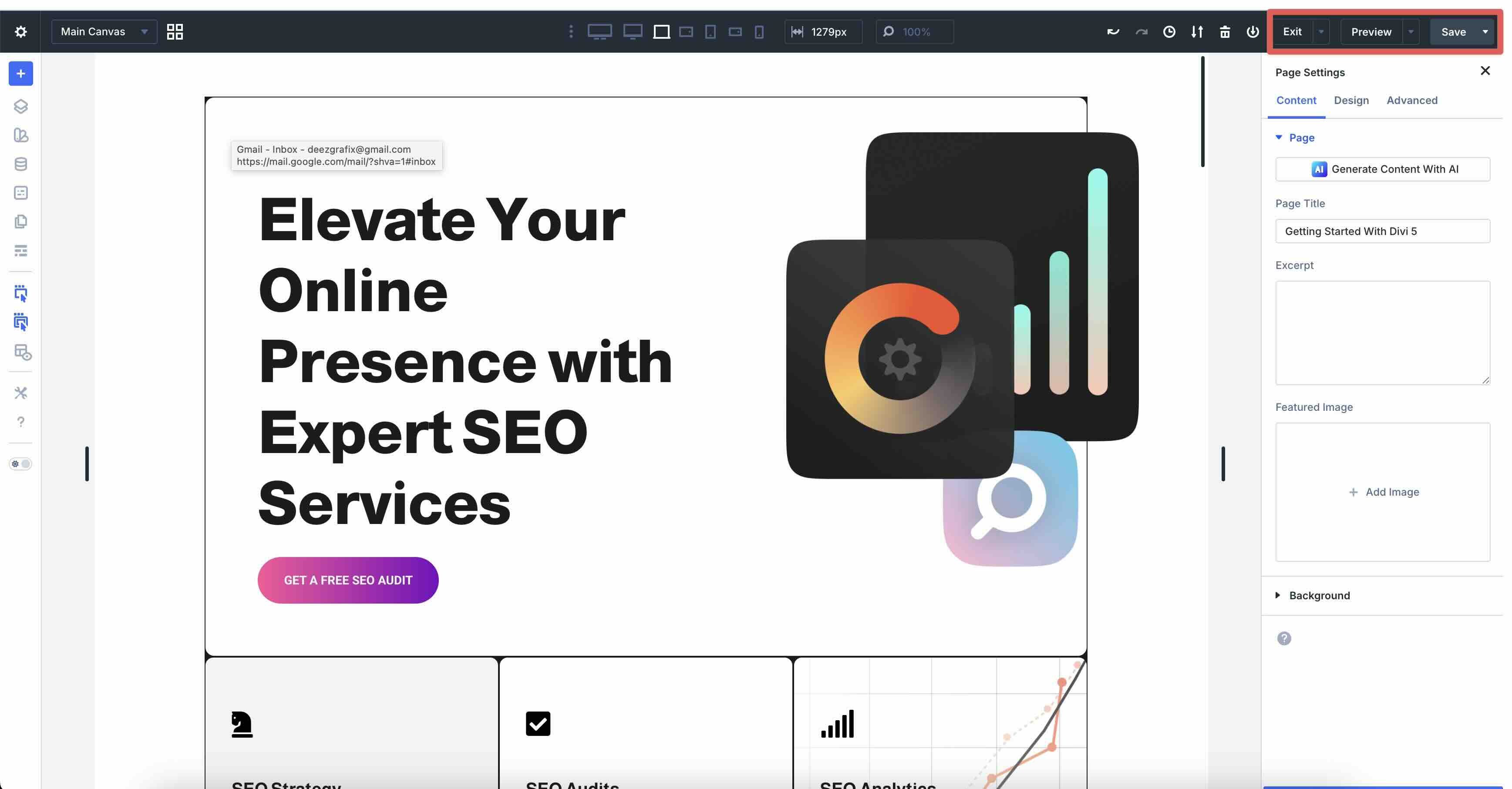
Finally, the Exit, Preview, and Save controls allow you to view your page, edit it, navigate to the Dashboard, preview the page in Divi 5’s Preview mode, or save the page.
Left Sidebar
The left sidebar is your main toolkit for structure, global tools, and settings. You can dock it, collapse it, or keep it open as needed.
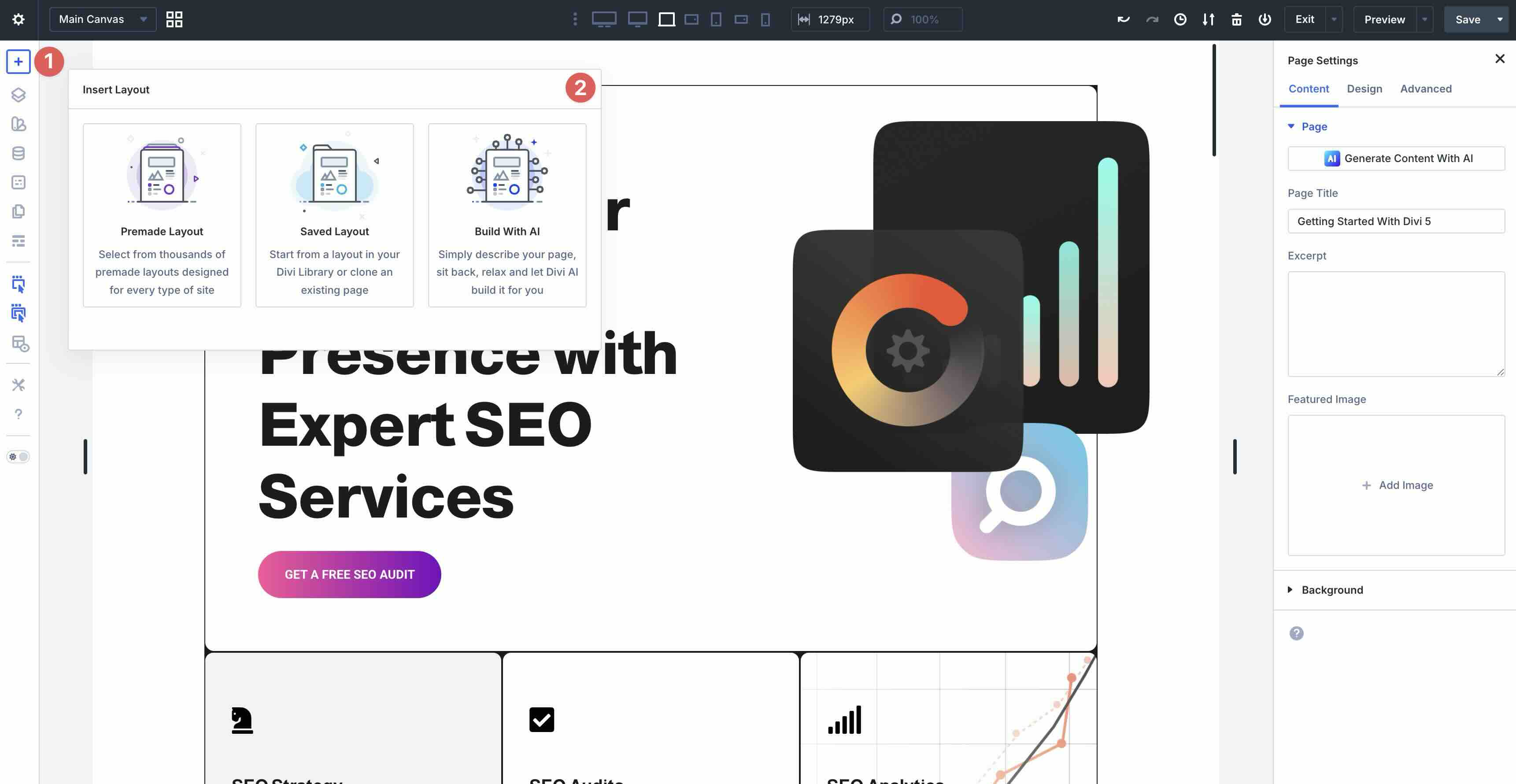
Insert Layout lets you easily add layouts, including premade Layout Packs, Divi Library items, or layouts generated with Divi AI.
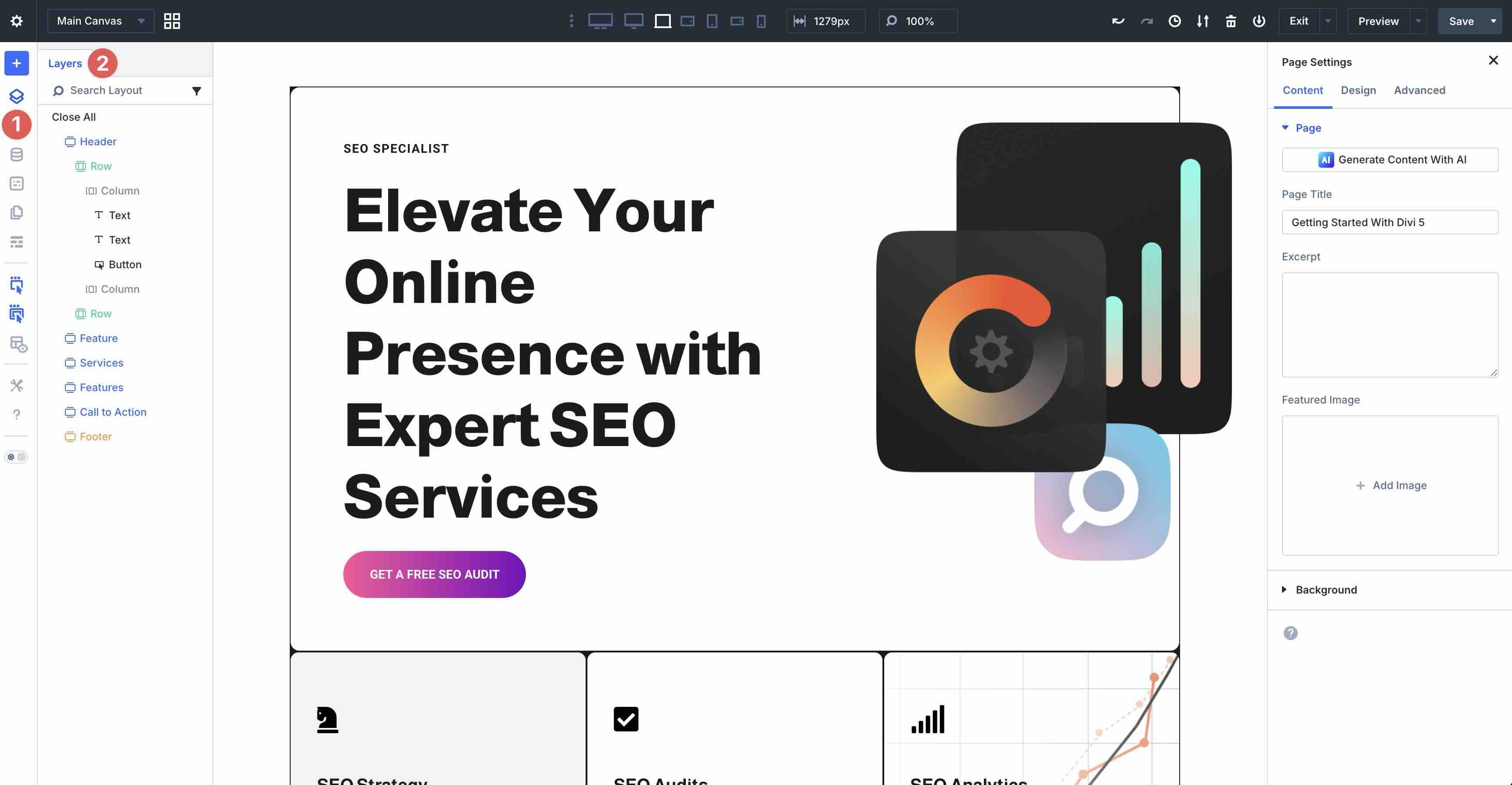
Layers View gives you an overview of your page’s layers for quickly selecting, reordering, or hiding elements.
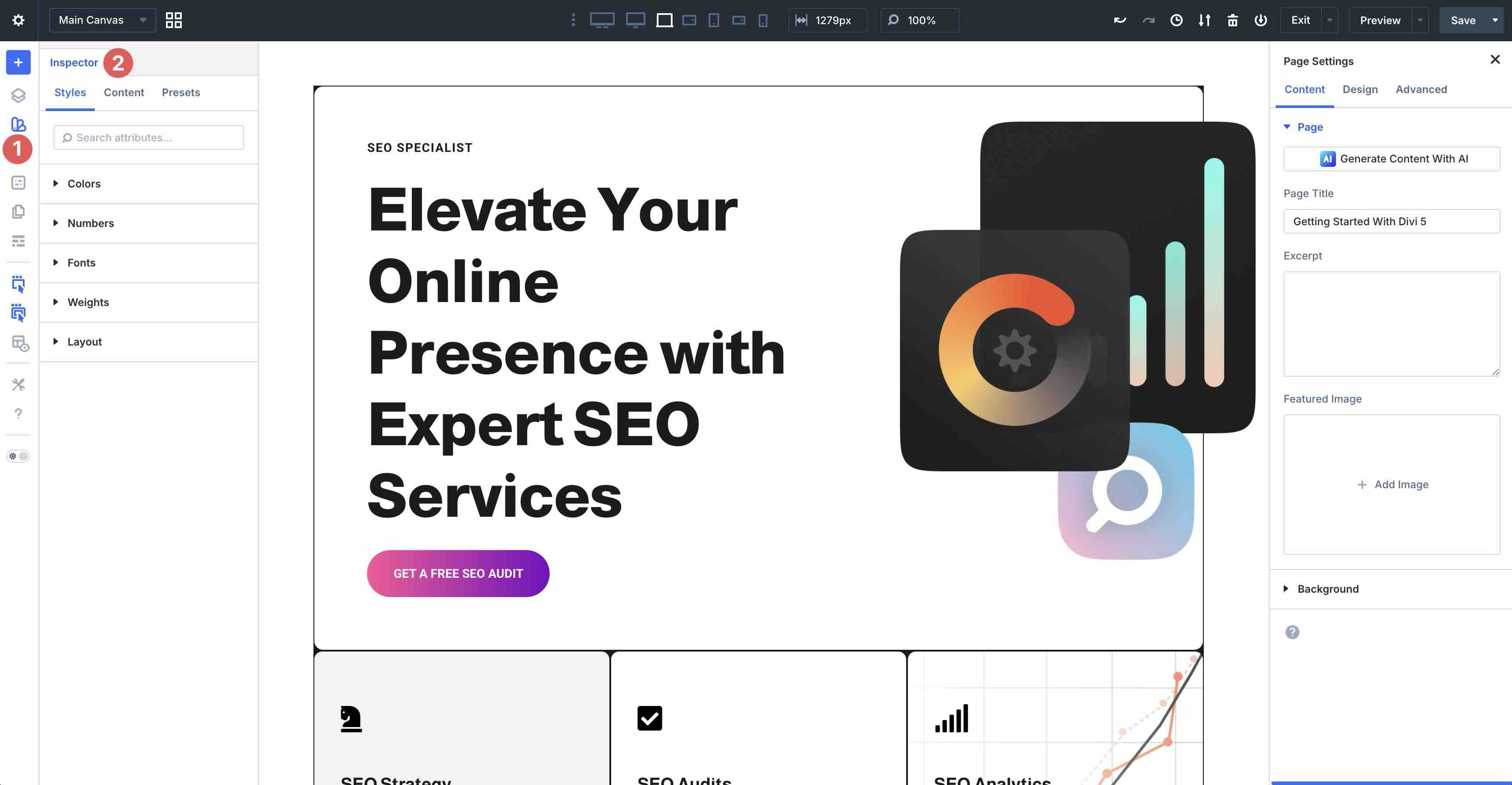
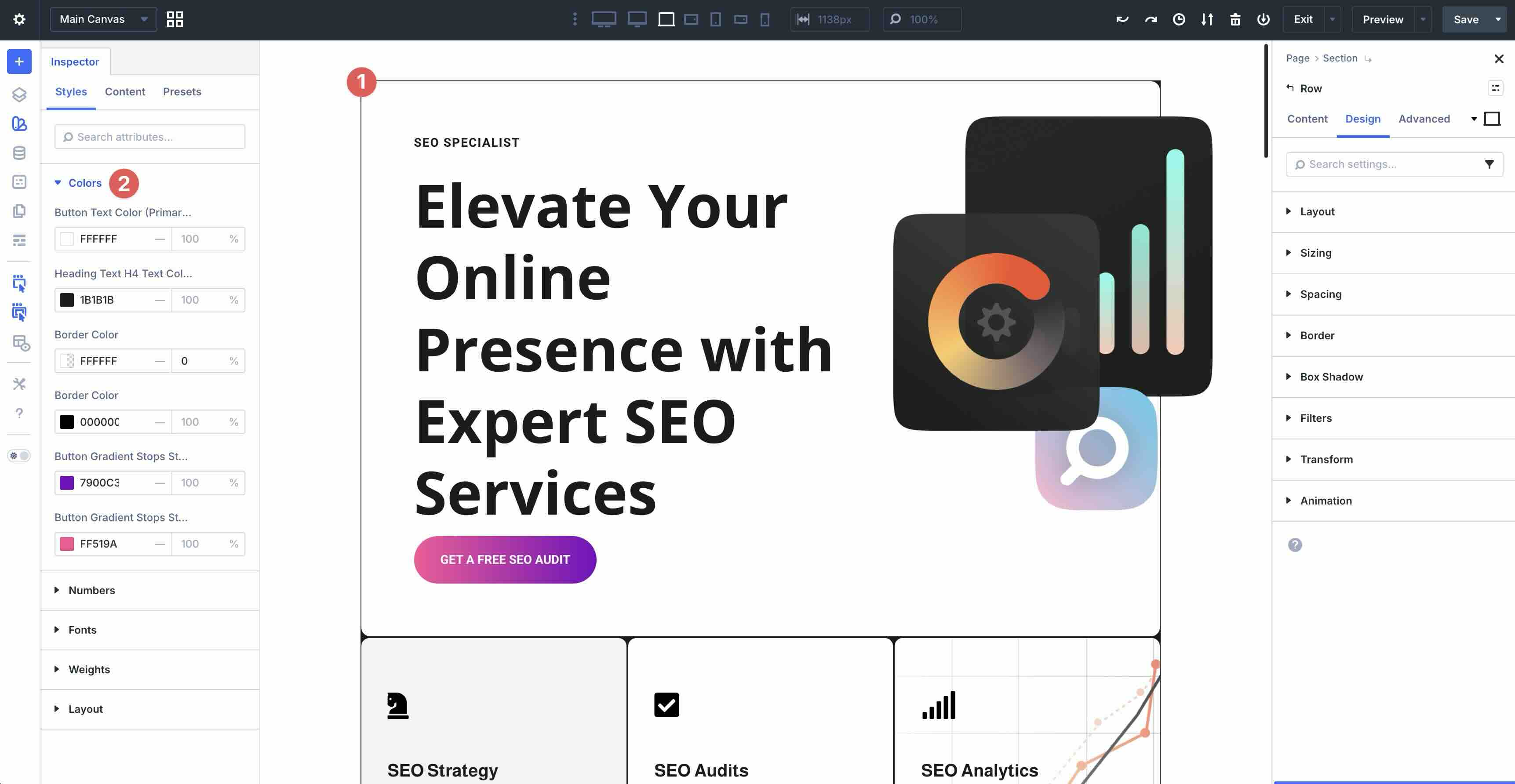
The Inspector tool offers an overview of your styles, content, and presets, allowing you to change values with a few clicks. Changes are applied across your website where that style or color is used, making it easy to change multiple settings at once.
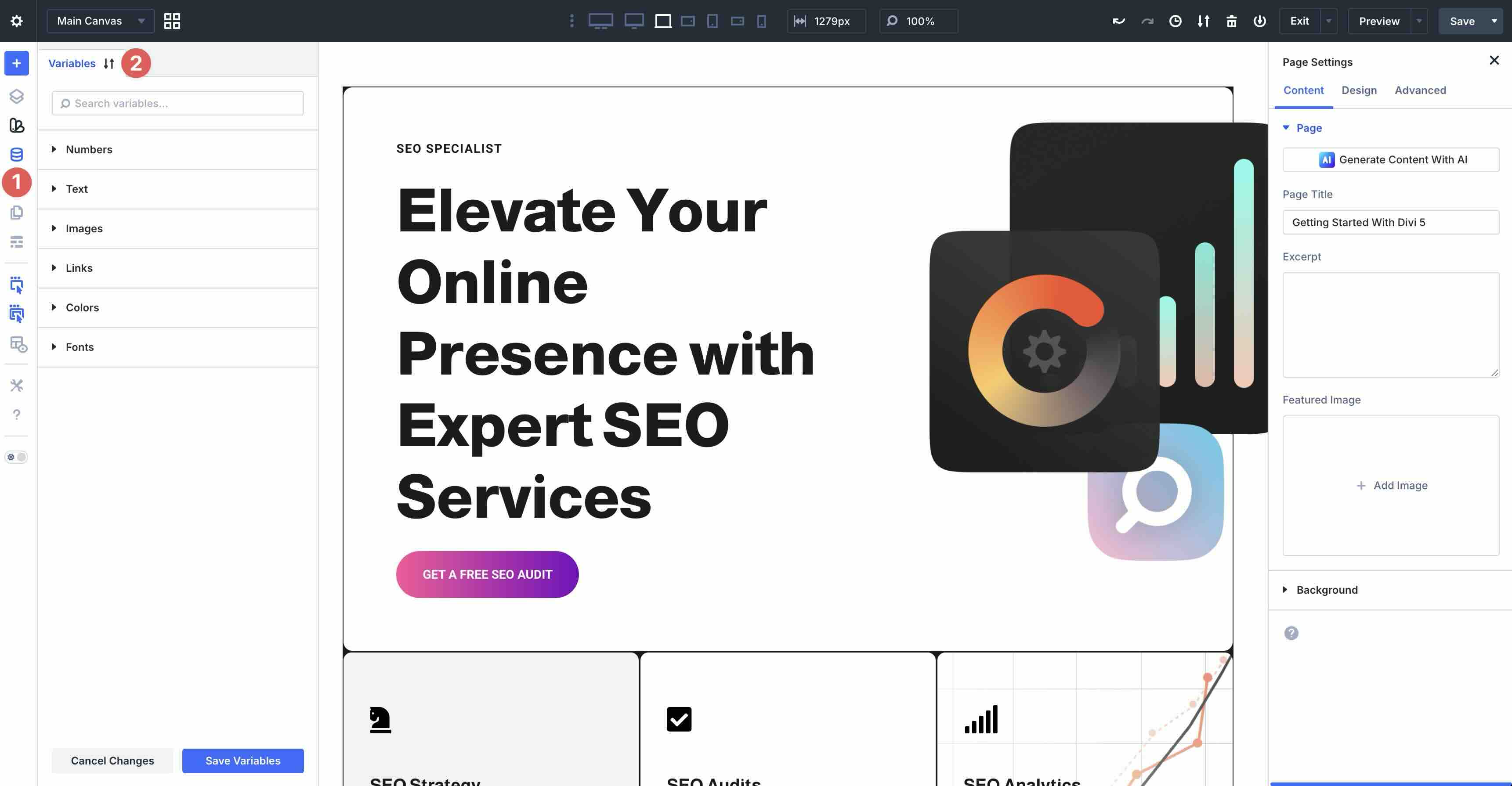
Design Variables allow you to manage global settings for numbers, text, images, links, colors, and fonts. Set these values once and use them throughout your website.
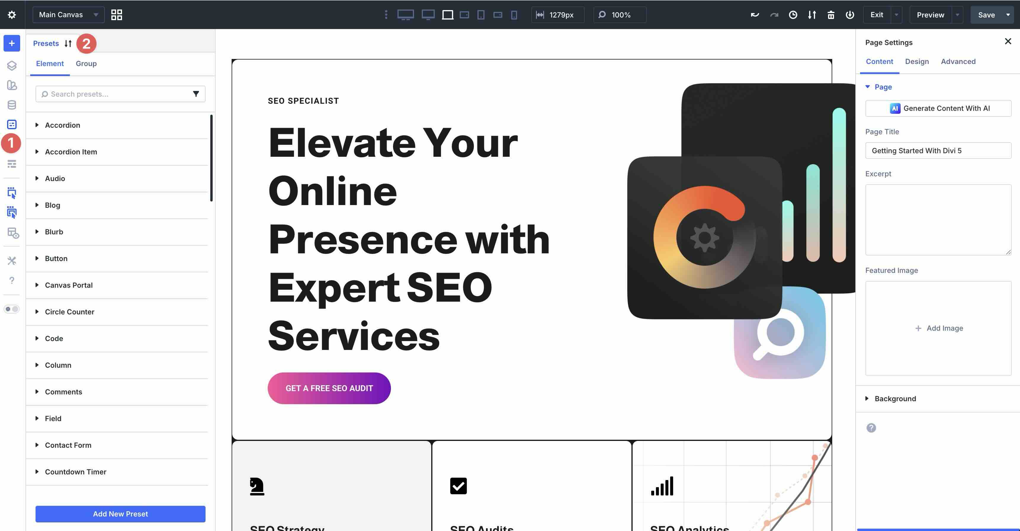
The Preset Manager gives you a way to save, preview, apply, and import or export presets so that you can manage all of your saved styles in one place. They can be easily exported for use in other projects, giving you an easy way to maintain design consistency across multiple site builds.
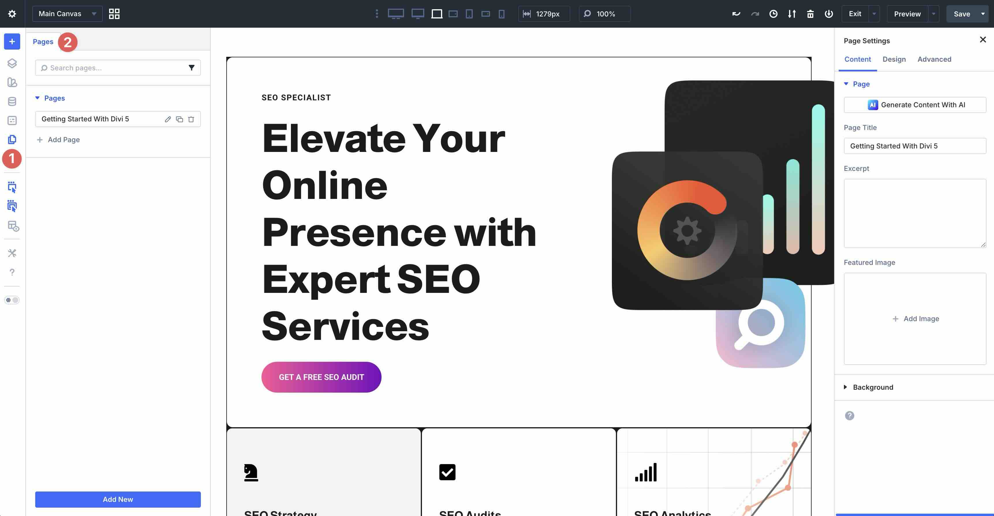
One of Divi’s newest features, the Page Manager, allows you to create, edit, duplicate, delete, or switch pages without exiting the Visual Builder.
The Wireframe View provides a simplified outline mode that lets you focus on structure, like the early days of Divi.
The Actions Icons On Hover and Parent Action Icons On Hover options provide hover tools that appear on elements for quick duplicate, copy, edit, and delete actions.
X-Ray mode highlights all elements in boundaries for better understanding of the layout.
Divi 5’s Builder Settings allow you to customize preferences, modes, and more.
Right Sidebar
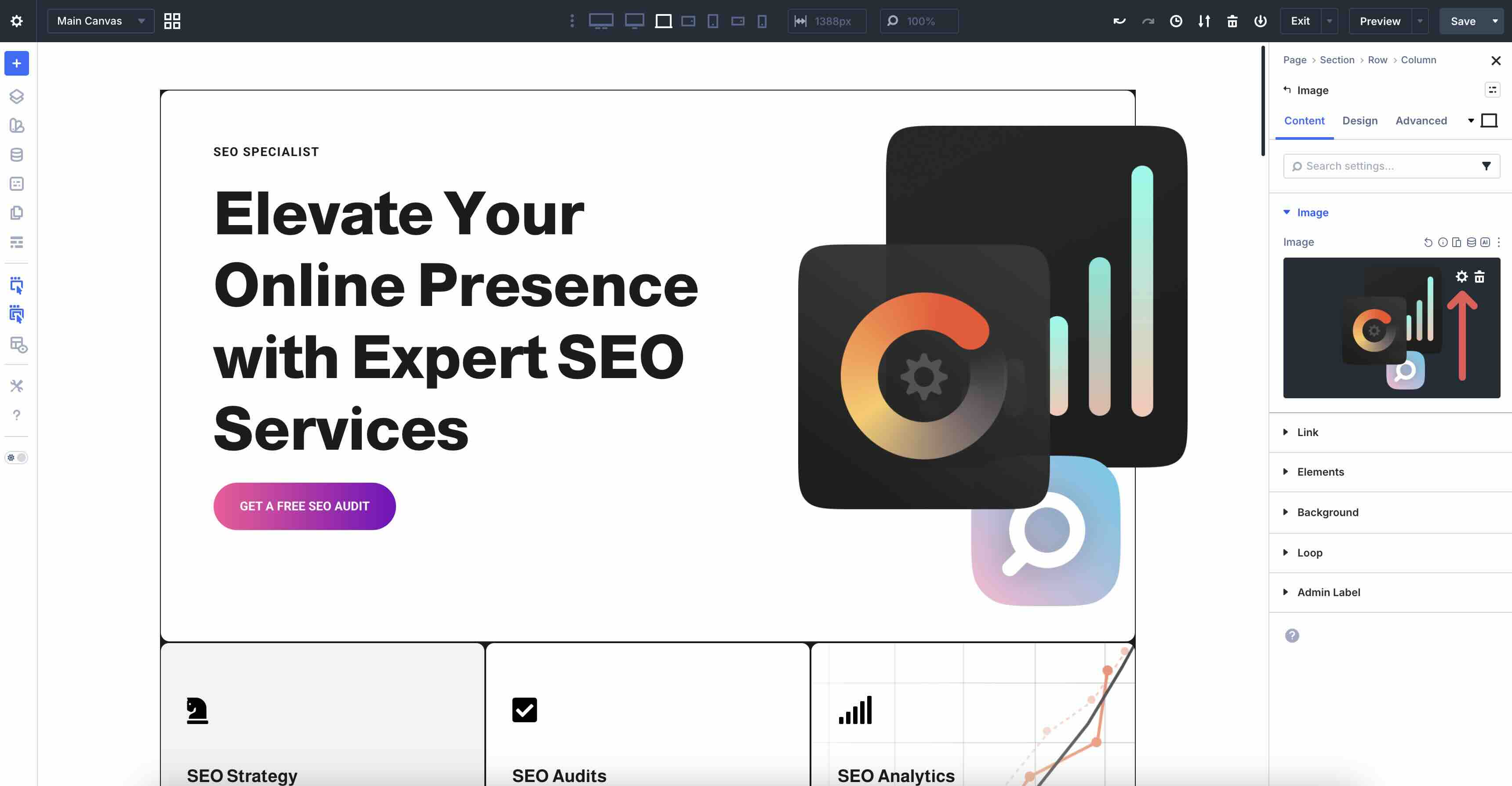
Any time you click on a design element (module, row, or section) in the canvas, the right sidebar automatically opens. It consists of three tabs: Content, Design, and Advanced. The Content tab provides options for editing a module’s content, including text, images, backgrounds, and Loop settings. You can also add Nested Modules by expanding the Elements tab.
In the Design tab, you can control all of the module’s design settings. For example, when editing a Heading module, you can adjust Layout settings for spacing, direction, and more. You can also control the size, color, and weight of the font, its color, apply borders, box shadows, and filters, or add transforms and animations.
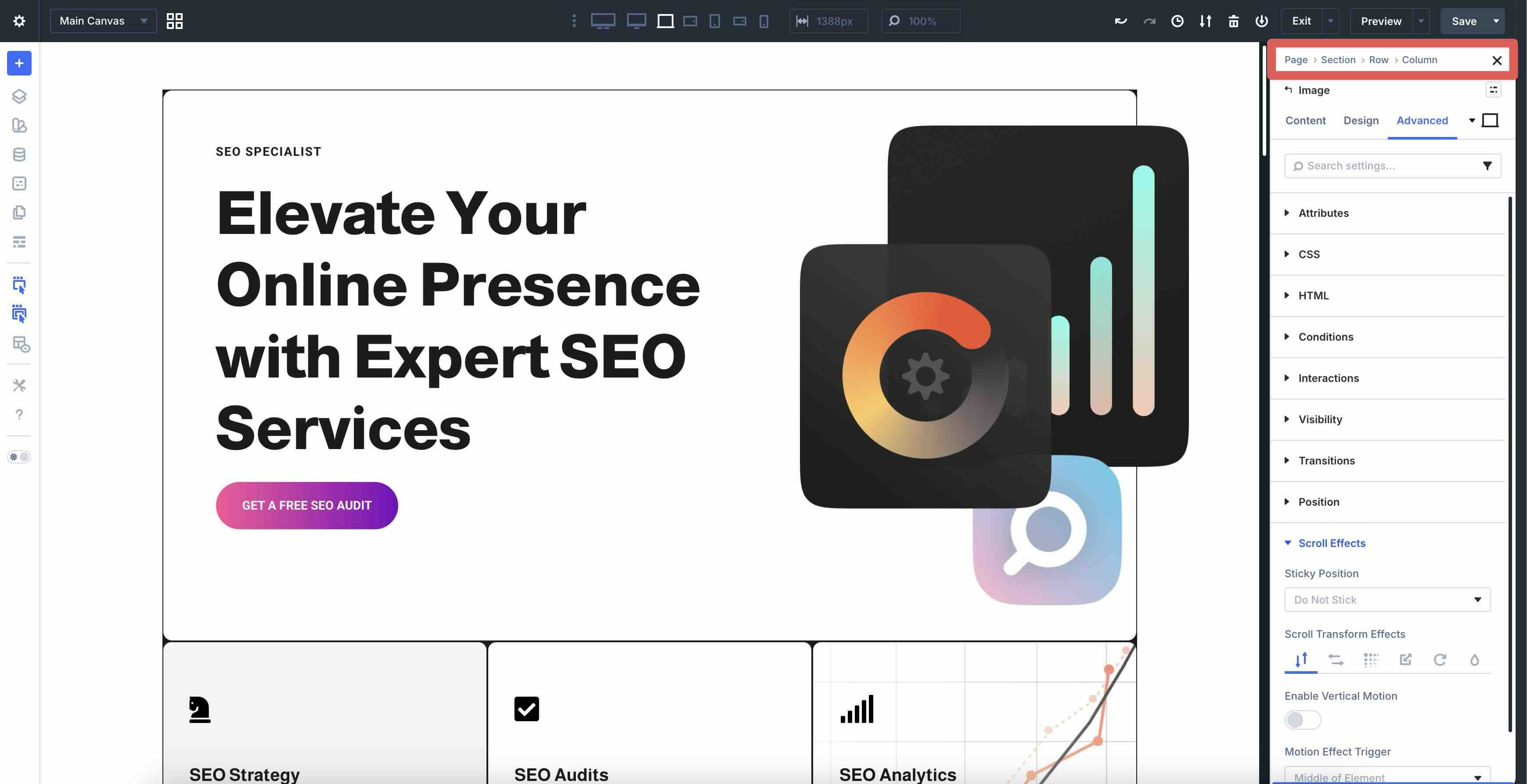
The Advanced tab contains settings for adding ID Attributes and CSS classes, Semantic Elements and custom HTML, Conditions, Interactions, and various effects for Transitions, Scroll Effects, and more.
On-Canvas Tools
Everything happens directly in the live page preview for instant feedback. Use Breadcrumbs at the top of the right sidebar or on hover. Easily click to jump to any parent section, row, column, or module without having to click directly on the module itself.
In Divi 5, you no longer need to click directly on the Settings icon to bring up the module’s settings. Simply click anywhere within the module to open the settings.
Sections, rows, and modules all have color-coded icons for easy identification, similar to Divi 4. Blue corresponds to sections, green to rows, and black to modules.
This setup keeps your workspace flexible and focused. You can dock the left sidebar for tools, pin module settings on the right, and enjoy the full canvas for real-time previewing of changes.
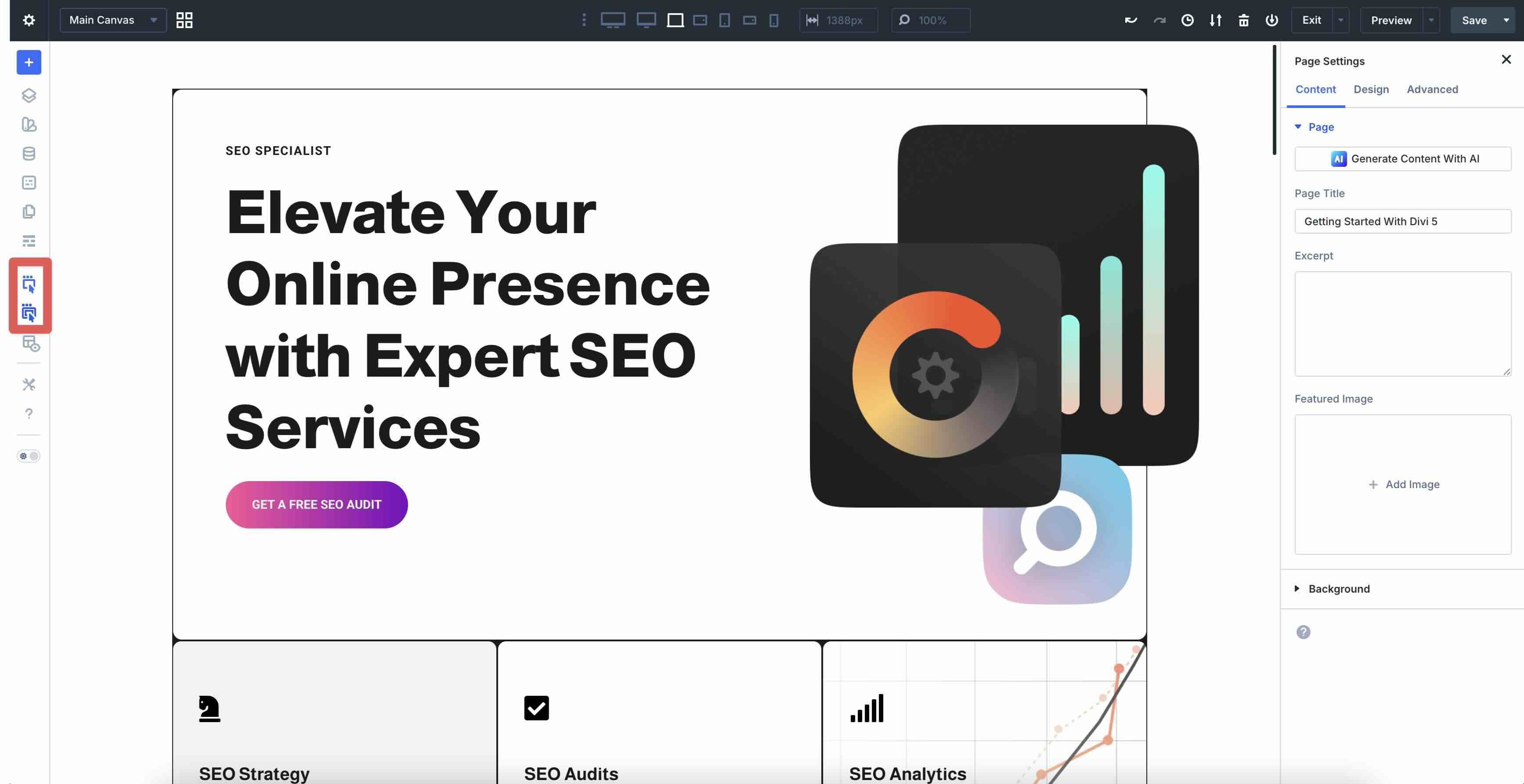
Customizing Your Page Layout
With a layout in place and knowledge of the Visual Builder’s settings, you can personalize it and make it your own. You can easily replace images, change text, and more, in a few clicks. For example, swap images by selecting an Image module. In the Content tab, click within the image preview window to reveal the Settings icon.
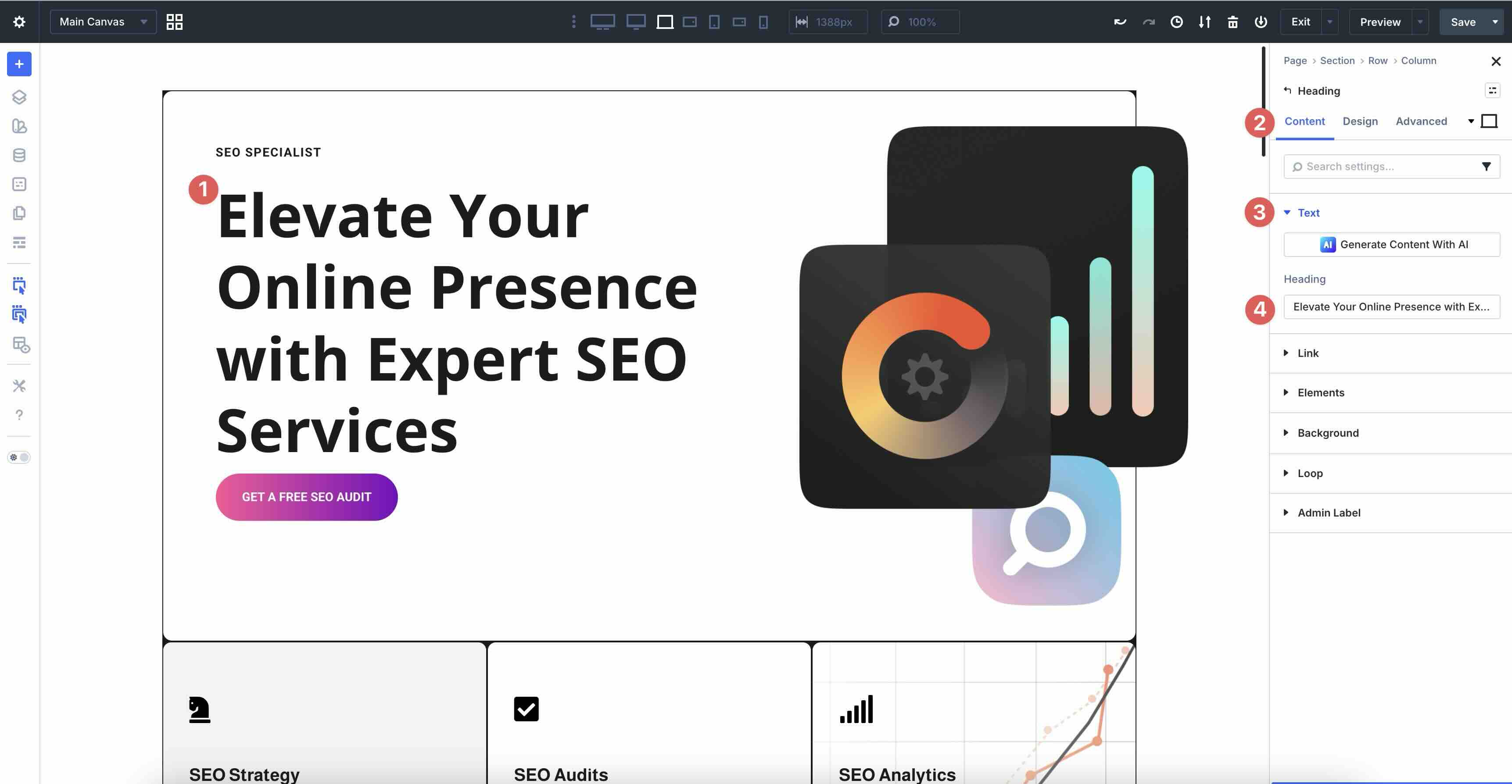
Replacing text in Text and Heading modules is easy, too. Click anywhere within a Heading module, expand the Text dropdown menu in the Content tab, and add your new content in the Heading field.
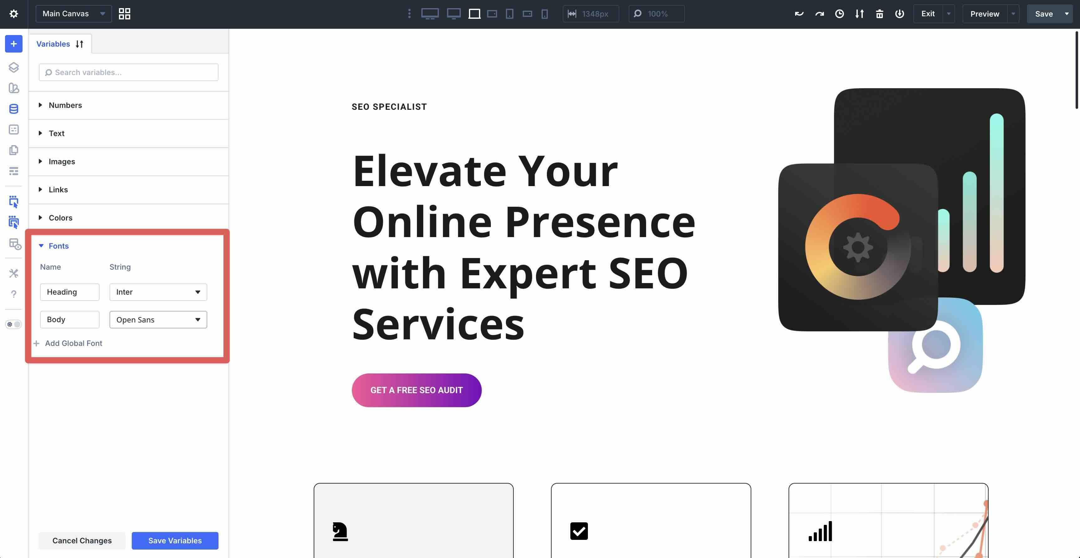
For site-wide consistency, open the Variable Manager (left sidebar). Edit Design Variables for brand colors, fonts, spacing rules, images, or text. Layout Packs often include starter variables. Tweak one (e.g., swap Heading/Body fonts), and every matching element updates instantly across the page.
For example, if you want to change your Heading and Body fonts, you can swap them with a single click. Every text module using the default font will update with the new fonts instantly.
Apply Presets (from the Preset Manager) for reusable style bundles — like a button with a 50px border radius and gradient background. Select a module, choose the preset, and it applies immediately. Update the preset once, and all instances refresh.
For fast bulk tweaks, use the Inspector. Select an element (or open Page Settings for site-wide view) to see a consolidated breakdown of colors, fonts, images, numbers, and presets. Change a value, and it propagates where applied.
These tools make customization feel effortless, leveraging Divi 5’s rebuilt efficiency to keep your designs consistent and professional with minimal effort.
Exploring Divi 5’s New Features
Divi 5 introduces a wealth of innovative tools that make building modern, responsive, and dynamic websites faster and more intuitive. These features leverage the rebuilt architecture to give you greater control, consistency, and creativity. Below, we’ll break them down by category.
Layout Systems
Divi 5’s layout systems give you the flexibility to design sites any way you want. We’ve stepped away from Block (but it’s currently still an option) to focus on Flexbox and CSS Grid. These options let you start simple and scale up to complex builds.
Flexbox
A new addition to Divi, Flexbox offers easy controls for spacing, direction, alignment, and wrapping in the Layout menu. You can use these settings when converting from Block to Flex, or when creating a layout from scratch.
Swap to Flexbox by opening the Design tab of any element, expanding the Layout menu, and clicking the Layout Style dropdown. Choose Flex from the options.
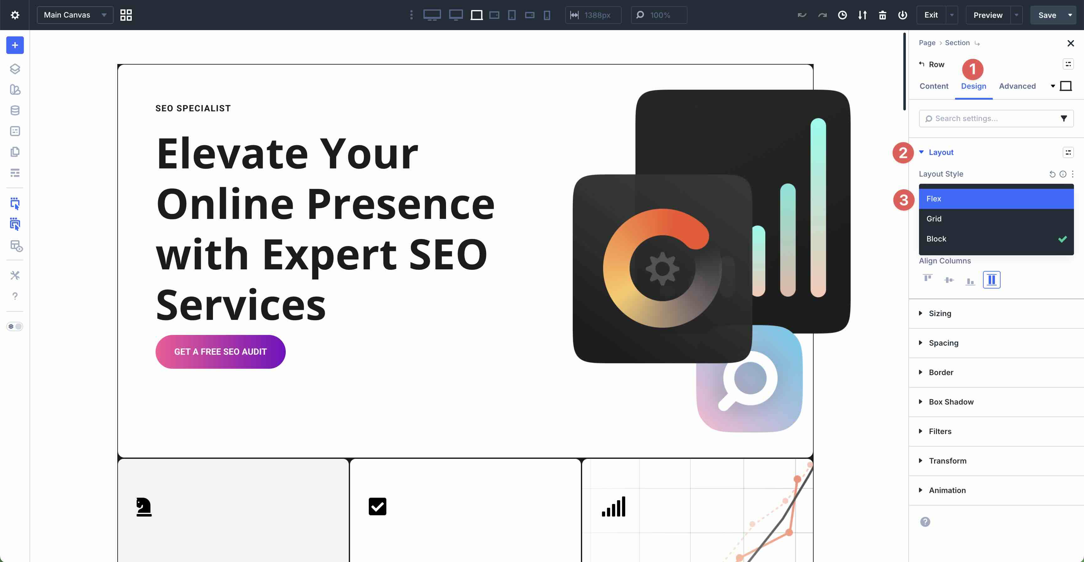
Adjust the Horizontal and Vertical Gap to reduce or increase spacing between flex items or Layout Direction to swap columns or stack them vertically.
Use Justify Content and Align Items to place items at the start, center, or end of the container.
Structure Templates allow you to change the number of columns in a row and adjust them for smaller screens. This lets you make your sites responsive in just a few clicks.
Display Order lets you control how columns stack at each breakpoint, so you don’t end up with awkward layouts on smaller screens.
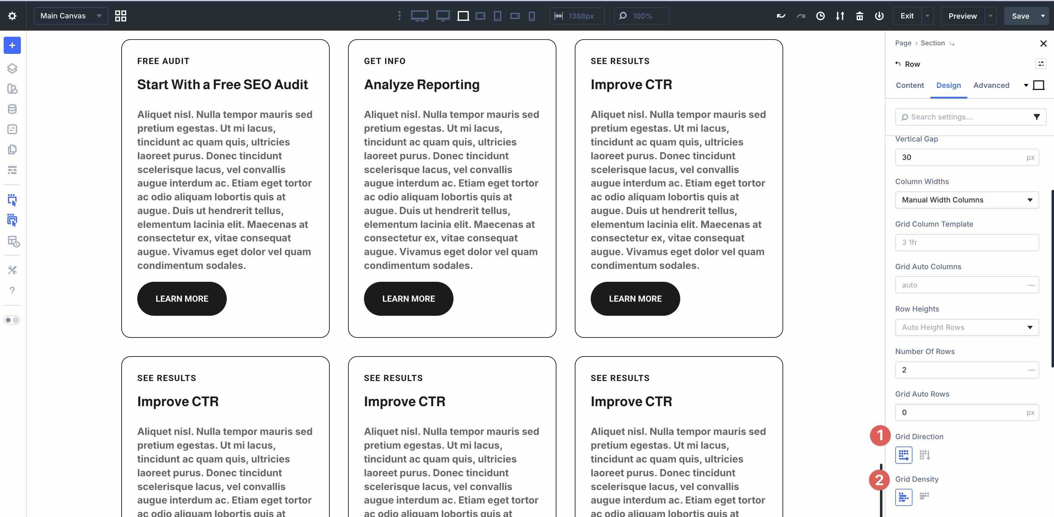
CSS Grid
Another powerful new addition to Divi 5, CSS Grid, brings true two-dimensional layout control directly into the Visual Builder. It lets you define both rows and columns, making it ideal for complex, structured designs such as galleries, product grids, masonry layouts, and asymmetrical layouts.
Switch to CSS Grid by opening the Design tab of any container, expanding the Layout menu, and selecting Grid in the Layout Style field.
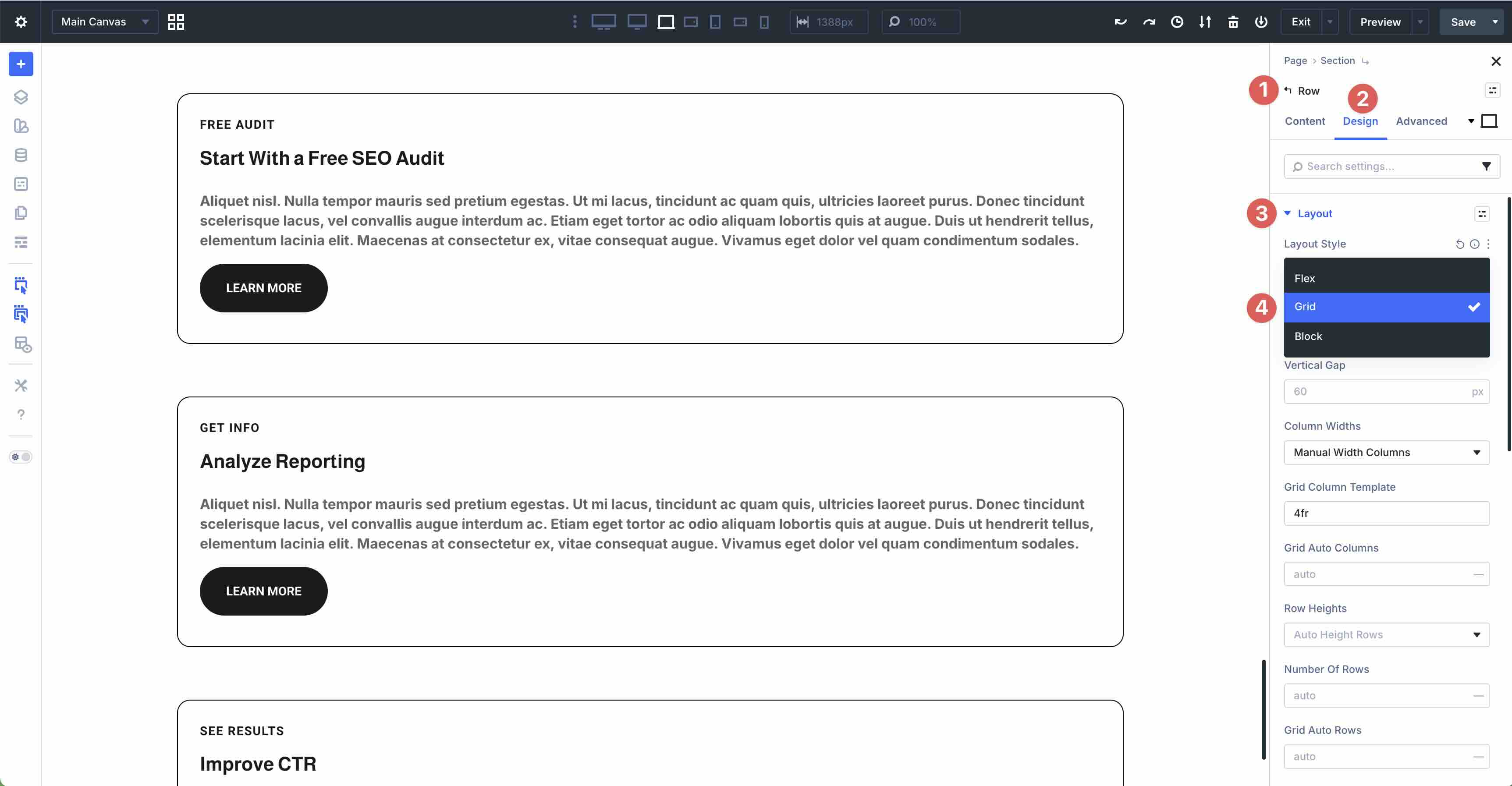
Divi offers prebuilt Grid Templates for quick starts, or you can build from scratch for full customization.
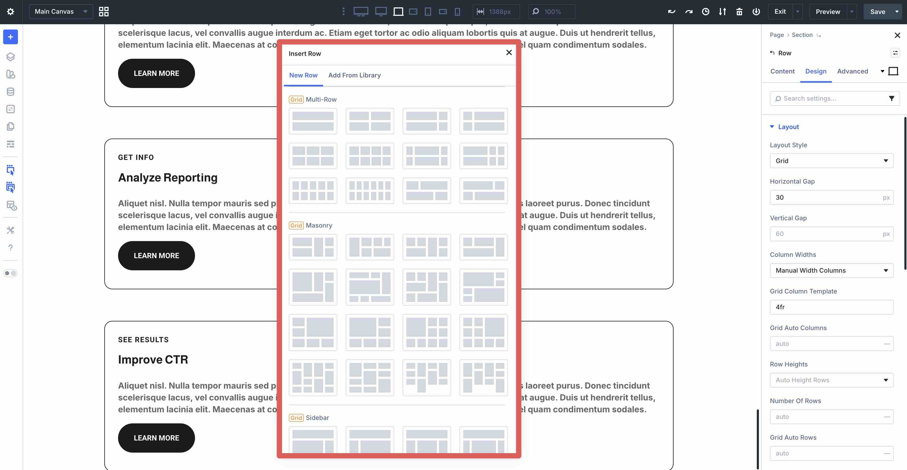
Once active, the settings expand for full control. Set the Number of Columns and Column Widths. Choose Equal, Auto, or Manual for responsive wrapping.
Define the Number of Rows and Row Heights. Use Auto, Equal Height, Minimum Height, Fixed Height, or Manual Height. Grid Auto Rows handles overflow rows automatically.
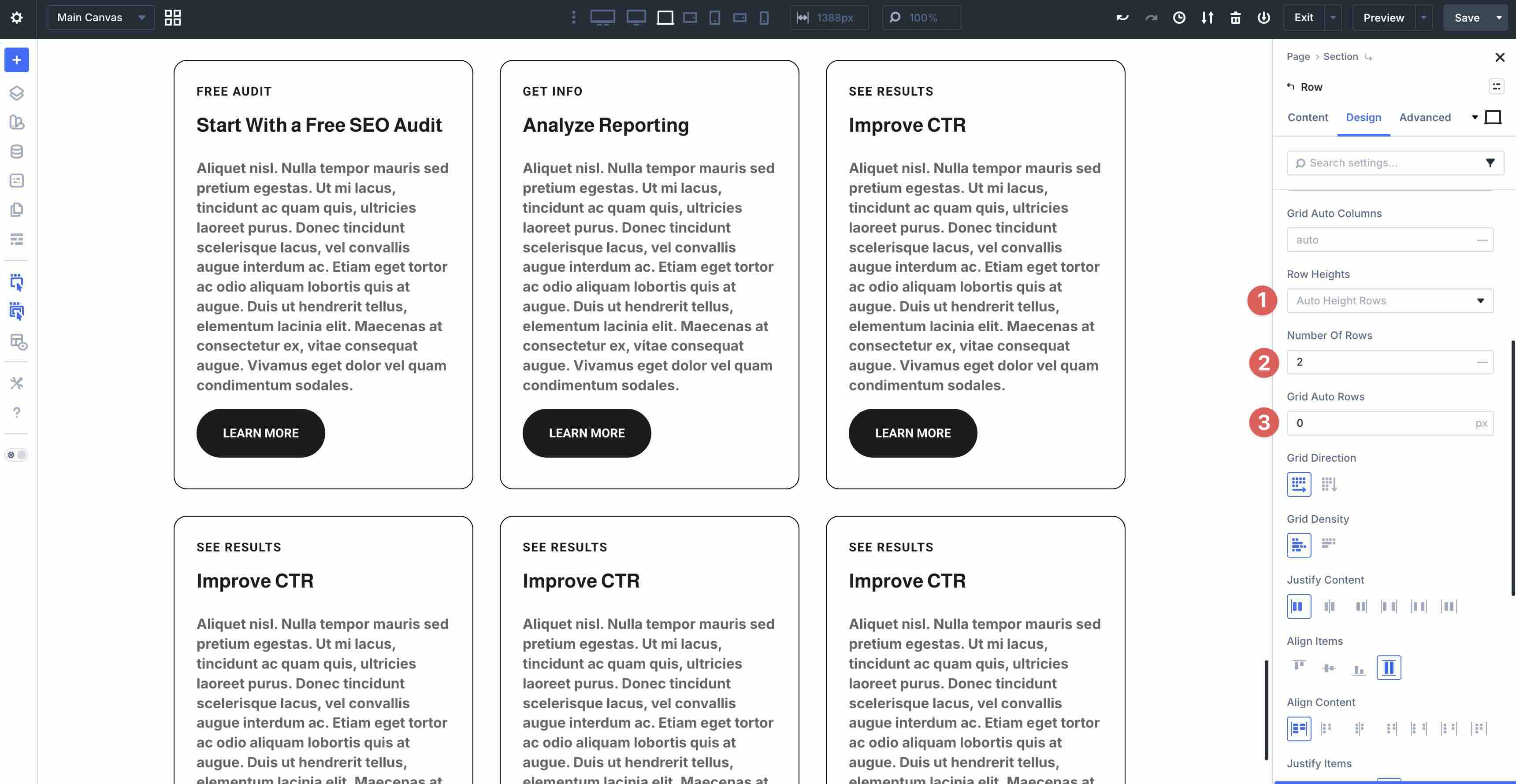
Control flow with Grid Direction with options for Row or Column. Use Grid Density to manage how items fill the grid. Dense packs smaller items into gaps left by larger spanning elements, while Auto preserves original order without backfilling.
Finally, Grid Offset Rules let you precisely position individual modules. Create rules (nth-child, first/last, u, etc) and set offset like Column Span, Column Start/End, or Row Span/Start/End. Rules stack, work responsively across breakpoints, and enable you to build asymmetrical or masonry layouts without custom CSS.
For each rule, choose an Offset Rule, like Column Span, Column Start, Column End, Row Span, then set the Offset Value.
Rules stack from top to bottom, adapt responsively, and allow for asymmetrical, masonry-style designs.
Responsive Design
Divi 5 gives you exceptional control over how your website appears and functions across different screen sizes, making responsive design easier and more precise than ever.
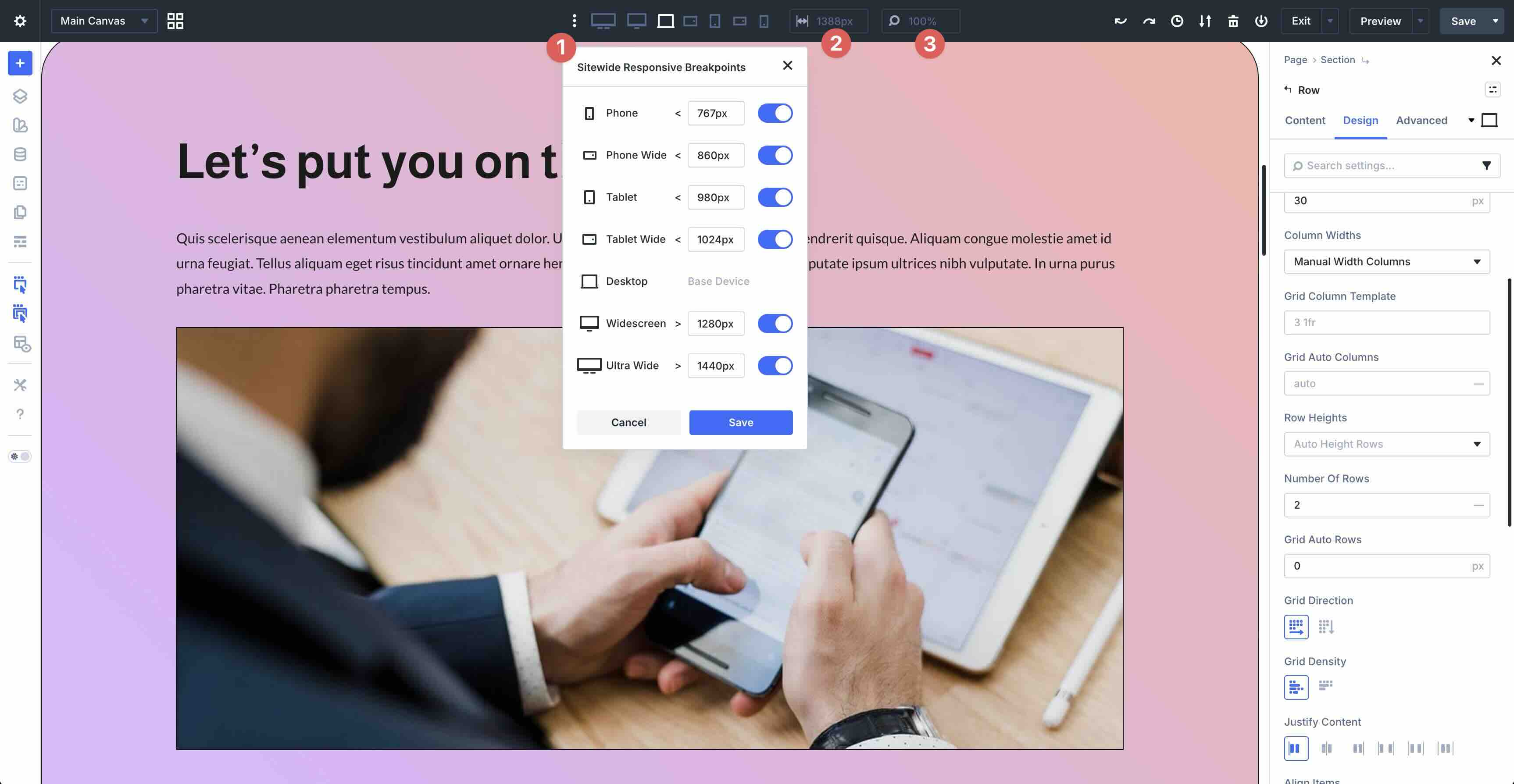
Customizable Responsive Breakpoints
The Customizable Responsive Breakpoints feature includes seven editable breakpoints, ranging from ultra-wide desktops down to smartphones. You can enable and disable any breakpoint, adjust the exact pixel width, and preview your design instantly. This flexibility lets you size layouts perfectly to real-world devices with ease.
Responsive Editor
With the Responsive Editor, you make adjustments directly in the Visual Builder for each device view. You can tweak typography, spacing, hover states, and more.
Canvas Scaling provides accurate previews so you can see how typography and images look on various screen sizes.
These tools ensure every detail looks perfect on desktops, tablets, and smartphones.
Advanced Units
Divi 5 also supports Advanced Units such as rem, em, vw, vh, percentages, clamp(), min(), max(), and calc(). These modern CSS units create fluid, scalable values that adapt smoothly to different screen sizes. When combined with Design Variables, they allow you to build designs that respond well to any viewport.
Together, these features allow you to create professional, responsive websites with minimal effort.
Styling And Consistency
Divi 5 makes it easy to keep your entire website looking polished, cohesive, and on-brand without repetitive manual tweaks or mismatched elements.
Design Variables
Design Variables are the foundation of site-wide design consistency. In the Variable Manager, you define reusable global values once and apply them anywhere. Once set, simply select the variable in any module’s settings. Change the master value, and every instance of it updates instantly across the page.
Relative Colors (HSL)
Relative Colors take color management to the next level. Instead of hard-coding every shade, base colors on a primary value and dynamically adjust them. You can lighten or darken them by percentage, shift hue or saturation, or create complementary tints and shades.
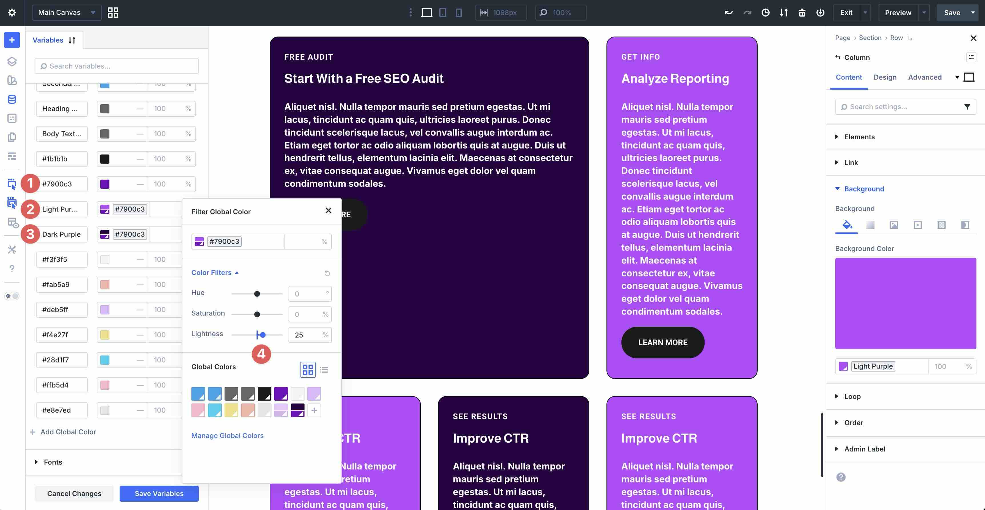
For example, define your main brand color, then create variations that automatically adapt if the base ever changes. It’s ideal for harmonious palettes, hover states, accents, and theme variations without manual adjustments.
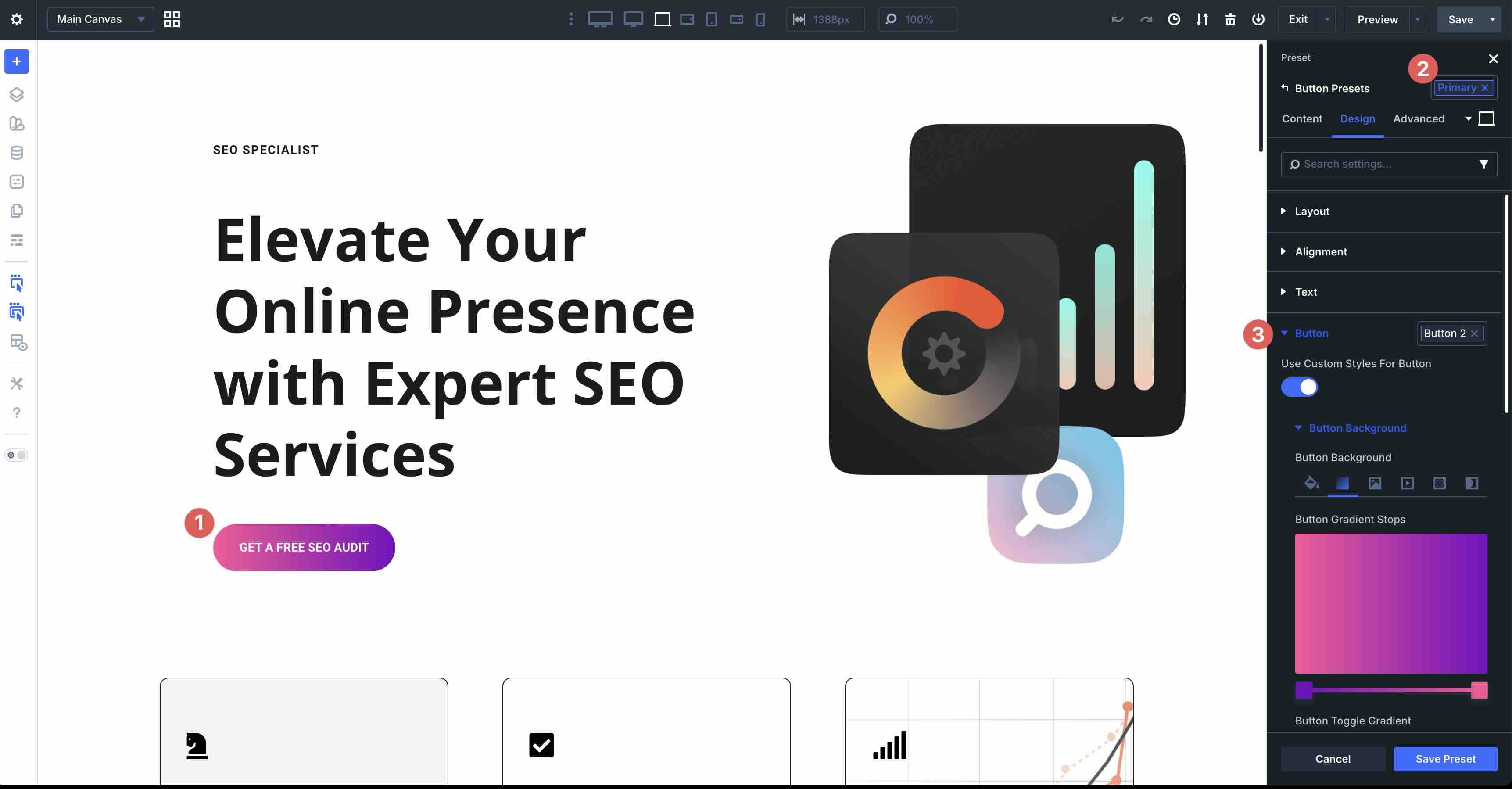
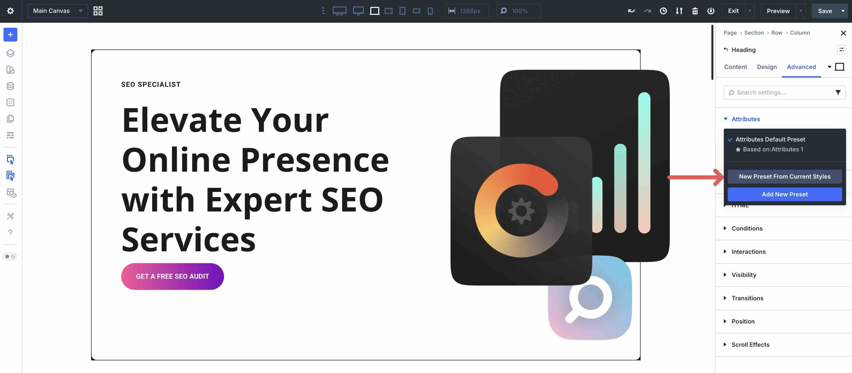
Preset System
The Preset System lets you save and reuse complete style bundles for maximum efficiency. Create Element Presets for full modules or Option Group Presets that target specific properties, like borders or background colors, and stack them together.
Stacked and Nested Presets allow layering for complex combinations without duplication.
The Preset Manager is the central hub where you can edit, preview, organize, import, and export for other projects, and apply with one click.
Update a preset once, and all matching elements refresh instantly. Presets are perfect for maintaining scalable, professional design systems across pages, clients, or multiple websites.
Together, these tools turn Divi 5 into a true design system. Define a preset once, apply it everywhere, and update globally with minimal effort. Your sites stay consistent, professional, and easy to manage as your brand grows.
Advanced Customization
There are several powerful ways to fine-tune your site’s underlying markup and structure in Divi 5. You can improve SEO and accessibility and gain creative flexibility, all without leaving the Visual Builder.
Semantic Elements
Semantic Elements let you change the HTML tag of any section, row, column, or module directly in the Advanced tab. Instead of every element defaulting to generic div and span tags, you can switch it to more meaningful tags like nav, header, article, footer, or button, amongst others.
This helps search engines better understand your page structure, improves screen reader navigation for accessibility, and produces cleaner, more semantic HTML.
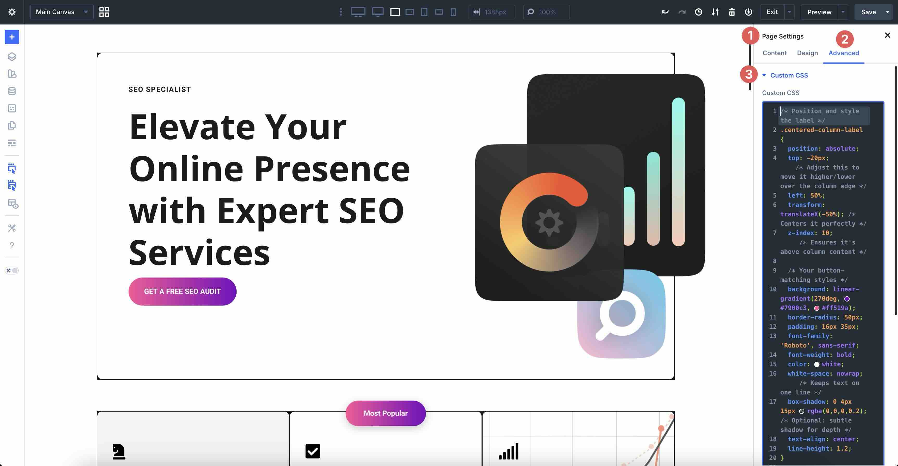
Custom HTML Wrappers
Custom HTML Wrappers provide two dedicated fields in the Advanced tab: HTML Before and HTML After. Use them to insert HTML immediately before or after the element’s rendered output. Because the code is injected at the exact spot in the DOM, you get cleaner, more precise results than adding separate Code modules.
Any associated CSS can be placed in the Page Settings in the Custom CSS field.
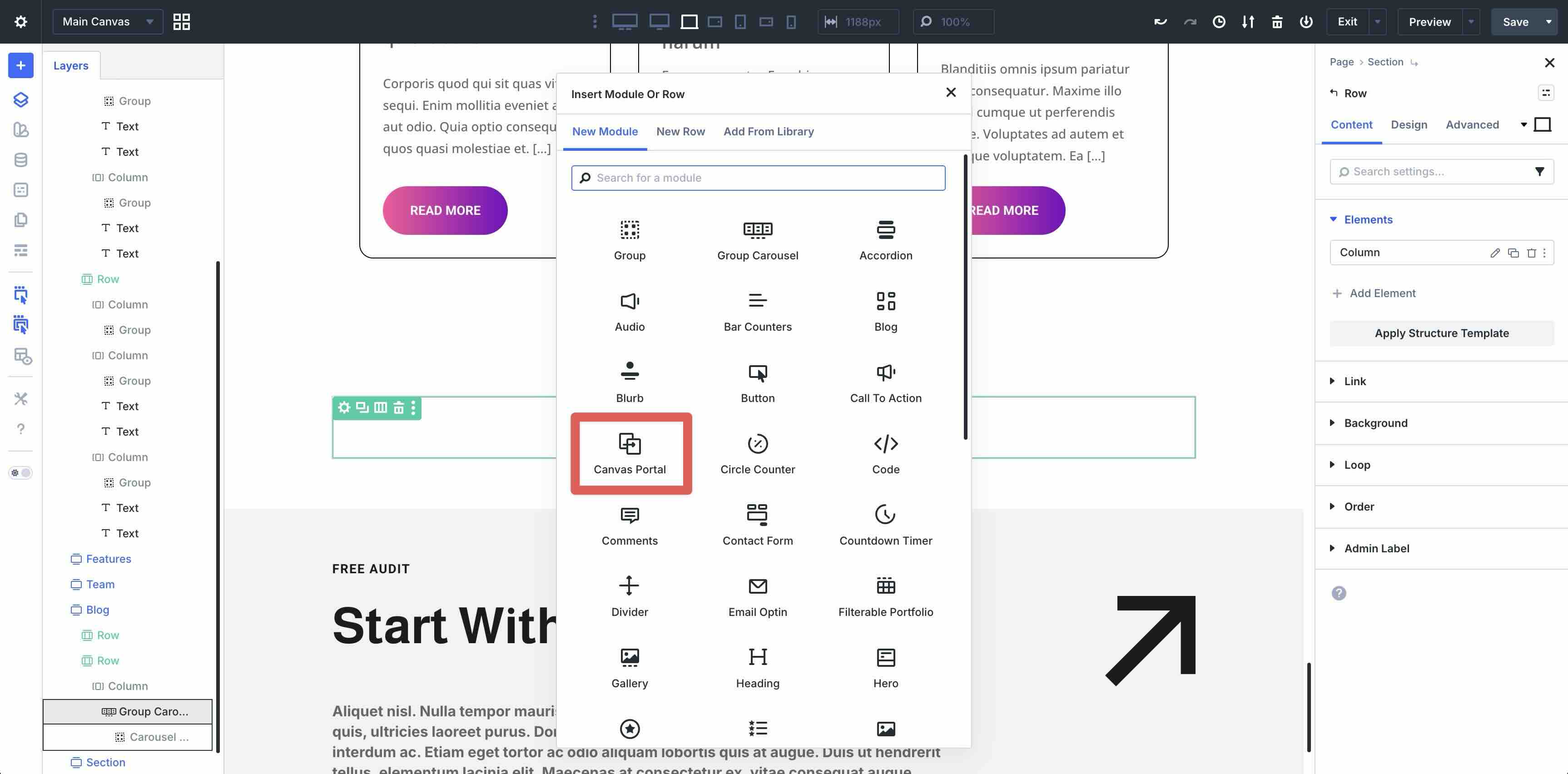
Divi 5 Canvases And the Canvas Portal Module
Divi 5 Canvases unlock creative possibilities for off-screen and floating elements. Canvases let you design and edit popups, mega-menus, image hotspots, tooltips, and more, keeping your main canvas clean while you work.
Once designed, the Canvas Portal module lets you embed that Canvas anywhere on the page with precise positioning. It’s ideal for dynamic overlays, interactive hotspots, or reusable off-canvas components that appear on click, hover, viewport enter, or scroll.
These advanced tools give you developer-level control over structure and presentation while keeping everything visual and intuitive.
Dynamic Content And Interactions
Divi 5 offers powerful tools for automatic, data-driven content and engaging user experience that allow you to turn static pages into dynamic, responsive ones.
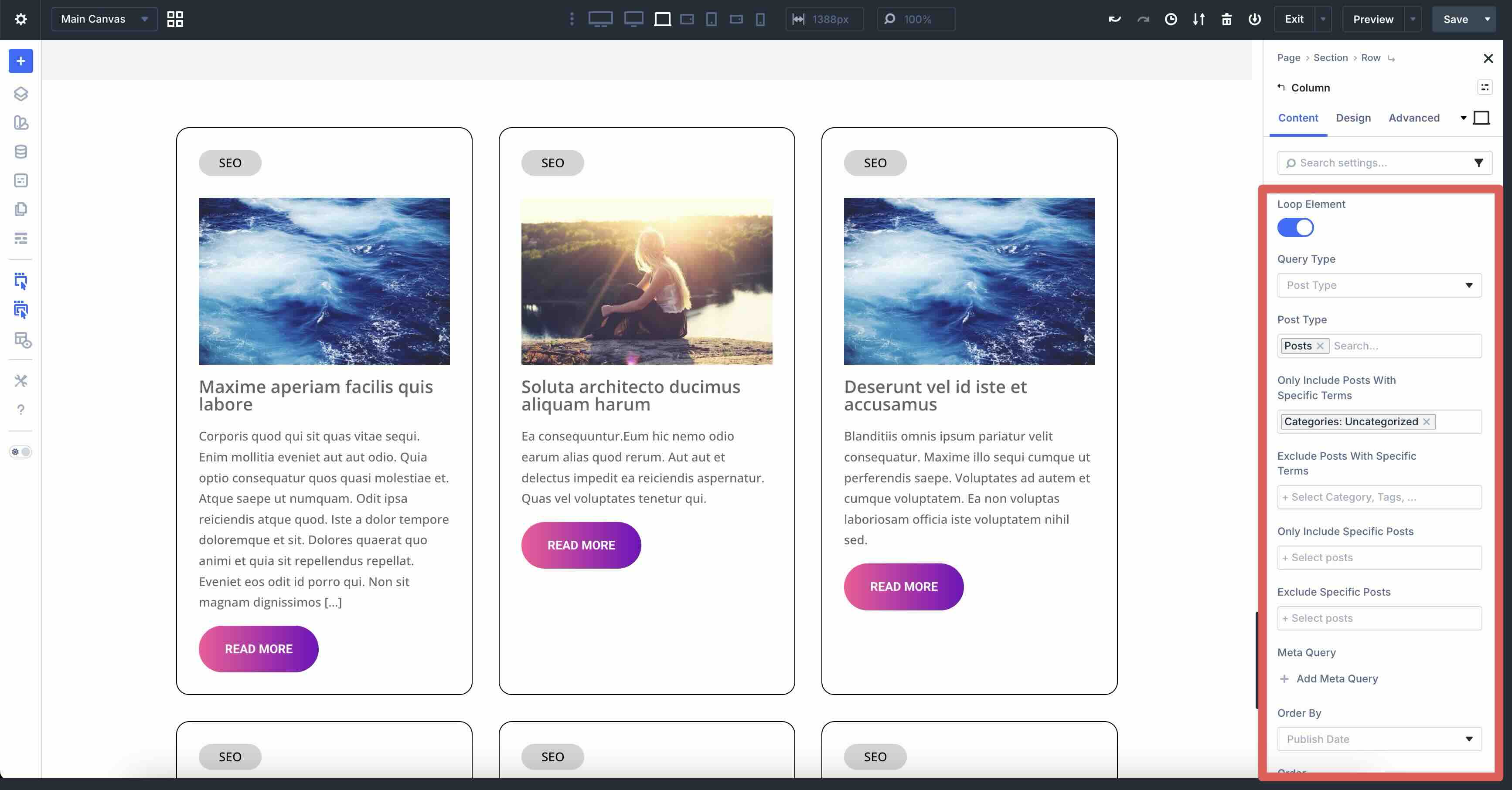
Loop Builder
The Loop Builder is a native feature for creating repeating content loops without plugins. Design your loop item once using Divi modules, then let Divi automatically pull in and repeat real data from your site’s database. Query and display posts, portfolios, products, authors, categories, tags, and more, and filter them by date, meta values, taxonomies, and advanced conditions.
You can customize the number of items, control pagination, ordering, and more. It’s perfect for blogs, WooCommerce product grids, or team directories, and watch as everything updates automatically as your content changes.
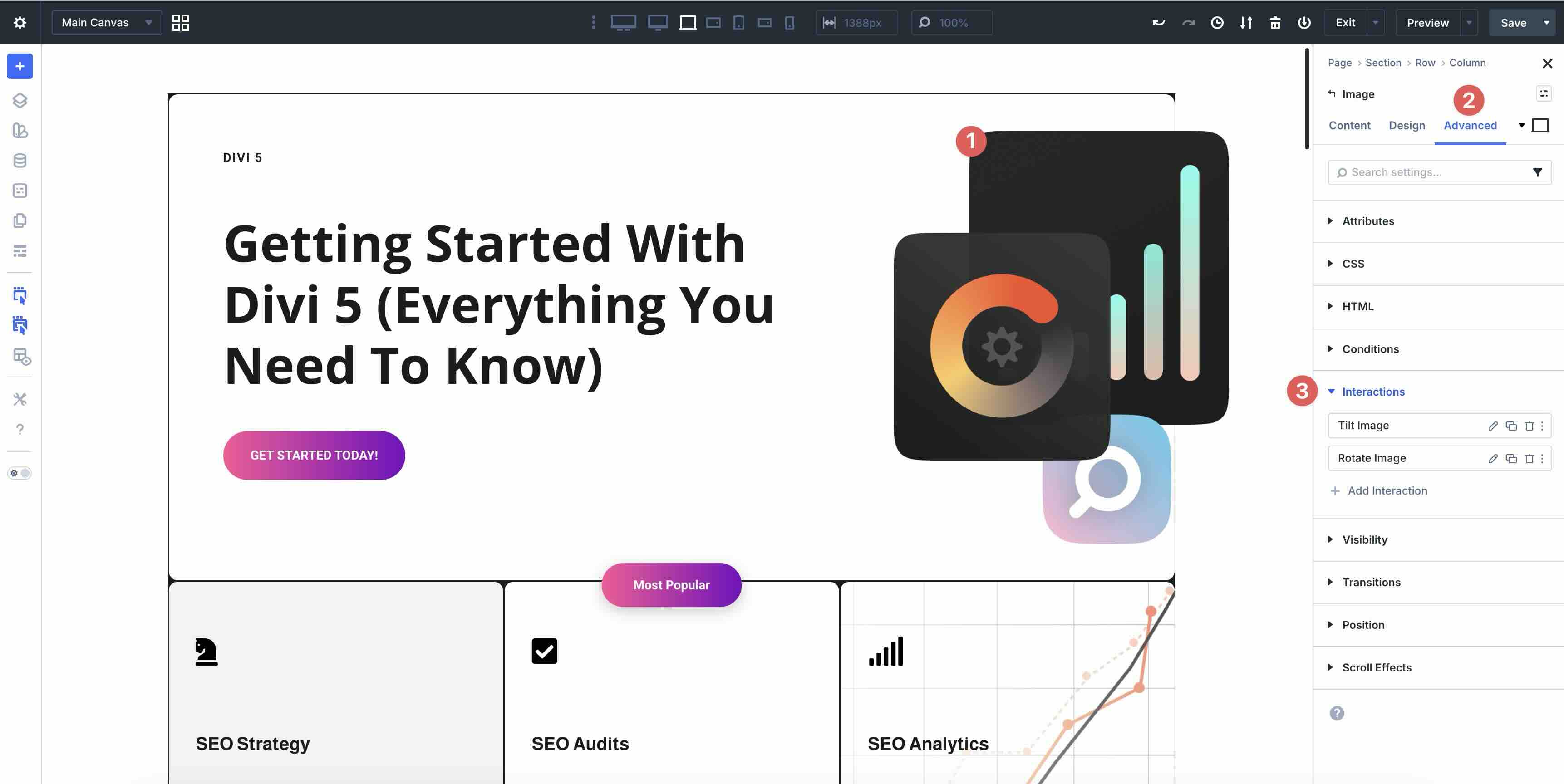
Interactions
Interactions add lightweight animations and behaviors directly in the Advanced tab of any module, row, or section. You can create custom responses based on user actions or page events without JavaScript or plugins.
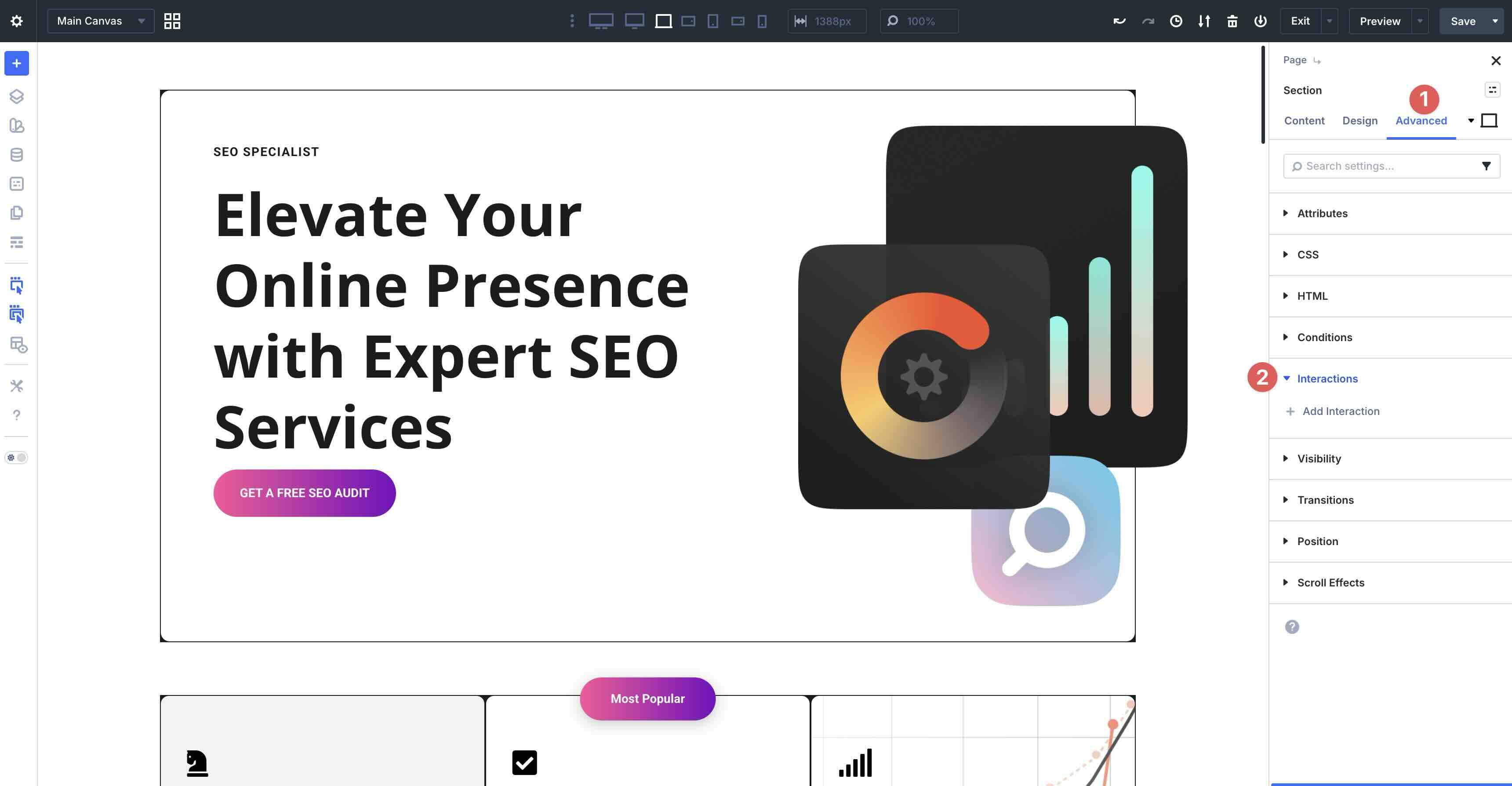
Set a Trigger Event, like click, hover, mouse enter, or viewport enter, choose an Effect Action, select the Target Module, and set a Time Delay.
You can chain multiple actions for complex interactions onto a single element, making it ideal for scroll-triggered animations, popups, menus, tooltips, or engaging micro-interactions that make your site feel alive and modern.
These features leverage Divi 5’s rebuilt speed and flexibility, so loops stay fast even with dozens of items, and interactions run smoothly without code bloat. With Loop Builder and Interactions, you can build dynamic, user-focused sites that feel professional and responsive.
Attributes
Custom Attributes let you add valid HTML attributes directly in the builder. This makes it easier to improve accessibility, add tracking hooks, and fine-tune SEO without leaving the Visual Builder. Extend Attributes lets you copy and paste styles from one module to another, whether across the entire page or within a single section.
Custom Attributes
The Custom Attribute System is located in the Advanced tab of any module. It replaces the CSS ID and Class fields in earlier versions of Divi with settings for any valid HTML attribute like aria-label, aria-hidden, role, id, class, or title.
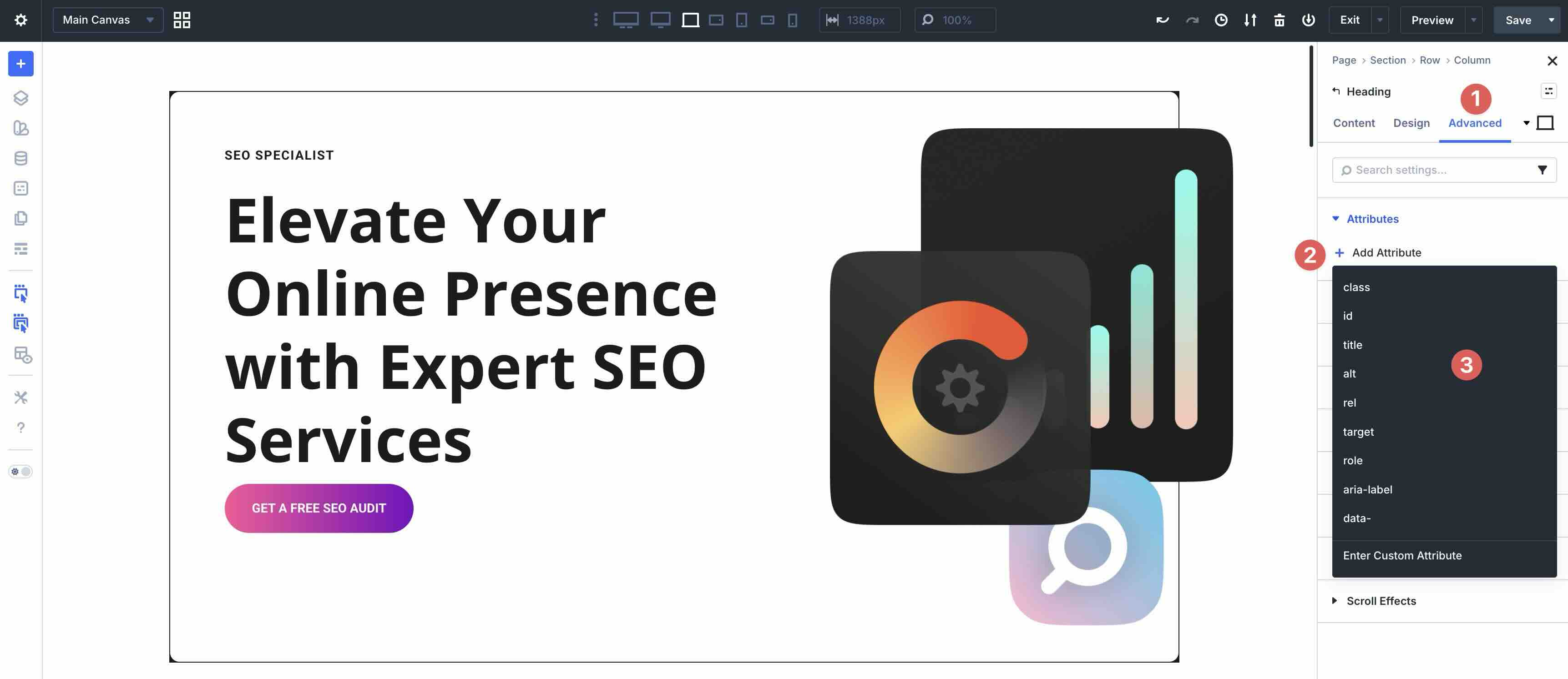
You can apply attributes to a section or individual element. Simply select an attribute and click to enable it. Choose the Target Element, Attribute Name, and Attribute Value. It’s also a good idea to add an Admin Label for easy identification later.
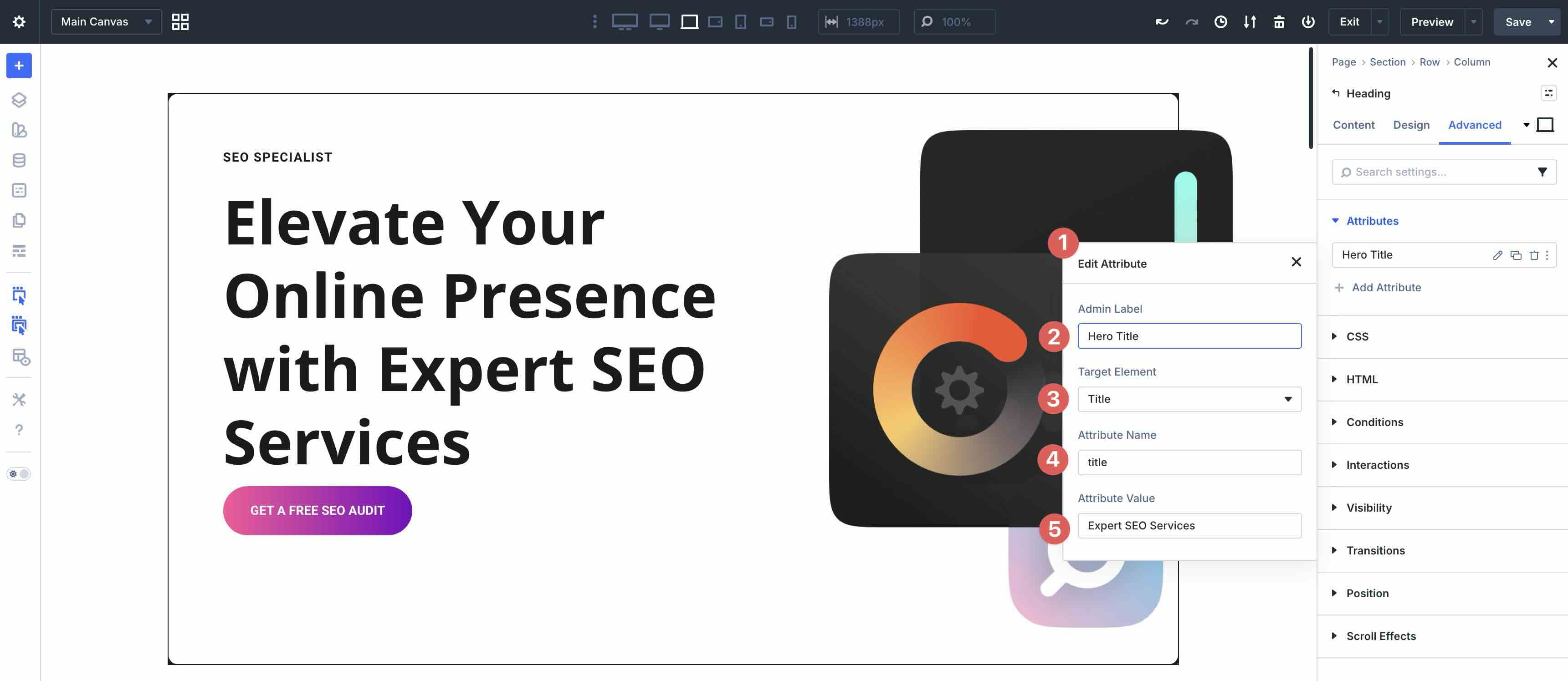
Save your favorites as Option Group Presets for quick reuse anywhere on your site.
Extend Attributes
Using Divi’s Extend Attributes feature lets you instantly apply any design, content, style, or preset attribute from one module to multiple modules on the same page. Right-click an element and select Extend Attributes from the dropdown menu.
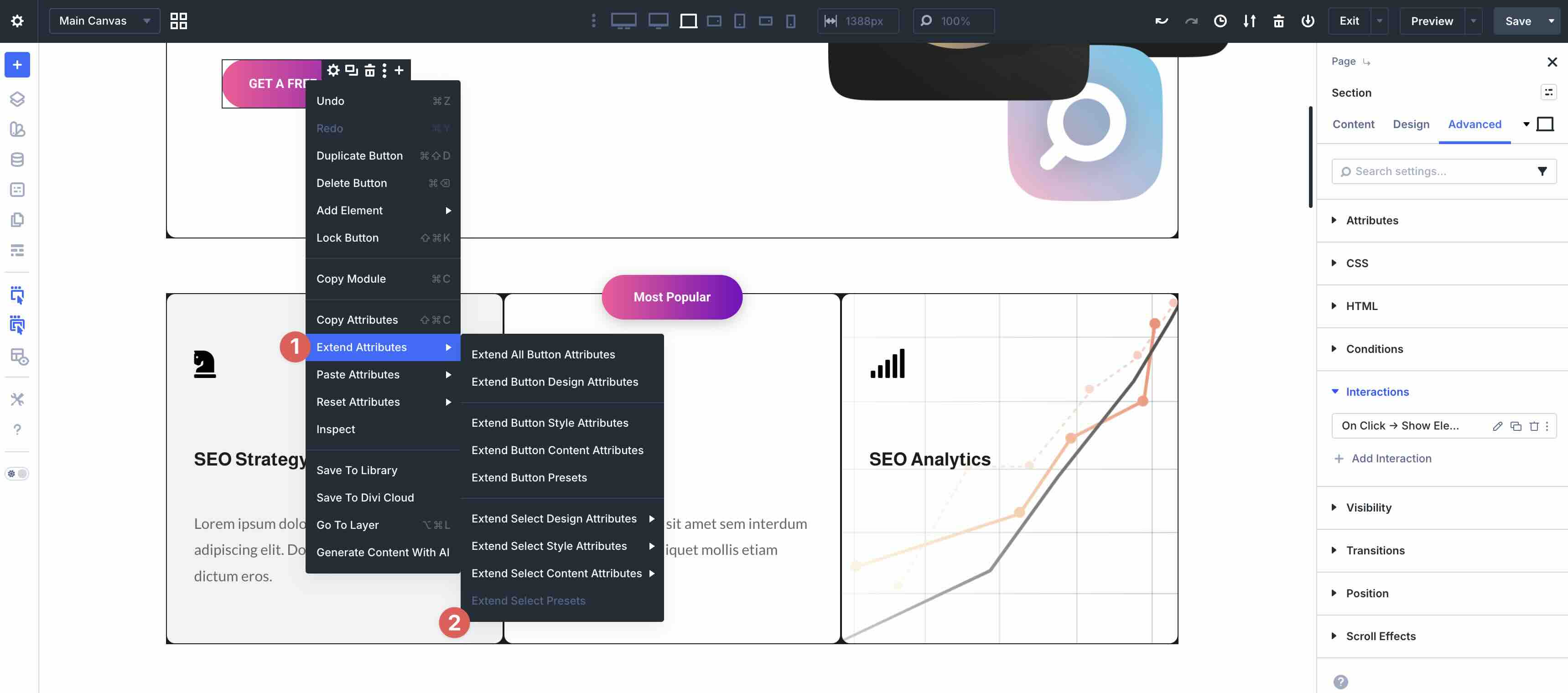
For example, you can extend the styles from a Heading module and apply it across the entire page, the current element, and its children or descendants. You can also target different element types, select attributes (design, style, content, or presets), option groups, or modified fields (font weight, line height, etc).
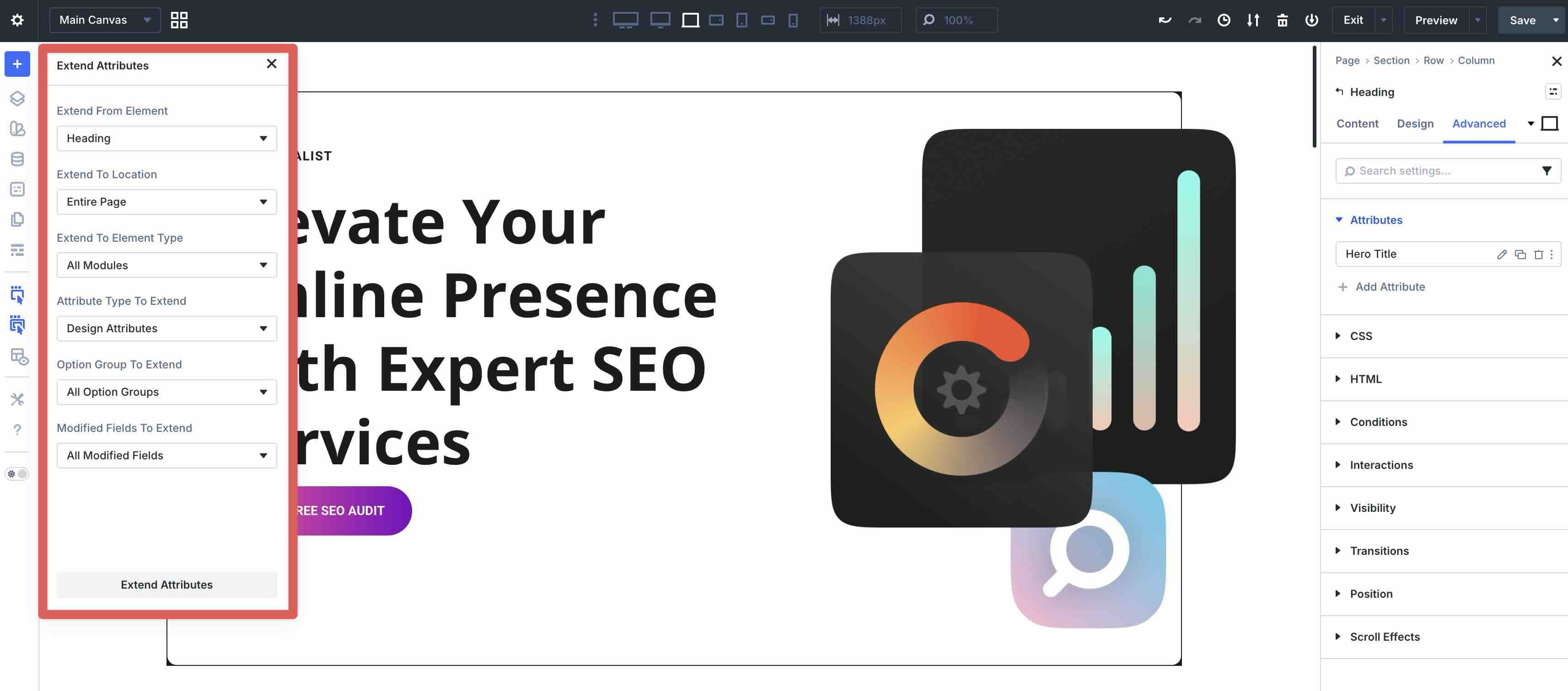
Limit changes to modified fields or make updates in bulk in just a few seconds.
Divi AI
Divi AI is built directly into Divi 5, acting as a creative partner that speeds up the web design process, from start to finish. With Divi AI, you can generate complete websites, full pages, individual sections, text, images, and code with a simple text prompt. Click the AI icon in any module’s text or image field, add a Code module to the page, or generate a new section or page with AI right inside the Builder.
To generate images, click inside the image preview in the Image or Background Image field in a module. Select the AI icon, and choose from multiple styles, including photo, concept art, or anime. Provide a brief description, add a reference image if desired, and generate. The entire process only takes a few seconds.
Divi AI changes how you build websites by letting you build faster than starting from scratch.
New Modules
In addition to new features, Divi 5 introduces several new modules that expand what you can build, taking full advantage of the rebuilt architecture for better performance, nesting, and flexibility.
Module Groups
The Module Groups feature lets you nest multiple modules inside a single container. Once grouped, you can style, move, duplicate, or save the entire group to the Divi Library. This is perfect for creating reusable card layouts, feature blocks, testimonials, pricing tables, or any repeating content structure, keeping your page clean and organized while enabling complex designs.
Group Carousel
The Group Carousel module lets you build sliders and carousels using any Divi module inside blank slides. It’s fully compatible with all existing modules, rows, and Module Groups, so you can create dynamic, content-rich sliders. Add Loop Builder integration for automatic post-product feeds, customize navigation, add autoplay, apply transitions, and configure responsive behavior, all without any third-party plugins.
Canvas Portal Module
The Canvas Portal module lets you embed a Divi 5 Canvas directly into your layout. Design popups, menus, image hotspots, and more, then place the Canvas anywhere with precise positioning, z-index control, offsets, and responsive visibility. It’s ideal for modern overlays, interactive hotspots, or reusable off-canvas components that appear on click, hover, or scroll.
Hero Module
The new Hero module replaces the old full-width header with a more flexible, modern alternative. It supports advanced layouts with Flexbox and CSS Grid, Nested Rows and Modules, background videos and images, and full-height or custom sizing options. It’s perfect for bold landing page intros, product showcases, or section headers with better responsiveness and styling controls.
Icon List Module
The Icon List Module lets you create beautifully styled or numbered lists with custom icons for each item. Every list item is individually styleable. Simply adjust the icon size, color, position, spacing, hover effects, and typography separately. Great for feature lists, benefits, steps, processes, or service highlights with a clean, professional look.
Lottie Module
The Lottie Module allows you to easily add lightweight, scalable Lottie animations to your pages. Upload your own Lottie file or embed them from a third-party website like LottieFiles or Lordicon, then control playback, size, alignment, and interactivity. It’s ideal for eye-catching icons, loading animations, decorative elements, or interactive illustrations without heavy GIFs or videos.
WooCommerce Modules
Divi 5 includes a full suite of 19 native WooCommerce modules to build complete online stores without extra plugins. Create custom product grids, single product pages, cart and checkout pages, reviews, and more, all styled visually with Divi’s full design controls. Combine with the Loop Builder for dynamic product loops and extend with custom attributes for advanced functionalities.
These new modules unlock creative possibilities while staying lightweight and fully integrated with Divi 5’s core features. They make it easier than ever to build sophisticated, modern layouts.
Migrating From Divi 4 And Backward Compatibility
Divi 5 is designed with excellent backward compatibility, so upgrading an existing Divi 4 site is safe and non-disruptive. When you activate Divi 5:
- It automatically detects any instance where the Divi 4 framework might be needed.
- It loads the necessary older framework components only where required, ensuring pages, posts, layouts, templates, and modules continue to render and function exactly as before.
- A clear orange admin notice appears in your WordPress dashboard whenever backward compatibility mode is active for any part of your site, so you always know that the legacy system is being used.
- This means no immediate visual changes, broken layouts, or lost functionality. You can keep editing and publishing normally while deciding when to migrate.
If your site uses no third-party plugins or modules, migrating is safe and straightforward. You can run the Migrator on your live site, but a staging site is still the safest approach for validating the migration first.
However, if you do use third-party extensions, we highly recommend performing the migration first on a staging site. Many third-party developers have released Divi 5-compatible versions, but checking them in a safe environment prevents any surprises. Creating a staging site is a smart habit for any major theme update, even without third-party products, because it lets you verify everything works perfectly before going live.
Migration Process
When you’re ready to take advantage of Divi 5’s speed, modern features, and leaner performance, use the built-in Divi 5 Migrator. Go to your WordPress Dashboard, locate the Divi tab and select the Divi Dashboard. Choose Migrate to Divi 5.
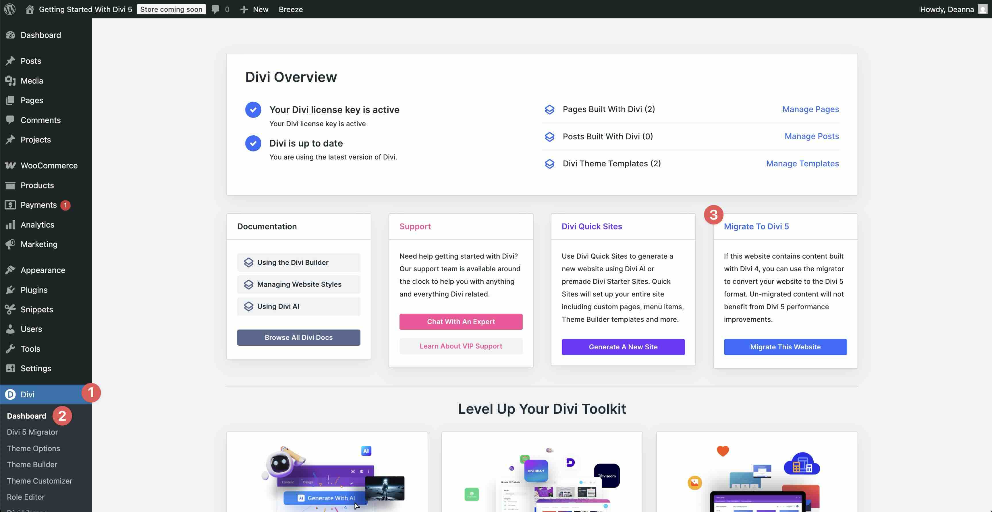
Divi will run a Compatibility Scan automatically. It reviews your entire site, including pages, posts, Theme Builder templates, third-party plugins, etc, and flags any potential issues.
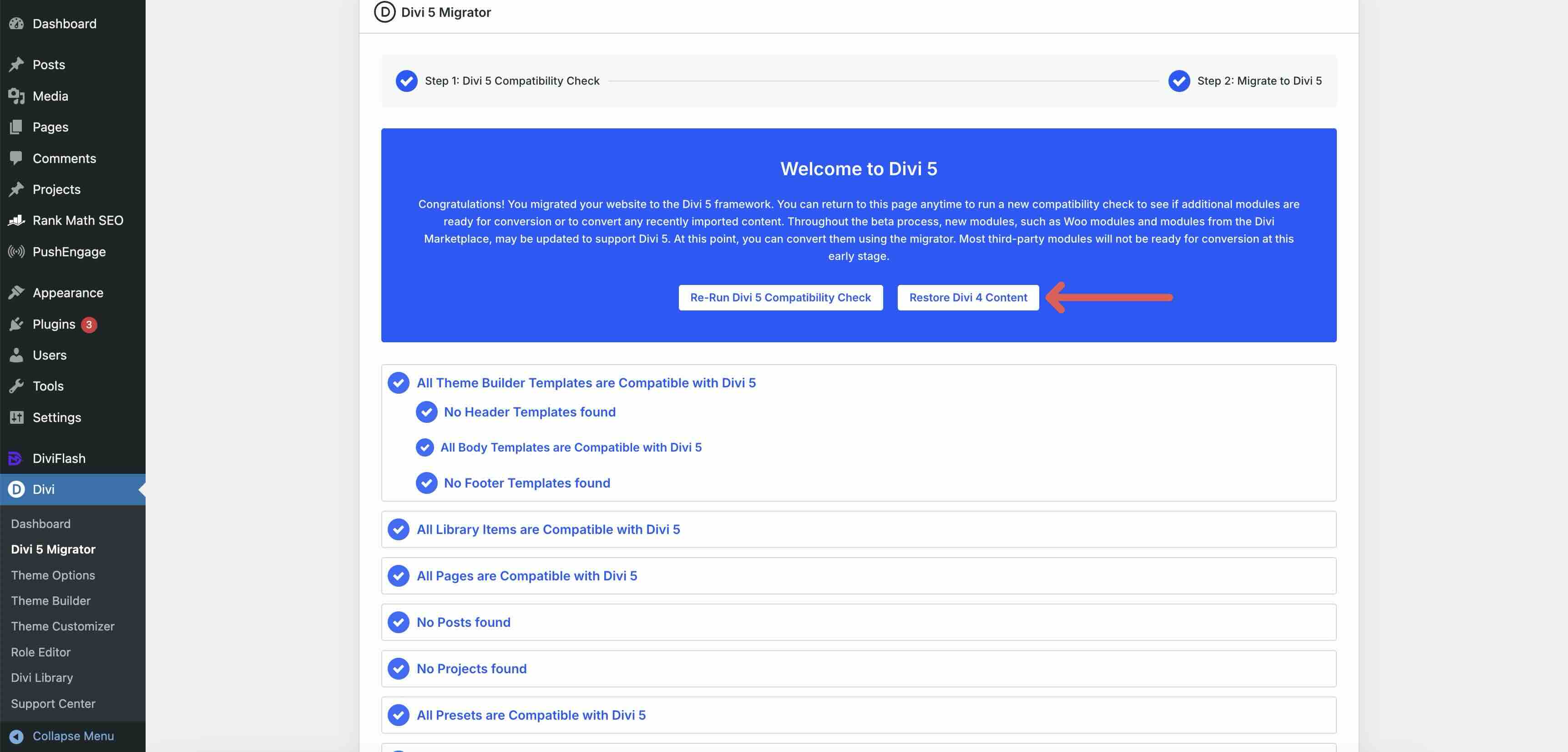
Review the results, then click Migrate That Site to Divi 5 to complete the process.
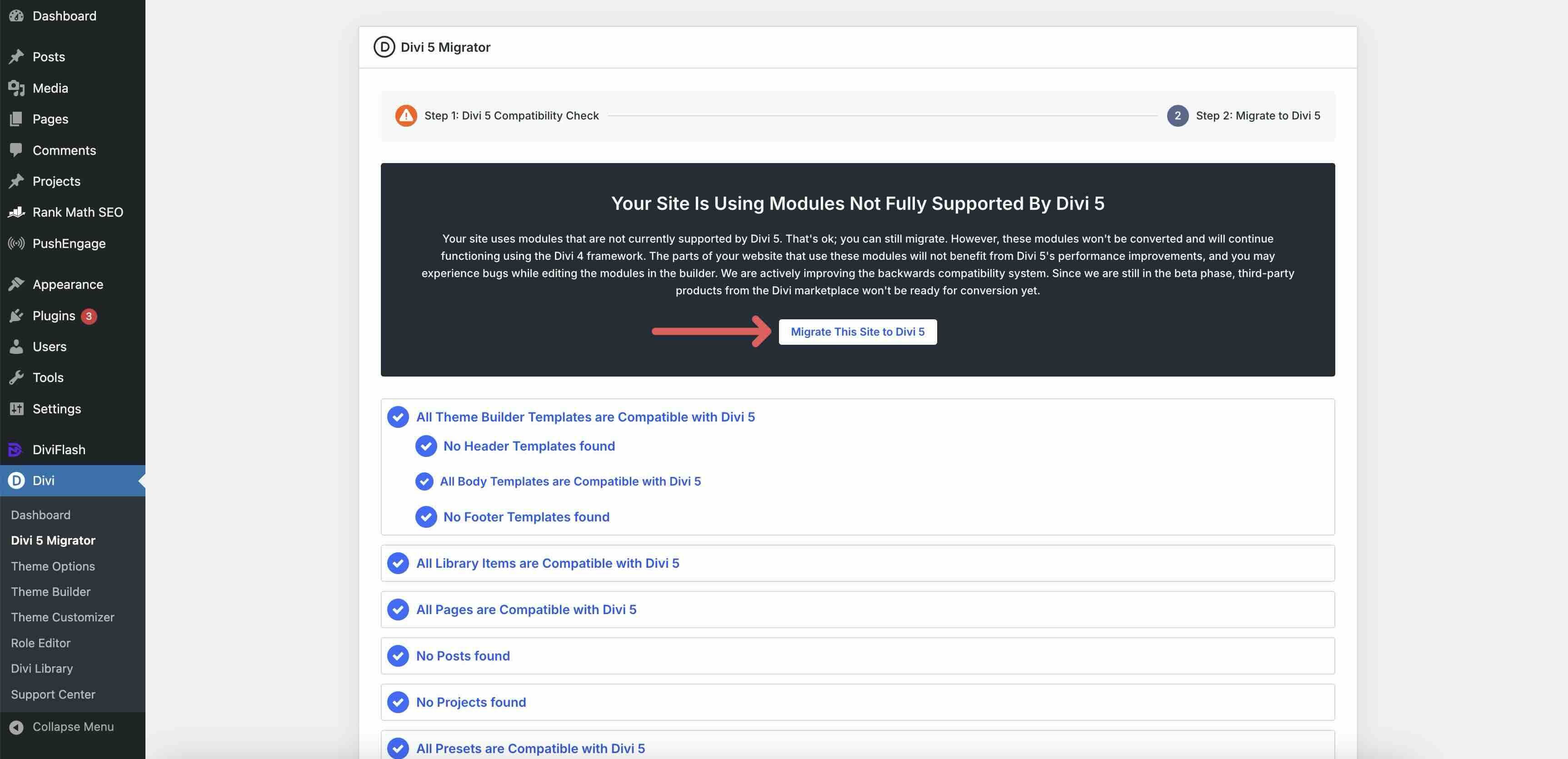
During the conversion process, the Migrator will convert everything compatible with Divi 5 and keep items that are not compatible in legacy mode.
If you encounter any issues, you can easily restore your Divi 4 content with one click.
Tips And Best Practices
Here are some practical tips to help you get the most out of Divi 5. These habits will save time, keep your designs consistent, and make the Visual Builder feel even smoother.
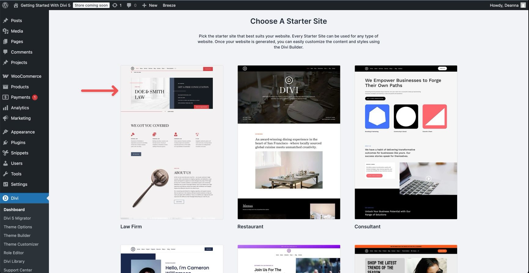
Start Fast With Divi Quick Sites Or Premade Layouts
The quickest way to see Divi 5 in action is to use Divi Quick Sites or import a premade Layout Pack in the Visual Builder. These give you professional, ready-to-go, customizable foundations in seconds. Once imported, immediately replace demo content, including colors, fonts, and images, with your own Design Variables and Presets. This ensures your site stays on-brand from the first edit and makes future updates effortless.
Leverage The Inspector For Quick Edits
The Inspector is one of Divi 5’s best time-savers. It gives you a fast, at-a-glance overview of styles, colors, fonts, sizes, media, and presets on your page. Use it to spot issues, make bulk changes, copy and paste styles, or apply global variables and presets without digging through multiple settings panels. For example, you can use it to switch Layout Packs from Block to Flex with a few clicks.
Use Advanced Units For Better Responsiveness
Take advantage of modern CSS units in typography, spacing, widths, and more. For example, set font sizes with clamp() so text scales fluidly across devices without manual breakpoint tweaks. Combine these with Design Variables for site-wide responsive rules that adapt automatically.
Group Panels For A Cleaner, Faster Workflow
Dock and group panels in the Visual Builder to suit your style. You can pin the left sidebar for tools, keep module settings on the right, and collapse anything you’re not using. Switch to light or dark mode, use X-Ray or Wireframe view when needed, and save your preferred layout in the Builder Settings. This maximizes screen space and reduces clicks, making long sessions more comfortable and efficient.
Always Test Your Breakpoints
Divi 5’s 7 Customizable Responsive Breakpoints make responsiveness precise, but testing the outcome across your breakpoints is necessary. Switch modes in the top bar, apply structure templates, adjust widths, and test typography, spacing, hover states, and visibility on each device view. Resize the canvas to catch issues early. Small tweaks here prevent big problems on real device screens.
Follow these practices, and Divi 5 will feel intuitive, fast, and powerful. Be sure to experiment. The Visual Builder is forgiving, and your designs will improve with every page you create
Download The Free Divi 5 Design System (Launch Gift)
To celebrate the official launch of Divi 5, we’re releasing a free Divi 5 Design System you can import into any new project. It’s designed to help you start with consistent colors, typography, spacing, and reusable presets, so your site looks polished from the first layout you build.
What’s Included
- Design Variables for brand-ready colors, fonts, and core spacing values
- Preset collections for common elements like buttons, headings, cards, and sections
- Ready-to-use layouts you can customize fast without rebuilding the same styles
How To Use It
- Download the Design System.
- Import the Design System into your site using the Divi Library or the Preset Manager import tools (depending on the file type).
- Open Design Variables and swap in your brand colors and fonts first.
- Apply presets as you build, then adjust the presets once to update the whole site.
If you want the fastest workflow, start with the Design System first, then build your pages. That way, every new module you add can inherit the same variables and preset styles from the beginning.
Get Started With Divi 5 Today!
Divi 5 is more than just the next version of Divi — it’s a complete overhaul that redefines what’s possible with WordPress. Rebuilt from the ground up, it delivers fast performance, instant Builder responsiveness, and a leaner codebase. With native Flexbox and CSS Grid, Design Variables, powerful new modules, and dynamic tools like Loop Builder and Interactions, Divi 5 allows you to create complex, professional, responsive websites faster and with greater flexibility.
The future of Divi is here. Download Divi 5 from the Elegant Themes member area, start a new project, and experience the difference for yourself.
The post Getting Started With Divi 5 (Everything You Need To Know) appeared first on Elegant Themes Blog.