Divi 5 continues to add new design-system features, and this update focuses on form styling. The new form field options introduce dedicated Input, Checkbox, and Radio option groups, new focus and checked editing states, form field presets, and a new Contact Form 7 module.
Together, these updates give you more control over form design directly inside Divi’s Visual Builder. You can style inputs, checkboxes, and radio buttons more consistently, customize labels and placeholders, and edit interactive states such as focus and checked from the module’s Design tab.
Field Presets let you save reusable styles for form field groups, so you can apply the same form design across multiple modules. Meanwhile, the new Contact Form 7 module brings Divi’s form styling options to Contact Form 7 forms, with more integration-based modules planned.
In this post, we’ll break down what’s new, how the features work, and how to use them to build better forms in Divi 5.
Let’s dive in.
What Are Divi 5’s New Form Field Options?
Divi 5 brings a major improvement to how forms are designed and styled. Form-based modules, including Contact Form, Email Optin, and Login, now share a more unified set of design options.
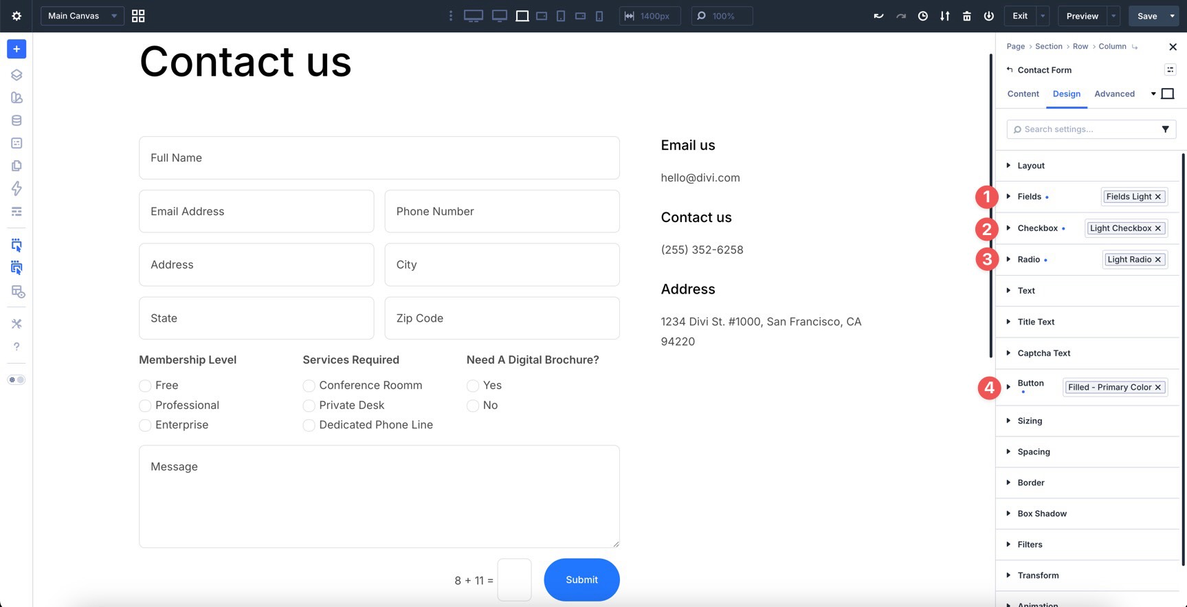
Previously, Divi’s form modules used a single Field option group, and available settings could vary from one module or field type to another. Now, form field design has been split into three dedicated option groups: Input, Checkbox, and Radio.
These new groups give you more precise control over each field type. They also add styling controls for label text and placeholder text where those elements apply. As a result, you can style form fields more predictably and reuse those styles through Option Group Presets.
When paired with Composable Settings, these option groups can unlock additional Divi design controls for form elements, including sizing, backgrounds, borders, shadows, filters, transforms, and more.
Key Advantages
- More Complete Design Control: Style form fields using native Divi design settings instead of relying on custom CSS for common adjustments.
- More Consistency Across Form Modules: Form-based modules now share the same Input, Checkbox, and Radio settings, so designs are easier to repeat from one module to another.
- Integration With Composable Settings: Enable additional option groups where you need them while keeping the settings panel focused.
- Reusable Field Presets: The new Input, Checkbox, and Radio option groups support presets, so you can save and reuse form field styles across compatible modules.
New Pseudo-Class Editing States
If you are familiar with Divi 5, you already know about hover editing. You can switch to the hover state and style design options for the way an element looks when someone hovers over it.
Divi 5 now expands this workflow for form fields with two additional pseudo-class editing states: focus and checked. These states let you control how fields look when users interact with them.
Use the Focus state to style a field when a visitor clicks or tabs into it. Use the Checked state to style selected checkboxes and radio buttons. These visual cues make forms easier to understand and more pleasant to use.
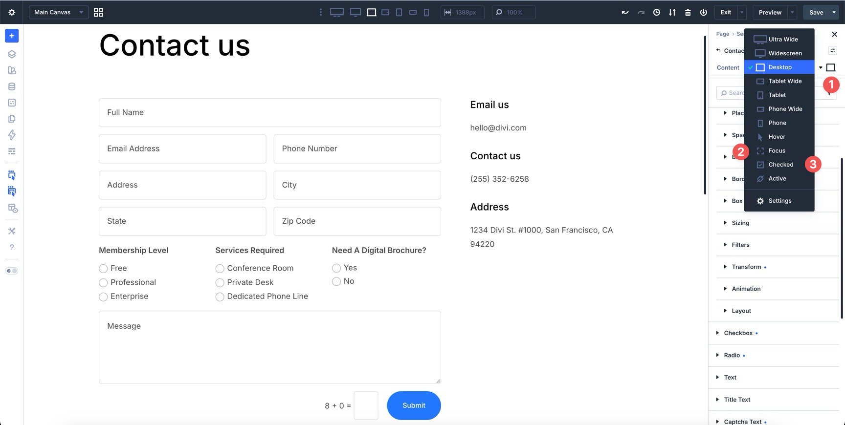
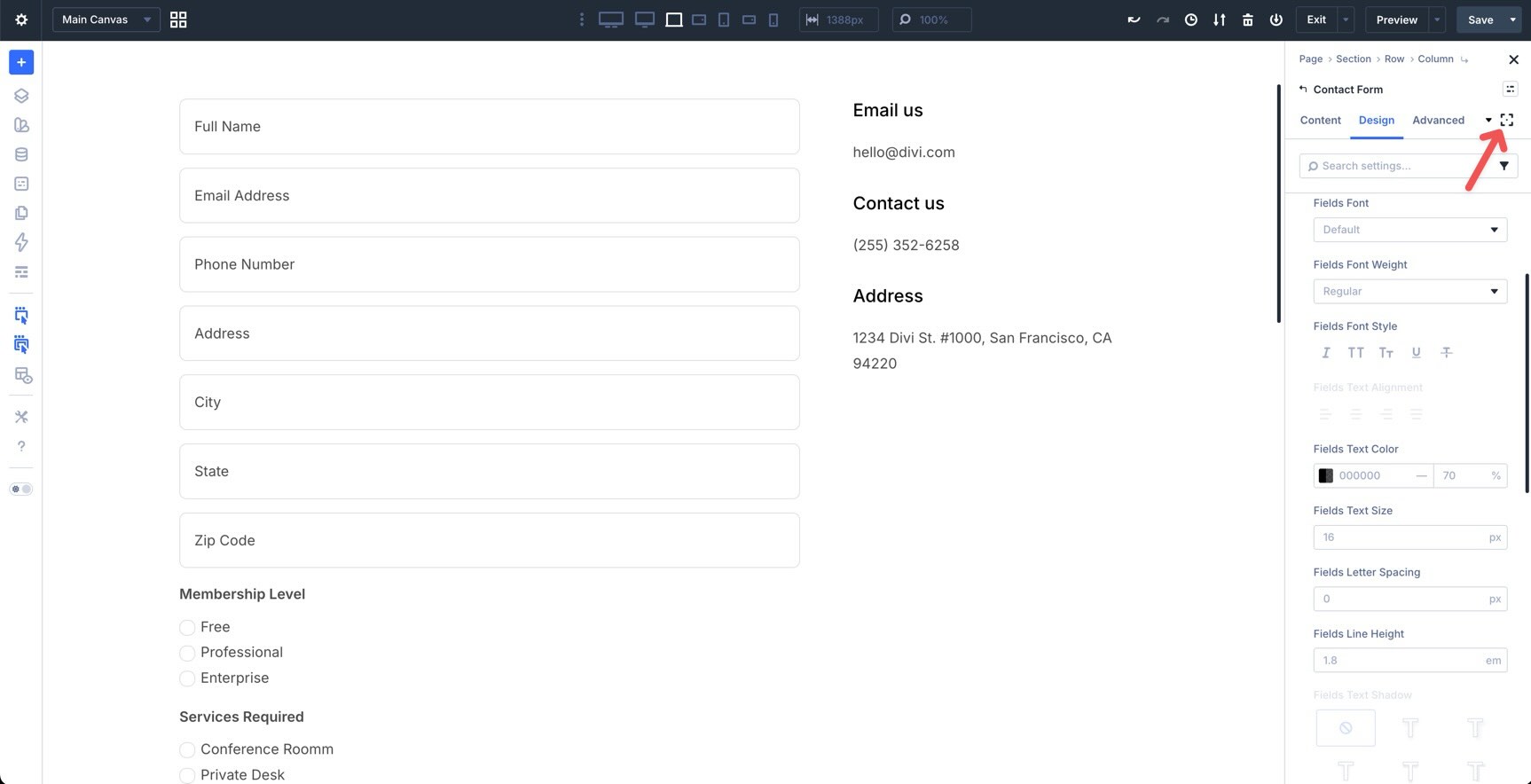
To access these states, open a form module and go to the Design tab. Near the top of the settings panel, open the state selector and choose the state you want to edit.
The New Contact Form 7 Module
This update also introduces a new Contact Form 7 module.
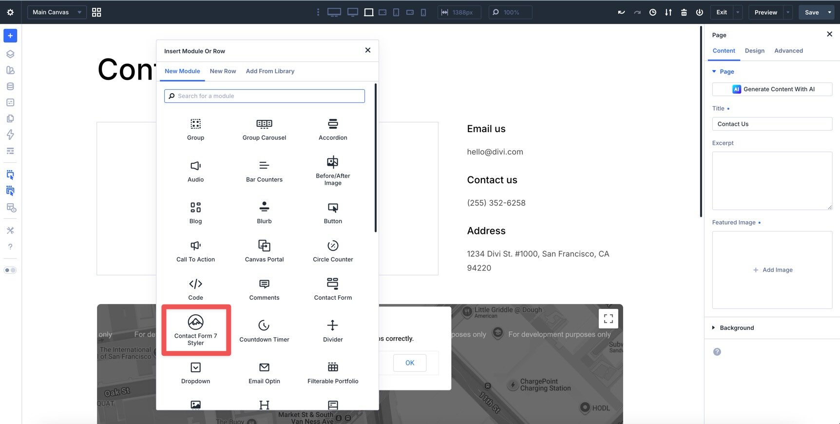
Instead of embedding a Contact Form 7 shortcode and writing custom CSS to match your branding, you can add a Divi module, choose one of your existing Contact Form 7 forms, and style the form directly inside the Visual Builder.
The Contact Form 7 module uses the same new form option groups and styling options as Divi’s native form modules. It is also the first of more integration-based modules planned for Divi 5.
How To Use Divi 5’s New Form Field Options
Getting started with Divi 5’s new form styling system is straightforward. In this tutorial, we’ll style a Contact Form module, edit hover, focus, and checked states, adjust individual field widths, and save reusable presets.
Note: Most of the styles below are applied at the module level. That means you can style inputs, checkboxes, and radio buttons across the entire form in one place. You can still adjust individual fields when you need layout-specific changes, such as field width.
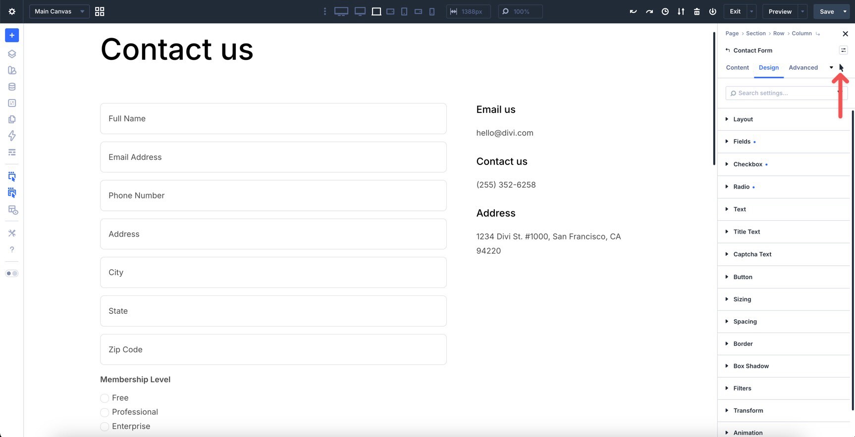
Step 1: Add And Style A Contact Form Module
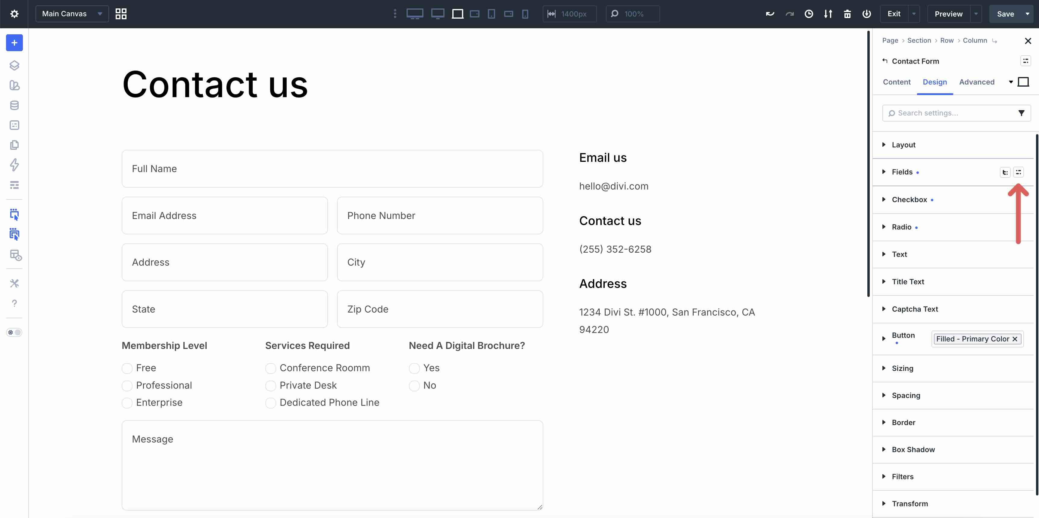
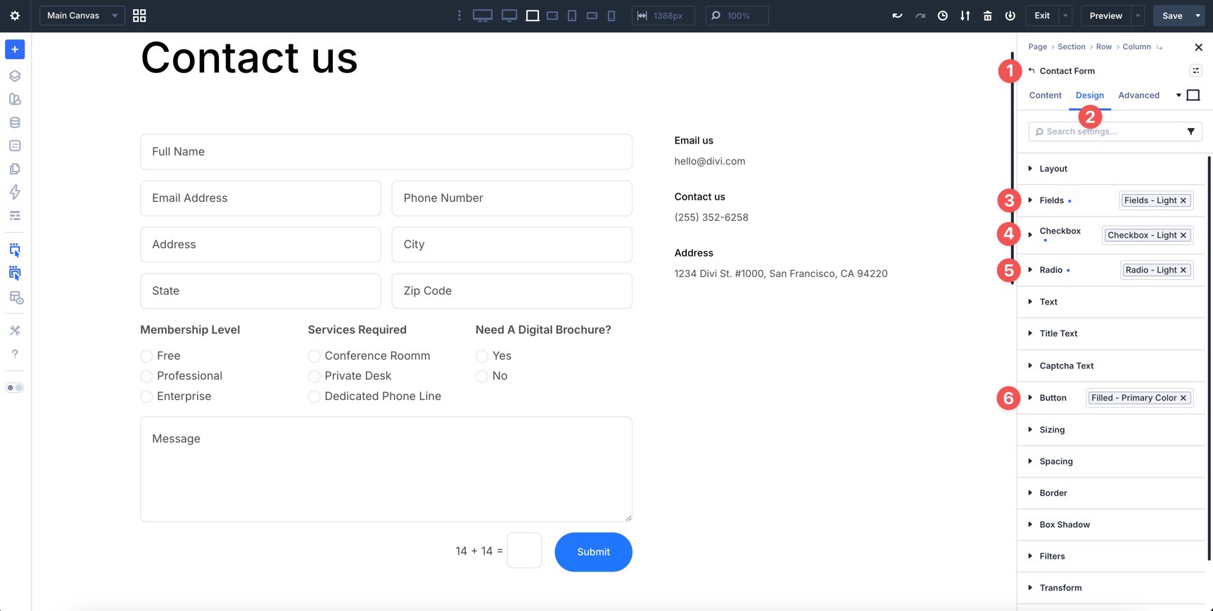
Open any page in the Visual Builder and add a Contact Form module. In the module’s Content tab, add the fields you need. Then, go to the Design tab. You’ll see the updated form option groups.
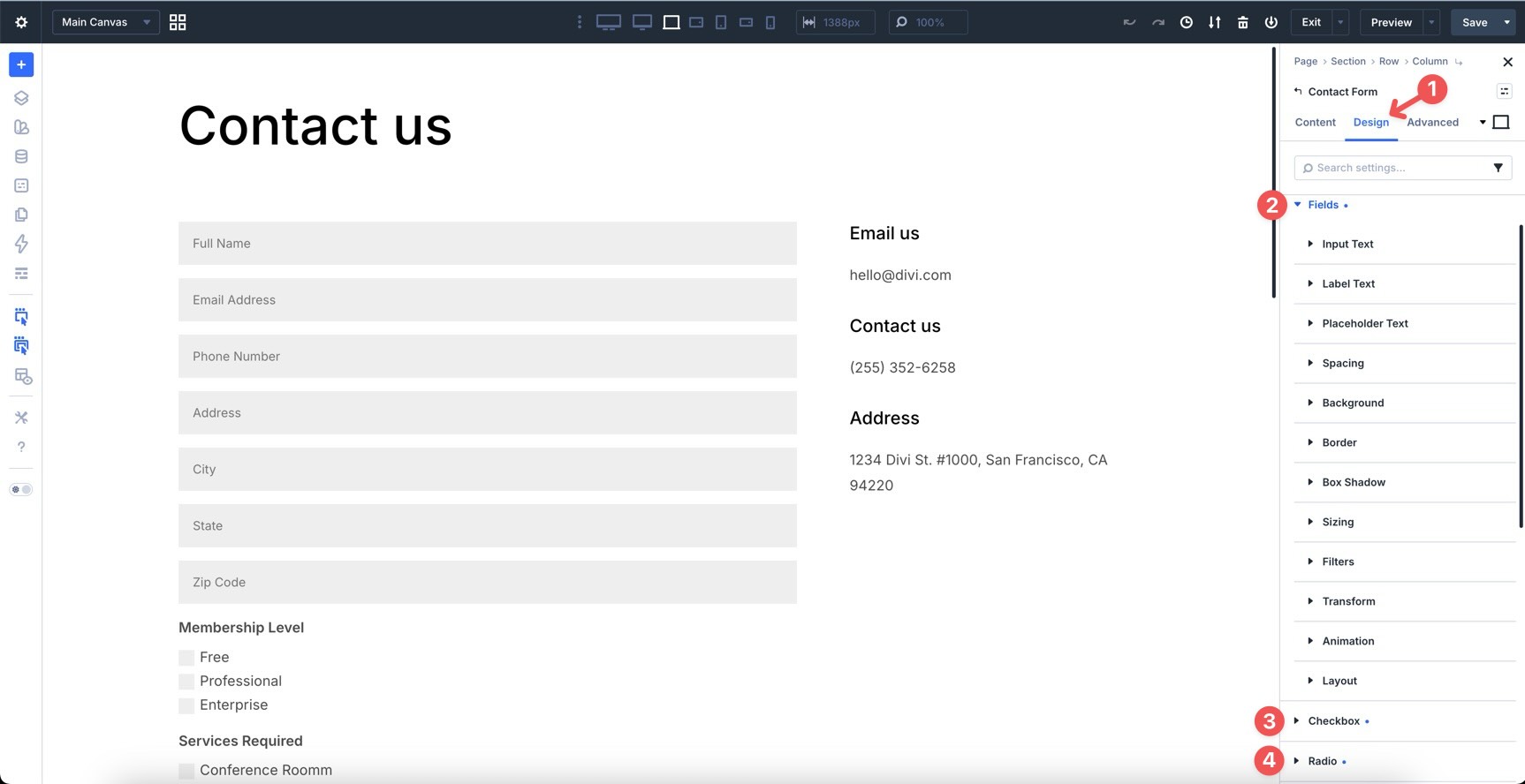
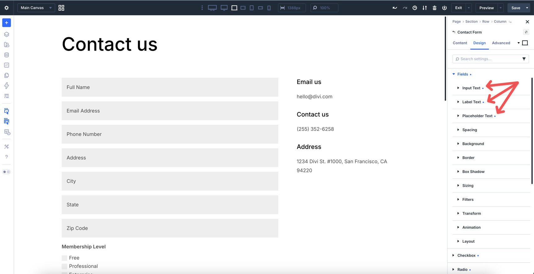
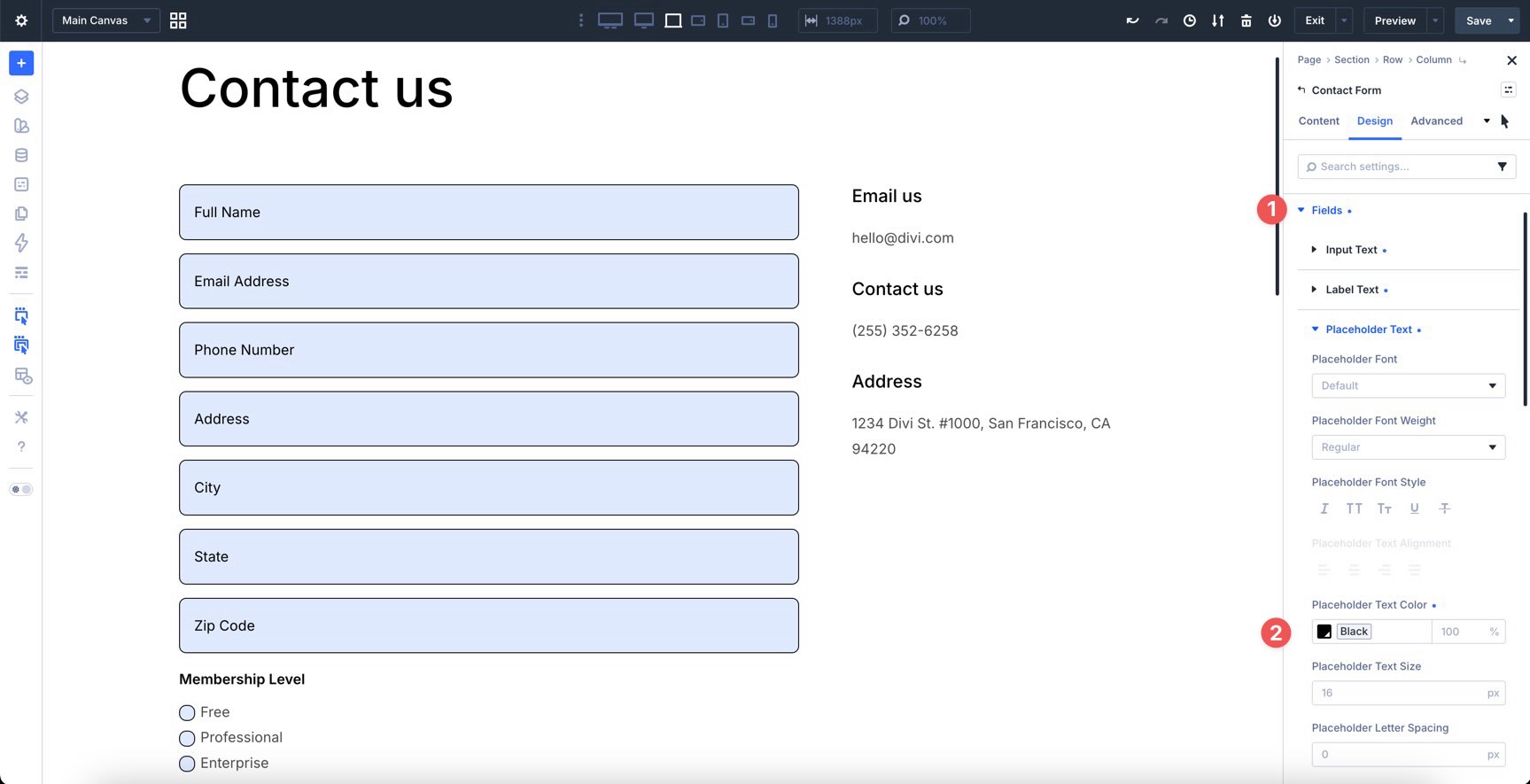
Style The Field Option Group
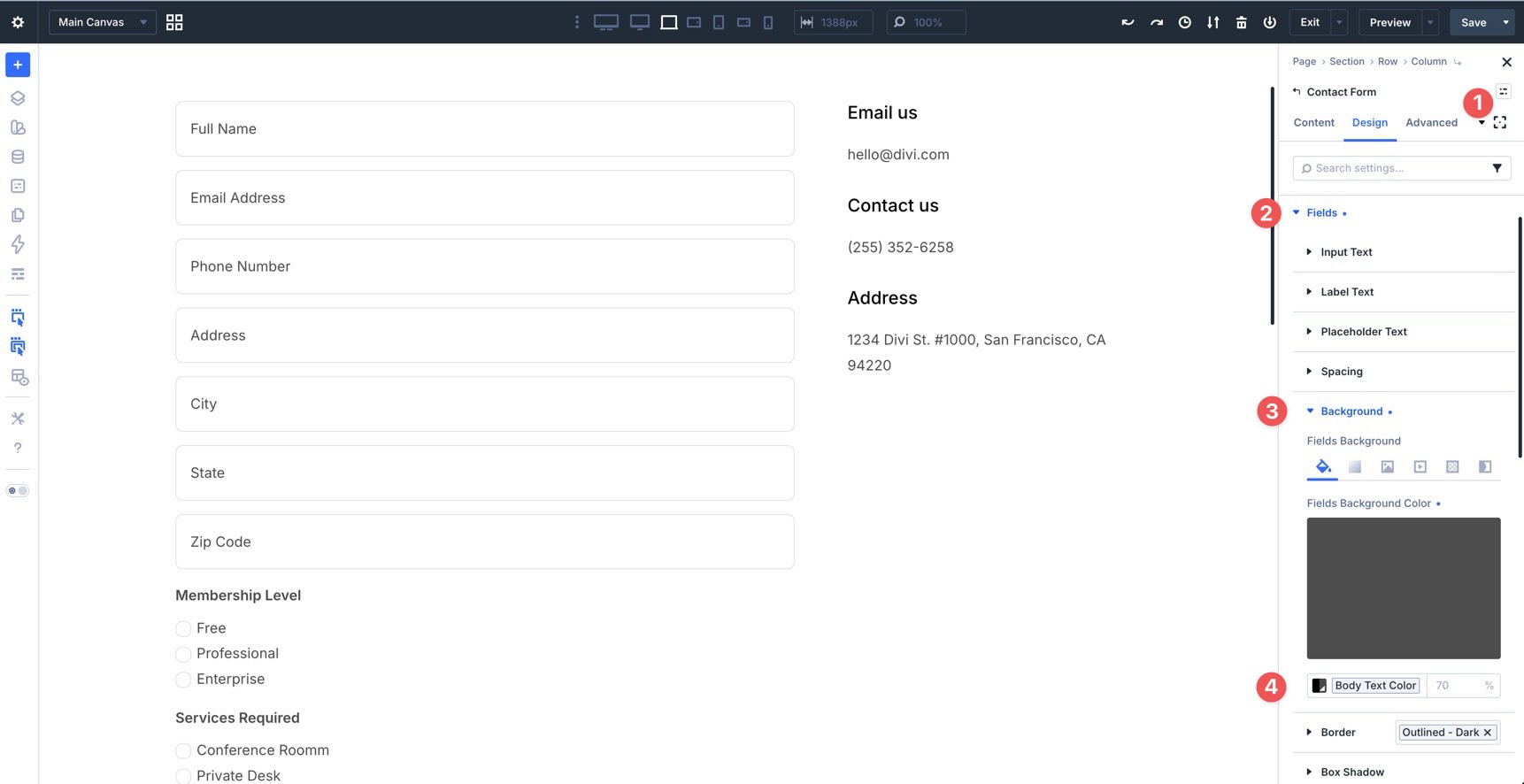
While in the default state, expand the Fields option group. Then, expand the Input, Label, and Placeholder subgroups to style the form.
To keep the form consistent with the rest of your site, use Design Variables for values such as field text color, field text size, line height, border width, and border radius.
Once styles are added, Divi 5 displays a blue dot next to modified settings and option groups. This makes it easier to see which parts of the module have been customized.
You can also add background colors, gradients, borders, and other visual details using Divi’s design settings.
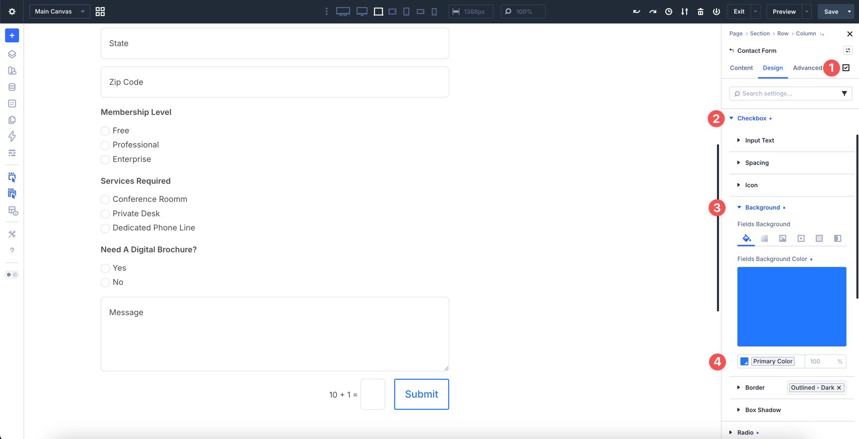
Style The Checkbox Option Group
Next, expand the Checkbox option group. You’ll find subgroups for input text, spacing, icon, background, border, and box shadow. These can be styled individually.
For example, expand the Input Text group and adjust the Text Color, Text Size, and Line Height to match the rest of your form.
Before moving to the Radio option group, assign an Icon Color, Background Color, and Border style to the checkboxes.
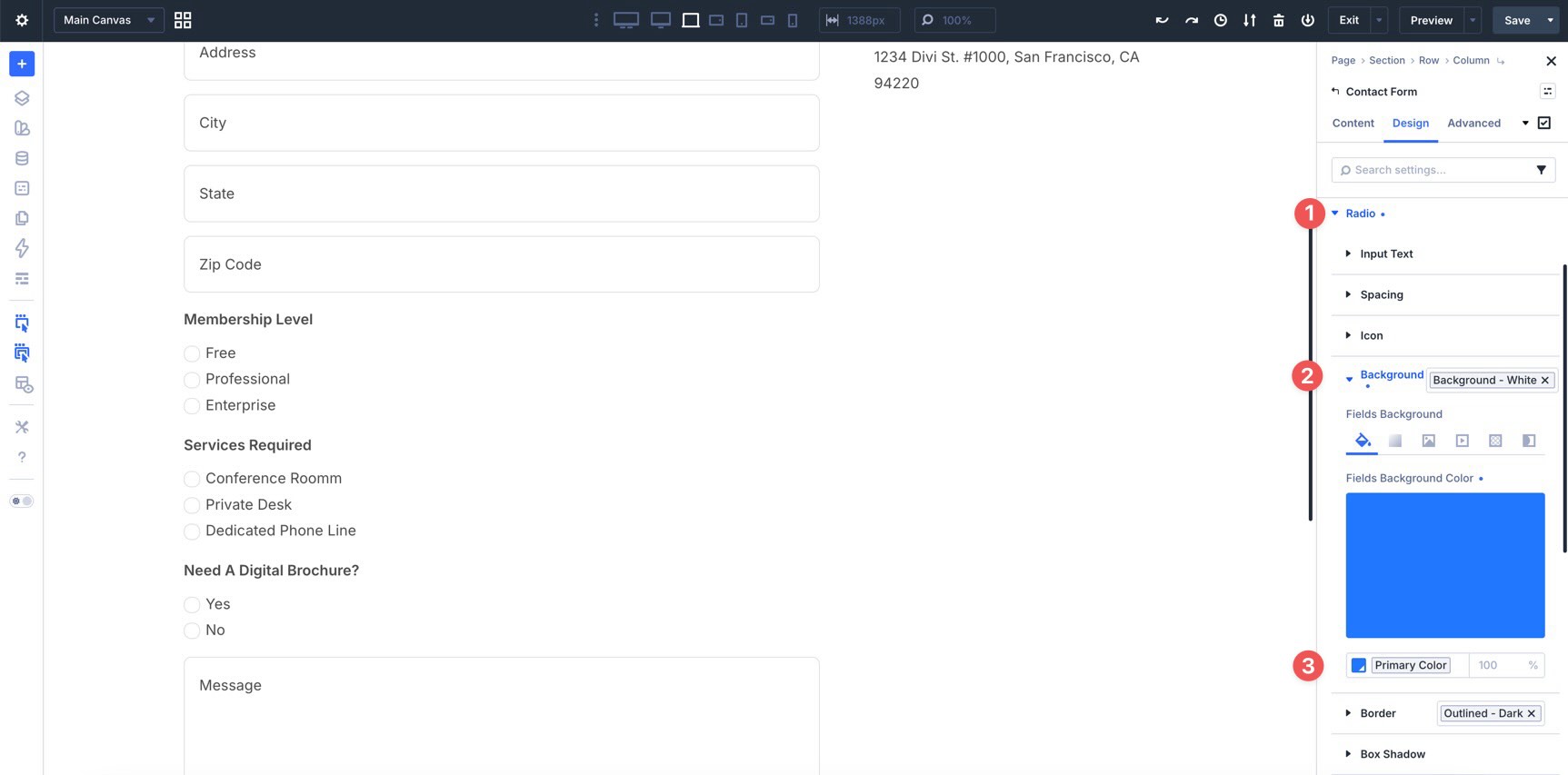
Style The Radio Option Group
Repeat the same styling process for the Radio option group. Add styles for Input Text, Icon, Background, and Border so radio buttons match your checkboxes and inputs.
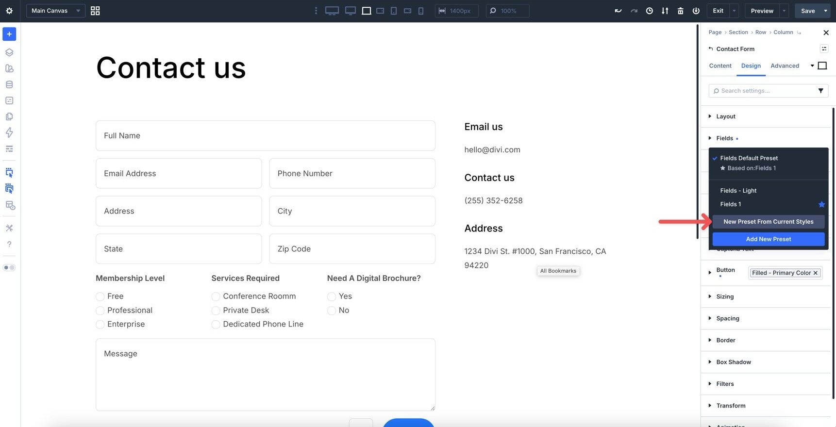
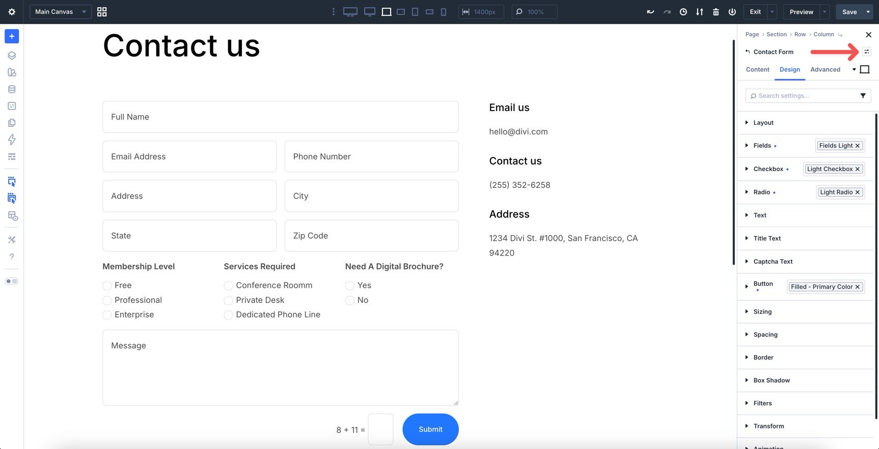
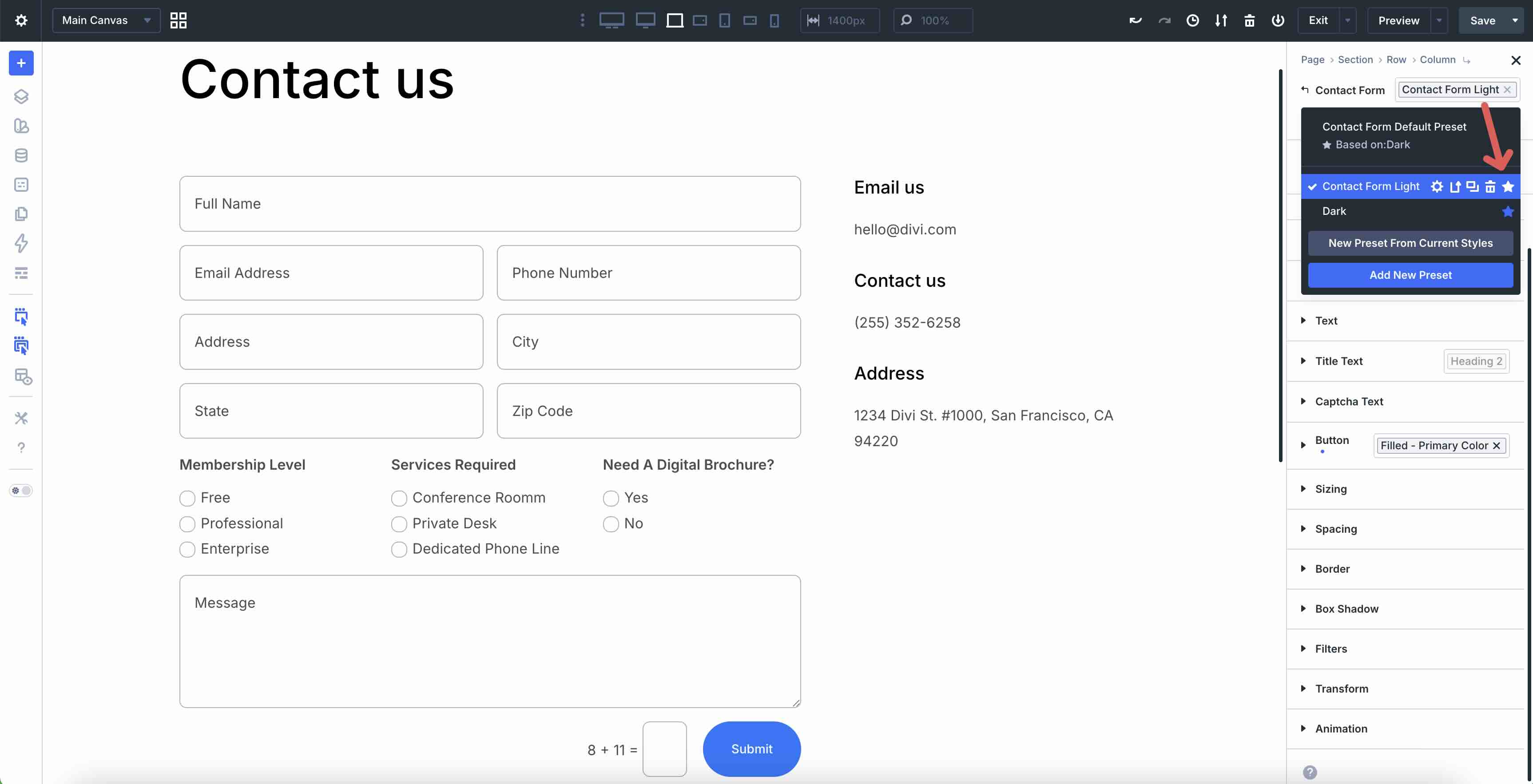
If you have not already created Option Group Presets for these sub-elements, this is a good time to do it. Style a sub-element, hover over the group header, and click the Assign Presets icon.
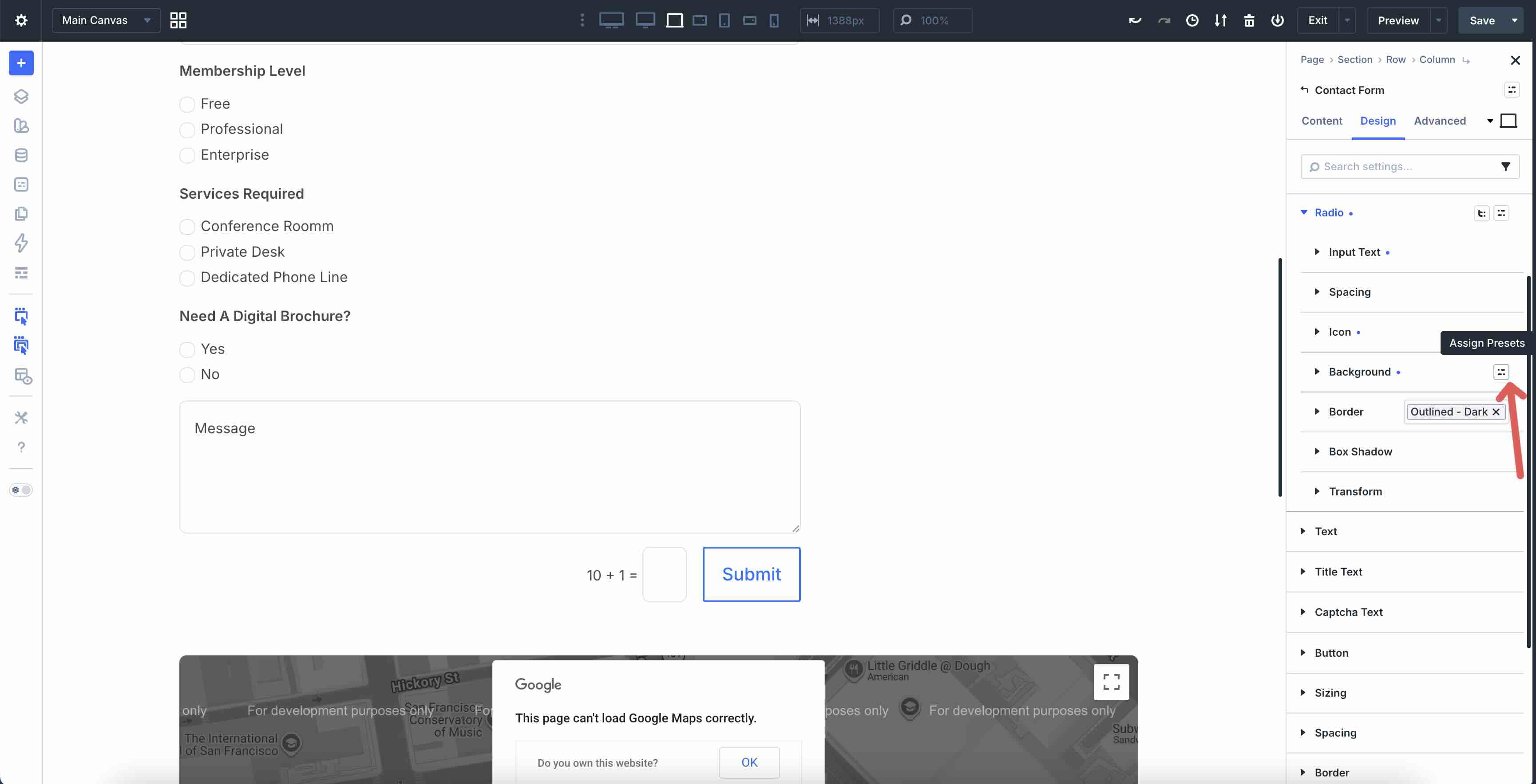
When the modal appears, click New Preset From Current Styles.
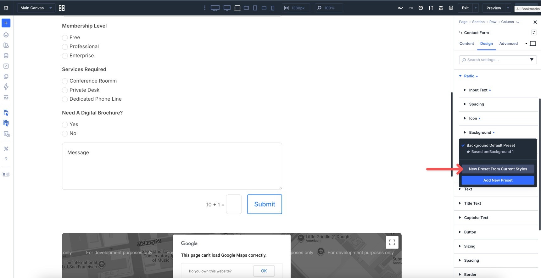
Give the preset a name, verify the saved styles, and click Save Preset.
Make Style Changes To The Hover State
Before switching to the Focus state, make any adjustments you want for the Hover state.
For example, you can change the background color for fields, checkboxes, and radio buttons. You can also adjust border colors to create a clear hover effect.
When adding a background color to fields, make sure the Placeholder Text Color remains easy to read.
Step 2: Switch To Focus State
Use the Focus state to style how fields look when a visitor clicks or tabs into them.
Changing the Background Color of fields or adding a subtle transform in the Focus state can provide clear visual feedback. Start by changing the Background Color in Fields > Background.
If you use a darker background color, change the Placeholder Text Color to a lighter color so it remains readable.
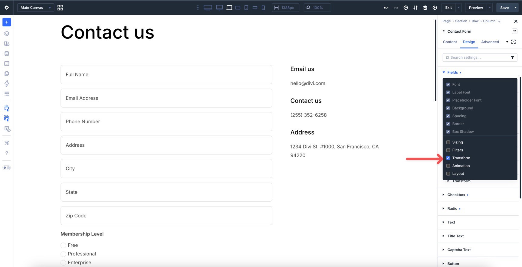
To make the focus effect more noticeable, use Divi 5’s Composable Settings to add Transform controls to the Fields option group. Hover over the Fields header to reveal the Toggle Options icon.
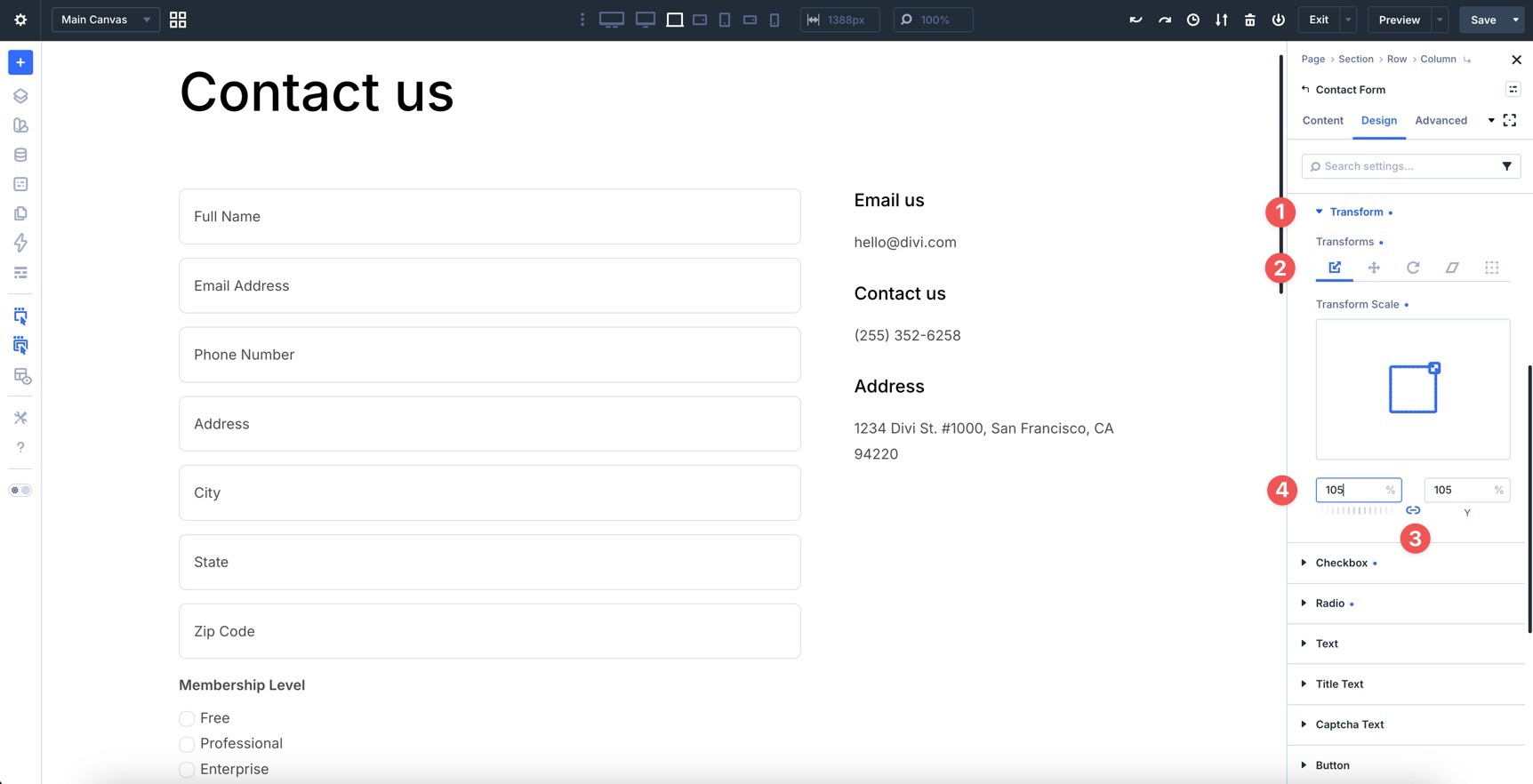
After clicking the icon, enable the additional options you need for the Fields option group. Choose Transform, and the Transform settings will become available.
Expand the newly added Transform option group. In the Transform Scale tab, keep the link icon enabled and add 105% to the X field.
Now, when you preview the form and click into a field, the placeholder text turns lighter and the field container expands.
Step 3: Switch To Checked State
Use the Checked state to style selected checkboxes and radio buttons. Open the state selector and choose Checked.
Expand the Checkbox option group, then open the Background subgroup. Change the Background Color for checked checkboxes.
Repeat the same process for the Radio option group.
Preview your form again. This time, pay attention to how the checkboxes and radio buttons look when selected.
Step 4: Style The Button
With the fields, checkboxes, and radio buttons styled, the last major element to edit is the Button. In the Contact Form module’s state selector, make sure you are back in the default state. Then, expand the Button option group.
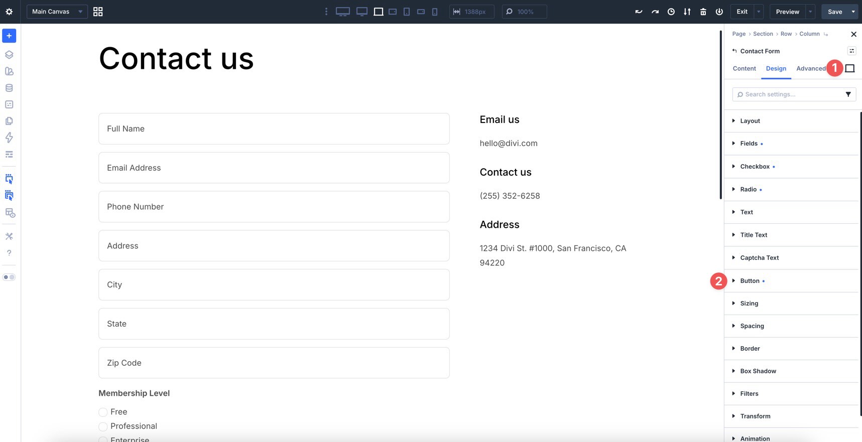
From here, assign a Preset or style the button manually.
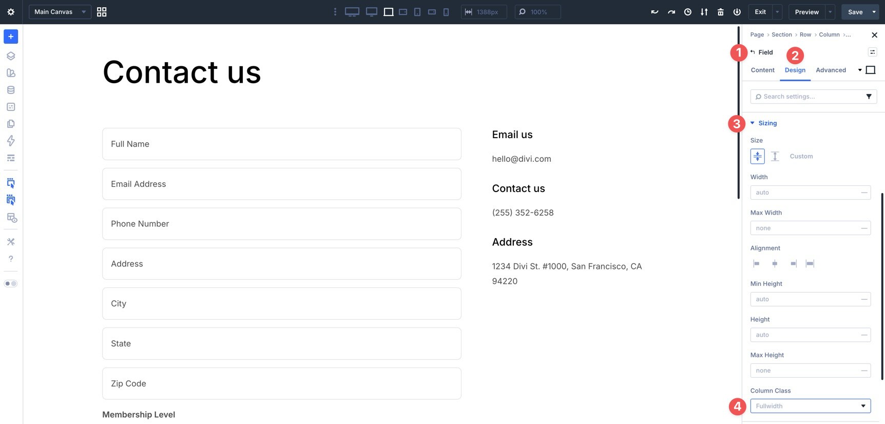
Step 5: Adjust Individual Field Settings
Module-level styling gives you fast, consistent control over the whole form. However, you can still customize individual fields when a layout calls for it.
For example, you may want two fields to sit side by side on larger screens. Divi 5 makes this possible with built-in Sizing settings. Open any field in the form, go to the Design tab, expand the Sizing option group, and look for the Column Class field.
When you click into the field, a modal appears with multiple sizing options. Select 1/2.
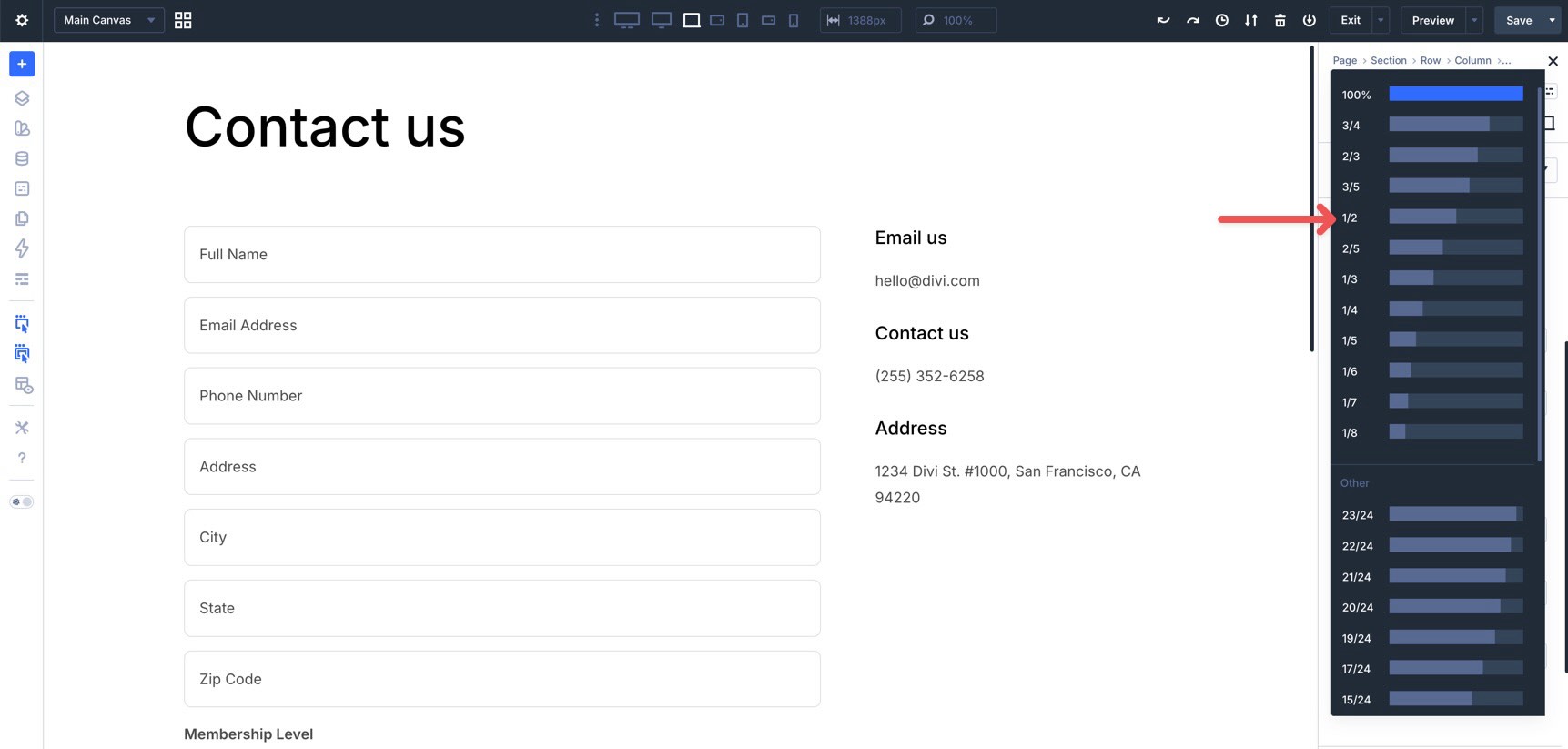
Repeat these steps to assign different column classes to other fields as needed.
Use Divi 5’s Responsive Editor to adjust field column classes for tablet and phone breakpoints when needed.
Step 6: Create Field Option Group Presets
Once your form fields look the way you want, save the reusable parts as Option Group Presets. This lets you apply the same field styling to future forms more quickly.
To create an Option Group Preset, go to the Design tab. Hover over the right side of the option group header to reveal the Assign Presets icon.
Click the icon. When the modal appears, choose New Preset From Current Styles.
Give the preset a name and click Save Preset.
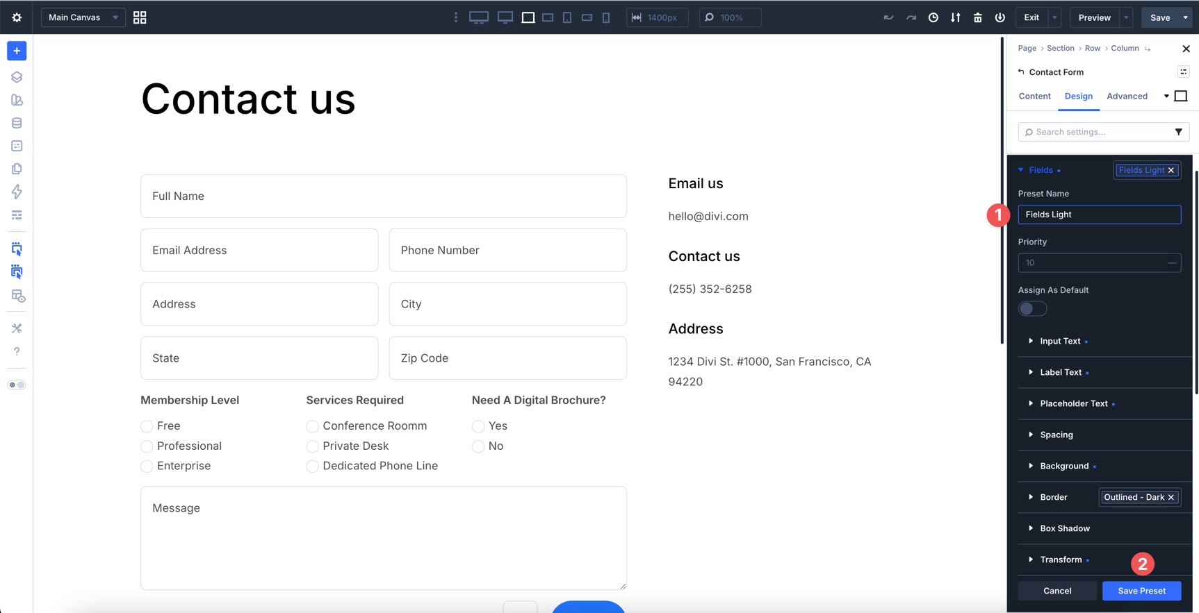
Repeat this process for any other field groups you want to reuse. Your saved Option Group Presets will appear in the preset dropdown for quicker application across compatible form modules.
Step 7: Create An Element Preset
For maximum efficiency, you can also create a full Element Preset. This saves the complete Contact Form module design as a reusable module preset. If the module design includes nested Option Group Presets, those smaller presets remain easier to manage and update later.
To create an Element Preset for the form, select the main Contact Form module and click the Assign Presets icon in the module header.
Select New Preset From Current Styles, name the preset, and save it.
To set this as the module’s default preset, click the preset. In the modal that appears, click the star icon next to the preset name.
From now on, any new Contact Form module you add can start with that preset applied by default.
Tips And Best Practices
Here are several ways to get more from the new form styling options and avoid common mistakes as you start using them in projects.
Create Field Presets For Site-Wide Consistency
Instead of styling each Contact Form, Email Optin, or Contact Form 7 module from scratch, create Option Group Presets for Input, Checkbox, and Radio groups. Once saved, apply them as you add new forms to keep designs consistent.
For greater control, nest those Option Group Presets inside an Element Preset for the form module. Then, set that Element Preset as the default when you want new forms of that type to start with the same styling.
Use Focus And Checked States For Better User Experience
Style the Focus and Checked states intentionally. The Focus state helps users see which field they are typing in. The Checked state makes selected checkboxes and radio buttons easier to recognize.
These small cues can improve usability, especially on forms with multiple input types.
Combine With Composable Settings For Advanced Control
Use Composable Settings when you need additional design controls, such as filters, transforms, backgrounds, borders, or sizing options on a specific form element.
Only enable the option groups you need. This keeps the interface cleaner while still giving you advanced control when the design requires it.
Preview Interactive States Across Devices
Forms can behave differently on mobile and desktop. Switch to tablet and phone views to test focus, hover, and checked states. Pay special attention to checkbox and radio styling, label spacing, touch targets, and contrast so your forms remain usable across screen sizes.
Download And Install The Files
To make things easier, we’ve created a JSON file with the contact form layout used in this tutorial. The file does not include saved presets, so you can import the layout and practice creating the presets yourself.
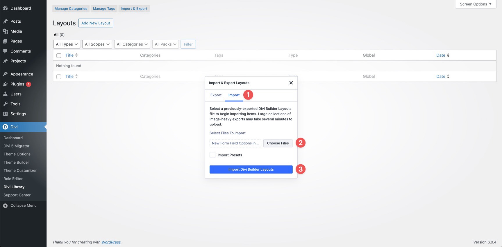
To use it, open the Divi Library and click the Import & Export button.
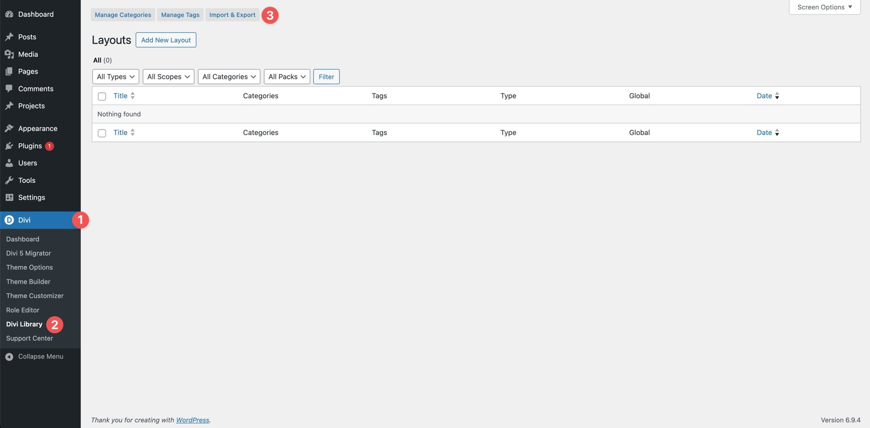
Click the Import tab, select the New Form Field Options In Divi 5.json file on your computer, and click Import Divi Builder Layouts.
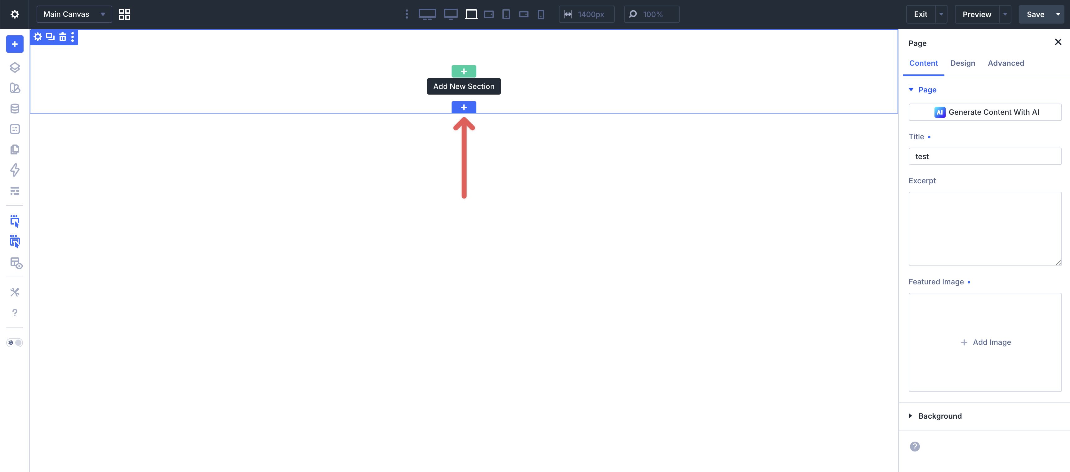
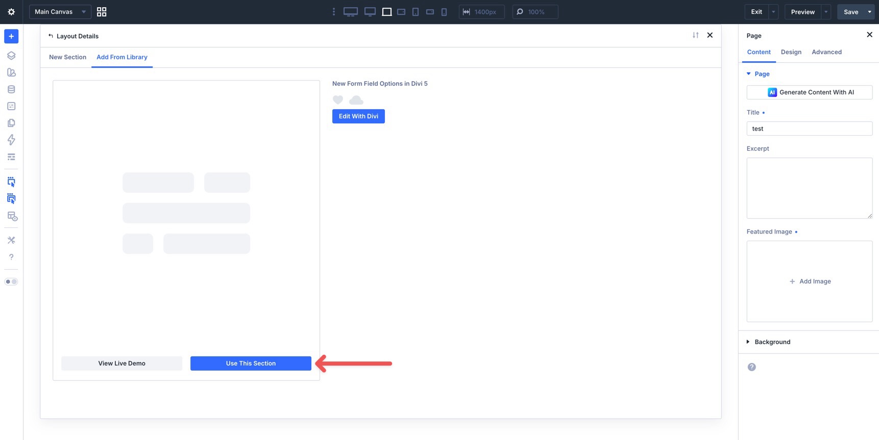
Once imported, create or open a page in the Visual Builder. Click to add a new Section to the page.
Select the Add From Library tab and choose the New Form Field Options in Divi 5 section.
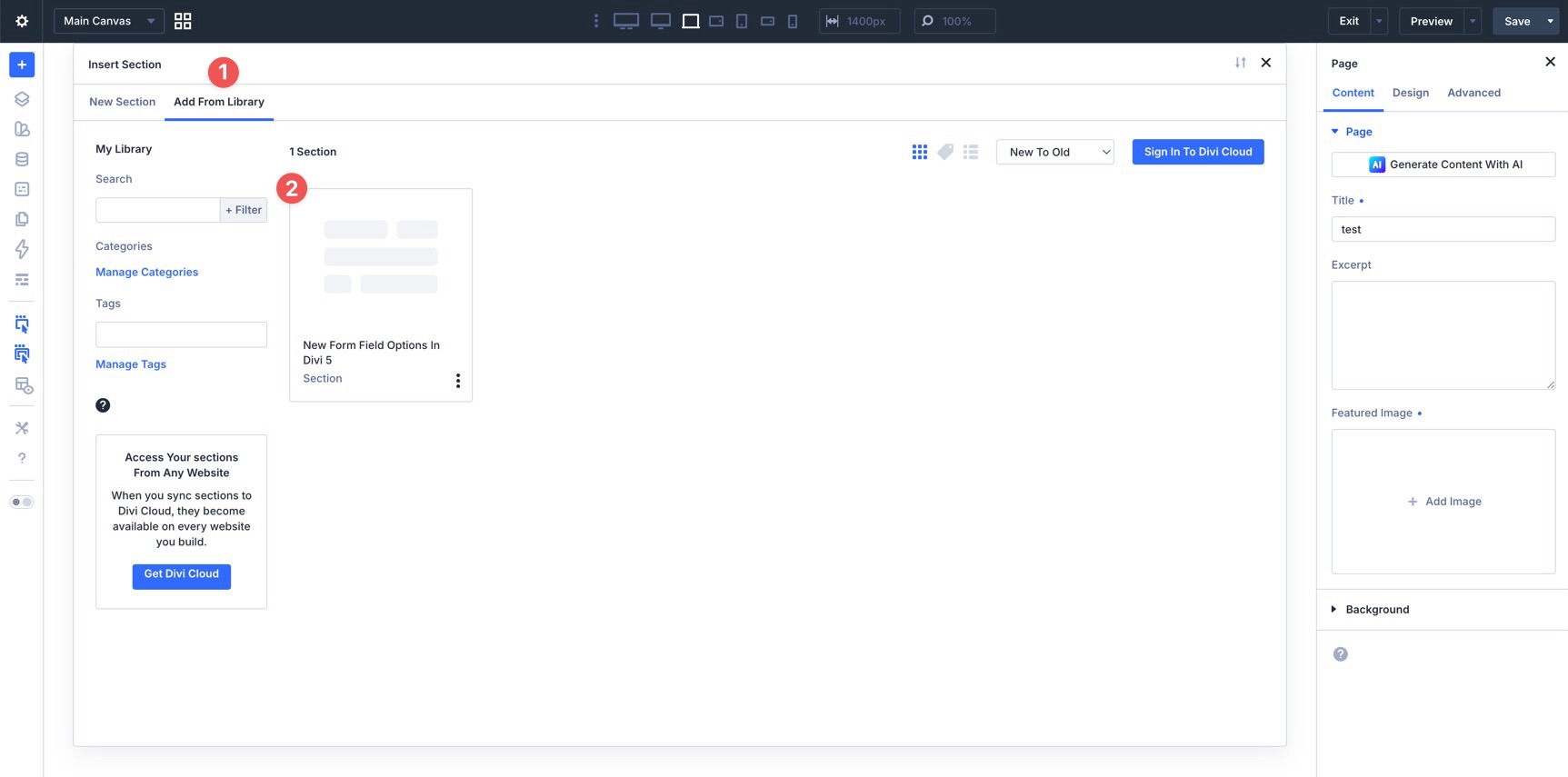
Finally, click Use This Section to add the layout to the page.

Start Building Better Forms With Divi 5 Today!
Divi 5’s new Form Field Options change how form styling works in Divi. With dedicated Input, Checkbox, and Radio option groups, label and placeholder styling, focus and checked editing states, field presets, and the new Contact Form 7 module, you can create more consistent forms using native Divi controls.
These updates bring form design more closely into Divi 5’s design-system workflow. Whether you are styling a contact form, an email opt-in, a login form, or a Contact Form 7 form, you can reuse presets, reference variables, and adjust interactive states without leaving the Visual Builder.
If you have not already, download the latest version of Divi 5 and start experimenting with the new form features.
Let us know what you think by leaving a comment below or reaching out on our social media channels.
The post Everything You Need To Know About Divi 5’s New Form Field Options appeared first on Elegant Themes Blog.