In Part 4, we turned the Design Variables from Part 3 into a library of Option Group Presets and Element Presets. Now, the design system is in place. Every color, font size, spacing value, border, and button style is either saved as a reusable preset or available as a reusable variable reference inside a module.
In this part, we’ll use that library to build the homepage of our coworking space website, section by section. The homepage includes seven sections, from the opening hero to the closing FAQ. Each section has its own structure, content priorities, and visual role. Because the design work is already done, most of this build focuses on assembly rather than repeated styling decisions.
The Build Approach For Part 5
Before opening the Visual Builder, it helps to understand the workflow. Every section on this homepage follows the same basic process.
First, add the Section. Then, configure the rows and columns that define the structure. In Divi 5, you can use Flexbox and CSS Grid layout controls to create flexible, responsive structures. Several sections on this homepage use both approaches.
Second, drop the modules into the correct columns. At this stage, focus on structure before styling. Once the modules are in place, applying the design system becomes much easier.
Third, apply the presets. This is where the work from Parts 3 and 4 pays off. A Heading preset can control font family, size, line height, and color. A Button preset can control padding, border radius, background color, text color, and size. Instead of restyling every module manually, you can apply consistent design decisions in a few clicks.
Finally, handle the remaining static content. Text, images, video sources, countdown dates, accordion items, and individual icon choices still need to be set per module. However, those are content decisions now, not design-system decisions.
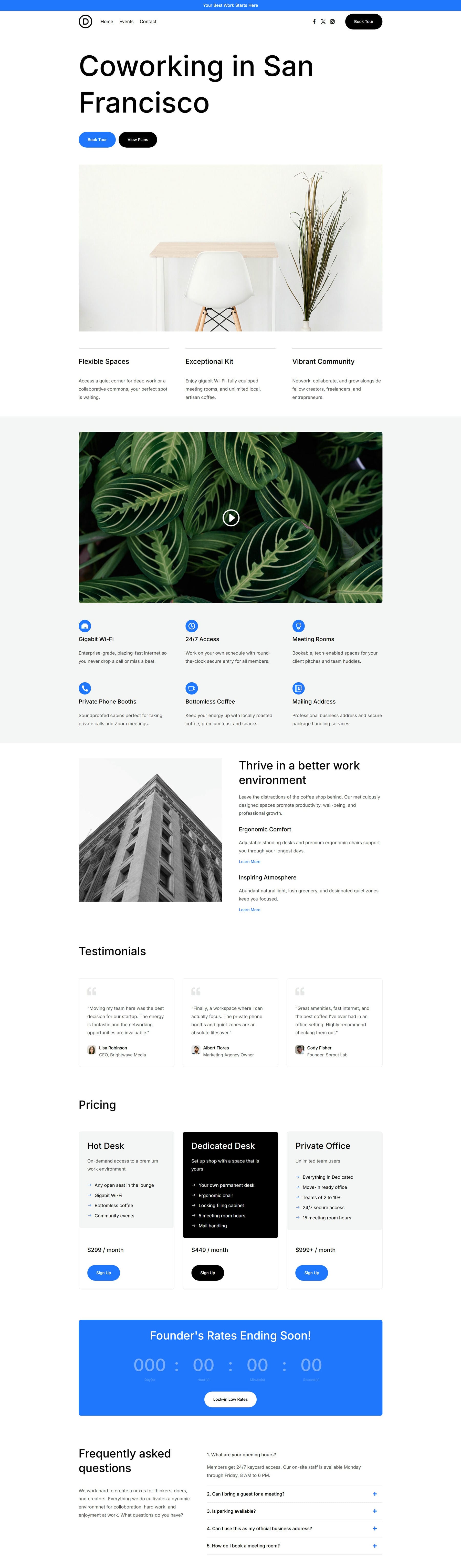
By following this workflow, you’ll create this homepage:
To get started, create a new page in the WordPress dashboard and name it Home.
After the page is created, click Edit With Divi. For a new build, it can also help to simplify the workspace. If your Theme Builder Header and Footer areas are visible and you want to focus only on the page body, hide or disable those template areas for now. You can turn them back on later when we build the global Header and Footer in Parts 6 and 7.
Homepage Build
We’ll build the homepage in seven sections: Hero, Features Grid, Split Features, Testimonials, Pricing, Countdown, and FAQ.
Hero Section
The Hero section tells visitors what the coworking space offers within the first few inches of scroll. It uses three rows: a headline and primary calls to action at the top, a full-width hero image below, and a three-column statement row at the bottom.
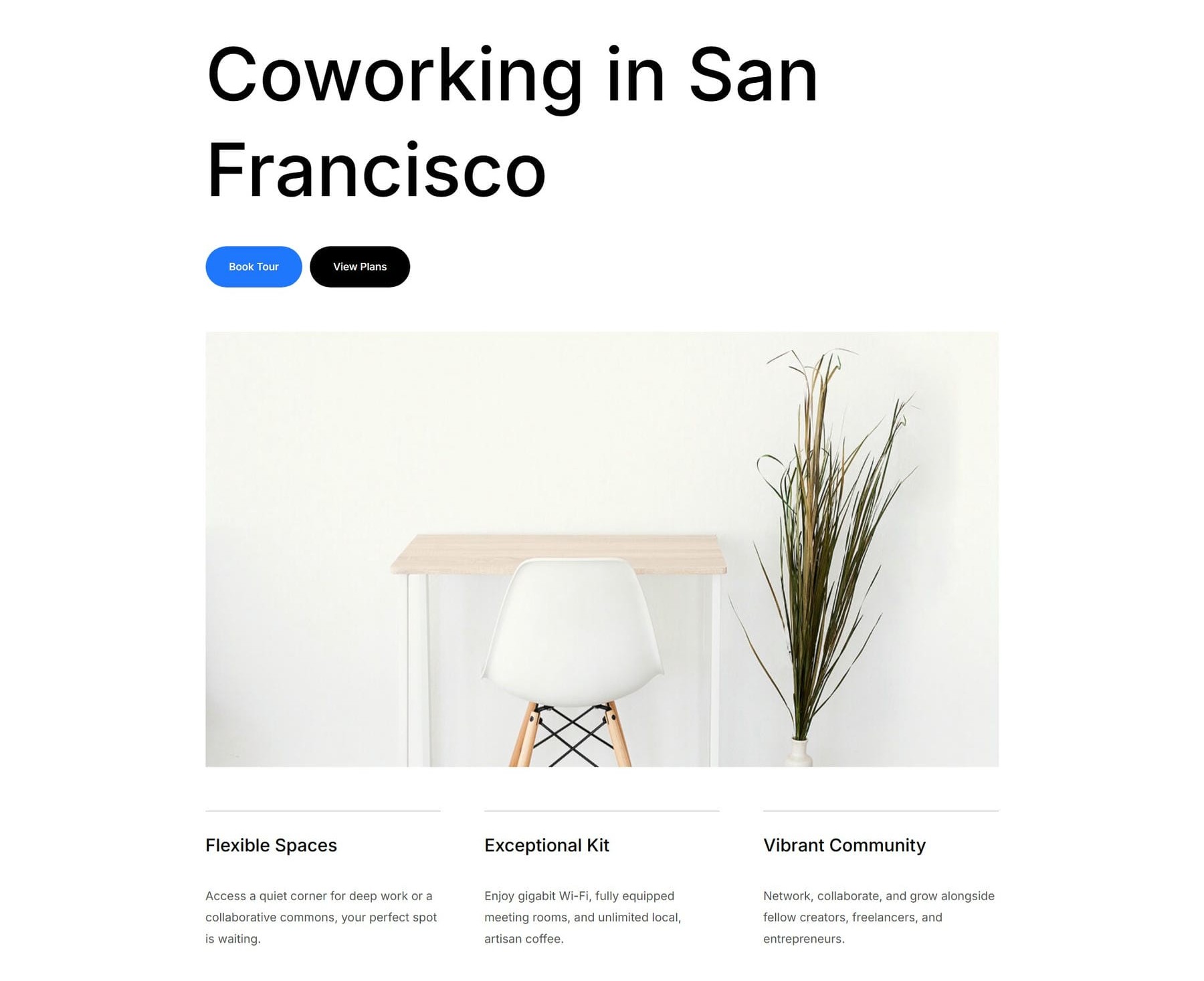
Start by adding a new Section. From the Insert Section modal, choose a Flex Equal Columns structure with one column. Divi creates the Section with its first Row already configured as a single-column flex layout.
Place a Heading module and a Group module inside the Column. The Heading holds the hero headline. Inside the Group, add two Button modules. Then, open the Group module’s Design tab. In the Layout option group, set Flex Direction to Row and set the Horizontal Gap to 10px so the buttons sit side by side.
Next, add a second Row. From the Insert Row modal, choose another Flex Equal Columns one-column structure. Drop an Image module inside it. This becomes the hero visual below the headline.
Then, add a third Row. From the Insert Row modal, choose a Flex Equal Columns structure with three columns. This becomes the statement row for three core value propositions. Inside each Column, add one Heading module and one Text module.
Now, apply the presets. The Heading in the first row gets the Heading 1 Big Element Preset. The first Button gets Filled – Primary Color. The second Button gets Filled – Black. The Image gets the Rounded Element Preset.
In the third Row, apply the Top Border Option Group Preset to the Border option group of each Column. Then, set 30px padding-top on each Column to separate the text from the top border. Apply Heading 4 to each of the three Headings and Dark Text to each of the three Text modules.
Finally, add the text and image content. The hero headline reads Coworking in San Francisco. The first Button uses the Book Tour text variable, and the second Button uses the View Plans text variable.
The three statement columns use the headings Flexible Spaces, Exceptional Amenities, and Vibrant Community. Pair each heading with a short supporting paragraph.
Features Grid Section
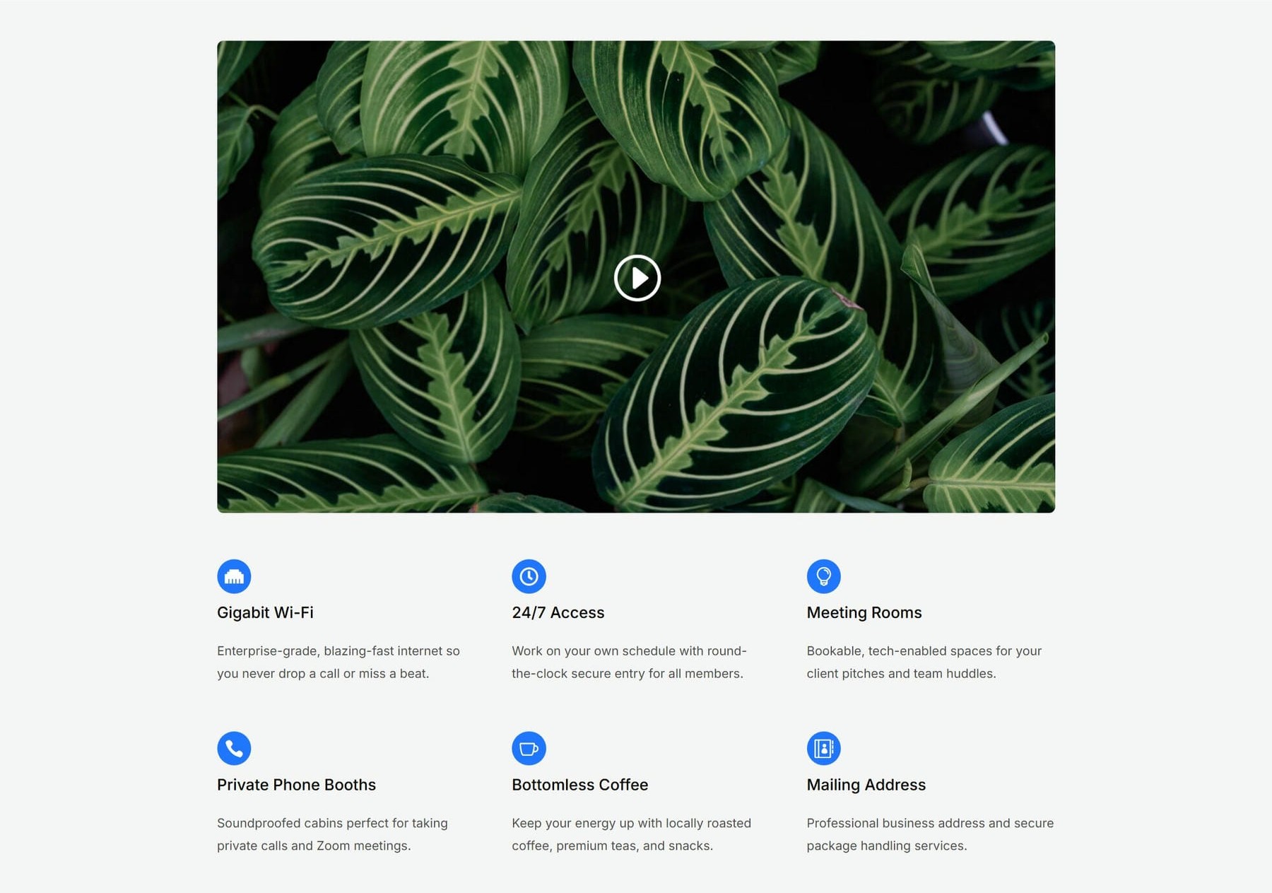
The Features Grid section showcases six amenities in a tight, evenly spaced layout. It uses CSS Grid so the feature columns stay consistent across desktop, tablet, and mobile breakpoints.
Add a new Section. From the Insert Section modal, choose a Flex Equal Columns one-column structure. In the Section’s Design tab, open the Background option group and set the Background Color using the Background – Light Gray variable. In the Section’s initial Row, insert a Video module.
Next, add a second Row and choose a Flex Equal Columns layout. Inside the single Column, add an Icon module, a Heading module, and a Text module, in that order.
Now, open the new Row’s Content tab and go to Elements. Click Apply Structure Template. On desktop, change the row structure from single-column flex to a three-column grid. Then, switch to the Tablet breakpoint and set the row to a two-column grid. Finally, switch to the Mobile breakpoint and set it to a one-column grid.
After the responsive structure is set, return to the Desktop breakpoint. Find the first Column and duplicate it five times so the grid contains six feature items.
Now, style the section with presets. The Video module gets the Rounded Element Preset. Each Icon gets the Dark – Small – Contained Element Preset. Apply Heading 5 to each feature title and Dark Text to each description.
Each Column inside the grid should use a Vertical Gap of 12px. This keeps the icon, heading, and text visually grouped.
Finally, add the Video module source and overlay image. The six features for this coworking site are Gigabit Wi-Fi, 24/7 Access, Meeting Rooms, Private Phone Booths, Bottomless Coffee, and Mailing Address. Assign a distinct icon to each feature from the Icon Library and write a short one- to two-sentence description for each.
Split Features Section
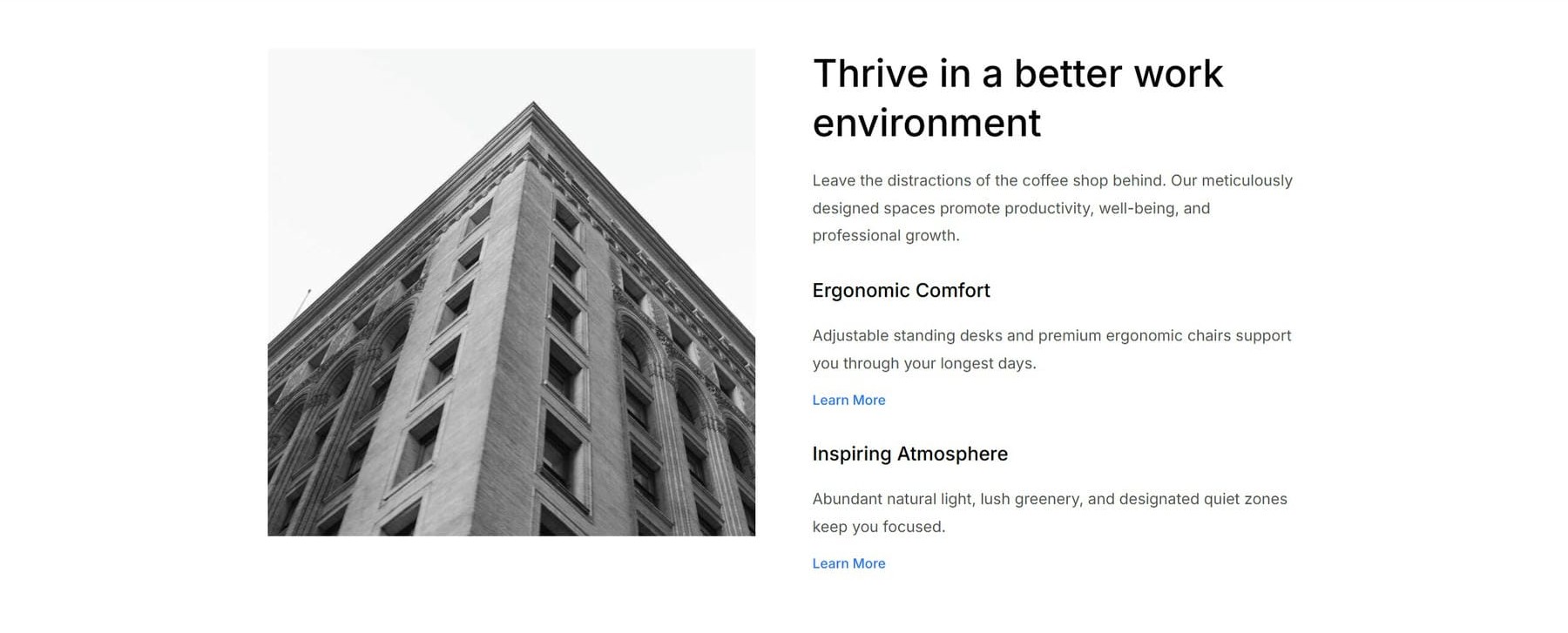
The Split Features section pairs a tall image on the left with three content blocks on the right. It creates a simple visual hierarchy within a single row: the first block introduces the section, while the second and third blocks highlight supporting features with call-to-action links.
Add a new Section. From the Insert Section modal, choose a Flex Equal Columns structure with two columns. The Section’s first Row is already configured with the two columns you need.
In the left Column, add an Image module. In the right Column, add a Group module. Inside the Group module, add a Heading module and a Text module. Duplicate the Group once, then add a Button module at the bottom of the duplicated Group. Finally, duplicate that second Group once more.
For each of the three Groups, open Design > Layout and set Flex Direction to Column with a 10px row gap between child modules. To speed this up, you can style one Group first and use Extend Attributes to apply the same layout settings to the other Groups.
Then, apply the presets. The Image gets Rounded. The first Group’s Heading uses Heading 2, and its Text uses Dark Text. The second and third Groups use Heading 5 for their Headings and Dark Text for their Text modules. Both Buttons use Text – Primary Color, so they appear as inline links instead of solid CTAs.
Add the image and text content to the modules. The lead heading is Thrive in a better work environment. The two supporting blocks cover Ergonomic Comfort and Inspiring Atmosphere. Each supporting block uses the Learn More text Design Variable on its Button.
Testimonials Section
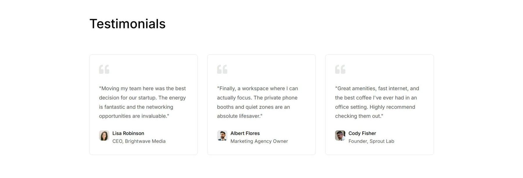
The Testimonials section presents three customer quotes in a three-card layout with a section heading above.
Add a new Section. From the Insert Section modal, choose a Flex Equal Columns one-column structure. Place a Heading module in the Section’s initial Row. Then, add a second Row and select a Grid Multi-Column structure with three equal columns. Inside each Column, add an Icon module, a Text module, and a Blurb module.
The section title Heading uses Heading 2. In the second Row’s Design > Layout option group, set the Horizontal Gap to 30px. Each of the three Columns gets the Outlined – Dark Element Preset.
Inside each Column, the Icon gets Dark – Small, the Text gets Dark Text, and the Blurb stacks two Element Presets: Dark Text and Dense. The Blurb image gets a Border Radius of 8px. You can also use the relevant rounded image or border preset if you created one in Part 4.
To work faster, style the modules in the first Column first. Then, use Extend Attributes to apply the same styles from matching elements in the first Column to matching elements within the Parent Row.
Now, fill in the image and text content. The section heading reads Testimonials. Each card gets a quotation-mark icon, a testimonial quote in the Text module, and an author photo with a name and role in the Blurb module.
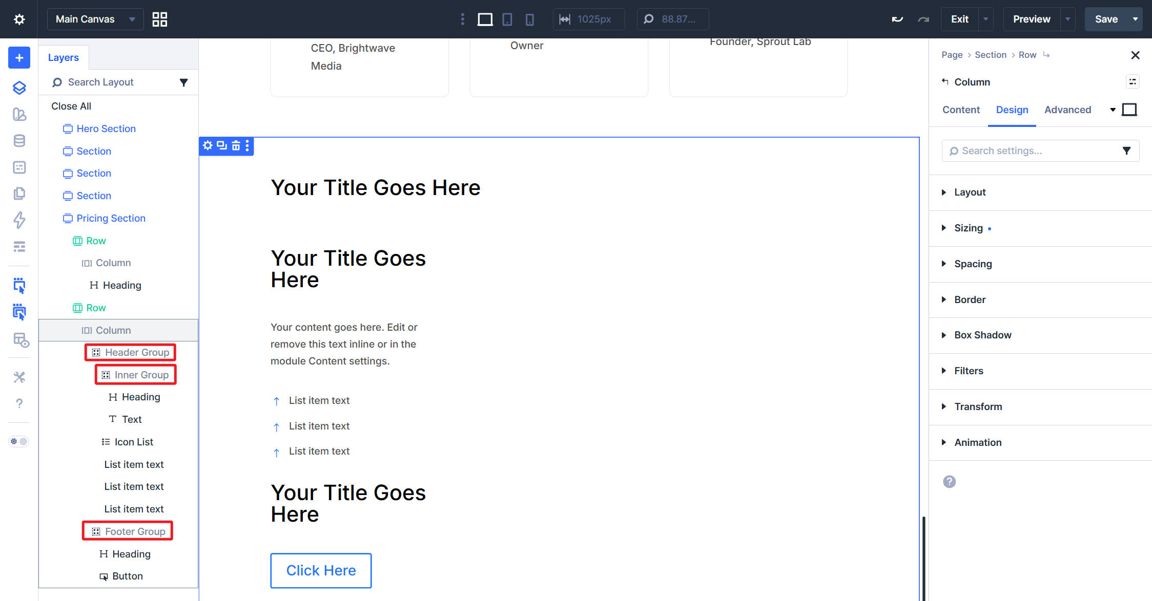
Our three testimonials are from Lisa Robinson, CEO of Brightwave Media; Albert Flores, Marketing Agency Owner; and Cody Fisher, Founder of Sprout Lab.
Pricing Section
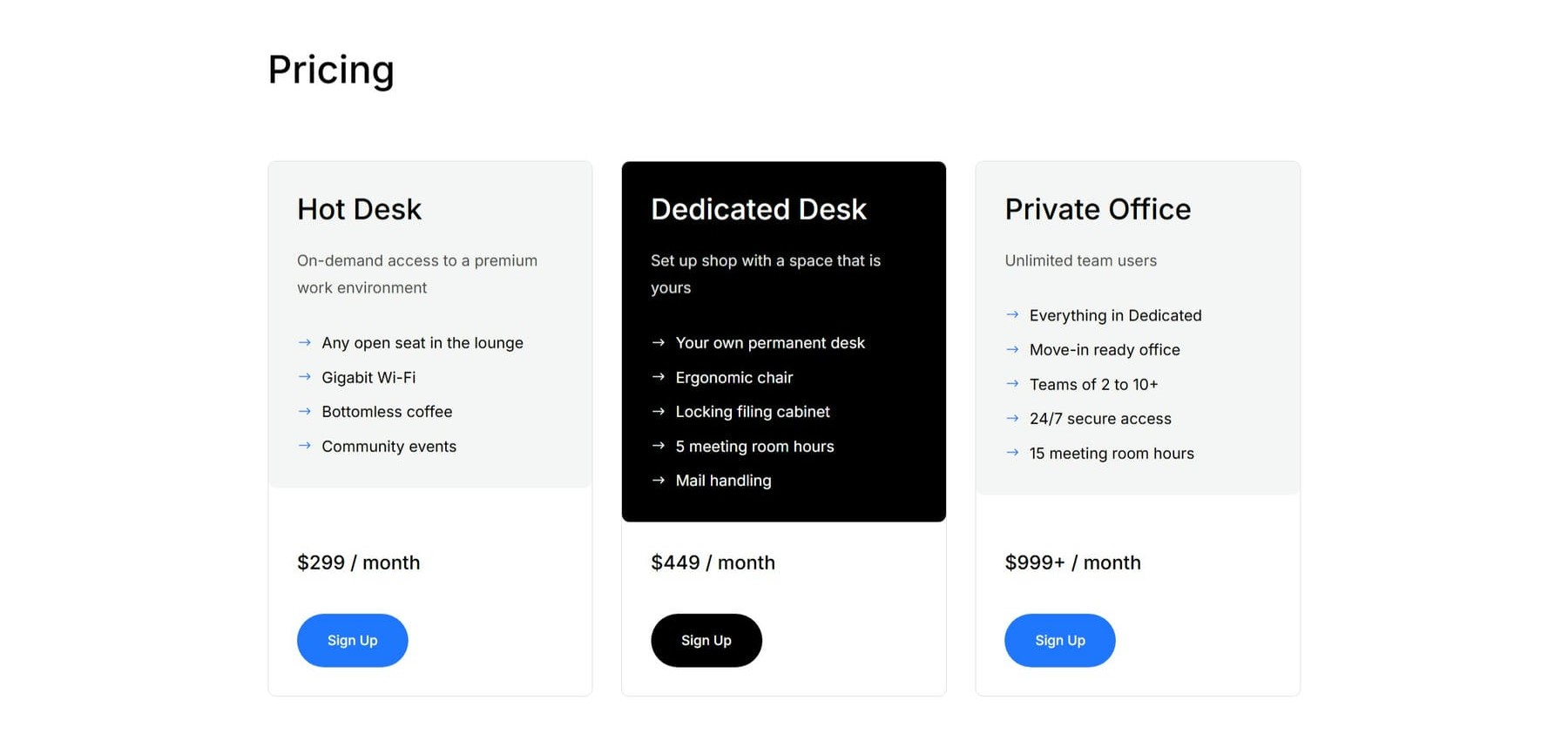
The Pricing section is the most structurally complex part of the page. Each price card uses a Group-based layout with nested Groups, an Icon List, and a footer Group. The payoff is a clean, consistent card structure where the middle tier can stand out through contrast.
Add a new Section. From the Insert Section modal, choose a Flex Equal Columns one-column structure. Place a Heading module in the Section’s initial Row for the section title.
Then, add a second Row and choose a Grid Multi-Column structure with three equal columns. For now, focus only on the first Column because the card structure is dense. Inside the first Column, add a Group module. Then, add another Group module inside it with a nested Heading module and Text module.
As a sibling of the second Group, add an Icon List module. Then add another Group module as a sibling of the first. Inside that footer Group, add a Heading module and a Button module.
Delete the two extra Columns and leave only the first pricing card for now. On the remaining Column, apply the Outlined – Dark Border Option Group Preset. Then, switch the Row to the Tablet breakpoint and set the row to a one-column layout. After that, return to the Desktop breakpoint.
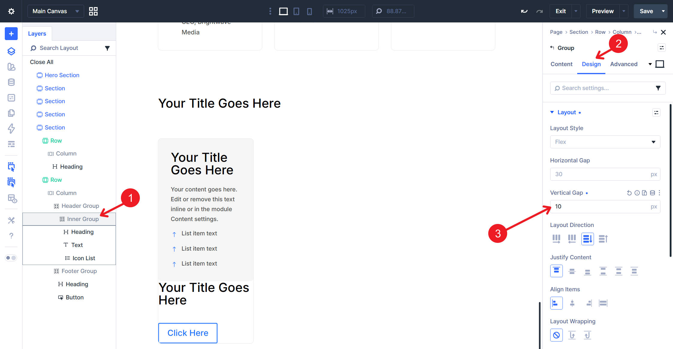
To make the instructions easier to follow, we’ll refer to the three Groups as the Header Group, Inner Group, and Footer Group. Use the Layers panel in the screenshot below to confirm which Group is being edited.
Each card’s Header Group uses either the Contained – Light or Contained – Dark Element Preset. The outer cards use Contained – Light, while the middle card uses Contained – Dark.
The first Inner Group gets a Vertical Gap of 10px using the spacing value from your design system.
Each card’s Footer Group uses the Padding – Medium Option Group Preset. Each tier Heading uses Heading 3. Each tier description Text uses Dark Text on the light cards and Light Text on the dark middle card. Each price Heading uses Heading 5. Each Button uses Filled – Primary Color on the outer cards and Filled – Black on the middle card.
The Icon List uses Dark on the light cards and Light Text on the dark middle card. Once the first card is styled, duplicate the first Column twice. Then, adjust the middle Column by changing the relevant text presets to their light versions and setting the card background to Black.
Next, switch to the Tablet breakpoint. In the second Row’s Content > Elements option group, set the Layout Structure to 1 column. Set the Horizontal Gap to 30px so the stacked pricing cards keep consistent spacing on smaller screens.
Finally, set the pricing content. The three tiers are Hot Desk at $299/month, Dedicated Desk at $449/month, and Private Office at $999+/month. Each tier gets a short description, a list of included benefits in the Icon List, and a Sign Up Button. Change the Icon List icons to right-pointing arrows.
Countdown Section
The Countdown section creates urgency with a prominent promotional CTA. The entire section sits in a single row with a bright background, creating a visual break between the pricing section and the FAQ.

Add a new Section. From the Insert Section modal, choose a Flex Equal Columns one-column structure. Apply the Contained – Dark Row Element Preset to the Section’s initial Row. Inside the Column, add a Heading module, a Countdown Timer module, and a Button module.
The Heading gets Heading 2 and Center Aligned, with its text color set to White. Remove the Heading Text from the Countdown Timer module so the CTA headline remains the main title. The Countdown Timer gets Light Text. The Button gets Filled – White, so it contrasts clearly against the blue background.
Set the content next. The main heading can read Founder’s Rates Ending Soon!. Configure the Countdown Timer’s target date to match your promotional window. The Button text is Lock In Low Rates.
FAQ Section
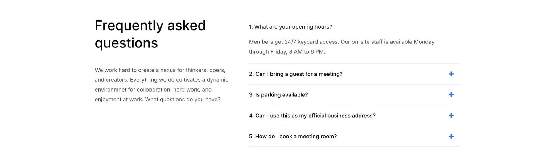
The FAQ section uses an offset two-column layout. A short introductory block sits on the left, while the collapsible question list fills the wider column on the right.
Add a new Section. From the Insert Section modal, choose a Flex Offset Columns structure with two columns. A 2/5 + 3/5 pattern works well here because it gives the heading block a narrow anchor and gives the FAQ list more room.
Inside the left Column, add a Heading module and a Text module. Inside the right Column, add an Accordion module.
Then, apply the presets. The Heading uses Heading 2, and the Text uses Dark Text. The Accordion uses the Dark Text Element Preset.
The left Column heading reads Frequently asked questions, followed by a short intro paragraph. On the right, add five Accordion items with questions and answers that fit the coworking space. Good topics include opening hours, guests, parking, business address use, and meeting room bookings.
Reviewing The Homepage
With all seven sections in place, the homepage is complete. It includes a headline and hero image, a visual feature grid, a split-feature row, testimonials, pricing, a promotional countdown, and an FAQ section. Here is the finished page again.
The important part is not just that the page is finished. It is how the page was built. The modules reference Design Variables and Presets rather than relying on hardcoded hex values, one-off font sizes, or ad hoc padding. That is the point of the design system.
The homepage is now easier to revise, extend, and keep consistent. The hard work from Parts 3 and 4 has paid off, because the design decisions are reusable rather than trapped within individual modules.
Coming Up Next
The homepage is built, but it is still just one page. In Parts 6 and 7, we’ll build the site-wide Header and Footer using the Theme Builder. We’ll wire them up as global templates and keep using the same Design Variables and presets we have been building throughout the course.
After that, every new page can inherit the same global structure. That is the last piece of scaffolding we need before building the inner pages.
You are well on your way to a complete website design from scratch using Divi 5.
The post Part 5: Building A Divi 5 Homepage From Scratch appeared first on Elegant Themes Blog.